Creating forms that are accessible to all users, including those with disabilities, is a critical aspect of web design. Accessible forms ensure that users can interact with your site seamlessly, regardless of their abilities. This article delves into the components of accessible forms, including labels, helper text, placeholders, and error validation, and provides detailed guidance on how to configure these elements effectively, complete with examples.
Understanding Form Components
Forms are an integral part of any website, enabling user interaction through data entry. However, not all available form components in Pega are accessible by default. This often stems from the need for backward compatibility, where legacy components must remain functional for long-term customers. Before implementing components, explore the UI Gallery in your development environment. This resource provides a showcase of all available user interface (UI) components and their configuration options. By experimenting with different components, you can identify the relevant options that best meet your application’s UI and accessibility needs.
Labels and Captions
Labels are crucial for associating form fields with their unique name – especially important for assistive technology and user comprehension. Labels serve to provide the name and purpose of each field and should be concise and easy to understand. Captions function the same and are used with specific controls such as buttons, links, and checkboxes.
While a label placed in close proximity to a field may let a sighted user know their association to each other, there also needs to be a programmatic association between the two so that users of all types can understand the relationship. Programmatic association is the method of joining UI elements to each other through specific markup and attributes in the Document Object Model (DOM) to provide necessary context for individuals using assistive technologies.
When configuring a control on the UI, always make sure you provide a form of label or caption, such as in the following example of a text input field:
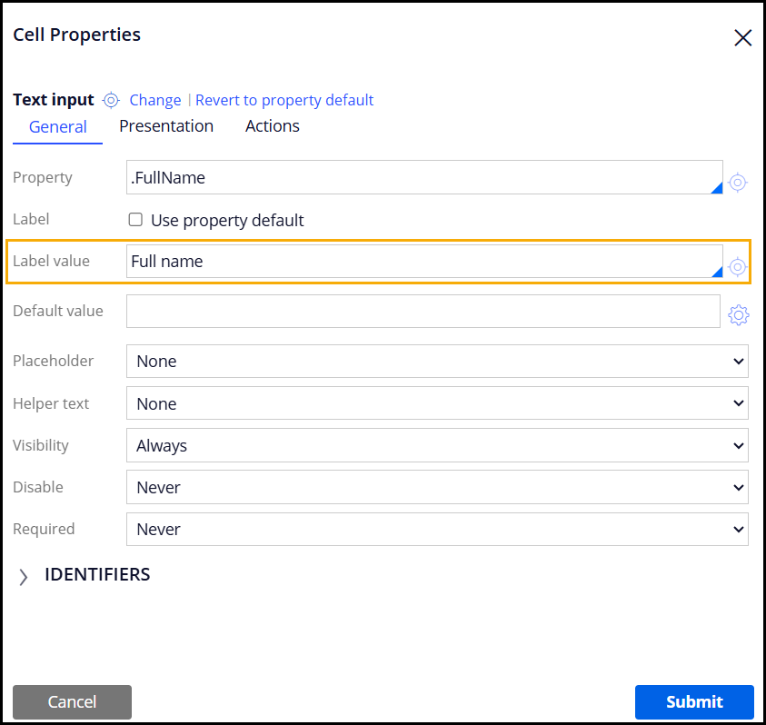
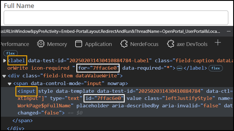
When configuring labels directly on form controls in this way, Pega will automatically handle the programmatic association in the markup. This is done by generating an adjacent <label> tag in the DOM for the field. On the label tag is the “for” attribute, whose value will match the id attribute value that is generated on the editable field at runtime. This association is highlighted in the following image of the same text input field where we have configured a label:
Avoid configuring a separate label control adjacent to the form control, as this will not provide the programmatic association required for assistive technologies to understand the relationship. For captions configured on buttons and links, these make up the inner HTML of the button or anchor tag and are also displayed visibly on the UI.
Helper Text
Helper text allows authors to provide controls with additional instructions or context, guiding users on how to complete a form field correctly. Adding helper text to a field can be especially useful for complex fields that require specific input formats or values. Pega offers several options for helper text, with the following options recommended for better accessibility.
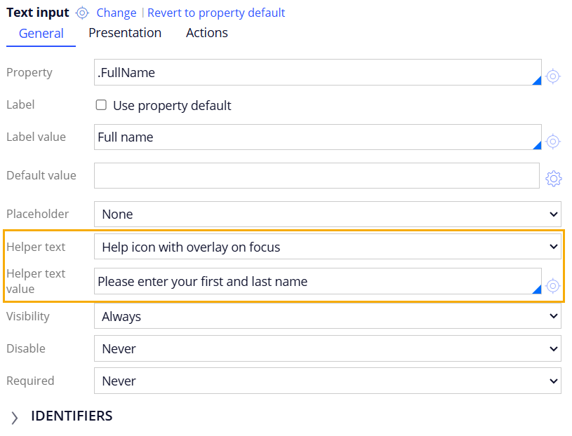
Help Icon with Overlay on focus
This option displays a help icon adjacent to the field label that can be focused with keyboard and activated with Enter key. When the user activates the icon, helper text will appear visibly and be relayed to screen readers as well. The label of this button follows the format of “Help for [field label]”, so that screen reader users will understand which field this help icon is associated with.
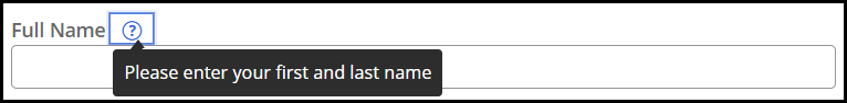
The Help icon with overlay on focus is an ideal option for providing additional information without cluttering the user interface. Additionally, the functionality will also allow the configured tooltip to display on mouse hover.
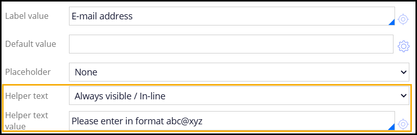
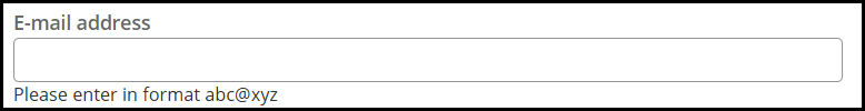
Always Visible Inline Text
This helper text is positioned directly beneath the form field and remains visible at all times. It is particularly useful for fields requiring specific input formats or explanations, as this text will remain visible as the user inputs data in the field. The helper text is associated to the field as through the use of the aria-describedby attribute.
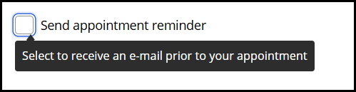
Smart Tip
Smart tips provide helper based on certain user input events. They are a highly customizable helper text option, allowing the use of plain text, field values, or paragraph rules to display as the helper text value. Smart tips are configured through the action set of a control rather than as a specific helper text option, allowing authors to specify specific user input events such as focus or hover to determine when to display the tip. The tip will appear and disappear on the UI based on the user performing the specified input event, and is associated with the configured field through the aria-describedby attribute.
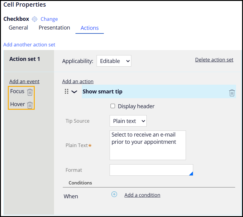
Given that Smart tips are configured through an Action set, it is necessary for authors to specify exactly which user input events dictate the showing or hiding of the helper text. Depending on the use case and your user needs, these events can vary. For example, if the Smart tip has been configured on an editable field, selecting Focus and Hover events for the Smart tip is recommended. This ensures that both keyboard and mouse users can perceive the helper text when reaching the specified field without requiring further input to display it. As an alternative example, if there is a standalone help button or icon that you want to display general information about the form, consider using Enter and Click events to display the tip. This aligns more with the interactive button role and similarly covers both mouse and keyboard input methods.
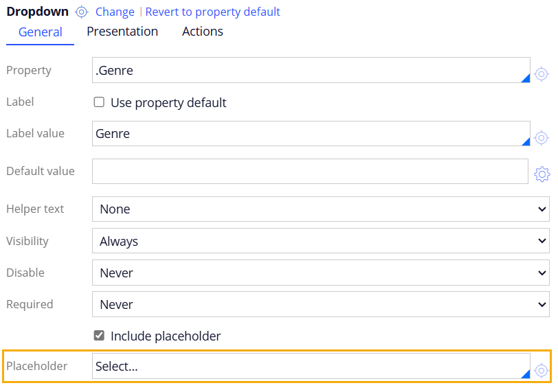
Placeholders
Placeholders are typically used to offer users guidance about the expected input format within a form field. They are not generally recommended for input fields due to potential color contrast issues, which can hinder readability for users with visual impairments. Additionally, placeholders in input fields will not display their configured text once the user begins entering data. This can cause a confusing experience if users need to refer back to what the placeholder text was. Try to use placeholders sparingly and opt for other more accessible options where possible.
Placeholders can be useful in certain scenarios such as for dropdown controls. Rather than having one of the items pre-selected, configuring a placeholder value indicates to users that they need to select a value from the list.

Error Validation
Error validation is essential for informing users about issues with their input. Accessible error messages should provide clear, actionable feedback, enabling users to correct mistakes easily.
Pega offers two varieties of form validation, client-side and server-side validation.
Client-Side Validation
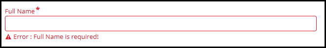
Client-side Validation is configured directly on a form control, and at runtime will provide immediate feedback when users leave a required field blank. When this validation is triggered, the field becomes highlighted in red and error text appears below the field: “Value cannot be blank”.
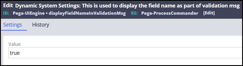
Within Dev Studio, there are ways to customize client-side validation messages to provide more context for users. One way to do so is by enabling the Dynamic System Setting (DSS) displayFieldNameInValidationMsg. When set to true, this setting will modify the error messaging so that the respective field’s label is also included in the error message, giving users more unique context as to which specific field has an error.
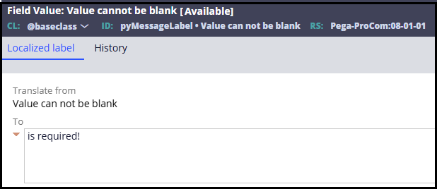
Additionally, further customization of the error message wording is possible through modifying the available Field Value rule “Value can not be blank” in the Pega-ProCom ruleset. This Field Value contains the default text that is shown for client-side validation error messages, which can be modified to any different wording that better suits application needs.
Together, these customizations can help provide clearer and specific error messages that can help your users address form errors more efficiently.
Server-Side Validation
Server-Side Validation allows authors to apply more in-depth form validation and constraints, either on a flow action or to individual properties. Unlike client-side validation, server-side validation will typically only occur when the user submits the form. These error messages are highly customizable within Validate rules, allowing authors to specify a wide variety of constraints as well as the wording of each error message shown to the user.
Accessible forms are a cornerstone of inclusive web design. By focusing on proper configuration of labels, helper text, placeholders, and error validation, you can significantly enhance the accessibility and usability of your forms.
@BobbyPastorelli is there a way to translate/localize the aria label "help for" from the helper icon?