Tabs are a common user interface pattern used to organize content into layered sections on the web. Each section of a tab's content is contained within a tabpanel, which is displayed when its corresponding tab is selected. In Pega, tabs can be introduced into the user interface using a layout group configured as Tabs. However, the standard tab layout group has some limitations in terms of accessibility.
Accessibility concerns
One of the main issues with the standard layout is the structure of the HTML markup it generates. Each tabpanel is rendered as a child of the tab element that controls it. This structure is not valid according to HTML and ARIA specifications, which expect tabpanel elements to be siblings of their associated tab elements. As a result, automated accessibility scanning tools may flag this as a structural issue, potentially impacting users who rely on assistive technologies.
Another challenge arises when the number of tabs exceeds the available horizontal space. In such cases, overflow controls such as left and right scroll buttons are introduced to allow users to access tabs not in the current viewport. While this helps with visual navigation, it can create confusion for screen reader users and others who navigate via keyboard, as the tabbing order may become less intuitive due to the insertion of these scroll controls.
Semantic tabs
Pega provides a configuration option called "Semantic tab layout" When enabled, this option changes the way the markup is generated so that each tabpanel is no longer a child of its corresponding tab but rather a sibling element. This ensures a semantically valid structure.
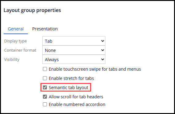
Additionally, semantic tabs support overflow handling in a way that accommodates both mouse and keyboard users. With the "Allow scroll for tab headers" configuration checkbox selected, mouse users can scroll to access hidden tabs using a scrollbar, and keyboard users can still navigate between tabs using the left and right arrow keys when any tab in the tablist has keyboard focus.
From an accessibility perspective, using semantic tab layouts is the recommended approach. Starting with version '25, Pega will make semantic tabs the default configuration selected when a layout group control is added to a section rule, ensuring better compliance and usability by default.