Cascading Style Sheets (CSS) is a technology in web development used to control the presentation and layout of web pages written in markup languages like HTML. By separating content from presentation, CSS allows developers to craft visually engaging web experiences without altering the underlying content. Its primary function is to style elements—defining everything from fonts and colors to spacing and layout. However, CSS doesn't introduce new content to a page; it transforms how existing content is displayed.
When it comes to web accessibility, the majority of user interactions and page behavior is defined by the contents and structure of the markup. Authoring web pages with well-formed markup ensures content is understandable and usable by users with various levels of ability. Where does CSS fit into creating accessible web content? Given that CSS is primarily about visual styling, its role in accessibility might not be immediately obvious. However, CSS can significantly change how accessible a web page is to users with various levels of ability, making it an important consideration in inclusive web design.
How CSS can affect accessibility compliance
Several style choices in CSS have a direct impact on accessibility and are closely linked to the Web Content Accessibility Guidelines (WCAG), which set the standard for accessible web content. One of the prominent areas where CSS affects accessibility is in managing colors and contrast. CSS allows developers to specify colors for different page elements, such as text and backgrounds. In Pega, this is handled through the styles and theme defined in the application’s skin rule. Ensuring styles are defined to meet sufficient color contrast is vital for readability, especially for users with visual impairments. WCAG specifies minimum contrast ratios that must be met for text and graphical components to be considered accessible, that being 4.5:1 and 3:1 respectively.
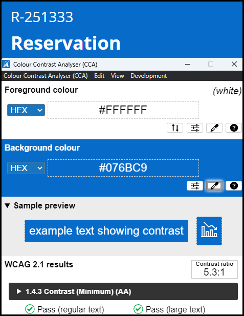
Following is an image depicting a heading that is the title of a work object in Theme Cosmos with the out-of-the-box application color palette. The text is white on a blue background, showing the computed contrast ratio of 5.3:1 between the two colors:
Similarly, for users who may have difficulty seeing certain colors, consider choosing a color palette for your application theme that better supports their vision needs.
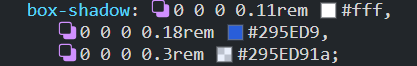
Another aspect of accessibility that CSS influences is the visibility of focus indicators. These indicators help users, particularly those navigating with a keyboard, to identify which interactive element is currently focused. These are defined through CSS and should provide both visible and consistent focus indication across the site, essential for efficient navigation. Pega Platform offers a focus indicator that makes use of the box-shadow CSS property, visually appearing as a blue outline with gradience around the focused element. Following are images of the box-shadow style used for focus indicators as well as how it appears visually on a form field.
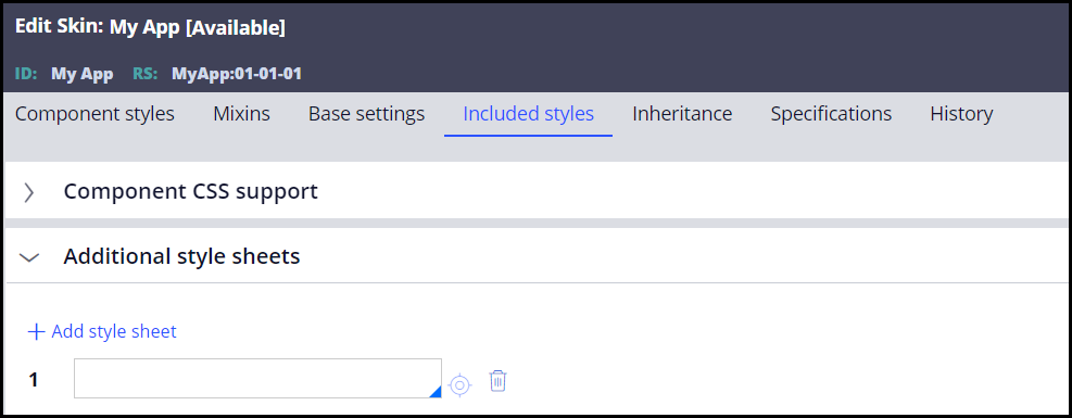
The application skin rule also allows authors to introduce their own custom stylesheets. Further modifications to existing styles or new styles built to align with the application theme can be implemented under the “Additional styles” tab:
While CSS primarily controls the visual aspects of a webpage, its implications for accessibility extend beyond just appearance. Users with a range of ability, including those who rely on assistive technologies like screen readers, experience web content differently. CSS has the capability to either enhance or hinder their interaction with a webpage depending on how it is used, making it important to consider accessibility when styling a page.
CSS and assistive technologies
One of the prominent ways CSS can influence the behavior of assistive technologies is through the positioning of elements. CSS allows developers to position content anywhere on a page to fit their desired design. However, this flexibility can lead to issues if the visual order of elements does not match the order in the Document Object Model (DOM). For users relying on screen readers, maintaining a logical DOM order is crucial as it is what dictates the reading sequence of the page. Ensuring the DOM order aligns with the visible order the content is presented in lets users navigate the page as intended.
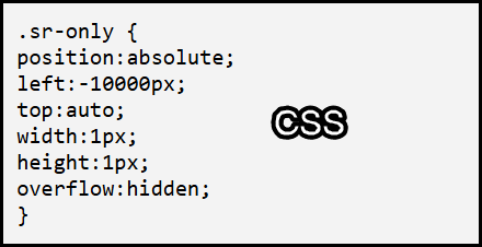
Off-screen positioning of elements is a design method achievable through CSS that can provide benefit for users in some instances. For example, you may have a component or part of a page that is more complex in its navigation with keyboard or simply requires longer instructions for keyboard interaction. Developers might want to provide additional information for screen reader users by placing this text in the DOM but positioning it off-screen so that it does not clutter the user interface. Following is an example of how this could be achieved through off-screen positioning with a reusable class designated for screen reader users:

On the flip side, using off-screen positioning as a method of "hiding” elements from the UI (user interface) can cause screen readers to announce content unexpectedly, leading to a confusing experience as users navigate the page. This often happens when authors choose to preload content off-screen and later reveal it on the (UI) with CSS after some user interaction.
Configuration in Pega allows authors to circumvent this by making use of conditional visibility. Controls can be initially hidden through a When rule or expression prior to a certain condition being met. Unlike CSS styles such as display: none; or visibility: hidden;, which explicitly hide elements from both the UI and assistive technology, the visibility condition prevents respective markup for the specified control(s) from being generated in the DOM. Once the condition has been met and the control(s) become visible, their markup is then inserted into the DOM.
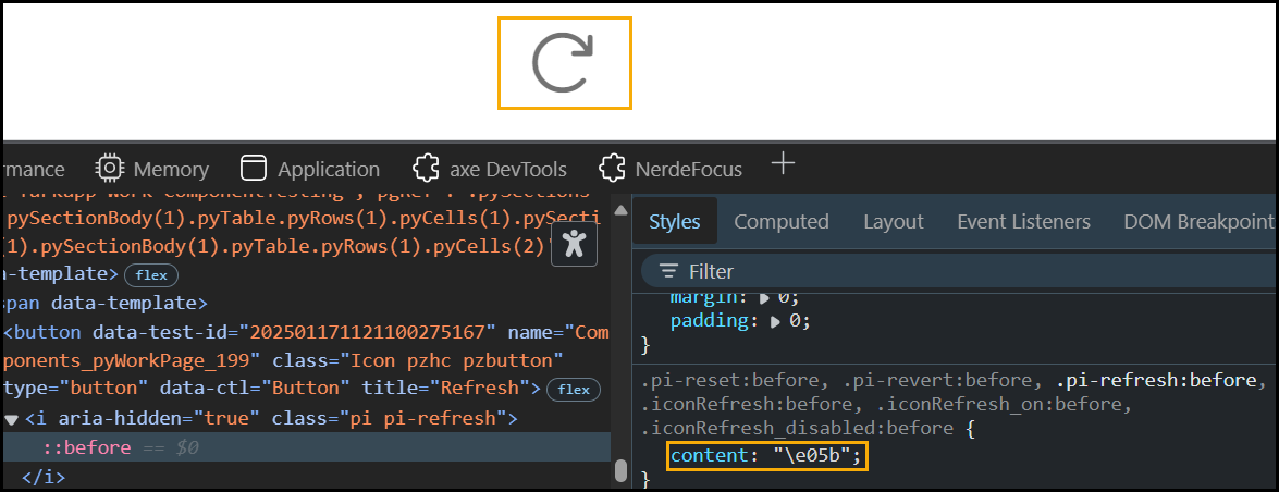
Although CSS’ primary function is determining the styles and layout of a given page, it can also introduce new content on the page without adding further tags into the DOM. A common method to display such content is using CSS pseudo-elements. Pseudo-elements are used either to style specific parts of an element or are used to display an image through either an entity code or URL. In Pega Platform these are commonly used to display icon images on interactive controls that otherwise do not have visible caption text.
The following image shows how a CSS pseudo-class can introduce an image on the web page by using the content property:
Pseudo-elements can present unique accessibility scenarios when used to show images, as they do not have a corresponding <img> tag in the DOM. Instead, they use the CSS content property to render images. With regards to accessibility requirements, this could theoretically present a problem. Wherever an image is displayed on screen, alternative text is required to ensure users who cannot see the image can still understand its content and purpose. This is done by placing the “alt” attribute on the HTML <img> tag and providing a value that describes the image. How can we provide alt text to a psuedo-element displaying an image that is not actually in the DOM?
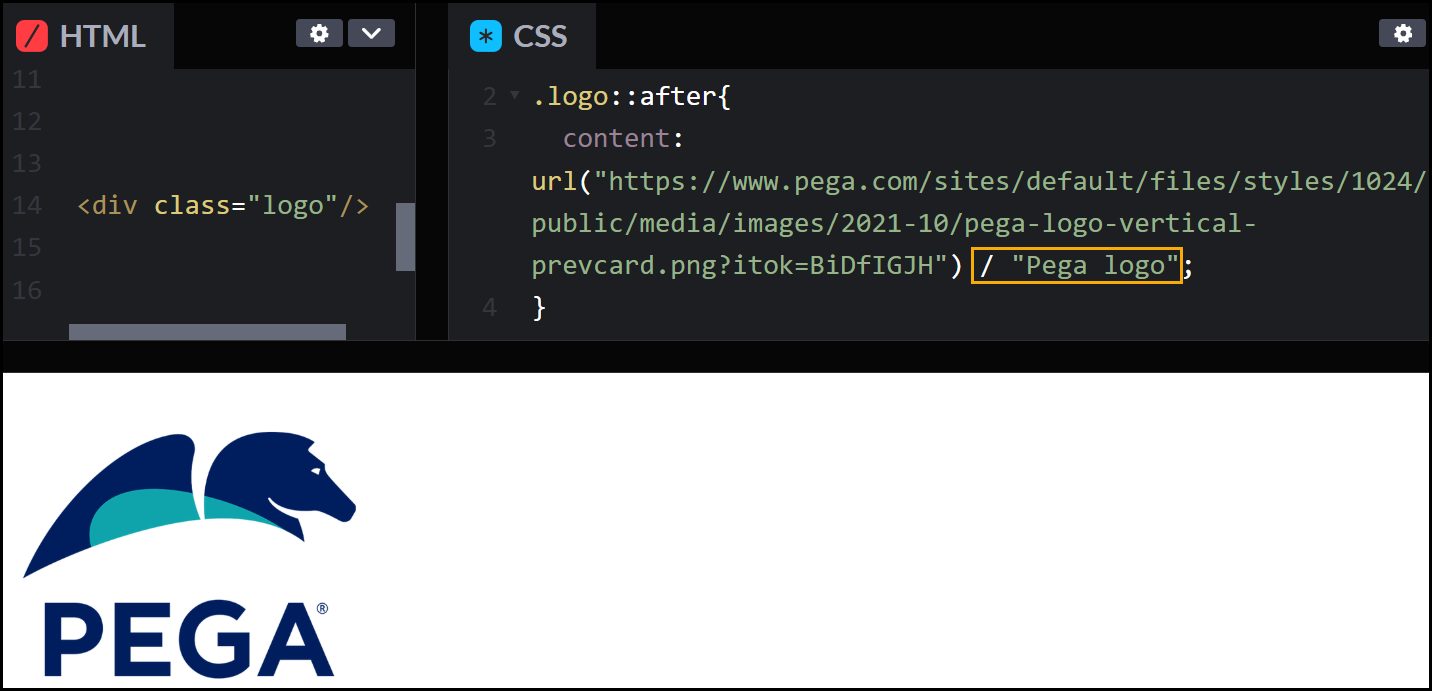
For pseudo-elements, the “content” CSS style does in fact allow for authors to designate alternative text. This involves adding the desired alt text in quotes after the CSS content value, separated by a forward slash. For example, the following style for a pseudo-element provides the image being shown with the alternative text of "Pega logo”.
This allows developers to add alternative text through CSS where there is otherwise nowhere to designate an alt attribute.
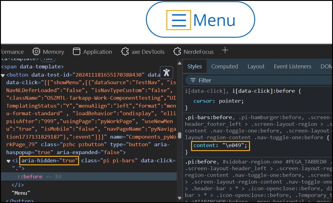
If the pseudo-element serves as a purely decorative image that does not provide meaningful context to the user, there are options to ensure that assistive technologies do not recognize and announce the pseudo-element. In the content property value, providing an empty string as alternative text ensures that screen readers do not announce the decorative element. Another method which can be seen across various controls in Pega is by including the aria-hidden attribute on the HTML element where the pseudo-element is present. The following image is an example of including the aria-hidden attribute on the element holding the pseudo-element:
When a pseudo-element image is configured to complement an interactive control such as a button or link, Platform will generate a child element inside of the interactive HTML element to hold the pseudo-element. This makes it so the aria-hidden attribute does not interfere with the expected label and functionality of the interactive element itself as it only applies to the inner element, ensuring that assistive technologies perceive the element as expected. This can also be used with interactive icons without a visible caption but with some form of helper text.
CSS is more than just a styling tool; it's a powerful ally in creating accessible web experiences. By understanding and leveraging its impact on accessibility, developers can design websites that are not only visually appealing but also inclusive for users of all abilities. Whether it's through ensuring adequate color contrast, positioning elements logically, or providing alt text for pseudo-elements, each CSS decision can make a significant difference in web accessibility.