Definitions
Reflow on the web defines how a page should dynamically resize and scale to fit browser zoom levels up to 400% at 1280X1024 pixel dimensions, or simply 320X256 pixel dimensions. At such dimensions, content should not overlap and maintain a vertical structure that does not introduce two-dimensional scrolling via a horizontal scrollbar. It is defined as a WCAG Success Criteria to support accessibility for users who may rely on magnified screens, have impaired vision, or cognitive disabilities.
Responsivity on the web defines how web pages and applications adapt and modify the way in which content is presented based on available screen size. This includes size differences based on browser zoom levels, devices used (i.e. desktop vs. mobile) and physical screen dimensions.
Magnification software/Magnifiers are applications that enlarge the content displayed on a device's screen, without modifying the actual level of browser zoom. These tools typically allow for a section of the screen to display content with increased zoom, and will follow the user's mouse cursor or keyboard focus placement. Common magnification software includes ZoomText and Windows Magnifier. Because magnifiers function outside the scope of browser zoom, web page responsivity is not affected by the applied levels of zoom.
Traditional UI
Individual experiences with increased zoom level in Traditional UI applications may vary depending on the level of customization in the application, the specific page in the application being viewed, and the innate dimensions of the user's screen or viewport. Applications built on Theme Cosmos usually provide better responsivity compared to UIKit as it is the more recent design system for Traditional UI. As a general pattern, users can typically increase browser zoom up to 200% before encountering potential issues with page responsivity in Traditional UI applications but may see proper responsivity up to 400% browser zoom as well.
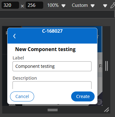
Some targeted changes have been implemented to support reflow and responsivity where possible. In the Platform '23 release, enhancements were made to parts of Cosmos applications to support zoom levels up to 400% in modal dialogs and case view screens. The following image shown an example of a modal dialog in a Cosmos app when viewed at reflow dimensions 320x256 pixels:
Constellation UI
Looking forward, the modern Constellation UI was developed with a strong emphasis on responsivity between various dimensions and zoom levels, and better support for accessibility in general. Constellation applications have been designed to support reflow between pages, providing a more seamless user experience.
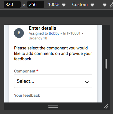
Following is an image of a case view screen when viewed at 320 x 256 pixels:
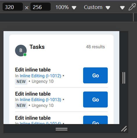
Similarly we can see how the Tasks list on the Home screen of a Constellation application is responsive when viewed at the same dimensions:
Overall support for reflow is significantly more robust in Constellation UI compared to Traditional UI. With Constellation being directionally the path forward in modern capabilities, performance, and wide support for accessibility, we are iteratively updating and continuing to address any issues with reflow and responsivity as they are identified for consistency across applications.
Special thanks to Jesse Monks for their assistance creating this document.