Complex components are a collection of multiple related interactive elements, known as sub-components, that comprise the component as a whole. Such components can be seen across the web as well as in Constellation applications, such as tablists and progress indicator steps.
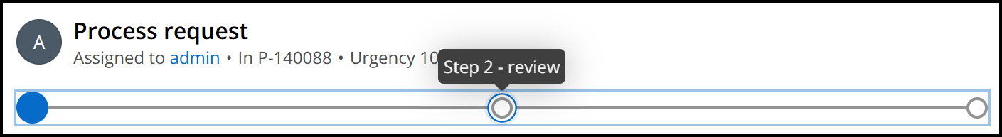
When a keyboard user interacts with complex components, the true interaction lies within the individual sub-components. For multi-step form progress indicators, the individual buttons representing each step are what receive keyboard focus and allow for interaction and navigation. For tablists, the same is true for each individual tab (role="tab") contained within.
Focus indicator pattern for complex components
Constellation offers two visible focus indicators for its complex components. Whenever a user brings keyboard focus to a complex component, we provide a lighter focus indicator around the entirety of the component. This is an intentional cue for keyboard users that this is a complex component that has its own interaction, typically with the arrow keys.
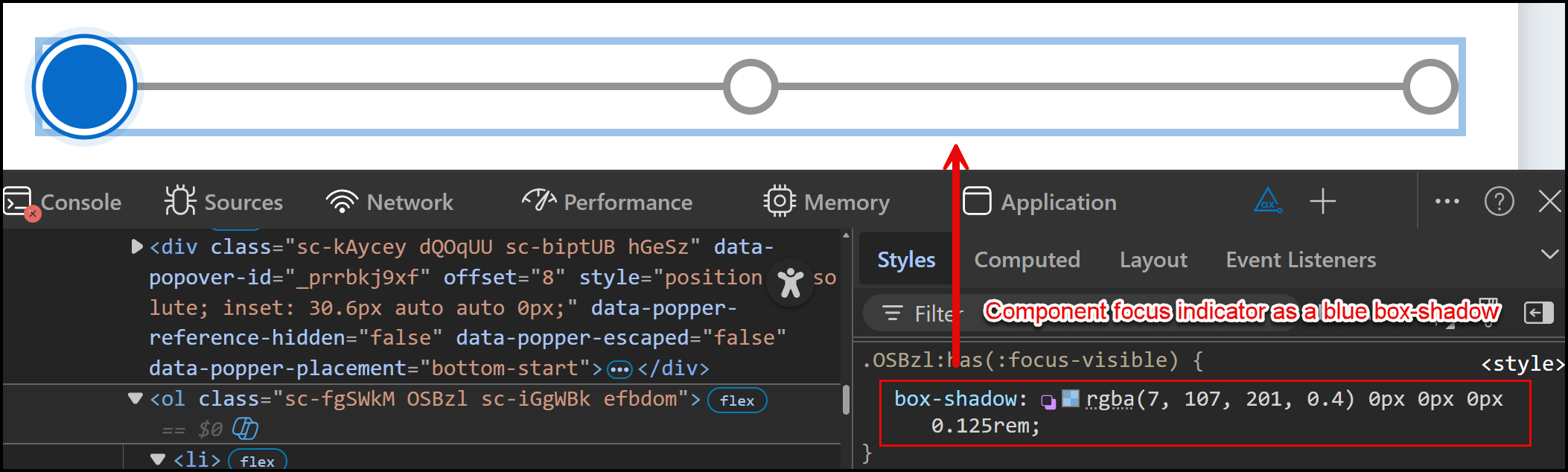
Within the component, whichever sub-component receives keyboard focus has its own focus indicator:
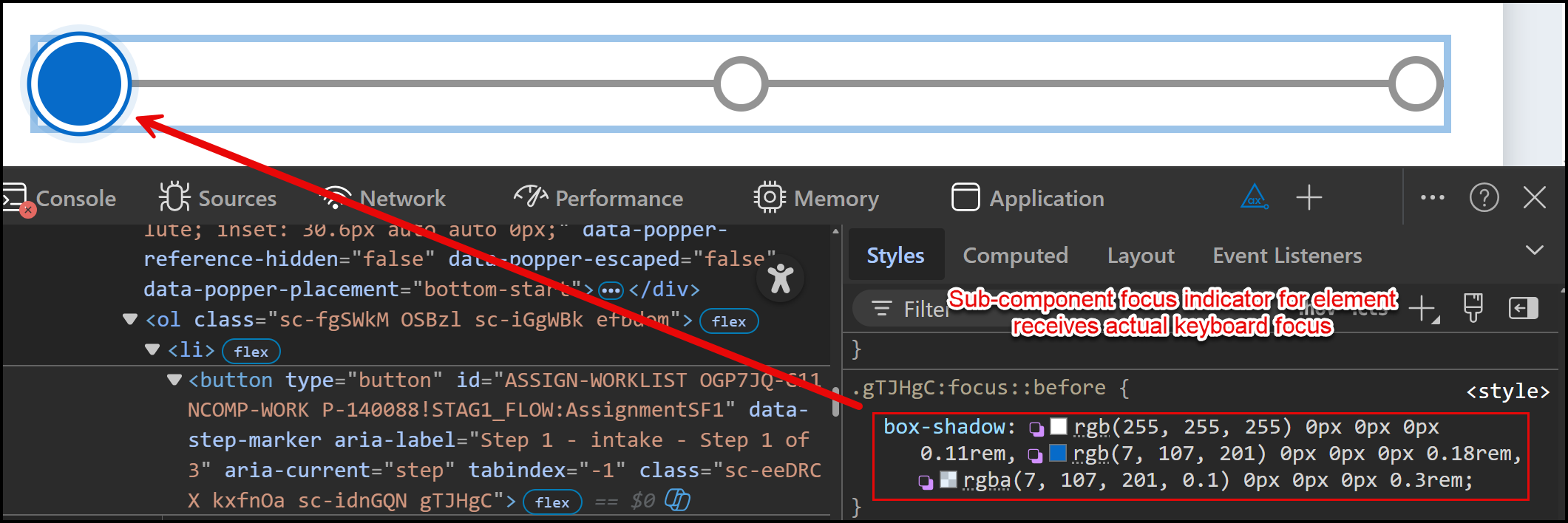
This pattern Constellation uses is defined in WCAG's documentation for SC 2.4.13: Focus visible (specifically in Figure 21). This approach states that "either the group focus indicator or the sub-component indicator must meet the requirements of this success criterion. To avoid being overly prescriptive, the success criterion allows authors to choose which makes the most sense. Generally, if a sub-component focus is necessary, it should be assessed instead of the group indicator."
While the component's focus indicator may not meet the 3:1 contrast ratio against the background color, the focus styles we apply to each sub-component that receives actual keyboard focus will always exceed this ratio - thus satisfying the requirements of the success criterion.