Multi-selectable listboxes are a common pattern in Constellation, allowing users to navigate between available options and select one or more to either serve as the value of a field or choose what content is displayed on the UI.
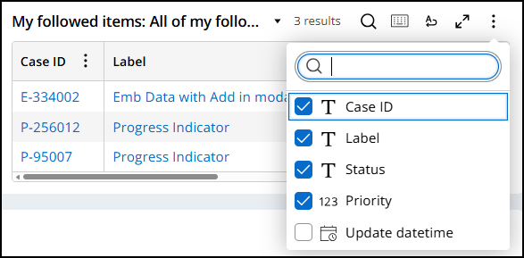
For example, grids in Constellation allow users to choose which columns are hidden or visible on the UI by selecting or unselecting items from a listbox.
Selected options are denoted both programmatically and visually. Unselected options have the aria-selected="false" attribute and display an adjacent image of an empty box. Selected options have the aria-selected="true" attribute and display an image of a checkmark filling in the box.
Take the following image of a multi-selectable combobox field's listbox and relevant markup as an example of this implementation:
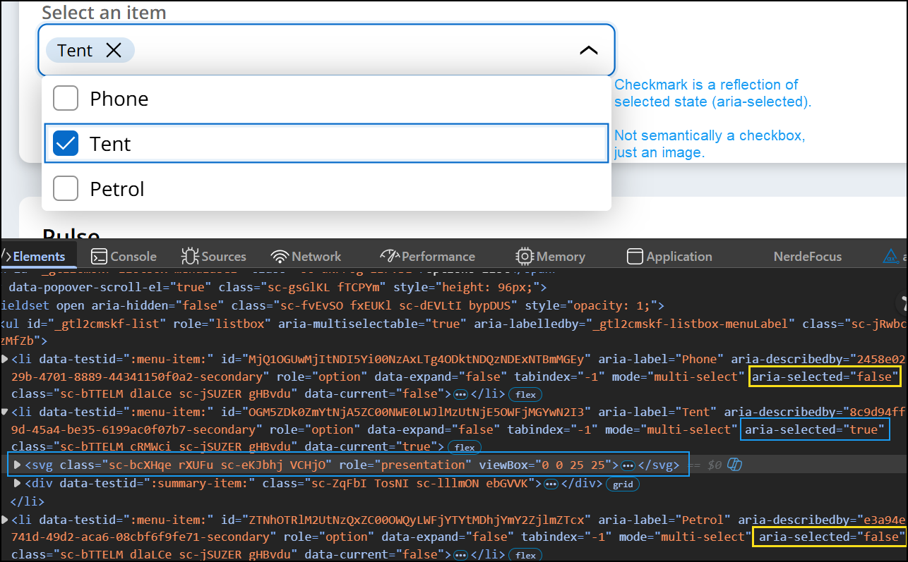
For a given option in the listbox, the adjacent image shown for each item always reflects its selected state, or the value of aria-selected. It is important to remember that these images are not semantically checkboxes, rather they are just images to visually reflect the option's selection state.