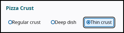
Radio buttons are a commonly-used component in Pega and around the web to let users select a value from a set range of available options.
When a screen reader user brings keyboard focus to a radio button, they will hear navigation instructions announced on how to navigate and select a value from the group.
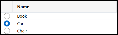
While this is likely the most common use case where users would encounter radio buttons, there are other scenarios where radio buttons are used to select from a value within a range of options while not being contained in a radio group. Constellation tables and Traditional UI optimized tables both make use of radio buttons to implement single row selection:
Navigation instructions provided by screen readers by default may introduce confusion to users depending on the use case where a specific component is used. In this document, we will explore in depth how this applies to radio buttons and their use in row selection.
Conflicts with how screen readers interpret differing use cases
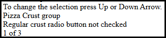
Whenever a screen reader such as JAWS recognizes that system (keyboard) focus has been brought onto a radio button (<input type="radio"), it will always announce the standard navigation instructions: "to change the selection use up or down arrow". These instructions are standard for interacting with radio buttons contained within a radio group, where arrow keys are the expected method of both moving between and automatically selecting an option.
However, screen readers do not have the capability to recognize if a radio button is in fact within a semantic group, and to not announce these default instructions if it is just a standalone radio button. Take this simple HTML edit of a single radio button as an example. Using JAWS, we can see that navigation instructions are announced on focus of the radio button.
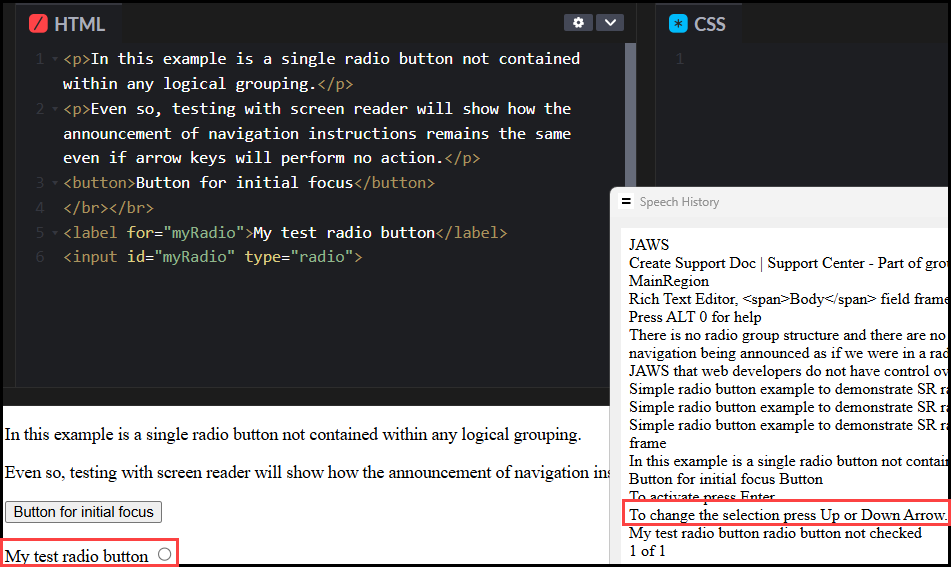
There is no radio group structure here, nor are there any other radio buttons associated to this single radio button. Yet with JAWS, we still hear the instructions for keyboard navigation being announced as if we are choosing options within a radio group.
This is a default announcement behavior of JAWS and other screen readers that web developers do not have control over, unless we change the element to a different role completely.
How this applies to grid row selection
The way this factors into Pega's radio buttons in grid rows is similar. When a column is configured to contain a radio button for row selection, each cell in the column will contain a single radio button control. The radio buttons in this table column are not associated to each other in any sort of logical grouping. You can consider each radio button its own group, only containing a single radio button.
As described above, JAWS does not recognize the structure in which we are using radio buttons to achieve single row selection, and thus announces the default navigation instructions as if the user is in a radio group with multiple options available with arrow keys.
Tables in Constellation and optimized tables in Traditional UI are semantically grids, allowing keyboard users to navigate to any cell, or a single interactive element within a cell, using the arrow keys. When configured for single row selection, a new column appears on the far left of the grid containing one radio button per row. JAWS will announce standard radio group navigation instructions when focus lands on any of these radio buttons.
Although users can move between radio buttons using the up/down arrows, these buttons are not part of a single radio group. As a result, the up/down arrow keys will not automatically make a selection as they do within radio groups. Navigating this way only moves system focus to the adjacent radio button.
Regardless, as defined in WebAIM's keyboard support for interactive controls on the web, users can always select a radio button option using the Space bar in such cases where they are not automatically selected when focused.