List View: Configuring a Gallery display
Video:
Why:
The Card Gallery, Table View, and Timeline are common ways to represent a list of records, and each has distinct use cases and best practices depending on the nature of the data and the user goals:
- Flexibility: Users can switch between views depending on whether they need a high-level overview or detailed data analysis.
- User Preference: Different users may prefer different views based on their familiarity or comfort with card or table formats.
- Task Suitability: Some tasks may be better suited to a quick visual overview (card view), while others require detailed examination and comparison of data (table view).
Providing these views enhances the user experience by catering to diverse needs and ensuring that users can interact with data in a way that best suits their objectives.
Business use cases:
Businesses across various sectors utilize Card gallery and Tables to enhance efficiency. Below are a few sample use cases:
Card Gallery Use Cases:
- Contact Overview: Display key customer information such as name, contact details, recent interactions, and a profile picture for quick recognition.
- Sales Opportunities: Present sales opportunities or leads as cards, highlighting key details like potential value, stage in the sales funnel, and next action steps.
- Task Boards: Use cards to represent tasks or projects, with details like deadlines, assignees, and status. This format supports visual task management methods like Kanban boards.
- Resource Allocation: Display resources or team members with a summary of their current assignments and availability.
Table View Use Cases:
- Large Data Sets: The user needs to analyze and compare a large number of records simultaneously.
- Structured Information: The data is highly tabular and benefits from columnar sorting, filtering, and analysis.
- Comparative Analysis: The user must compare rows directly (e.g., comparing ages, email addresses, or statuses side-by-side).
- Export or Advanced Filtering: Data is frequently exported to tools like Excel or filtered by specific criteria.
- Examples:
- Audit logs.
- Financial transaction records.
- Inventory or stock management dashboards
Benefits:
A Card Gallery is ideal when:
- Rich Visual Content: Each record contains multiple fields of data that need to be displayed prominently (e.g., a mix of text, images, icons, etc.).
- Example: Customer information, product catalogs, profiles, or vehicles info.
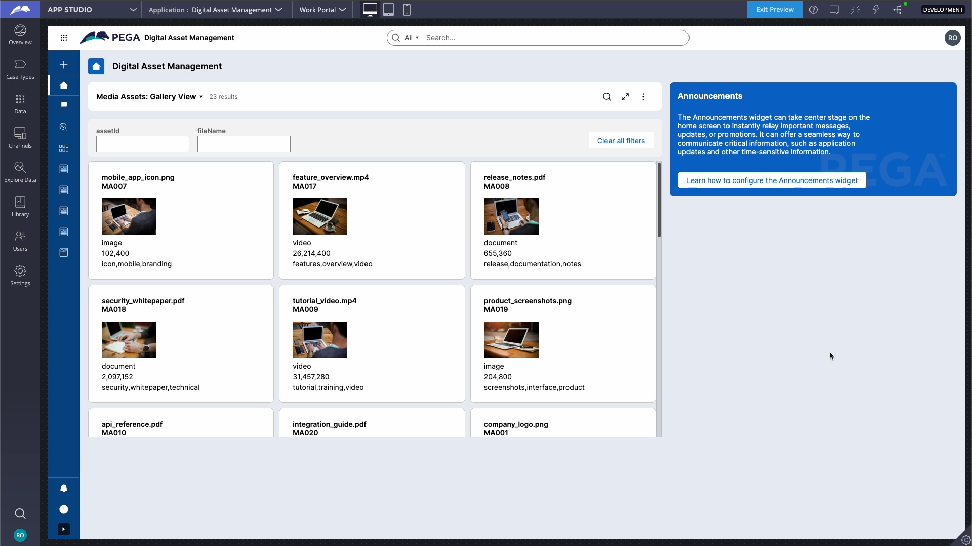
Figure 1: Example Card Gallery
- Quick Overview: The user needs to scan and focus on individual entries without being overwhelmed by a dense grid.
- Interactive Elements: Cards allow for individual actions on each record (e.g., buttons, links, or actions associated with a card).
- Responsiveness: Card layouts adapt well to varying screen sizes, such as mobile devices, where vertical stacking is more user-friendly than tables.
- Filtering & Sorting: Useful in cases where the user can filter or sort data.
A Table is ideal when:
- Large Data Sets: The user needs to analyze and compare a large number of records simultaneously.
- Structured Information: The data is highly tabular and benefits from columnar sorting, filtering, and analysis.
- Example: Financial reports, transaction logs, or inventory management.
- Comparative Analysis: The user must compare rows directly (e.g., comparing ages, email addresses, or statuses side-by-side).
- Export or Advanced Filtering: Data is frequently exported to tools like Excel or filtered by specific criteria.
Prerequisites:
- Ensure your application includes a Case Type set up.
- You have a landing page configured using List View that list Case instances.
Best practices:
Card Galleries
- Concise Information: Only display the most relevant fields. Use a "Read More" option or hover-over details for extended data.
- Consistent Layout: Ensure uniformity in card size, font styles, and placement of information to improve readability.
- Visual Hierarchy: Highlight key details like names, email, or profile pictures. Use bold text or larger font sizes for critical information.”
- Actions on Cards: Provide quick actions (like "Edit" or "Delete") if applicable.
- Scrollable Interface: For larger datasets, include pagination or infinite scrolling.
- Mobile Responsiveness: Optimize for smaller screens by stacking cards vertically.
Tables
- Column Prioritization: Display the most critical fields first; hide less important ones in collapsible views or details popovers.
- Sorting and Filtering: Allow sorting by columns and dynamic filtering for ease of data analysis.
- Action Indicators: Provide actionable icons or buttons within rows for quick operations (e.g., edit, delete).
- Adjustable Columns: Allow users to resize, reorder, or hide columns based on preferences.
- Performance Optimization: For large datasets, implement lazy loading or server-side rendering.
Points to consider:
When to Choose What?
|
Factor |
Timeline |
Table |
Card Gallery |
|
Primary Use Case |
Time-based data with sequential context. |
Tabular and structured comparison. |
Visual and detailed individual records. |
|
Chronology |
Explicit and inherent. |
Implicit through columns (if sorted). |
Implicit or absent. |
|
Details vs. Overview |
Condensed overview with expandable nodes. |
Focused on dense data comparison. |
Moderate detail for individual entries. |
|
Visualization |
Linear or vertical timeline flow. |
Grid-based rows and columns. |
Freeform cards arranged in a gallery. |
Summary:
In your image, a Card Gallery is used for customer information, which is appropriate since it focuses on presenting concise details for each individual. This format is visually appealing and user-friendly for browsing such data. If the primary goal shifts to analyzing trends, comparisons, or exporting data, a Table would be a better choice.
References:
Constellation 101 Series
Enjoyed this article? See more similar articles in Constellation 101 series.
Capgemini
IN
@RichOren - Thanks for the detailed explanation. I have a question regarding the Gallery view. Is it possible to edit individual items in the Gallery? I see Add/Edit/Delete options in the configuration, but it doesn't show up in the Gallery view. Am I missing something? (we are using 23.1.4 version)
Pegasystems Inc.
US
@Sudit Sengupta - It is possible with 24.2
In 23.1.4 You can Edit a record by opening it in a Preview or New Tab and then Selecting Edit Details or the Edit Pencil Icon. Adding is not possible in 23.1.4.
Evernorth
IN
@RichOren Thanks for sharing detailed explanation on gallery display. Are there are any options to adding styling to each tile in gallery such as i want to modify background colors of tiles conditionally or static or change background as image
Pegasystems Inc.
US
@PenjarlaC - Not at the moment. However, you could create a DX Component to support this use case. For reference, you can find an example of a Card Gallery DX Component in the Constellation UI Gallery here: https://pegasystems.github.io/constellation-ui-gallery/?path=/docs/widg…
Cognizant Technologies Services
IN
Hi @RichOren,
Is it possible to select a single item from gallery view and display selected item in the step in a case?