Discussion
Pegasystems Inc.
US
Last activity: 18 May 2023 0:24 EDT
How to enable Pulse as slide-out in UI-Kit 13 and higher
Between UI-Kit 8 and UI-Kit 12 (Pega 8.1), the Pulse component was displayed as a slide out that would be visible when clicking on the pulse icon in the top right hand corner of the case header.
In UI-Kit 12 shipped with Pega 8.2, we wanted to make Pulse more visible when opening a case and we changed to OTB implementation so that Pulse was now always visible on desktop at the bottom of the case for both the Perform and the review harness. On mobile, the pulse was kept as a slide out to reduce the amount of scrolling required to open Pulse. The changes were described as part of the UI-Kit release notes - https://community.pega.com/knowledgebase/articles/improve-design-consistency-ui-kit-13-82#pulse
This document explains how to add back in UI-Kit 13 and higher the Pulse component as a slide out for desktop.
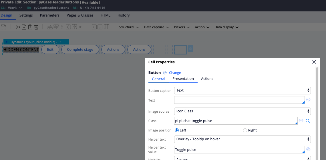
1/ Add back the pulse button to trigger the slide out in the Case Header section (pyCaseHeaderButtons)
Edit the section pyCaseHeaderButtons and add back the button control that triggers the slide - You can either copy / paste the button using an older version of this section from UI-Kit 12 or drop a button with the following settings and action set:


2/ Change the when condition used to display Pulse in pyCaseMain
Edit the section pyCaseMain and locate the first layout that contains the pxFeed section. Change the visible condition from
!pzIsReview && pyIsMobilePhone && !pxIsOfflinePackaging && (.pyTemporaryObject == false || .pyTemporaryObject == '')to
(!pzIsReview || !pyIsMobilePhone) && !pxIsOfflinePackaging && (.pyTemporaryObject == false || .pyTemporaryObject == '')which indicates that now this section will be loaded on Desktop (!pyIsMobilePhone) or on a mobile phone for the Perform harness.
3/ Add some override CSS to style the slide out panel
Add the following CSS selectors to one of your override CSS files attached to your skin
.workarea-view-scroll-wrapper div:not([node_name="pyPulseWrapper"]) > span.inspector-span > div[node_name="pxFeed"] {
    width: 346px;
    top: 52px;
    position: fixed;
    right: -370px;
    bottom: 0;
    background: #fff;
    z-index: 3;
    transition: right .4s ease;
    box-shadow: -2px 4px 7px rgba(0, 0, 0, .3);
    overflow: auto;
    display: none;
    -webkit-transform: translateZ(0);
}

.workarea-view-scroll-wrapper div:not([node_name="pyPulseWrapper"]) > span.inspector-span > div[node_name="pxFeed"].visible {
    right: 0;
}
This will make the section div position fixed. Of course, you can change the settings above to style the pulse overlay to fit your needs. The runscript action will actually add/remove the visible class on the pxFeed section div.
Important note: Depending on the Pega Platform used, the 2nd CSS selector could be slightly different - the inspector-span might not be present in the DOM.
4/ Remove pulse from the bottom of the page
You can not run both, the sidebar and the bottom section of pxFeed on one page due to some sync/refresh issues when both are loaded and visible and you do posts. As such, you need remove the Pulse feed from the bottom of the case by editing the pyCaseMainInner section. Locate the section called 'Multiple data sources feed gadget' and remove the section from the region.
After applying these 4 steps, your Perform/Review harness will now show Pulse as a slide out.

Note: To apply these changes to all your cases types, edit the 3 sections pyCaseHeaderButtons, pyCaseMain and pyCaseMainInner at Work-.
To apply this change for only a specific case type, override these sections on your case type but add a helper class in the pxFeed section present in pyCaseMain so that the CSS Selectors from step #3 are specific to this case type.
