In HTML, scrollable regions are introduced by adding an overflow property to an HTML element through CSS. If an HTML element contains more content than it can display within its defined width and height, the overflow property introduces scrollbars to let users move the visible viewport of the content being displayed.
Users who navigate using keyboard can also scroll through the contents of such an element. If keyboard focus is placed on the container element that has the overflow CSS property or an interactive element within the region, using the arrow keys allows users to scroll the viewport to reveal any content that overflows.
Tables with scrollbars
In Pega Constellation, scrollable regions may be introduced by tables embedded in a page. These tables may contain enough content that the defined width (or height) of the container element cannot display it all at once, and thus introduces a scrollbar.
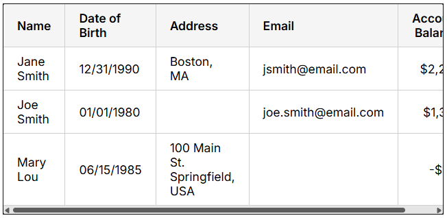
Keyboard focus needs to be on either the container element itself or an actionable element within to allow keyboard users to access the scrolling functionality. Pega does not provide the scrollable region with a tabindex attribute to make the region explicitly focusable, which may be flagged by some automated testing tools as lacking a focusable element for the scrollable region. This is because browsers automatically handle making scrollable regions focusable with keyboard, ensuring that users will always be able to bring focus to the region and scroll using the arrow keys.
This feature from browsers is introduced automatically when a scrollable region contains no focusable elements within, ensuring that in either scenario a keyboard user can still access the scrolling functionality.
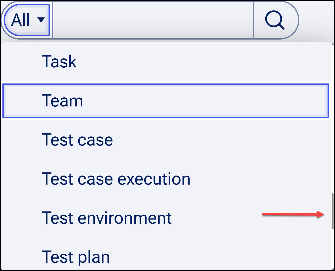
Menus and listboxes with scrollbars
Depending on the amount of items contained within, menus and listboxes (opened from a picklist combobox) may also introduce a vertical scrollbar when the number of items exceeds what can be displayed in the container at once.
Pega's menus and listboxes make use of the aria-activedescendant attribute to govern how users can navigate items with the keyboard. The way this works is that when activating a menu button or a combobox to display options, system focus (keyboard focus) does not technically move into the menu or listbox, respectively. Rather, it remains on the originating element that opened the list of items. The functionality of navigating between items in the list is governed by pseudo-focus, that is, a form of secondary keyboard focus contained entirely within the expanded list of items. Each item has a tabindex value of "-1" by default, which will dynamically change as the user navigates to and away from a given item in the list. The aria-activedescendant attribute on the originating element will point to the id value of the element within the list that has pseudo-focus, allowing screen readers to recognize the list item the user is currently navigating to and relay it back to the user.
Automated testing tools may consider such scrollable menus and listboxes as similarly lacking a focusable element within the scrollable region, as none of the elements within can technically be focused with keyboard through navigating with the Tab key. However, by providing this association of the parent container to the items within that can be navigated via pseudo-focus, we ensure that users can reach all items within using the arrow keys while maintaining the relationship between the originating element and menu or listbox.