When creating a case type in a Constellation application, authors can designate a process as a multi-step form. The main purpose of such forms is to divide a single assignment that captures many fields into a series of focused and concise screens through a logical flow.
A multi-step form configured in a case type will introduce a series of step indicators, or breadcrumbs, into the UI at that stage of the case lifecycle. These step indicators visualize a user's progress as they work through their assignment in a work object.
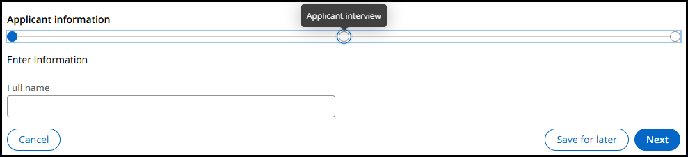
Currently as of the release of Platform version '24.2 and the upcoming version '25, these step indicators are each individual button elements in the Document Object Model (DOM). The step associated with the current form will always display the step name visibly above the step indicator, while other future or past steps will display their step name as a tooltip on keyboard focus or mouse hover.
The design and thought process that brought us here
When multi-step form step indicators were first created, they were semantically a list of non-interactive images. Each step in the list would display the step name visibly above its respective image.
This design posed challenges primarily with authoring abilities and localization. Depending on the business use case, individual step names could range from a few words to a long series of words. Coupled with the fact that multi-step forms do not realistically have an upper limit of how many steps can be authored within, space on the user interface (UI) would rapidly run dry as visible step names cluttered the form. Add to this how vastly different words may differ in length between various languages, and it was clear to see this approach would not remain a practical solution.
Introducing the tooltip for past and future steps
To preserve space on the UI and reduce the cognitive load on users having to view every single step name, we opted to instead only visibly display the current step name in the flow above its respective step indicator. If users want to view the step names of any prior or future steps, they could do so by hovering over the step with the mouse.
This, unsurprisingly, introduced another challenge with regards to accessibility as we cannot introduce a mouse-based solution without a keyboard-accessible equivalent way of accessing the same information. To address this, we modified role of each step indicator to become a button element rather than a non-interactive image. Doing so ensures that each step indicator button is navigable with the keyboard that would display the tooltip both on mouse hover and keyboard focus, additionally providing context to screen reader users on its placement within the full list of steps, i.e. "Step 3 of 5".
Concerns today and upcoming enhancements
While the solution in place today does provide an equivalent experience for both mouse and keyboard users, there remains the concern that these step indicators exist as interactive buttons that do not have any action configured upon activation. This introduces concerns for accessibility, where users may not understand what purpose the buttons serve when activation results in no action taken on the UI.
Beginning in the Pega Infinity '26.1 release, these step indicators can be configured to behave akin to what many developers and authors may be familiar with from Traditional UI's screen flows. By modifying the pyEnableMultiStepFormJump property value to "True" in the pyC11nFeatureMap data transform, multi-step form step indicator buttons will thus allow users to navigate between any step within the flow by activating the relevant step indicator. This configuration not only solves the accessibility issue of buttons not performing any action, but also achieving feature parity with what was possible in Traditional UI.
Interim configuration approach
Should the current behavior pose an accessibility concern for users in your application prior to version '26.1, we recommend removing the visible step indicators from the UI in a multi-step form as an interim solution. This can be achieved in the case lifecycle view in either authoring studio.
First, select the process that is configured as a multi-step form. This will reveal a configuration panel to the right, where we will select the "Change" button under the navigation template:
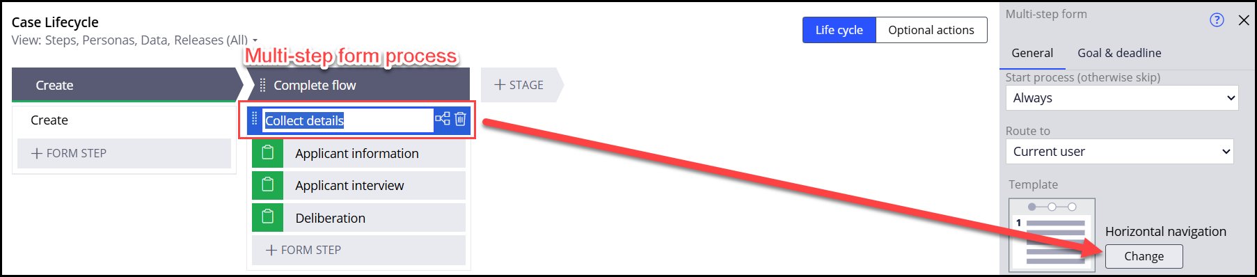
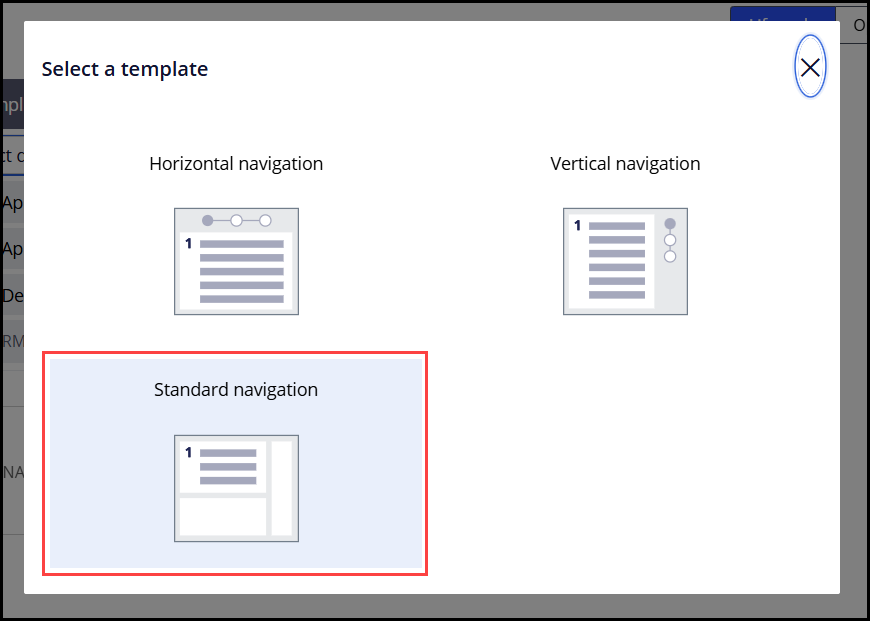
This opens a modal dialog listing three options to determine how the multi-step form should affect the UI. Selecting the "Standard navigation" option in this dialog will remove any step indicators from the UI in this process, and have each assignment screen appear as a normal, standalone form.