Helper classes to achieve complex forms using 2-column & 3-column inline wrapping templates
How can we create a complex form like this?

If a complex form like this has to be created, we need to create a 2column(70-30) template and then add the Name field in the first column and for the Age and height create a two column template and embed that layout into this second column.
Just for 1 row we need to create 2 templates which introduces whole lot of DOM
Likewise for rest of the rows we need to create few more templates which makes the job of the developer tougher and also creates lot of redundant DOM
How can we achieve the same with helper classes?
Following five helper classes have been introduced in Theme-Cosmos:02-01-01 (from Pega 8.5) & UI Kit, Theme-Clarity (from Pega 8.6) to achieve more flexible 2-column and 3-column forms.
- flex-cell-half
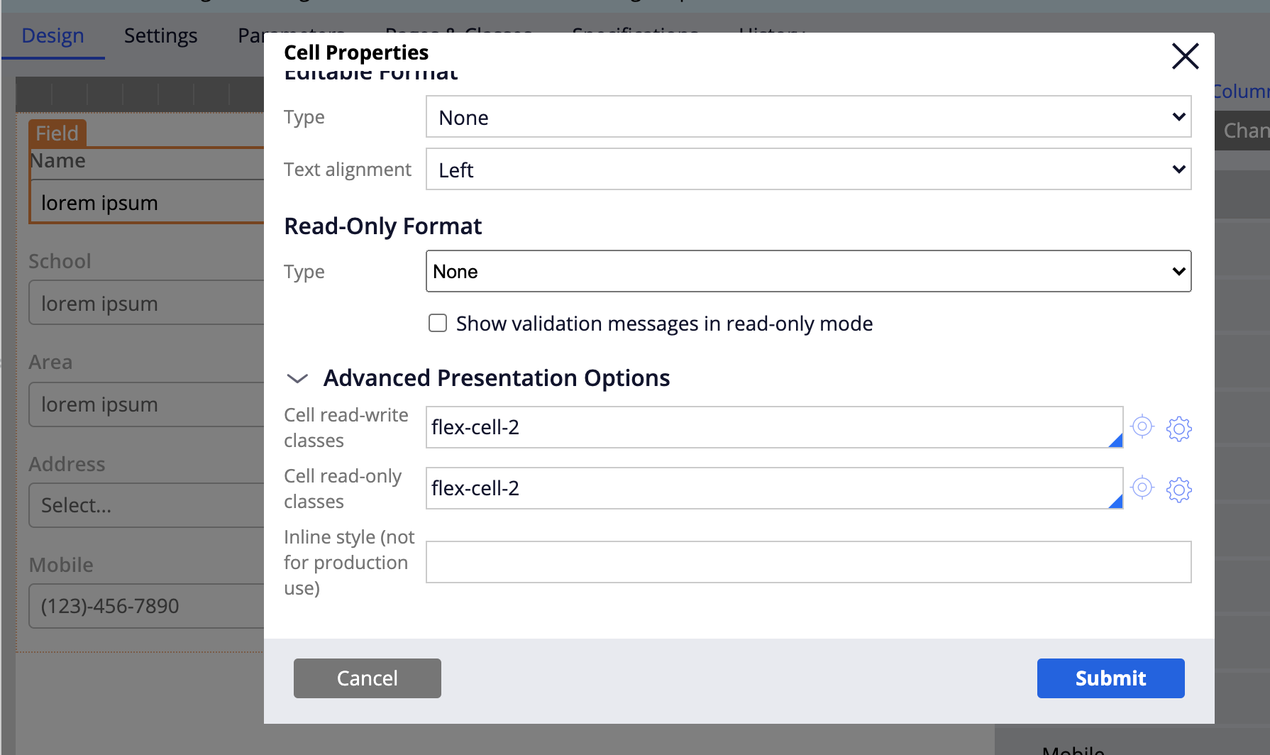
- flex-cell-2
- flex-cell-3
- flex-space-1
- flex-space-2
1. flex-cell-half
This helper class can be used to size the field to half the width of a column.
2. flex-cell-2
This helper class can be used to make the field occupy 2-columns.
In 2-column-inline wrapping template, this helper class can be used to make a field occupy entire width of the row
In 3-column-inline wrapping template this helper class makes a field occupy two columns completely, thus letting only one field in the last column.
3. flex-cell-3
This helper class can be used only in 3-column inline-wrapping template to make a field occupy entire row.
4. flex-space-1
This helper class can be used to give a right spacing of 1 column to a field.
5. flex-space-2
This helper class can only be used in 3-column inline wrapping template, to give right spacing of 2-columns to a field.
Example :

The above form is achieved by using 3-column inline-wrapping template without using any nested column templates by just using the helper classed discussed above.
In the first row,
Name field occupies first two columns of the template,
This is achieved by using flex-cell-2 helper class on the name field

The last column is occupied by Age, height fields, each occupying only half the width of the column. This is achieved by using flex-cell-half helper class on both Age and Height fields
In the second row,
School, College occupied first two columns leaving the space empty, this is a very common use case when we try to group the fields implicitly without any title for the category.
This is achieved by using flex-space-1 class on college to leave the third column empty.(Internally this helper class give a right margin of 1 column to the field)
In the third row,
This is the default view of a 3-column inline wrapping template
In the fourth row,
Address field is occupying the entire row leaving no space for the other fields in the row. This is achieved by using flex-cell-3 helper class on Address field.
(In a 2-column inline wrapping template flex-cell-2 helper class makes the field occupy the entire width of the row)
In the last row,
Mobile field occupies the first column and email id occupies the last 2 columns. This is achieved by using flex-cell-2 helper class on email id field.
This way reduces lot of DOM, increases the performance and makes the layout simpler.
In the similar way we can also modify 2-column inline wrapping template into our required design.
Note: These forms will shrink to single column layout below 480px, just like any other inline-grid/triple layout.

Thanks for this document. It is very clear and useful.