Discussion
Pegasystems Inc.
US
Last activity: 17 Feb 2021 10:25 EST
How to use the flex-col-4 and similar helper classes
A lot of Pega developers have had issues using the flex-col-4 and similar helper classes.
These classes are used to create grid layouts. For example, a typical layout would have 12 or 16 columns and the UI would be organized around these columns. Bootstrap provides by default a 12 column grid layout system that can be used to lay down the different components on your page - here is an example with the BBC web site

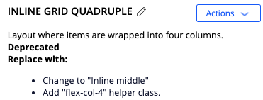
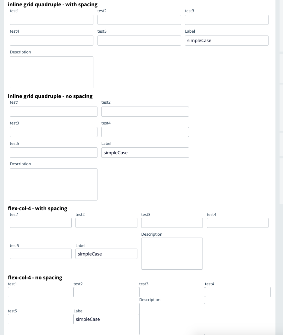
Some of the confusion comes from the fact that in the pyEndUser skin shipped in UI-Kit, the dynamic layout for inline grid quadruple is marked as deprecated and a comment indicates that a better solution is to use the flex-col-4 helper class
If you convert your DL format to use the helper class, you might end up with one column less than what you were expecting.
For example, using the flex-col-4 helper class - you need to remove left and right spacing on the layout by selecting 'All items' to remove the spacing... If you don't remove the right and left spacing you end up with 3 columns
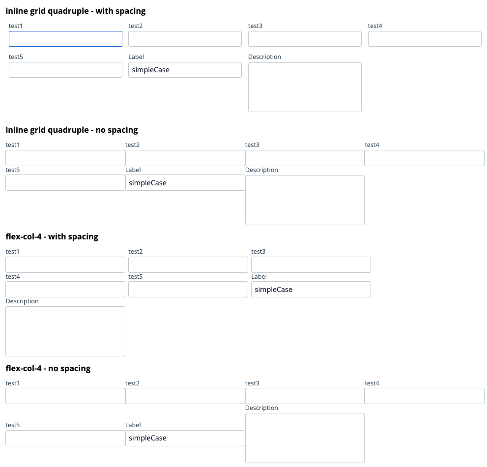
example with inline grid quadruple vs flex-col-4 when spacing is removed or not - The flex-col-4 will work fine if the spacing is removed

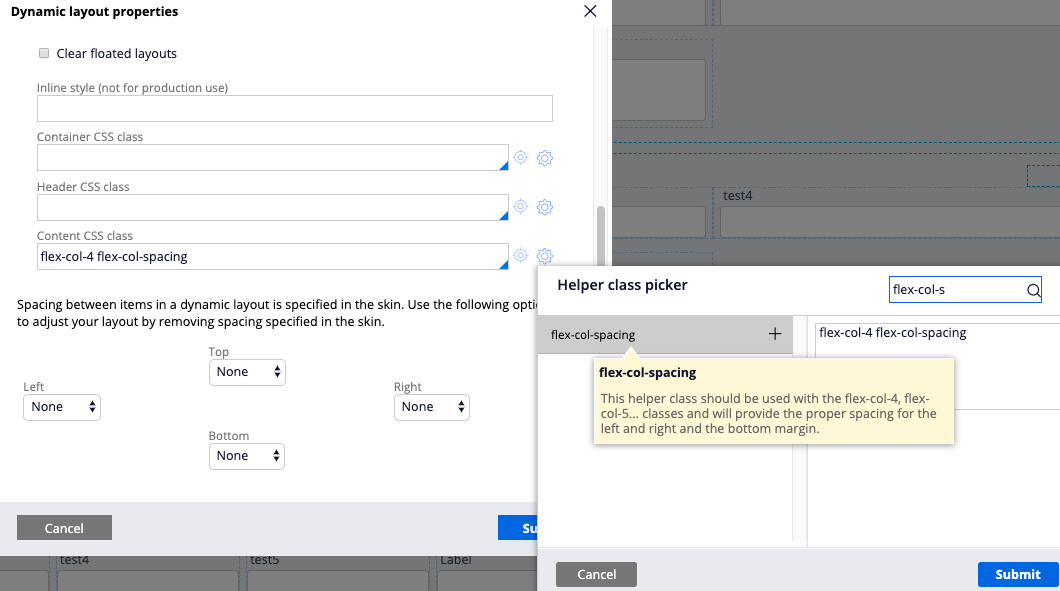
To achieve the inline grid quadruple with the spacing (left and right margin is 7 px - bottom margin is 14px) - add the following new helper class in your override CSS file
Important note: Using the comment block will make the helper class visible through the helper class picker which is critical when working with other Pega developers.
/****************************************
  Type: helper-class
  Name: flex-col-spacing
  Category: layout
  Description: This helper class should be used with the flex-col-4, flex-col-5... classes and will provide the proper spacing for the left and right and the bottom margin.
*********************************************************/
.flex.flex-col-spacing > .flex.content-item {
  padding: 0 7px;
  margin:0 0 14px 0;
}
Here will be the end results - the spacing is the same between the inline grid quadruple and flex-col-4
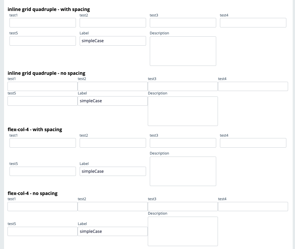
Note: Using flex-col-4 is not a complete replacement of using the inline grid quadruple - the flex-col-4 helper class does not implement any responsive behavior - on a smaller screen width, an inline grid quadruple will change to an inline grid triple but the flex-col-4 will keep the 4 columns
The flex-col-xxx helper classes are really helpful if you want to quickly implement a 6,8 or 12 column grid - here are couple of examples using the same flex-col-spacing helper class

You can adjust the number of columns used by each cell by setting a helper class on the cell that would adjust the value of flex-basis. Here is an example of what could be achieved

Let's look at a more typical use case: an address form where you want to enter town, zipcode and state on the same line but wants to give them a spacing of 4/2/6 columns in a 12 col grid
You can build this layout with a single dynamic layout:

and then add a couple of helper classes on each cell - for this example I used flex-cell-1 on the first 2 cells and last cell

and the following CSS helper classes:
/****************************************
  Type: helper-class
  Name: flex-cell-1
  Category: cell
  Description: This helper class should be used on a cell to set the flex-basis to 100%
*********************************************************/
.flex.content > .flex-cell-1.flex.content-item {
  flex-basis: calc(100%);
}

/****************************************
  Type: helper-class
  Name: flex-cell-2-12
  Category: cell
  Description: This helper class should be used on a cell to set the flex-basis to take 2 cells in a12 col grid
*********************************************************/
.flex.content > .flex-cell-2-12.flex.content-item {
  flex-basis: calc(100% * 2 / 12);
}

/****************************************
  Type: helper-class
  Name: flex-cell-4-12
  Category: cell
  Description: This helper class should be used on a cell to set the flex-basis to take 4 cells in a12 col grid
*********************************************************/
.flex.content > .flex-cell-4-12.flex.content-item {
  flex-basis: calc(100% * 4 / 12);
}

/****************************************
  Type: helper-class
  Name: flex-cell-6-12
  Category: cell
  Description: This helper class should be used on a cell to set the flex-basis to take 6 cells in a12 col grid
*********************************************************/
.flex.content > .flex-cell-6-12.flex.content-item {
  flex-basis: calc(100% * 6 / 12);
}
The output will look like this:

this is a better alternative than using 3 dynamic layouts to render the same UI.
The same could be done of course with components on a page rather than input fields in a form.
Vodafone
DE
Pegasystems Inc.
US
Hi @JeromeS7
Images are now displaying. Apologies for any inconvenience.
Also, that url is working for me. Are you still unable to access that?
Thanks!
@RichardMarsot Hi Richard, could you please add the images for reference again? The link to this page from the academy seems to be broken as well: https://academy.pega.com/topic/helper-classes-and-implementing-more-advanced-ui/v1/in/16481/16486