Customizing the Case Summary panel in Cosmos
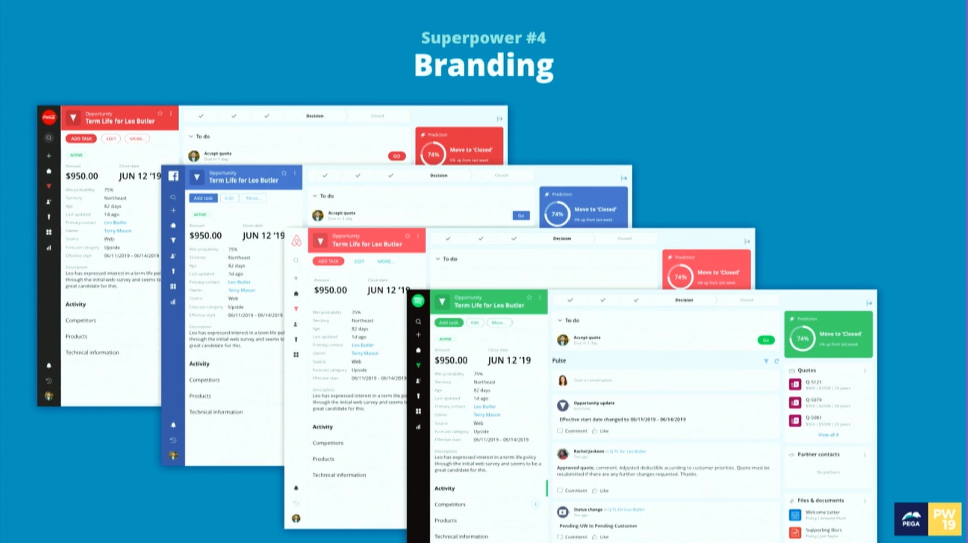
For Pega 8.3, we released an “early preview” of Cosmos Work, a new UX framework built around case management, AI, and collaboration. Cosmos is chock-full of new features, so If you’re unfamiliar with it you can watch a Pegaworld 2019 replay or read more about it at https://design.pega.com.
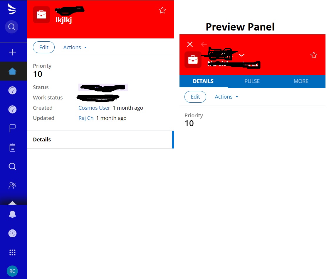
Cosmos Work includes an improved UX and visual treatment for end users working with cases, including a new case summary panel that highlights the most important data about your case. But we didn't stop there: with Cosmos we made it easy and fast for Pega developers to customize case data in a low-code fashion using only App Studio.
The goal of this article is to show you how to customize the “Summary panel” with your case's most important data using only App Studio.
Prerequisites
This article assumes you already have an application built with Cosmos. To create new application, please follow the instructions in this article. To migrate an existing application from UI-Kit to Cosmos, see this article.
Cosmos Summary Panel
In a Cosmos Work application, the Summary panel shows the most important information about a case. Once you decide what kind of information, data and fields are important for a specific case type, you can easily customize the summary panel using App Studio.
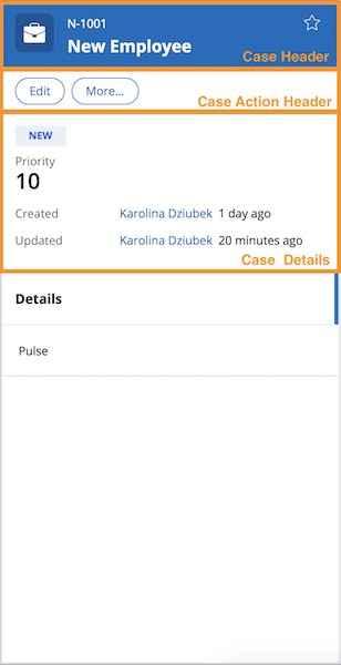
There are three main areas in summary panel which you can customize: Case Header, Case Action Header and Case Details.
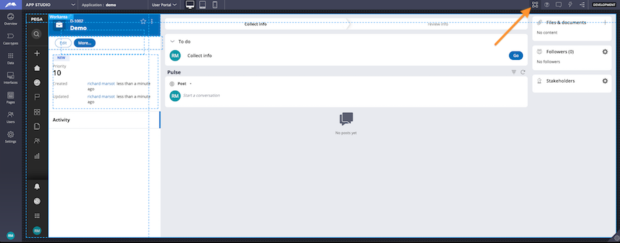
We'll discuss each section below, but first, log in to App Studio and enable Design Mode by clicking on the “Toggle Design mode” button located in the header. After that you will be able to choose section which you want to edit.
Customizing the Case Header
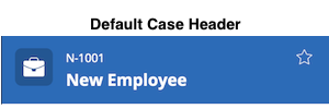
One of the sections you can edit is Case Header. Each case type gets a default case header, which includes a case icon, the case ID, the case title, and a “Follow” button.
Here's what you can customize in case header:
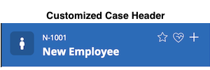
- Change case type icon
- Add additional buttons to the top-right corner
1. Change case type icon
In Pega 8.3, customizing the case type icon requires switching Dev Studio and modifying a Decision tree rule. In an upcoming release and in the spirit of low code, we're exploring options for letting you configure the case icon in App Studio.
To change case type icon in Pega 8.3 you have to:
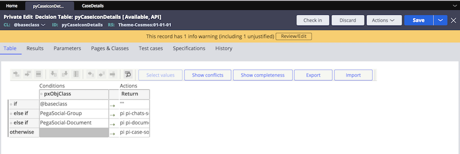
- search for Decision Table: pyCaseIconDetails
- save this decision table to your application ruleset and to a more specific class (not @baseclass)
- remove rows for Spaces and Documents ("PegaSocial-Group" and "PegaSocial-Document")
- change "if" row: replace "@baseclass" with the class to which you saved Decision Table
- add new "else if" row and provide: your case type class name and icon class
If you would like to change case type icon for another case type, just add next "else if" row and fill it with needed data.

2. Add additional actions to case header
If your case type needs additional actions buttons, you can easily add them to the top-right corner of the case header. To add button you have to:
- Click "+" icon in "Additional actions" region
- Choose: Controls > Action > Button
- Button will appear on additional actions items list
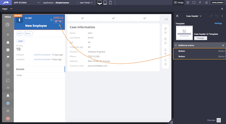
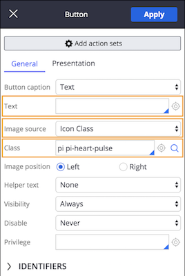
Button placed in the case header should be presented as an icon (same as follow button). To achieve that:
- Hover over added button and click "pen" icon
- Remove button text - leave it empty
- Select image source: "Icon class"
- Select icon representing your action - click "search" icon to find one
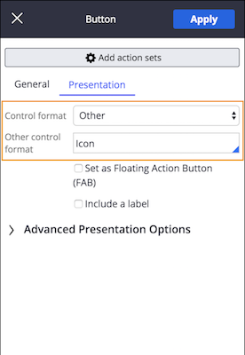
- Go to "Presentation" tab
- Choose "Control format: Other" and "Other control format: Icon"
The last thing you have to do is to add needed actions set to the button.
Customizing the Case Action Header
Next area which can be edited is Case Action Header. By default there are three buttons:
- Complete stage - OOTB button displayed when cas type meeet certain conditions
- Edit - case editing
- More... - case menu
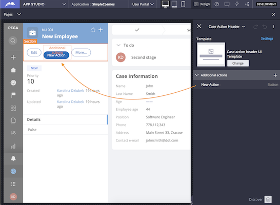
To add additional buttons for specific case type you have to follow these steps:
- Enable Design Mode
- Choose CaseActionHeader section
- Click "+" icon in "Additional actions" region
- Choose: Control > Action > Button
- Button will appear on additional actions items list
- Make sure to not include a label on the button
Additional buttons will be placed between “Edit” and “More…” buttons. The last thing you have to do is to add needed actions set to the button.
Customizing the Case Details
Case details section has three regions which you can fill with needed fields and data. Each region has its own purpose. Regions are named to point you what kind of data should be placed in each of them. Therefore we have: “Additional critical data”, “Primary case data” and “Additional details”.
As you can see, in case details section we have some data presented by default: case priority and detailed information about creating and updating the case. Both of them can be easily hidden:
- Enable Design Mode
- Choose CaseDetails section
- Go to this section's settings, by clicking "Settings" button
- Select checkboxes "hidePriority" or/and "hideDefaultCaseData"
- "Apply" your changes
If at some point you would like to bring this data back, just follow the same steps and deselect checkboxes.
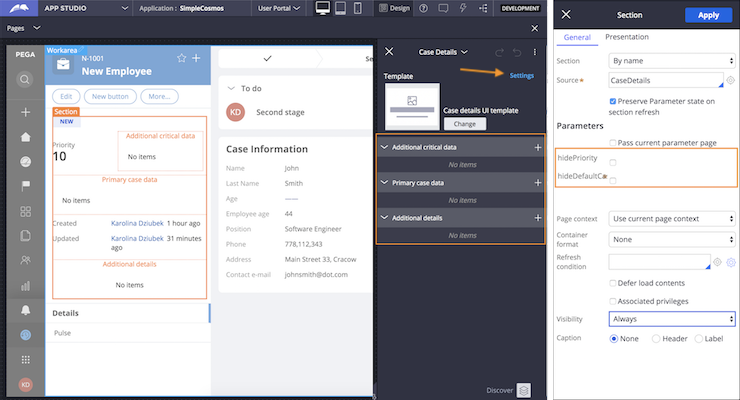
Adding data to each region is very simple. What you should keep in mind is the way your data will be displayed. “Additional critical data” will display fields inline, next to each other. “Primary case data” will display fields in two stacked columns. “Additional details” will display fields in one stacked column. Below are the steps for adding fields to regions:
- Enable Design Mode
- Choose CaseDetails section
- Click "+" icon in region to which you want to add fields
- Choose fields which you want to display
- Fields will appear on region items list
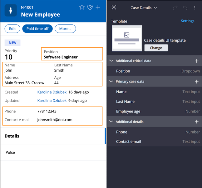
Let’s look at screenshots below to get an overview of the different options for customizing the summary panel in Cosmos Work. On the left you can see what you get by default. On the right you can see summary panel customized for a specific case type needs.
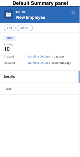
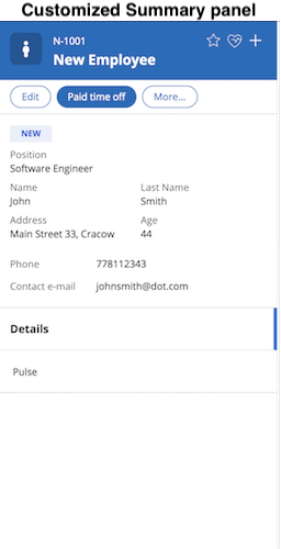
Summary
As you can see, in addition to a refreshing new visual treatment targeted for end users working with case data, we've also strived to help Pega developers quickly customize your Cosmos application in the model, using only App Studio. In this article you saw how to customize the summary panel area using only App Studio (except for the case icon, which requires Dev Studio for this release. We're working on addressing that!)
Check out the other Cosmos articles in this space and stay tuned for more articles to come!

