Question
Accenture
US
Last activity: 26 Jan 2022 8:14 EST
Building a responsive application to 400% zoom - Pega 8.4 UI Kit
Hi All,
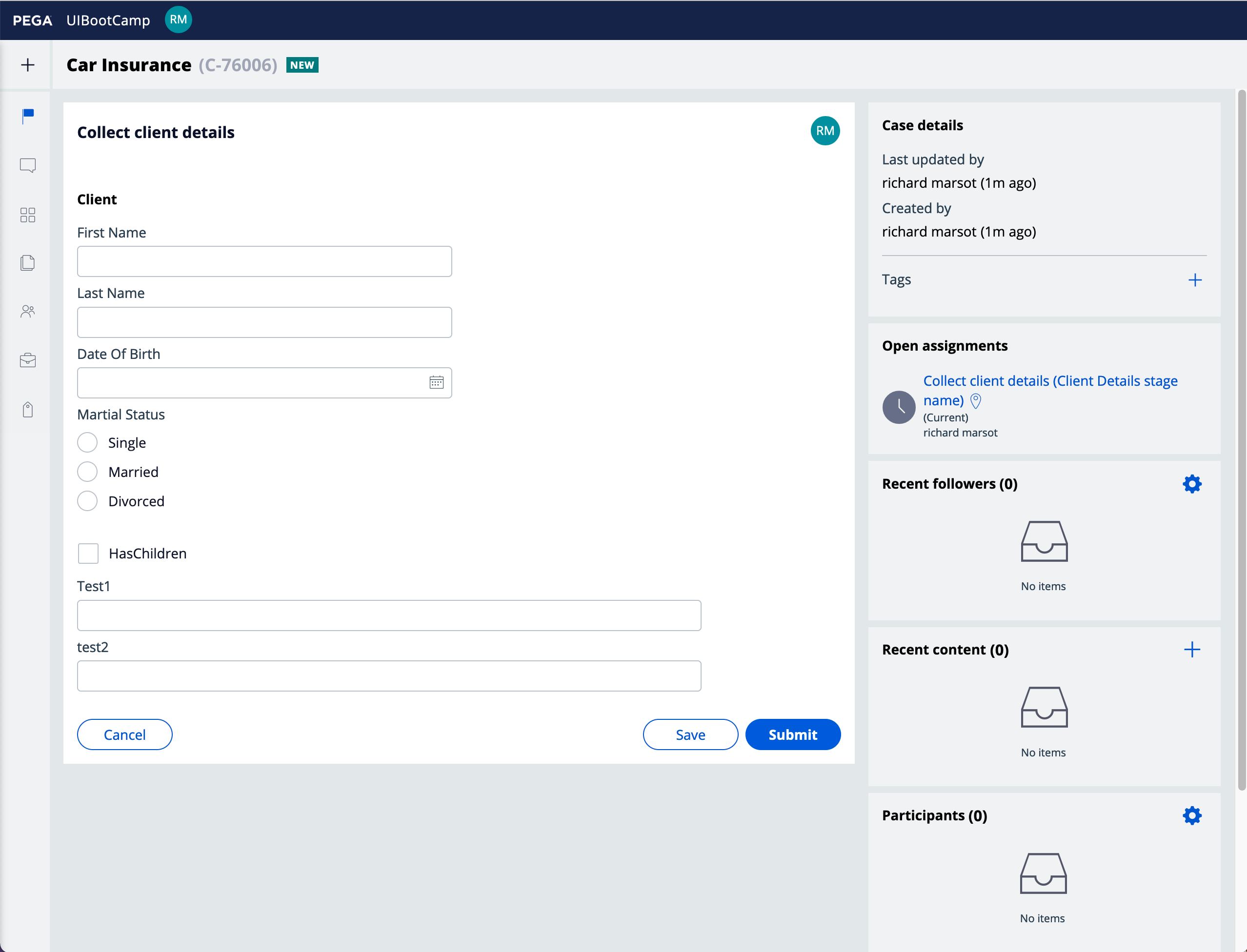
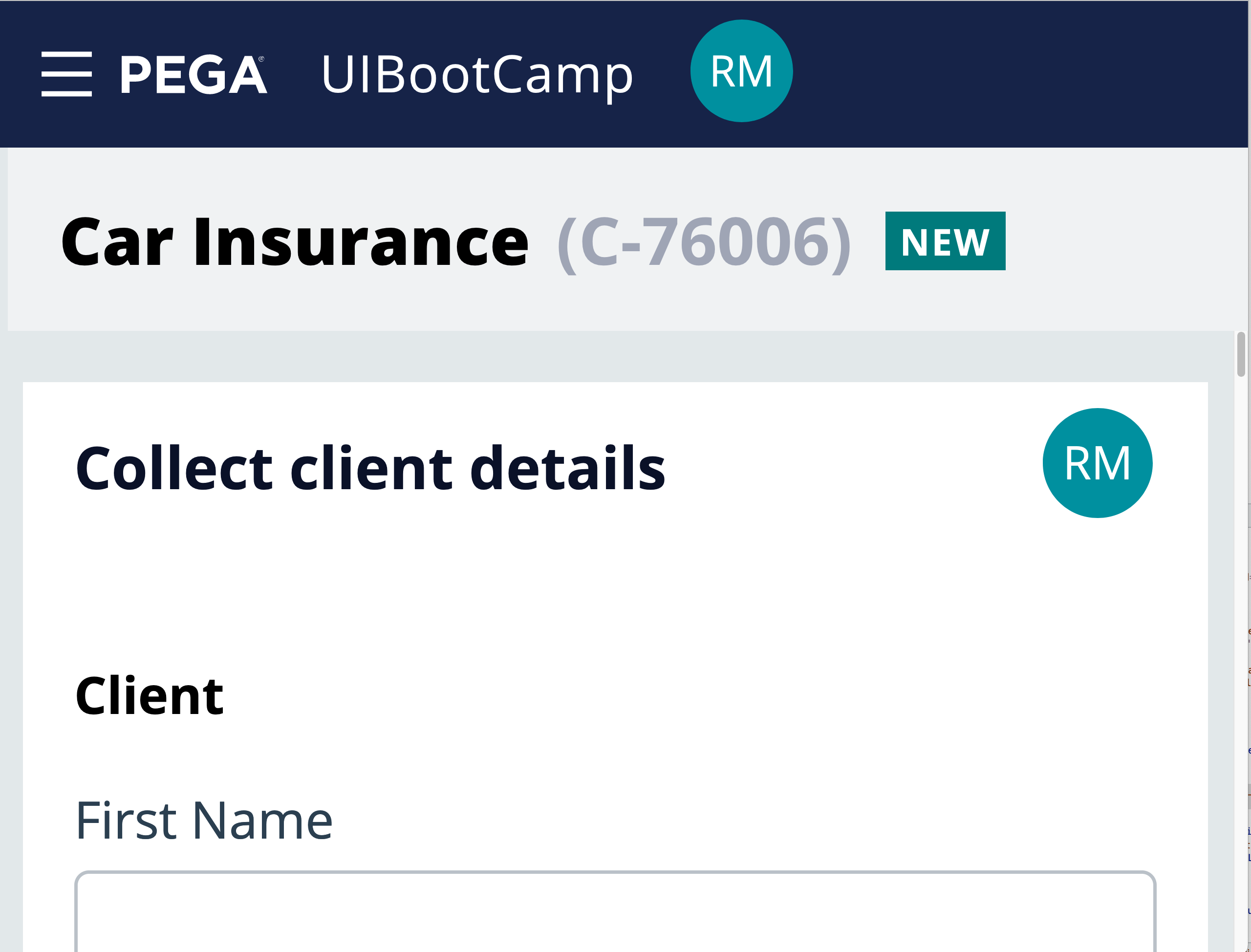
We are currently trying to build a responsive application that is compliant with WCAG AA standards. One of these requirements is that the application is responsive to a width of 320 pixel (400% browser zoom). One of the first issues we see is the screen layout defaults the header to 40px. is there a way to responsively change the screen layout or height of header in skin when changing screen width without building out an entire mobile app?
Additionally, we have some Dynamic Layouts (DL) that contain multiple buttons (8+). In order to make this functional at 320 width, we will be creating a new DL with a menu that contains these options that is visible based on the width of the screen. I see .pywidth is a property in pega but is it possible to reference this in an expression/when statement?


