Discussion
Pegasystems Inc.
PL
Last activity: 14 Aug 2024 1:24 EDT
Preparing for development with SDKs

This article is part of series of articles named Constellation Flexible UI. Please check table of contents: https://support.pega.com/discussion/constellation-flexible-ui

In order to start working with SDKs we need to understand what it takes to implement Constellation SDKs and integrate them with external portal. Understanding of process before even starting development work will help us better prepare, understand the process and visualize outcomes.
Development with SDKs can be divided into following steps:
- SDK installation - following previous articles in this series, this step shall already be done
- SDK configuration - as above
- Review of Pega application - here you review Pega application to assess scope of implementation needed on SDK side. Amongst the others:
- case types to be exposed
- what controls and templates are used
- Landing Pages to be exposed
- Review of Design System to be implemented - here you work wit UX designers to understand principles and rules of design systems to be used, in plain words, what and how needs to implemented in custom portal
- Clean up project structure - here you adapt folder and files structure of sample app
- Modularize code - in this step we continue refactoring of sample app to match requirements towards production ready app
- Install tech stack of choice - installing styling solution as well as ui library to be used and any other dependency that is identified in steps 3 and 4
- Create external portal - in this steps we will build external portal hosting SDKs. Portal is built in technology of choice - in our case it is React
- Integrate with Pega - having external portal working we would like to display Pega related UI inside it
- Overriding components - in this step we override styling and behavior of components to match our Design System, we are removing dependency to Material UI
- Implementing production grade authentication - depends on project needs (oauth2 authentication, silent authentication with SSO, anonymous access)
- Testing and deployment
Note: Above steps concerns Embed mode of SDK. If you follow implementation of full portal mode steps 6 and 7 are merged
As mentioned already, points 1 and 2 shall be already done when following previous articles in the series. Starting with point 3 we will describe development steps supporting our learning experience with example application.
We will use Tell Us More application which is an incident management application being developed by Sweet Life company. This is the similar application that is used in Constellation Adoption mission (for our purpose we use simplified version of the app) . It is advised that you will go through this training as prerequisite before starting with SDKs.
Review of Tell us more application
Tell Us More application is simple incident management application that support communication about incidents between manufacturer and customers. Download RAP file with Tell Us More application. Application is built on Pega 23.1 (shall be also fine to install it on Pega 24).
Note: Access to Constellation services is needed (either Pega Cloud or local setup).
After installing application open it and investigate what is inside. Download also Tell Us More application overview document attached to this article, which describes in details architecture of application and its implementation artefacts.
Review of Delight Design system
One of the basics requirement leading towards SDKs is the requirement to implement custom design system, rather than using Constellation Design system.
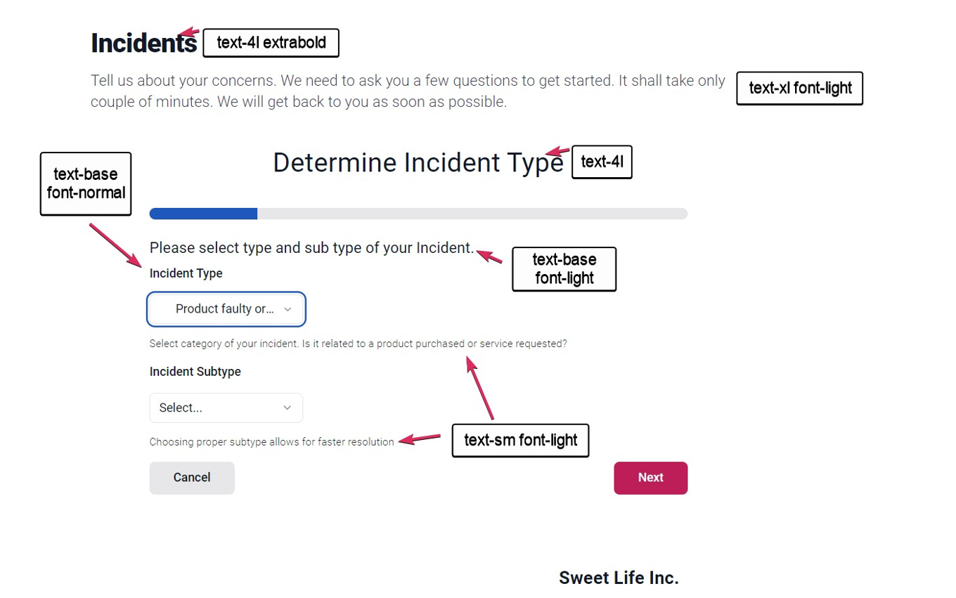
It is important that development team spends some time with designers to understand principles and fundamental rules that build given design system. As example in our build exercise we use Delight Design System owned and maintained by Sweet Life company. Each new application being introduced for Sweet Life company needs to adhere to those principles.
Download and open document named Delight Design System (attached do this article) to learn more. Rules and guidance will be helpful when implementing look and feel of UI controls that overrides default Material UI looks and feel from SDKs. Document also defines styling of specific UI tokens (typography, colors etc).
Note: this document is not complete or exhaustive, it is just just as an example.

We will refer back to Delight Design System in one of next articles where we will be creating custom components. Stay tuned!
