In Constellation grids, application authors and end-users can specify if they want to group the results by a specific column value. This can help categorize results into meaningful buckets relevant to one or more fields' particular values. When the user applies one or more groups, the groups appear as their own row in the results, displaying the field that is grouped along with the specific value for each group. These group rows effectively act as headers for the records contained within each group.
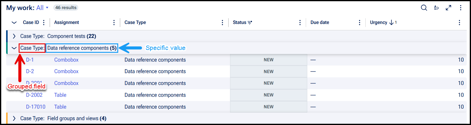
Group headers are collapsible, letting users expand or collapse individual groups to show or hide their associated records as needed. This can help reduce the amount of content presented to users at once and help them focus on whatever data is most relevant. To support this expand and collapse functionality, group headers are implemented as semantic button elements that use the aria-expanded attribute to allow assistive technology to convey a group's current state.
Automated accessibility testing tools such as aXe may flag this implementation as an issue, as button elements cannot be a direct descendant of a row (element with role="row"). Semantic structure dictates that the direct descendant of a row must be a grid cell (element with role="gridcell").
When attempting to rectify this issue by introducing a <div role="gridcell"> between the row and button elements, screen reader behavior was affected such that alignment of data cells to column index became out of order, resulting in incorrect announcements of the user's position in the grid.
For this reason, Constellation's current implementation prioritizes functional accessibility and accurate assistive technology behavior over strict adherence to semantic structure. While the resulting markup may be flagged in automated scans, it does not prevent users from effectively understanding and navigating the content in the grid. Keyboard and screen reader users can still navigate through the grid and interact with group controls as expected.