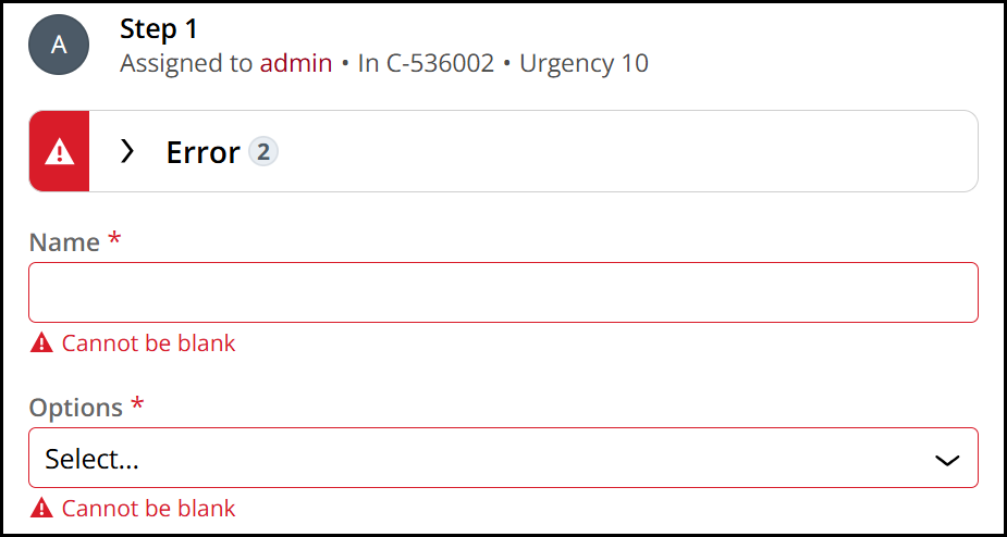
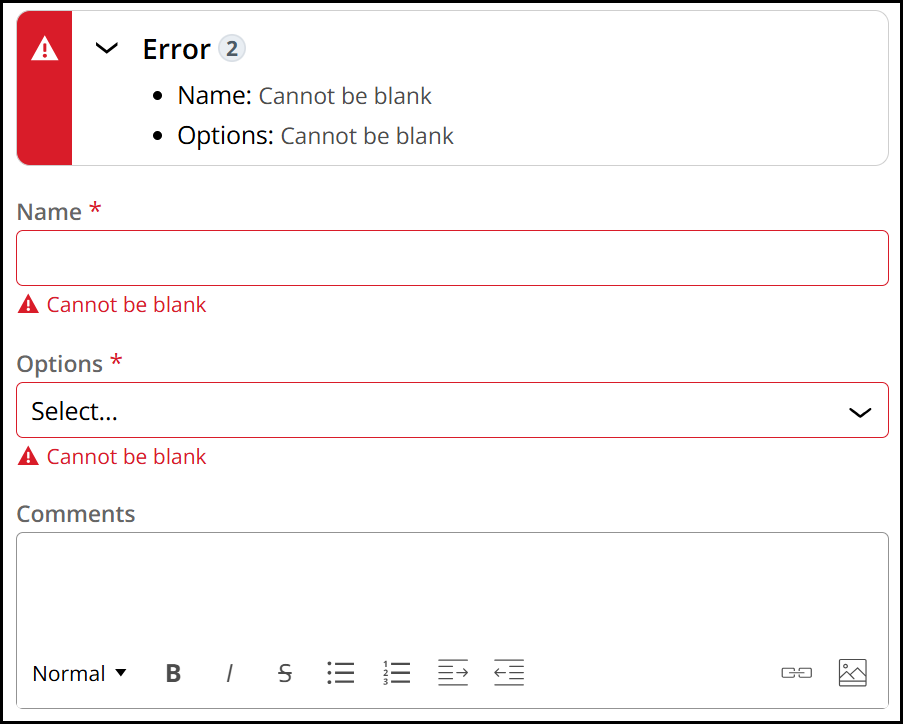
When a user submits a form and validation errors are detected, an error message banner appears at the top of the form. This banner has two states: collapsed and expanded.
In its default collapsed state, the banner displays the word "Error" followed by the number of errors found in the form.
When expanded, it lists each field that contains an error, along with a description of the error and guidance on how to resolve it.
Semantically, the error banner is introduced using a level 2 heading. Being a heading, screen reader users have the ability to use shortcut keys to jump between form fields and the error banner should they need to refer back to the steps on how to remediate each issue. This can be especially helpful the longer and more complex the form and errors may be.
While it is most commonly seen within the context of a work object assignment screen, the error banner can realistically appear on any screen configured with form validation. Because of this, we chose level 2 as the heading level that the error banner will always display as. Under the assumption that heading hierarchies may vary per page, level 2 logically would not interfere with any existing hierarchy on the page. The heading serves to introduce a standalone section of content that will always be introduced near the beginning of the page.