Discussion
Pegasystems Inc.
PL
Last activity: 19 Aug 2025 9:23 EDT
Form Views in Constellation
Special thanks to Marco Russo who co-created this article.
Why
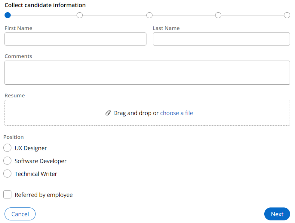
Form Views are fundamental UI components in Pega that serve as the primary interface for users to interact with cases and data. They provide a structured way to display and collect information while ensuring a consistent user experience across applications.
Form Views are essential components in Pega applications because they:
- Provide a structured way to display and collect information
- Enable decoupling of UI from business logic for easier interface management
- Allow creation of reusable views for different contexts
- Support responsive design with automatic adjustment across devices
Purpose and functionality
Form Views are particularly valuable in the following scenarios:
- Creating new cases or data objects (Create View)
- Editing existing case or data objects information (Edit View)
- Automatically created when configuring assignment step in a case lifecycle (Only one view per assignment is created when you click on assignment from case lifecycle)
- Creating reusable UI Views for multiple locations
Business use case
- Complex Data Collection Processes
- Use Case: A multi-step form that guides users through collecting detailed information while maintaining data integrity
- Business Value: Reduces error rates by up to 40% through built-in validation and improves completion rates by breaking complex processes into manageable steps
- Example: Insurance claim submission or loan application processing
- Customer Onboarding Workflows
- Use Case: Progressive disclosure forms that adapt based on customer type and service selection
- Business Value: Streamlines the onboarding process by showing only relevant fields, leading to faster completion times and improved customer satisfaction
- Example: New customer registration or service activation
- Service Request Management
- Business Scenario: IT service requests or customer support ticket creation
- Implementation: Dynamic forms that adjust based on service type and user context
- Business Value: Improves first-time resolution rates by capturing all necessary information upfront and routing requests to the right teams
Form View vs Partial Views:
The distinction between form views and partial views plays a crucial role in crafting efficient and user-friendly interfaces.
- Form Views: These are designed to display or edit a set of data, typically associated with a data object or case type. They are often used in scenarios requiring input across multiple fields and often involving validations and conditional logic
- Partial Views: These are more focused and are meant to display data. They are often used for quick interactions or to present specific pieces of information within a larger context, such as in dashboards or side panels.
Features exclusive to Form Views
Some features are exclusive to Form Views because they are designed to collect data, therefore the users should be guided to have a better UX and the data inserted must be validated.
- Instructions: Form views can include detailed instructions or guidance for users on how to complete the form. These instructions can be context-sensitive and help ensure data is entered correctly.
- Validations and Conditional Logic: Form views can incorporate extensive validation rules and conditional logic to dynamically show or hide fields, ensuring that only relevant data is presented to users.
- Integration with Case Processing: Form views are often tightly integrated with case processing, reflecting the status and requirements of a case or process step.
There features make Form Views well-suited for scenarios where detailed data collection and complex user interactions are needed, while Partial Views excel in providing focused, efficient access to specific data elements.
Default form structure
The default form supports up to three responsive columns. Depending on the layout arrangement, the maximum width of the column (in characters) varies as follows:
- 1 column: 80 characters
- 2 columns: 60 characters
- 3 columns: 40 characters
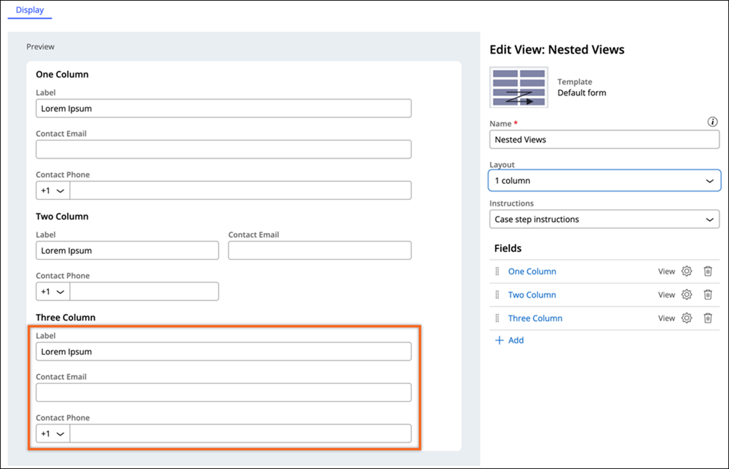
Fields in the default form template
On the default form, the following Field Types take up the whole width of the layout even when the form is divided into two or three columns:
- Text (Paragraph)
- Picklist (radio button)
- Boolean (checkbox)
- Attachment
- Field group
- Data reference in a format other than a table and with a details View
Prerequisites
- Create a View for a Step. For more information, see Creating form Views for Steps.
- Prepare the data components that you want to add to the View. For more information, see Extending a Data Model for a Case.
Configuration
A detailed configuration guide can be found here: Configuring forms
Best Practices
Design and Structure
- Build Views from lowest embedded level upwards: By starting with the most granular or detailed views, you establish a strong foundation where each embedded view can be individually developed, tested, and validated, reducing the likelihood of errors as you integrate them into higher-level views. This approach enhances reusability, as once a detailed view is created, it can be embedded in multiple parent views without redundant development efforts. It also allows for better encapsulation, where each view is responsible for its own data and logic, promoting modular design and easier maintenance.
- Build Form View from Step in the Workflow
- Choose templates consistently
- Keep forms focused on single purposes
- Organize fields logically with appropriate steps
Field Management
- Minimize number of fields to reduce user burden
- Group related fields together: start by identifying fields that are functionally or contextually related, such as contact information or billing details, and place them together in the same view. Utilize layout components like field groups to visually separate these layouts, enhancing readability and user navigation.
- To manage related data objects, use embedded views that represent these objects, allowing you to encapsulate related fields and present them as a cohesive unit within the form. This approach not only maintains a clean and organized interface but also facilitates reusability and consistency across different parts of the application
- When using Field Group, instruction text will only show if the field group has fields, otherwise the field group will not render in the UI.
- Use dedicated field types for different data, such as date pickers for dates or dropdowns for predefined options; this helps prevent user input errors by restricting data entry to valid formats and values. This practice also enhances user experience by providing intuitive and efficient ways to input data, reducing the cognitive load on users.
- Implement field validation where necessary
Performance and Usability
- Reduce the number of read-only data within forms: Including too much read-only data in a form view can clutter the interface, making it harder for users to focus on the actionable or editable parts of the form:
- if cannot be avoided, use dedicated views for displaying read-only data, where the information can be accessed as needed without cluttering the main form.
- Use App Studio for View creation
- Implement appropriate validation conditions
- Consider mobile users in design layouts
Summary
Form Views are powerful component that enable efficient data collection and display. They combine flexibility with structure, allowing developers to create consistent, reusable, and user-friendly interfaces. By following best practices and leveraging built-in features, Form Views significantly improve both the development experience and the end-user experience in Pega applications.
References
Constellation 101 Series
Enjoyed this article? See more similar articles in Constellation 101 series.