Discussion
Pegasystems Inc.
PL
Last activity: 2 Jan 2025 6:59 EST
Creating Custom DX component
This article is part of series of articles named Constellation Flexible UI. Please check table of contents: https://support.pega.com/discussion/constellation-flexible-ui

Let's continue our journey of learning Constellation SDKs. We seen how we can override default components (fields, templates or widgets). How about implementing some UI control that doesn't exist in Constellation. Happy we got such use case in application for Sweet Life company, which happens to be our sample app.
Requirement is as follows:
Sweet Life company would like to present Featured Products widget on their home page. Widget shall help with selling more of their products. Widget shall present cards with featured products inside carousel component. Source of products shall be configurable so business can change this configuration if future without the need for a development.
Implementing such requirement requires from us going outside of ootb components. Happily with flexibility of Constellation there is pretty smart way to implement it. We will use Custom DX Components.
Again we will style our UI with Tailwindcss so we will reuse great carousel component https://www.embla-carousel.com that was also adapted in shadcn library: https://ui.shadcn.com/docs/components/carousel.
Info: To fulfill this requirement we could fetch data of featured products via Data API and leave rendering to frontend. As we did in one of previous articles for Products page. This time we would like to do it with Pega, using mashup and custom DX Component behind. This will allow to fulfill the requirements to allow business users to change featured products in future.
List of featured products
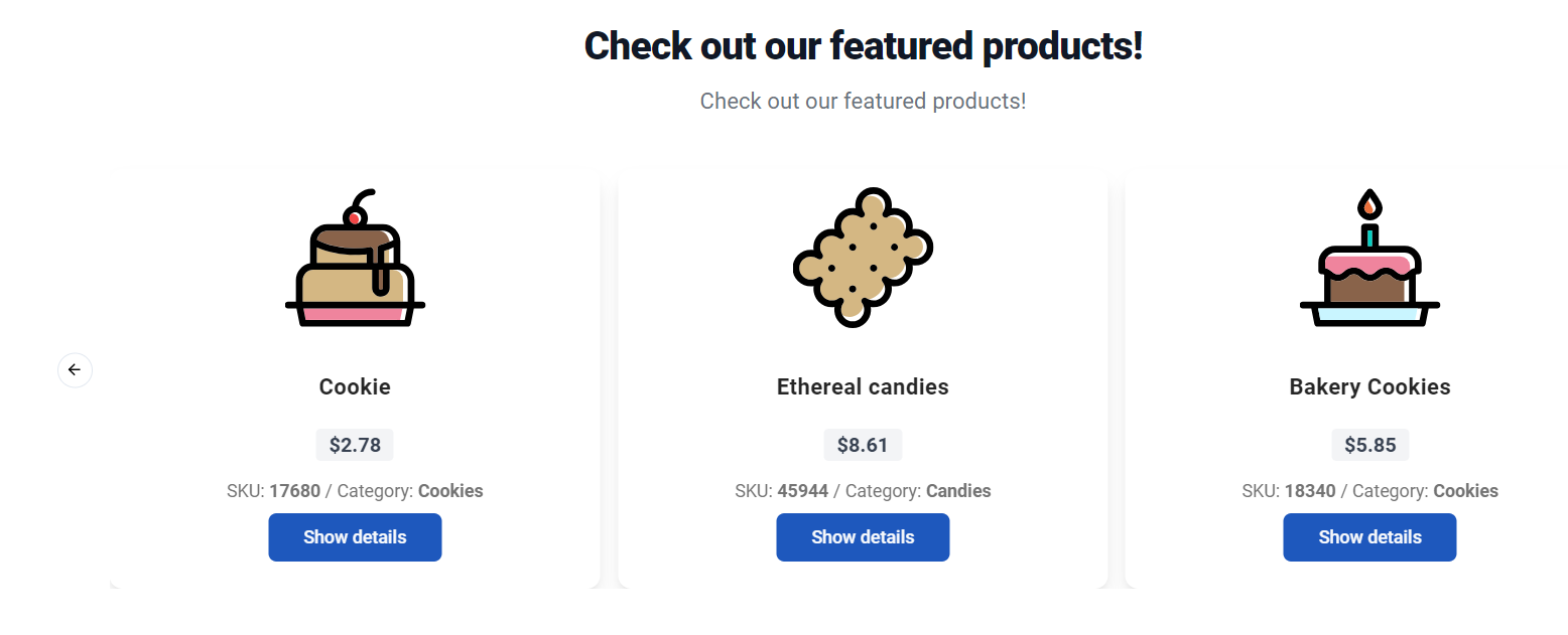
This time we will use openPage function available on MashupAPI to render Feature Product widget implemented as Custom DX Component. This is what we expect to build.
To create custom component we will following instructions from official documentation: https://docs.pega.com/bundle/constellation-dx-components/page/constellation-dx-components/custom-components/create-custom-components.html Once CLI tool finish its job, investigate folder structure being created.
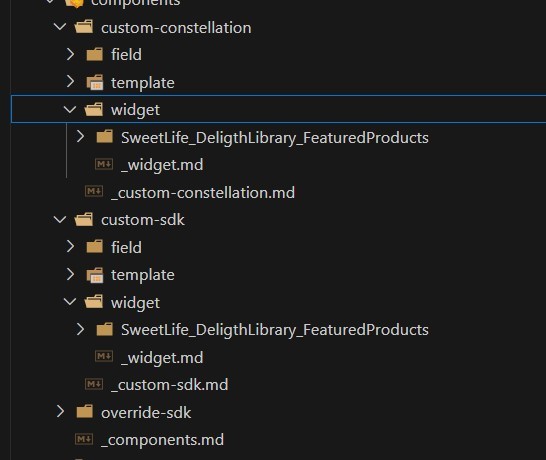
In override-sdk folder we have all of our overridden components, those are the components that we have been created in previous articles. The are overriding standard components from SDK. For the purpose of DX custom components that extends capabilities of Constellation we use additional two folders: custom-sdk and custom-constellation. What is the purpose of two separate folder structures?
In custom-sdk folder we will have our DX component, so the component that will render in custom portal. Second folder is stores code responsible for rendering DX Components in App Studio authoring. We will get there, but let's start will implementing DX Component to be used with Constellation.
In our scenario it will be the Embla carousel widget from shadcn library. Please refer to source code to see how it gets implemented https://github.com/kamiljaneczek/Sweet-Life-Pega/blob/main/src/components/customsdk/widget/SweetLife_DeligthLibrary_FeaturedProducts/index.tsx Main highlights from the implementation:
- component takes two props
- description - string that will be display above carousel
- data page - string with name of data page of list mode that will return featured products
- loadProducts - is the responsible for async fetching of products from mentioned data page using DataAPI
- we style component using Tailwindcss
- we import Carousel component from shadcn library
- for type safety we implement IProduct interface: https://github.com/kamiljaneczek/Sweet-Life-Pega/blob/main/src/types/types.ts
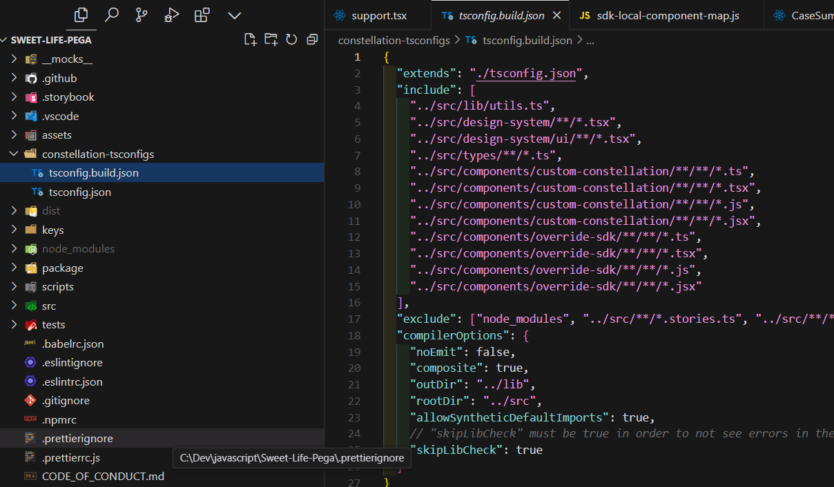
Info: take a look on tsconfig.build.json to make sure that all assets needeed for components are listed there
Having DX Component implemented, our custom React portal shall be able to render carousel with featured products. Another piece of work that is left is inside Pega. In order to use our component we need some view using it, and then with help of Mashup API we will render it. Here is how we approach it:
- inside Pega, we navigate to Channels and Interfaces. Lets open BO portal and thew we create new Landing page called Feature Products
- Here is a configuration for this Landing page.
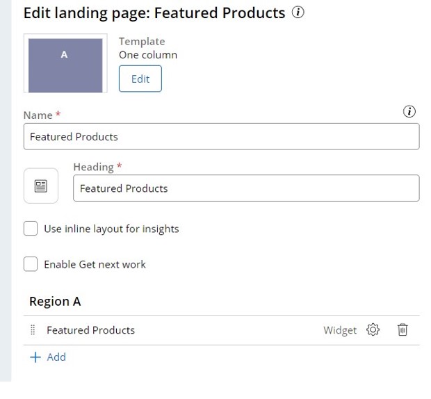
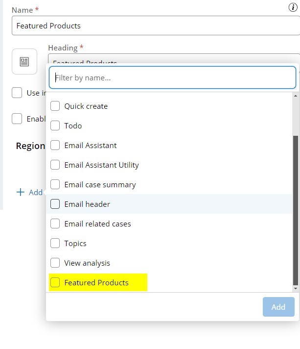
- once deployed to Pega our DX component shall be visible on a list and we could add it to a view
Once added to a View take a look on a preview pane. It doesn't look particularly good, why?
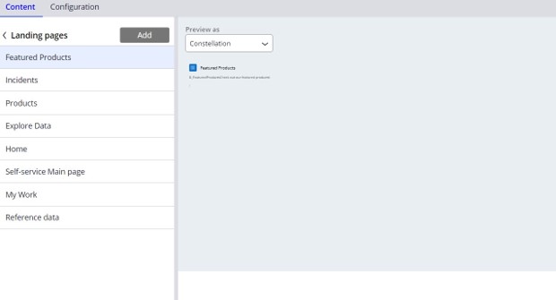
Pega can not render custom sdk component in out of the box Constellation portal. What we need is called Associated component. It is a implementation of our Custom sdk component using Constellation Design System. We implement this component using only UI components available in Constellation Design System. This needs to happen in folder in custom-constellation folder. For simplicity in our exemplary application we will skip this implementation as we are interested mostly in component being rendered.
