Discussion
Pegasystems Inc.
US
Last activity: 5 Nov 2025 7:19 EST
How to implement a calendar widget for Constellation UI as a DX Component
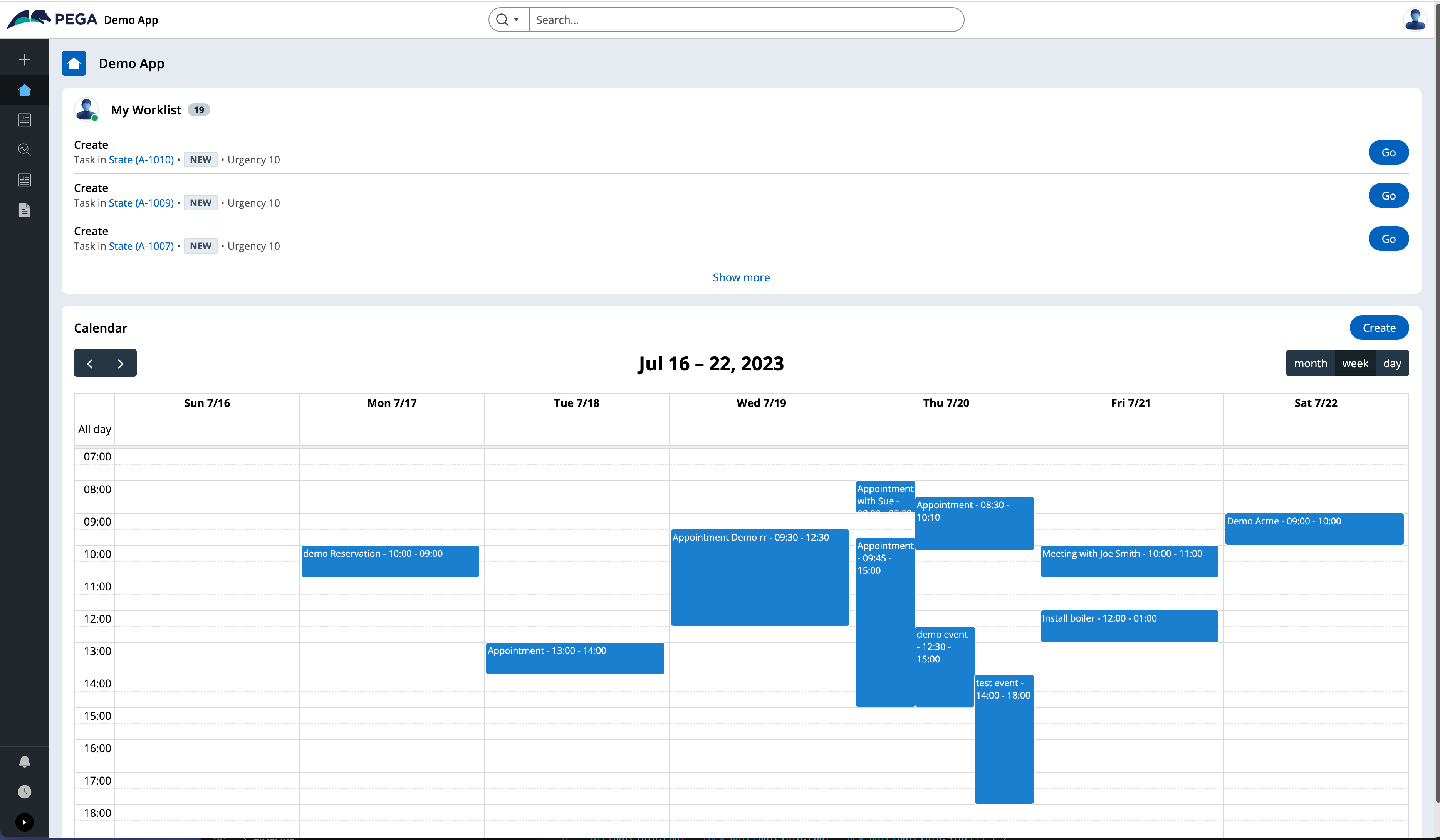
The purpose of this document is to provide some details on how to render a calendar view using Constellation UI. The widget is built as a custom DX Component.
Important note: The article is now in read-only mode - for any issues using the component, please use the code from https://pegasystems.github.io/constellation-ui-gallery/?path=/docs/widgets-calendar--docs and report any issues on github directly.
The 3rd party library used to render the calendar is called "fullcalendar" - it is an open source project with MIT license https://github.com/fullcalendar/fullcalendar - there is also a commercial license available for more advanced features like the timeline view - for more details: https://fullcalendar.io.
For this article, we will only use the standard functionality that is open sourced. This library has several benefits compared to other calendar libraries:
- lightweight and provides a React wrapper
- styles are loaded directly into the head of the document as inline styles - no need to load CSS files
- good documentation and interfaces for customization
- good performance and OOB functionality
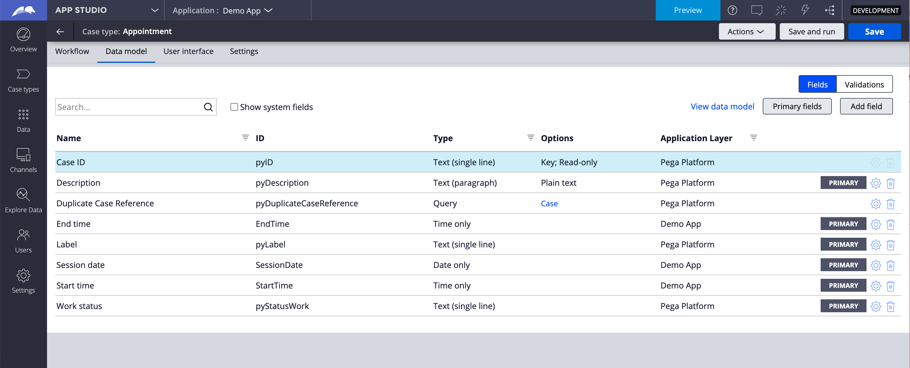
For this demo, we assume that we have a case type called 'Appointment' that will be used to store each appointment. The case type provides standard OOB properties like pyID and pzInsKey that can be used to open the case - On top of these properties, 3 additional properties are used: SessionDate, StartTime and EndTime by the calendar widget.
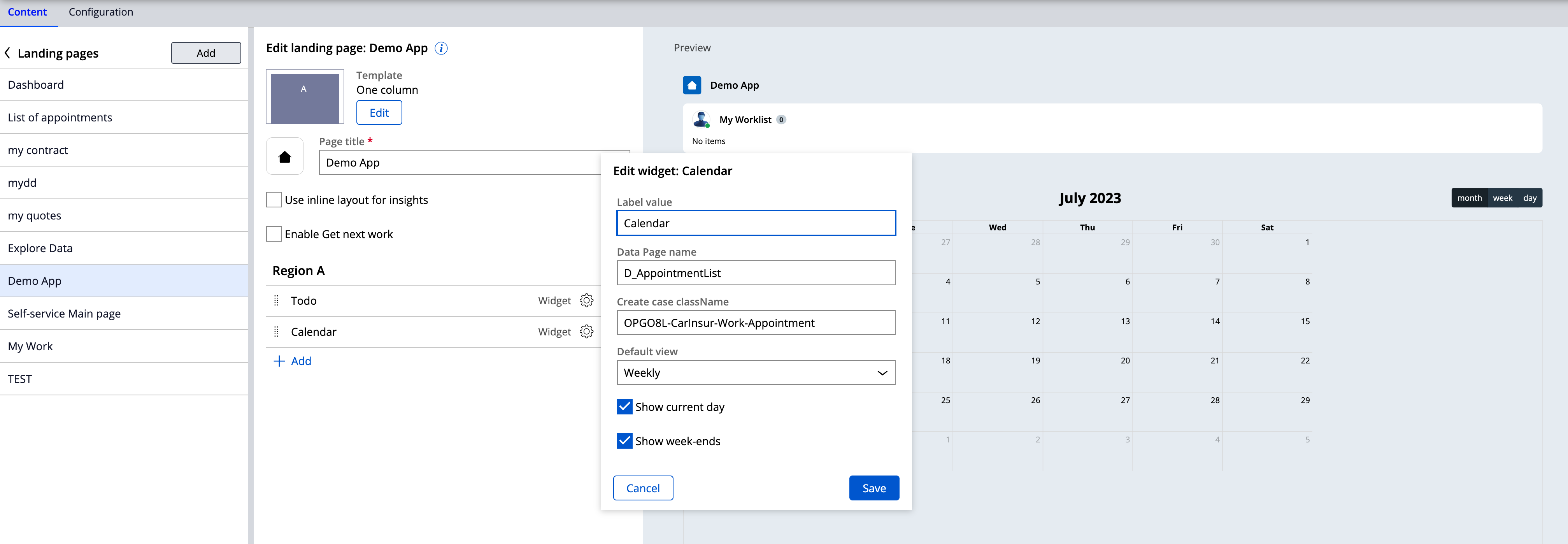
The Case type exposes a list Data page that provides all the instances of this case type. When configuring the widget, the name of the DP is passed to the component as parameter (D_AppointmentList) - Another parameter called 'Create case className' will show the 'create' button if this parameter is set.
Here is a screenshot of the widget configuration when adding it to a page:
The component supports the following functionality:
- 3 types of views are supported by default: Monthly, Weekly and Daily - Weekly and Daily shows an hour timeline whereas Monthly only show the day.
- Monthly view render the appointment as large card with field values whereas Weekly and Daily only render the title of the appointment (pyLabel)
- For hourly views - the range is from 7 AM to 7 PM - this is not configurable but could easily be exposed as settings
- The widget will listen to filter change on the UI (change month, view...) - it will persist the context in localstorage and on load of the UI, it will use the context from the localstorage if present - this allows to navigate between pages but maintain the selected view
- The widget will listen to ASSIGNMENT_SUBMISSION event from the Constellation runtime - if the case is edited using the preview panel, the calendar data will be refreshed automatically
Here is a screenshot of the component in storybook using mock data:
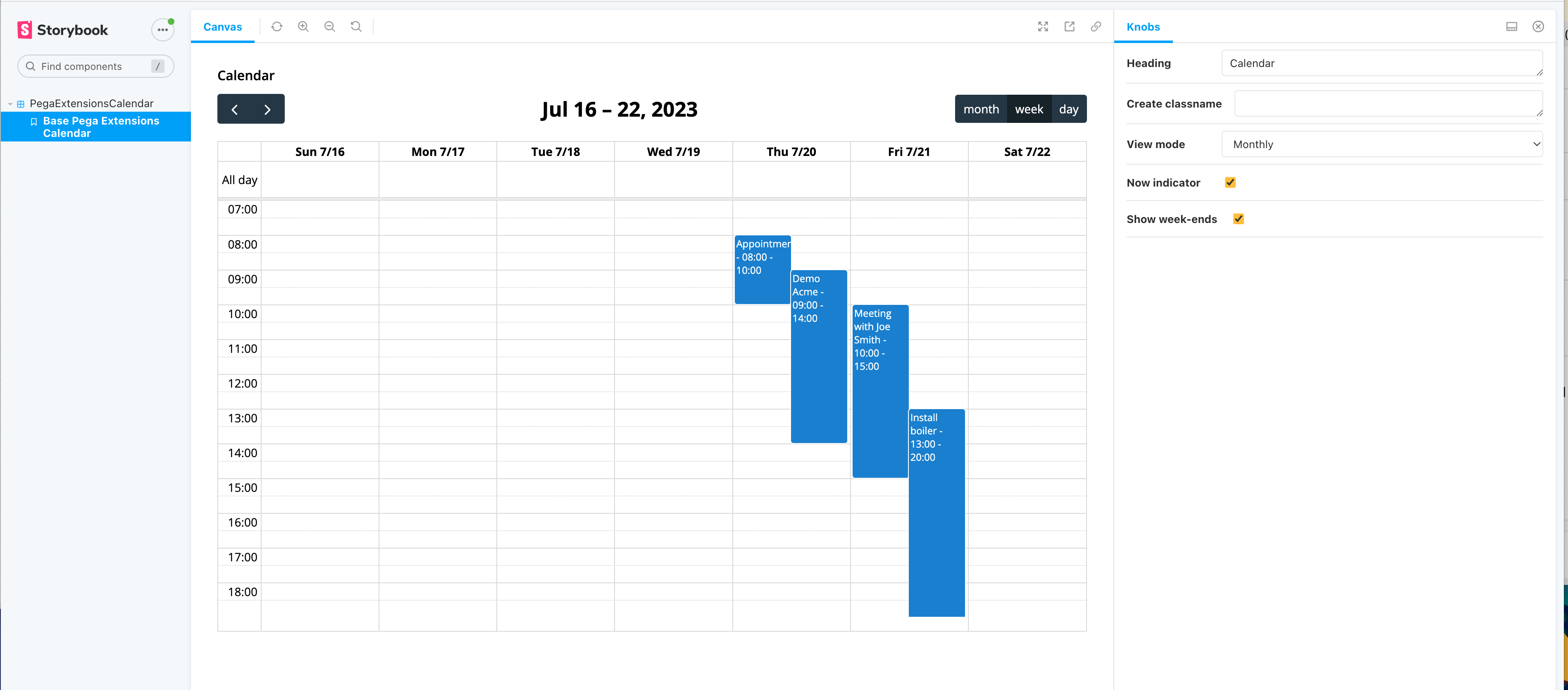
Demo of the component and other details
Important note: The demo and the source code attached has been tested against a Pega 8.8 system
For more details on how to build a custom DX Component - you can find the documentation here https://www.npmjs.com/package/@pega/custom-dx-components and https://docs.pega.com/bundle/constellation-dx-components-88/page/constellation-dx-components/custom-components/lifecycle-dx-cosmos-components.html
For more complex custom DX components, the recommendation is to host the component on a separate server using a micro-front-end architecture - You can find an example with the Chat GPT widget - https://support.pega.com/discussion/how-implement-chat-gpt-widget-constellation-ui-dx-component

