Discussion
Pegasystems Inc.
US
Last activity: 4 Feb 2026 12:47 EST
How to implement the compare and select pattern in Constellation UI
Commonly, we provide users with a curated list of items for straightforward side-by-side comparison. Typically, this list is kept concise, featuring no more than three or four items to ensure ease of comparison. Each line succinctly presents the unique features and specifications of each item. Upon making a selection, the user can then choose one of these items to proceed in their workflow.
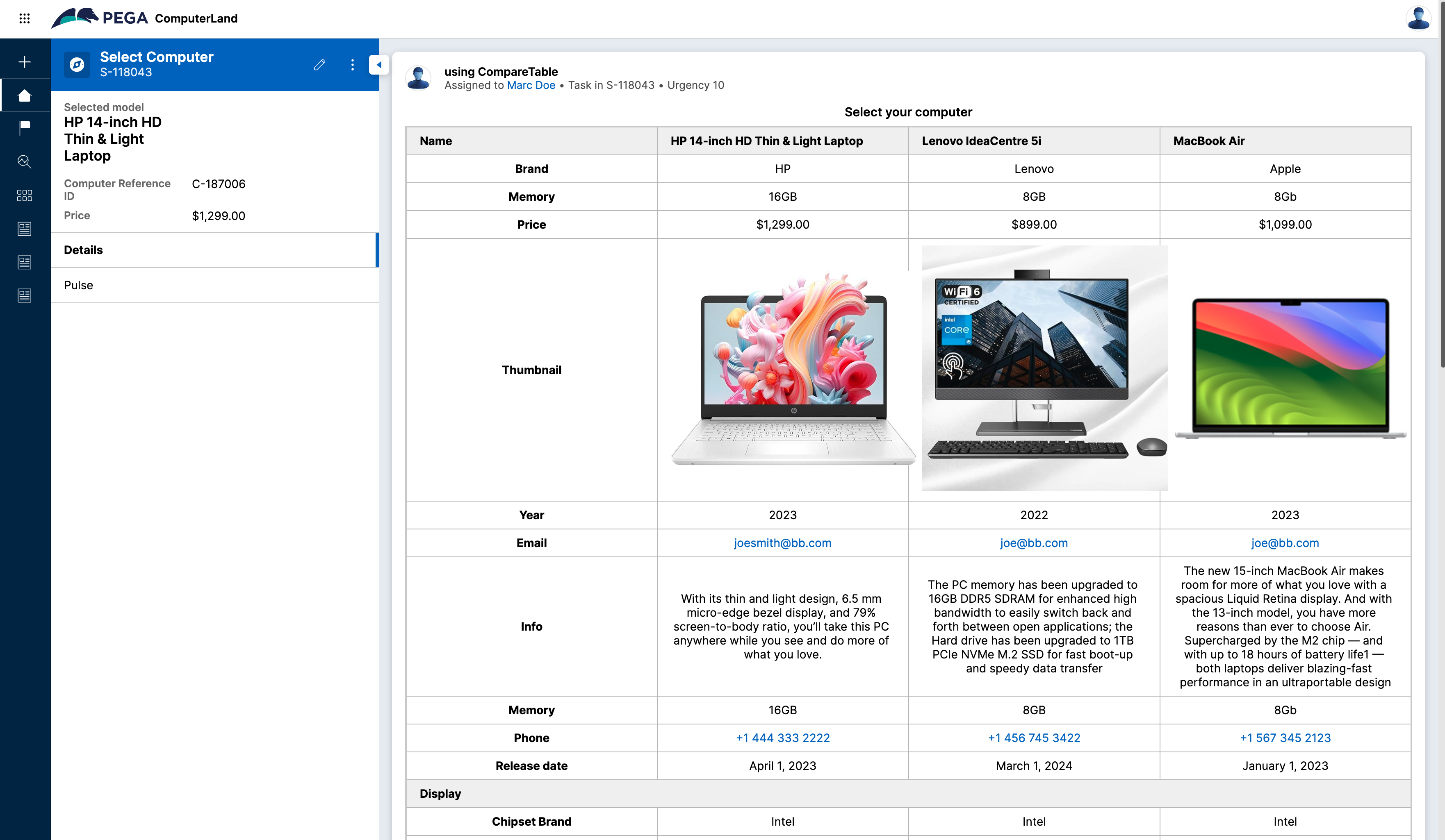
There are multiple examples of side-by-side comparisons that let you select computers, phones, or cars... Other examples include financial reports where you compare the performance of some financial metrics for different reporting periods.
The goal of this article is to showcase how to implement such functionality in Constellation UI.
For this article, we will use 2 custom DX Components: a FieldGroup rendered as a row, and a more advanced component called Compare Table Layout. The source code to implement these components is attached to this article.
1/ Implementing a basic transformation - no custom component
Let's focus first on implementing a financial report - These reports are well structured and grouped and the data are expected to be presented in a certain order.
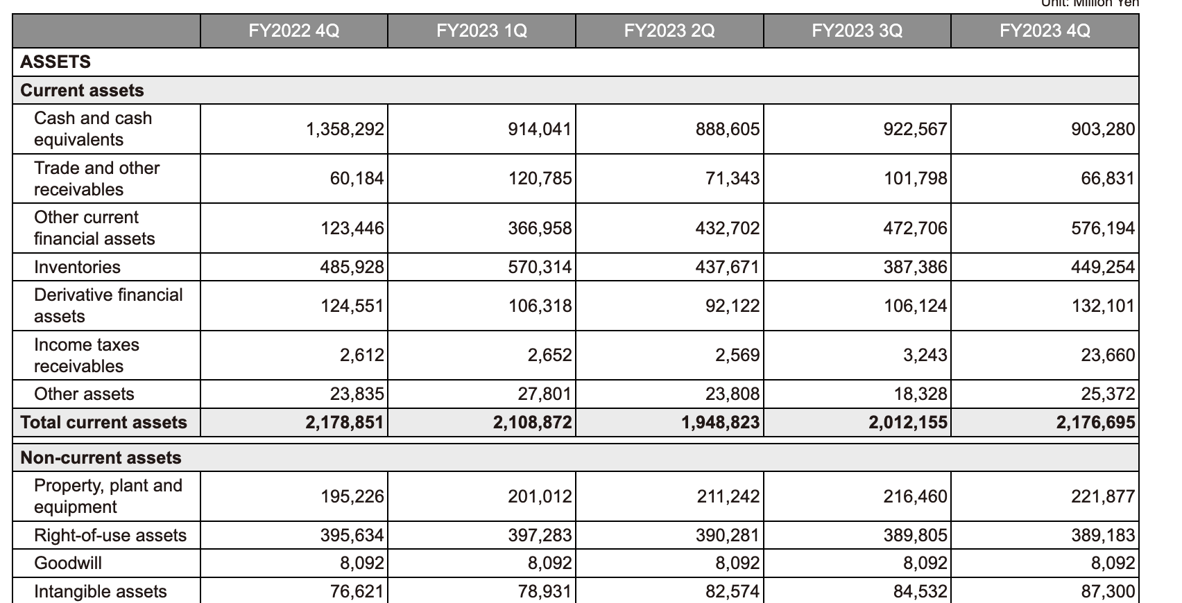
It is relatively easy to create a data page sourced from a 3rd party system that will give you these details for each reporting period - the issue is that if you render these data directly in a list view, the UI is the reverse of what is expected:

A comparison table is a reverse matrix of a table where the rows become the columns and vice-versa. The transformation can be done using an activity that will take a data page as input and generate the new data page with an object with only some fields like Period, value1, value2... You can find a similar example of flattening the data with the field-level history page https://support.pega.com/discussion/how-enable-field-level-auditing-constellation-based-application
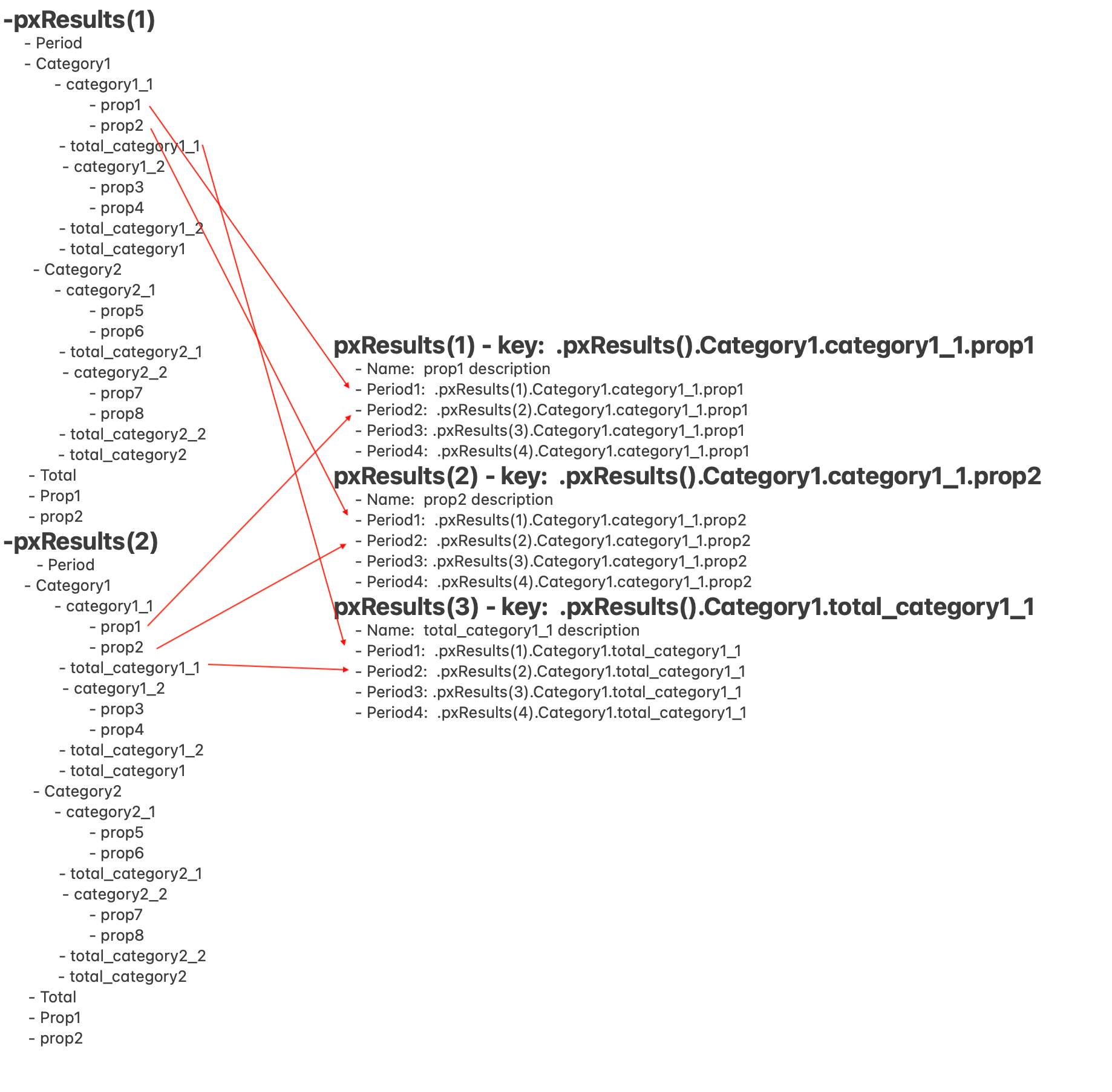
Using this pattern, you could then group the different rows by categories and achieve a report that would be similar to a financial report
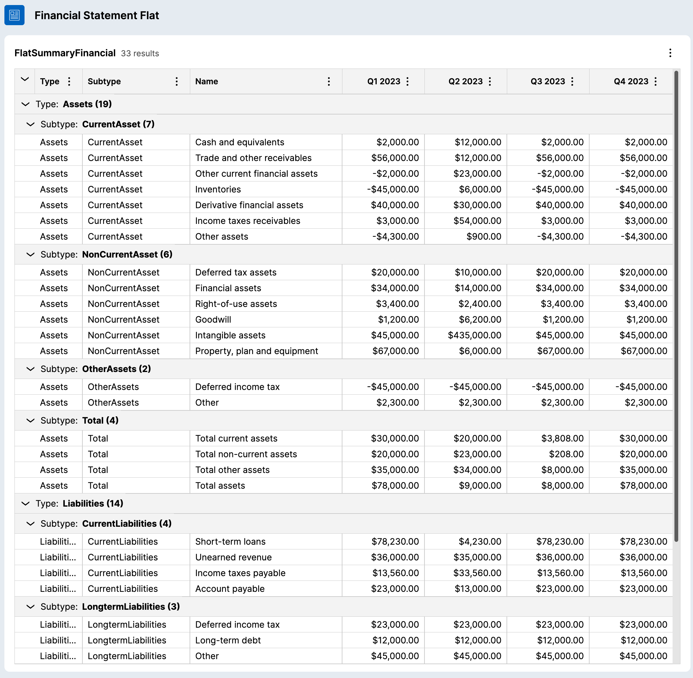
Several issues with this approach make it unsuitable for generating financial reports:
-
The sorting of the different rows (group and individual line items) is alphabetical - It works in this case because 'Asset' comes before 'Liabilities' in alphabetical order
-
The categories are repeated on every line item (Assets, CurrentAsset for example)
-
It requires a specific data object to store and report the 4 quarters and this approach will not scale if you want to change the reporting period and/or the number of periods to report
While transforming the data might not work for this use case, this approach is still a valid tool to use when the ordering of the data is not relying on a text field - for example, if you want to show a list of events sorted by date/time (like the Field Level audit table), this transformation approach can be useful.
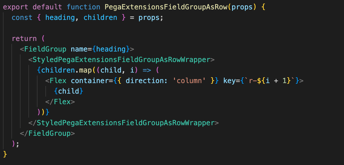
2/ Rendering a field group 'inline' using a custom component
Rendering the data as a field group would be a better starting point than using a table - The limitation of the field group is that they render as stacked by default and this would not work for a side-by-side comparison UI - You can workaround this limitation by creating a custom DX Component that wraps some CSS styles around the field group and change the display to render inline
The code of this custom component is very simple and creates a 'DIV' using the "styled component" library that will change the presentation of the child DOM elements generated by the field group to render them as 'inline'.
Here is how the same data shown above will look like when wrapped with this custom component:
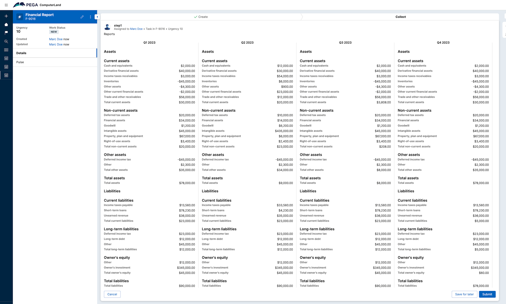
With this approach, you can guarantee the order and the grouping of the presented data objects. The UI is responsive and wraps the columns if there is not enough space to show them side-by-side.
There are a couple of downsides to this approach:
- Too many repeats of the categories label
- The items might not aligned on the same line if a value is expanding on multiple lines
- From an accessibility standpoint - it is not easily readable - the data should be formatted in a table tag
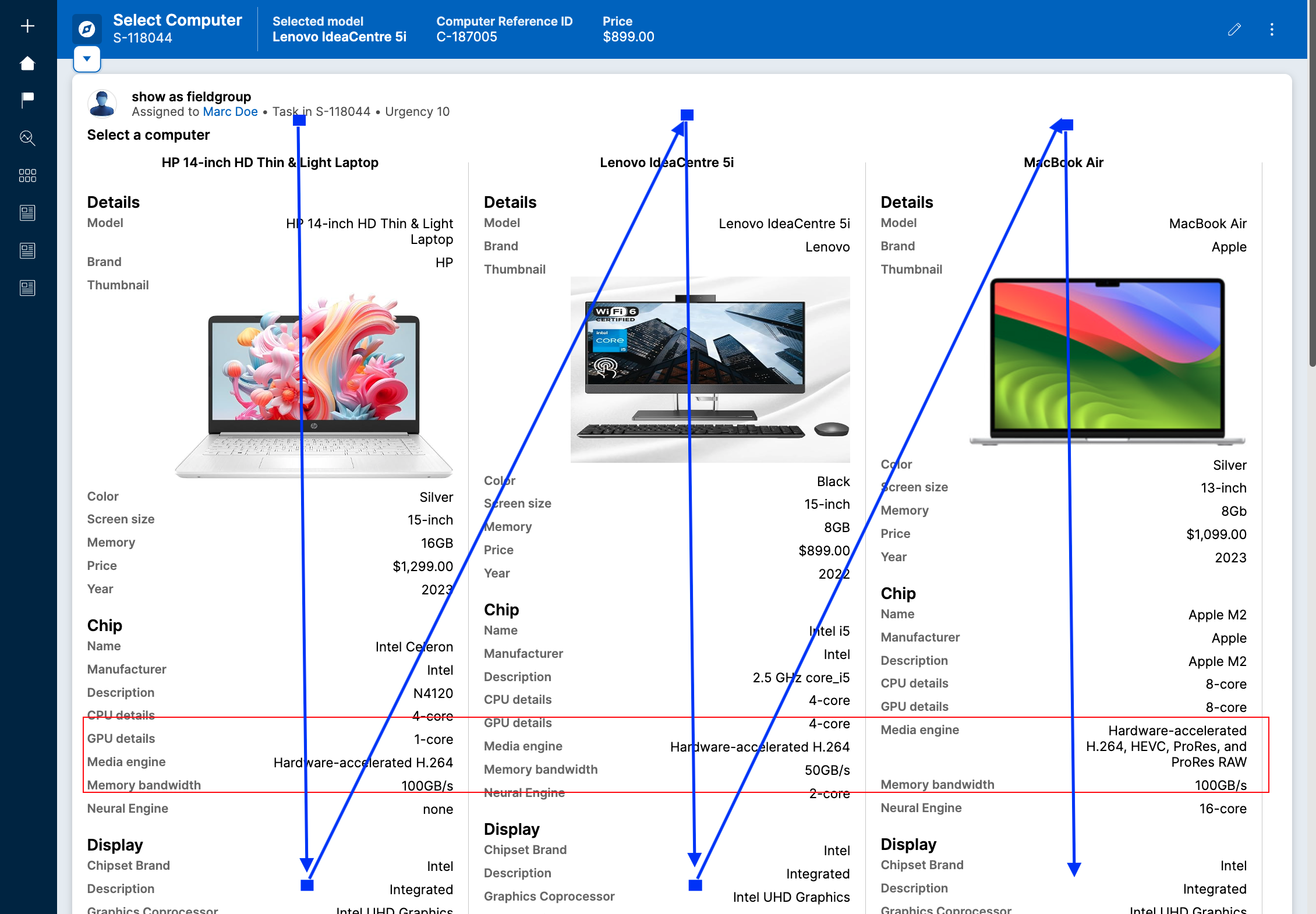
Here is the same approach using the computer example - while the UI looks great, there are still issues with comparing line by line. For example, the media-engine field is not aligned (the lines in blue indicate how the DOM elements are rendered).
3/ Implementing a more advanced compare table component
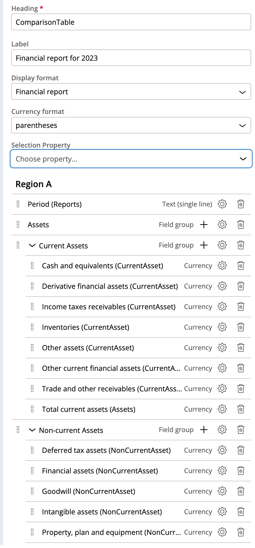
The best approach to implement this pattern is to implement a custom component that will generate a table layout for each row - The component can also leverage the field group authoring approach to group the different properties - Here is how the authoring will look like
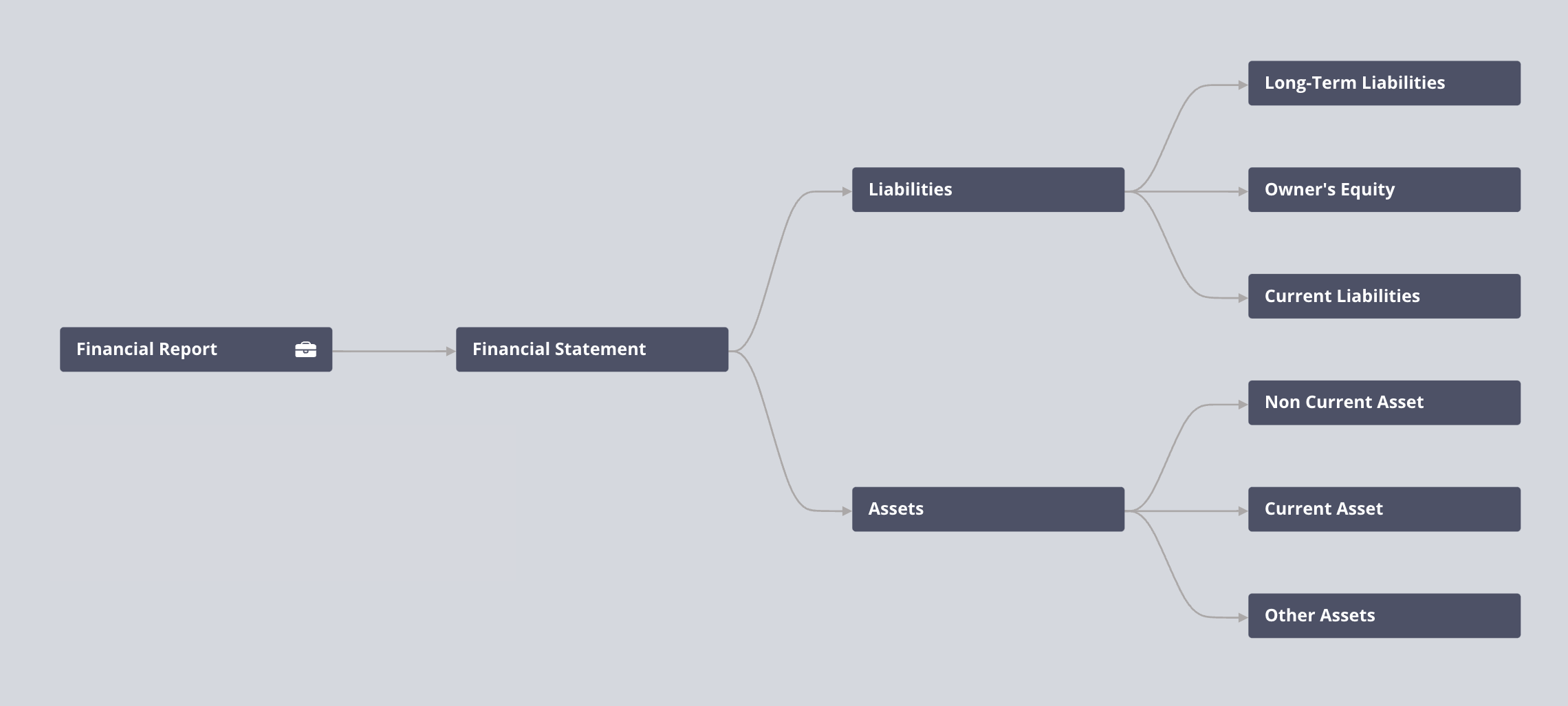
The financial data object has the following structure which is easy to maintain and extend
My view is configured to use an embedded data list property that will use the custom component as a template layout - the fields are added to the regions - you can use field groups to group these fields - each cell is rendered using the field rendering component.
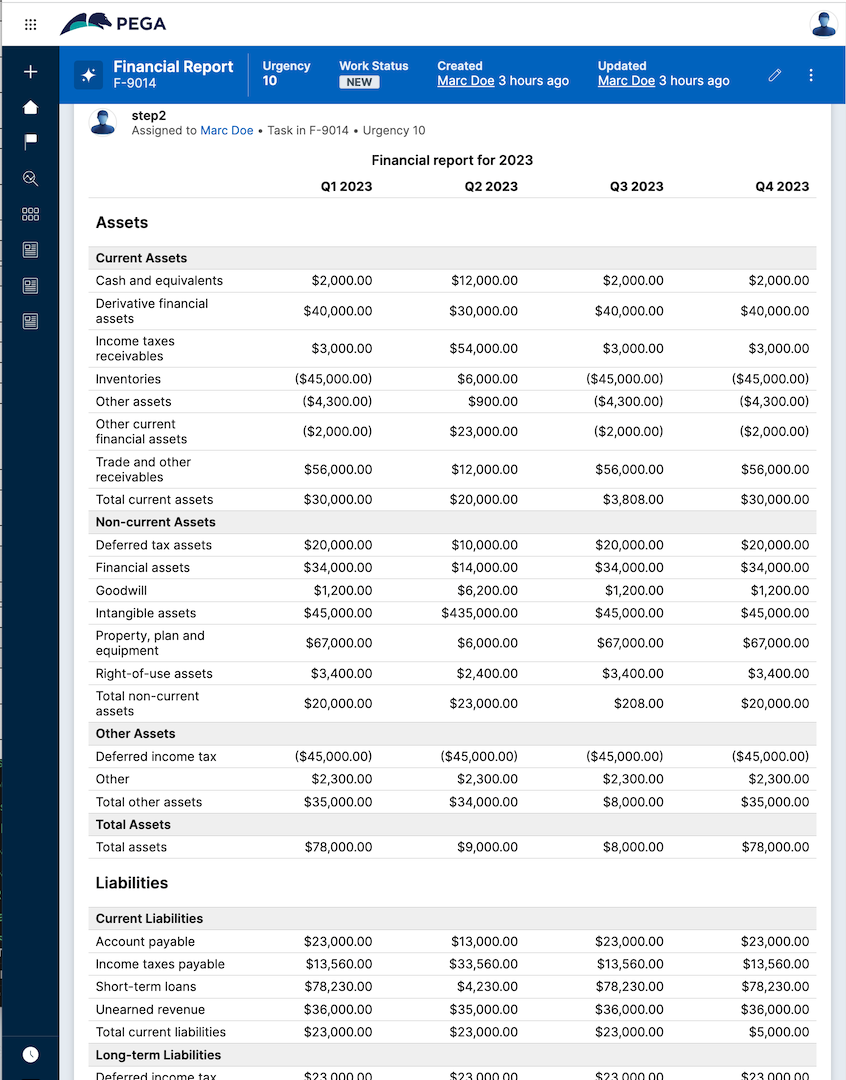
Here is the output of the report. The report uses the financial formatting for the value (using parentheses for negative numbers), will show 2 types of categories (for example 'Assets' and 'Current Assets'), and will ensure that all the values are lined up in the same row. This UI is achieved using a regular table markup.
4/ Extending the component for the 'select' use case
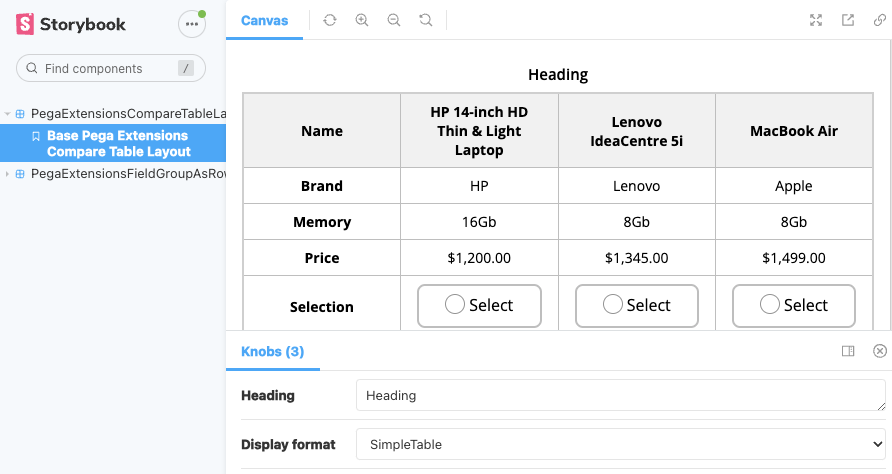
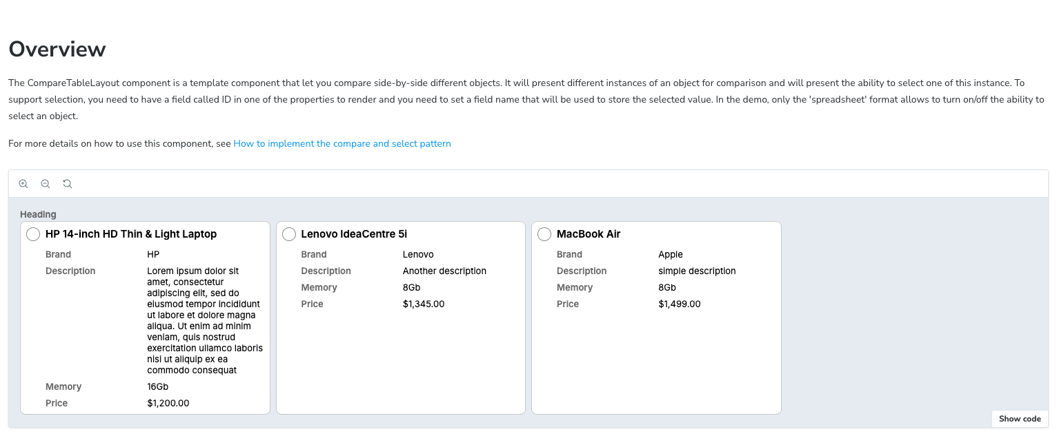
While a financial report is read-only, most of the use cases will require the user to select something - the custom component demo code supports the ability to change the display format to either use a simple table, a financial report, or a radio button as a card - the selection is done by adding a property that will store the selected ID of the case - if this property is set, the component can display a radio-button on the table.
Here is a screenshot of the storybook demo for this component using the 'simpleTable' display format
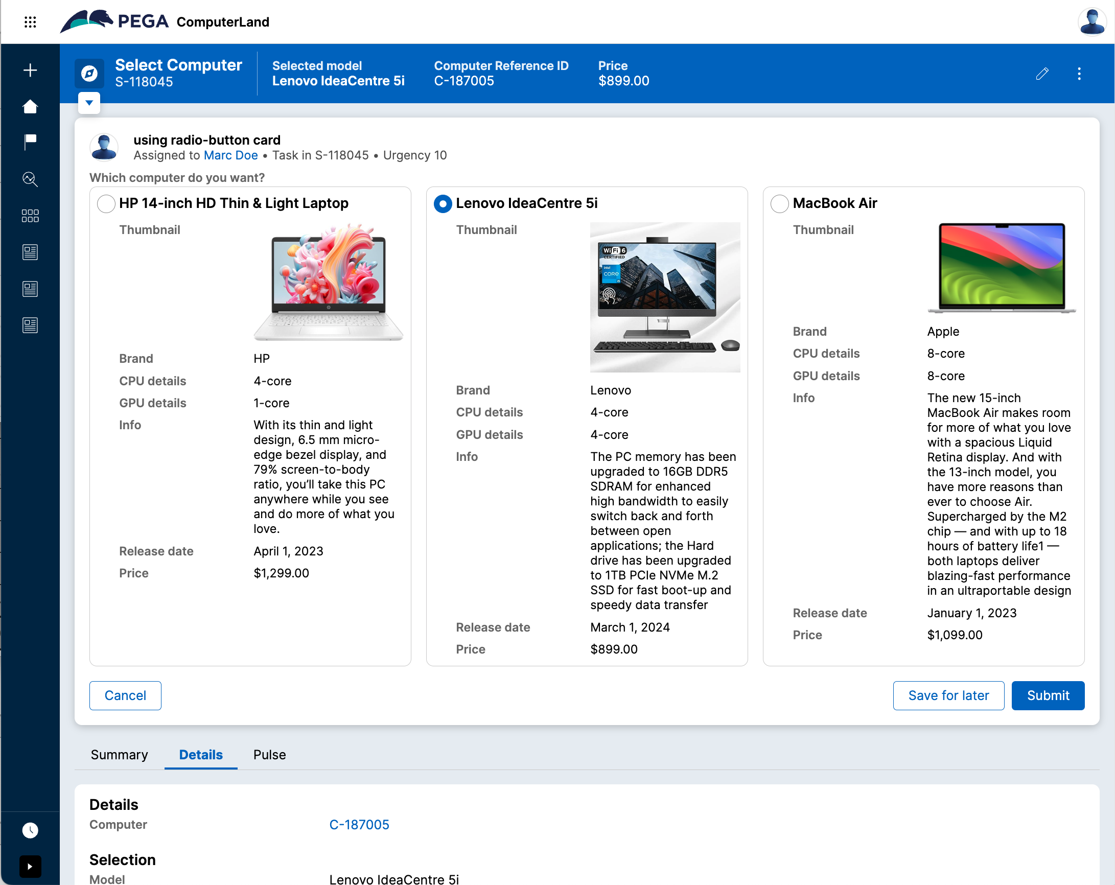
For some simpler use cases, you don't need a table with a lot of rows and a better approach is to show a radiogroup card. You can achieve this UI by changing the displayFormat to 'RadioButtonCard'

Here is a screenshot of this presentation mode in the computer application demo used above:
For more details you can watch the video below.
Important note: This example assumes that you are selecting a case reference. This code has not been tested for other use cases like data reference (either sourced in Pega or externally). This demo is using an hardcoded label to identify which field is the selected field. The code was tested on a Pega Platform '23 only and might not work on newer releases - Make sure to use the correct version of the DX Custom Component tool when using this code on a different version. The code is delivered 'as is' and is provided as an open-source license. If you have questions, feel free to reply to this post.
This post contains both the source of the custom DX components as well as a RAP that you can directly import into your Pega Platform if you don't want to build the custom DX components from source.
Constellation 101 Series
Enjoyed this article? See more similar articles in Constellation 101 series.
-
Likes (17)
Archana Ganesan Venkateswara Reddy Yerasu Sathishkumar Senthilkumar Clare Warburton Mario Batres and 12 More -
Share this page Facebook Twitter LinkedIn Email Copying... Copied!
Capgemini
GB
@RichardMarsot - can you please share the code for data pages and classes as well?
Pegasystems Inc.
US
you can install the demo appllication - it has the case 'select computer' that will show the component https://github.com/pegasystems/constellation-ui-gallery/releases/tag/1.0.9
Knowledge Expert
FR
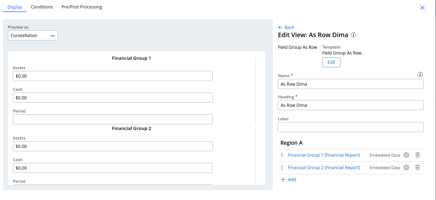
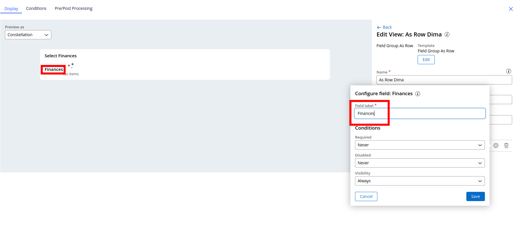
@RichardMarsot , I cannot make "Rendering a field group 'inline' using a custom component" to work
How should I declare properties on the view? I tried to display it as "embedded data", but they still appear stacked.
Knowledge Expert
FR
For some reason it doesn't get split per "Embedded Data"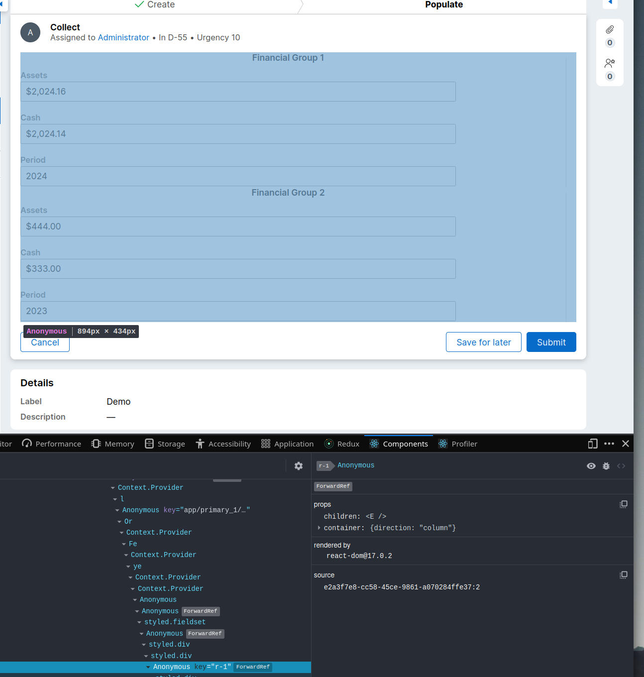
Updated: 12 Jun 2024 0:33 EDT
Pegasystems Inc.
US
you should select the embedded data inside the field group as row template
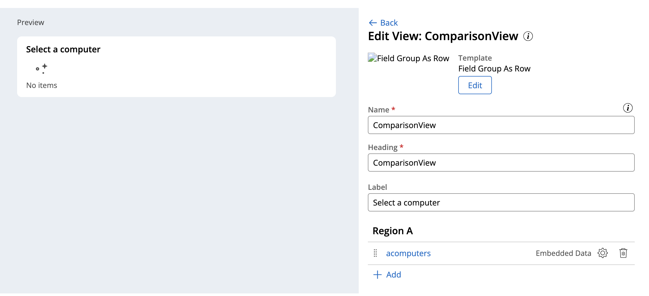
and then select the field group
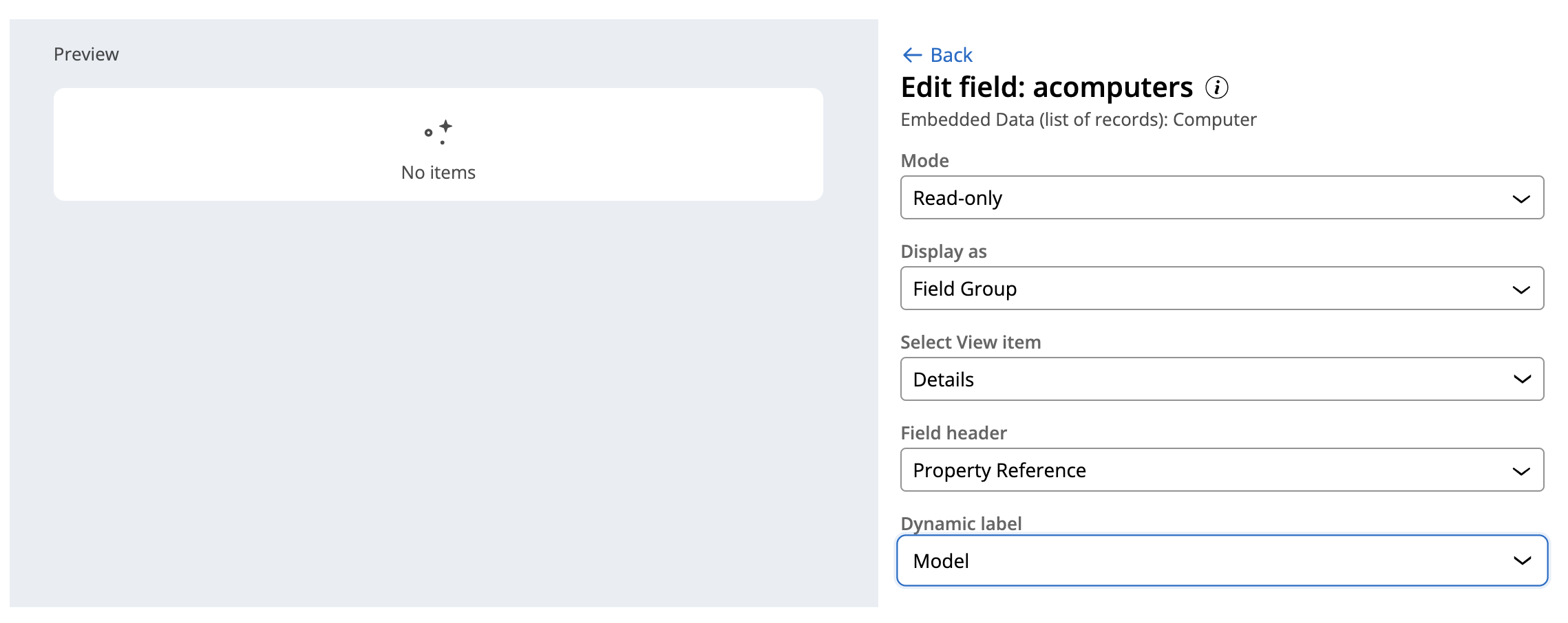
you can install also the demo appllication - it has the case 'select computer' that will show the component
https://github.com/pegasystems/constellation-ui-gallery/releases/tag/1.0.9
-
Dmitry Kolesnikov
Knowledge Expert
FR
@RichardMarsot nice, that worked.
One more question: how could you hide the field's label? It is mandatory and doesn't look nice when enabled
Pegasystems Inc.
US
@Dima K heading is required since you never should see something empty - having said that you can build your own component and remove the heading if you don't want it
Knowledge Expert
FR
@RichardMarsot I understand that a heading is required, but my question is not about the heading, but the field label. I don't see it on your screenshots

Knowledge Expert
FR
@RichardMarsot I am on the latest version available, 24.1
I see that in styles.ts you have style that suppose to hide this label:
Knowledge Expert
FR
I changed the CSS to
Updated: 13 Jun 2024 18:35 EDT
Pegasystems Inc.
US
@Dima K the Constellation ui gallery is currently only tested and supported on 23.1 - yes - the DOM will change in 24.1 and need update to these components - see https://github.com/pegasystems/constellation-ui-gallery/releases/tag/1.0.9 - a new branch will be created to support 24.1 at some point
Updated: 18 Jun 2024 5:22 EDT
Ai4Process
PL
@RichardMarsotDear Richard,
Thank you for publishing this component. As such view is requested and used by almost all clients that sell any products in self-service portals, why it is not being incorporated into OOTB component library? Are there plans to do so?
Since extending table format is not possible we have to do those workarounds to make things done + citizen/business person will not be able to configure those in App Studio - it is simply to misleading (creating something as embedded data, then switch to data reference, flattening the data etc.).
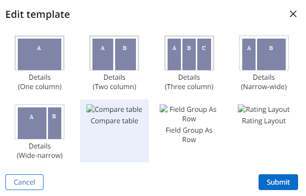
Could you please share how to make Layout icon visible in App studio? From what i see it is not pushed to the Constellation svc.
PS. There is a bug with boolean properties. If we will refer to them in compare table layout the way presented in the post, the view will get corrupted (in Infinity ver. 23.1.1).
Best Regards,
Pawel
Updated: 18 Jun 2024 8:47 EDT
Pegasystems Inc.
US
@Pawel SobolewskiSome of these components will likely be integrated into the product as some point - unfortunately this will take time - making such components as part of the platform requires a more significant effort in terms of authoring ui, testing, documentation... Also these components are available on 23.1 which was released 1 year ago - The benefit of the UI gallery is to showcase what is possible with Constellation DX components and more examples are added every week - If it was only in the product, you will not be able to use these components until you upgrade to the latest version.
Yes we are aware about the icon issue - It is not a great experience but does not affect the functionality - for the boolean, best is to post a bug in the github space.
-
Pawel Sobolewski
Blue Zone Consulting Partners
US
Hi @RichardMarsot, in the video about how to use the component, you mentioned a current limitation when authoring in App Studio where we need to change temporarily the page list property from let's say a Data reference (or Query) to an embedded data, so you can properly configure the fields that appear within the radio button cards. Do you know if this limitation will be addressed in future versions of Pega Infinity?
P.S. I have recently tested with the version 2.x (for Pega '24.1) of this DX component, but I still see that I need to do the small hack of the temporary change of the page list property.
Thanks
Pegasystems Inc.
US
@josenavas no - the limitation around how a query field can be configured has not yet been addressed so you still need to apply this workaround on 24.1 when you configure the component in view authoring.
-
Jose Navas
labb
GB
@RichardMarsot Thanks for the post!
I have imported the components and I'm trying to implement the radio-button cards of the CompareTableLayout, but I've encountered an issue. For some reason if a card contains a long string of text (such as the computer's Info field), the card takes up the full width of the case page, resulting the cards to be displayed ontop of each other rather than next to each other. This also happens when using the views you created as part of your demo.
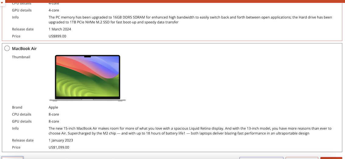
Do you have any idea why this might happen?
I'm on version 23.1.3 and using the 1.0.9 release.
-
Jose Navas
Updated: 12 Sep 2024 19:00 EDT
Pegasystems Inc.
US
@Jens Hoppenreijs you just need to add a little bit of CSS to make sure that the card does not stretch - In the current implementation each card stretch to fill all available content - if you use a grid layout, you can for example limit it to 20rem
see https://github.com/pegasystems/constellation-ui-gallery/commit/fc4d48feea466aec11e34d6e6179866599f9bf0a#diff-7090aa6c30ffe9e9150bbf2d922beecb14b4953c0121773596d8155e8dffe71a for the CSS changes required
The demo has been updated https://pegasystems.github.io/constellation-ui-gallery/?path=/docs/templates-compare-table-layout--docs
-
Jose Navas
Blue Zone Consulting Partners
US
Hi @RichardMarsot,
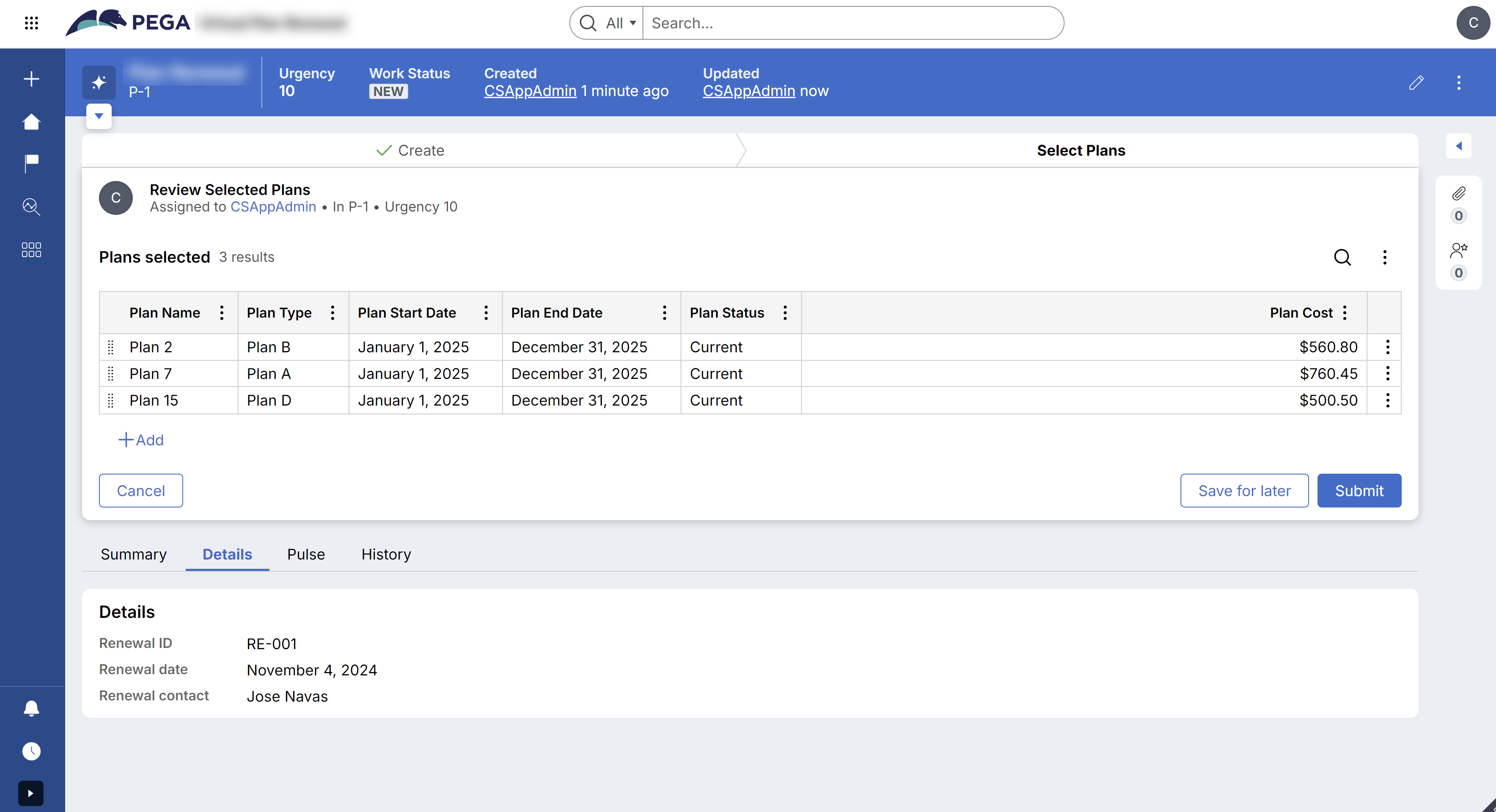
If we want to expand this component to render cards with checkboxes, I think we need to use CheckboxGroup and Checkbox instead of RadioButtonGroup and RadioButton respectively. But I wonder what we need to do regarding the selectionProperty, besides using a list property, can you suggest some hints on how to implement this type of multiple select functionality. Below you can see a picture of the component implementing this multiple select of cards:
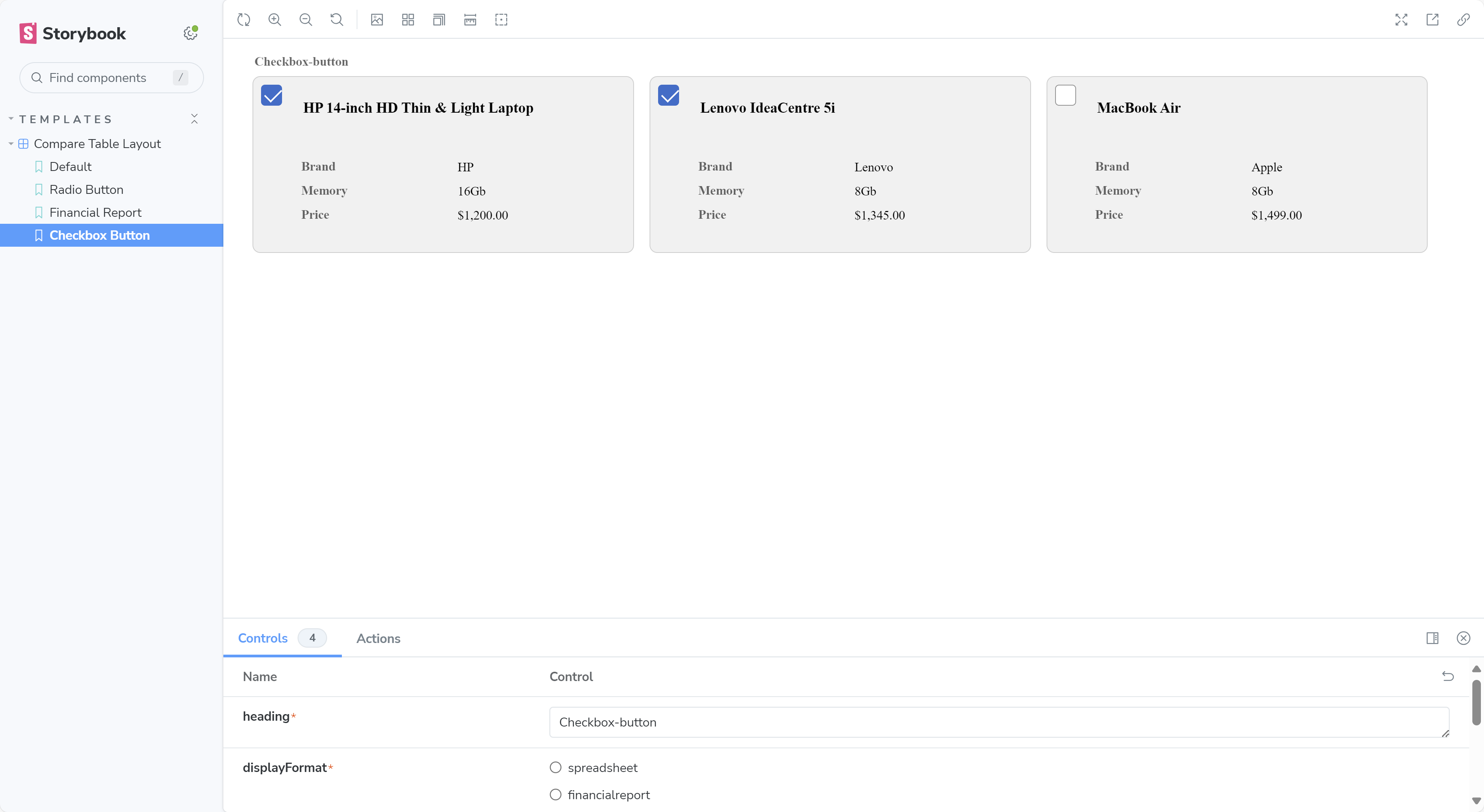
Thank you for your help, this component and the whole constellation UI Gallery has been a good source of inspiration to people like me that since the UI-Kit days we were trying to create enriched UI/UX in our Pega applications.
-Jose
Pegasystems Inc.
US
@josenavassince you need to select multiple cards, you don't have much choice and you to use a embedded data list instead of a single property - the list will contain a pyGUID pointing to the selected data object and will have a isSelected property that will be set to true / false if the card is selected - this is similar to the https://pegasystems.github.io/constellation-ui-gallery/?path=/docs/templates-dynamic-hierarchical-form--docs and the 'selection' of products - you can look at this function for help https://github.com/pegasystems/constellation-ui-gallery/blob/master/src/components/Pega_Extensions_DynamicHierarchicalForm/index.tsx#L98-L123 and run the example using the ComputerLand application
I am glad that you find the example helpful - Don't hesitate to contribute to the github repo and suggest ideas of components that would be helpful - If you can extend the current compare and select to support multi-select and want to share the code, I will review and merge the changes.
-
Jose Navas
Updated: 31 Oct 2024 17:46 EDT
Blue Zone Consulting Partners
US
I have continued working on this component from time to time, and it worked good for me in Pega Infinity '24.1, but recently my company updated our sandbox to Pega Infinity '24.2 and then it stopped working:
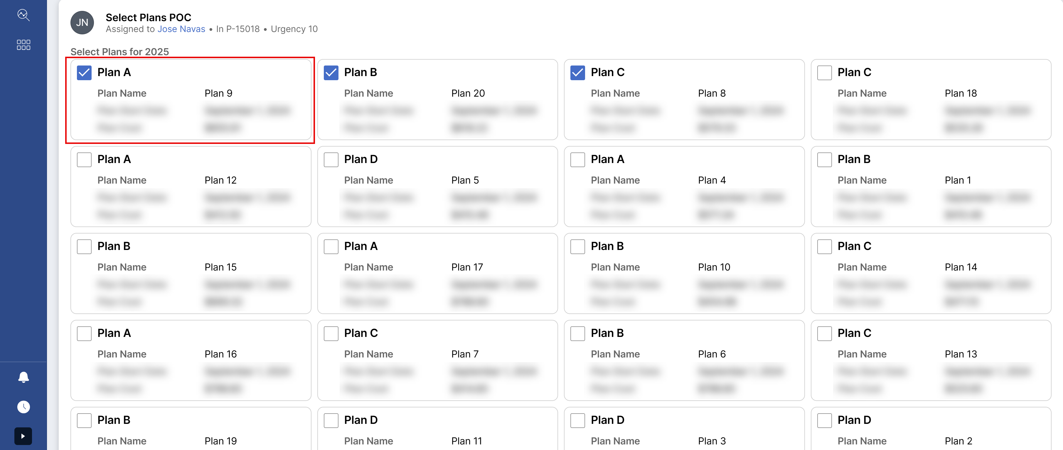
I have tried to debug it today and I noticed the value gets updated in the Redux store (screenshot below), however, for some reason when I change to the next step or screen (where I do a basic filtering of the selected items to a new embedded data list using a preprocessing data transform) the IsSelected property does not appear to be updated at all (all items are false).
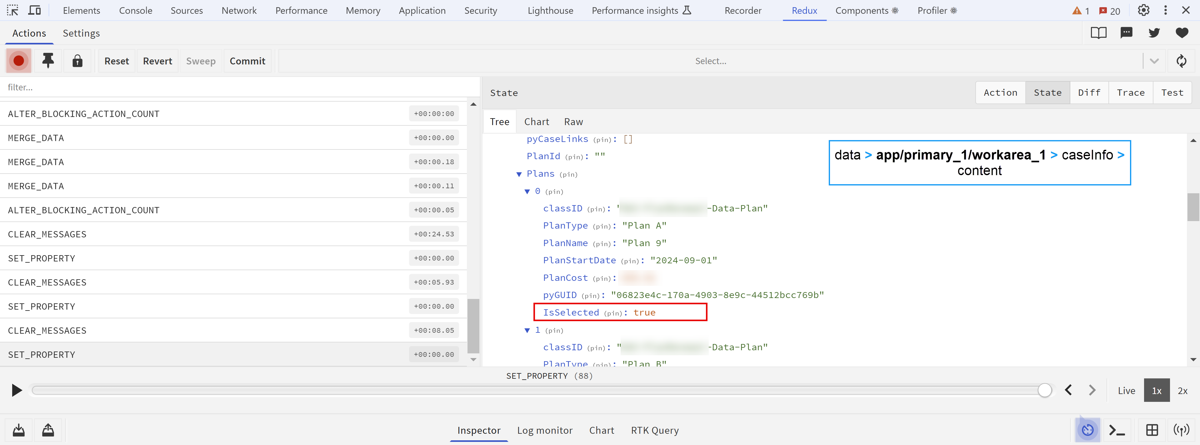
I use a similar function, as used in the component Dynamic Hierarchical Form to update the IsSelected property in the embedded data list:
I have continued working on this component from time to time, and it worked good for me in Pega Infinity '24.1, but recently my company updated our sandbox to Pega Infinity '24.2 and then it stopped working:

I have tried to debug it today and I noticed the value gets updated in the Redux store (screenshot below), however, for some reason when I change to the next step or screen (where I do a basic filtering of the selected items to a new embedded data list using a preprocessing data transform) the IsSelected property does not appear to be updated at all (all items are false).

I use a similar function, as used in the component Dynamic Hierarchical Form to update the IsSelected property in the embedded data list:
const updateObjects = (index: number, IsSelected: boolean) => {
  const messageConfig = {
  meta: props,
    options: {
      context: getPConnect().getContextName(),
      pageReference: `caseInfo.content.${listProperty}[${index}]`,
      target: getPConnect().getTarget()
    }
  };
  const c11nEnv = (window as any).PCore.createPConnect(messageConfig);
  const actionsApi = c11nEnv.getPConnect().getActionsApi();
  actionsApi?.updateFieldValue('.IsSelected', IsSelected);
};
*I added a new configuration prop (App Studio authoring) called listProperty which refers to the embedded data list.
At this point since I don't see any console errors when using the component, I wonder if the update to '24.2 might have broken something for custom DX components in our sandbox.
Any thoughts on this, I will appreciate.
Thank you
-Jose Navas
Pegasystems Inc.
US
@josenavasnote sure what you mean by it stopped working -is the issue a styling issue or a runtime issue?
my recommendation is to rebuild the component using @pega/cosmos-xxx 7.x and check that storybook looks fine - then republish.
-
Jose Navas
Updated: 31 Oct 2024 18:18 EDT
Blue Zone Consulting Partners
US
@RichardMarsot thanks. I will try to rebuild the component and see.
About your question, it should be a runtime or processing issue because as I mentioned in my previous reply, the property IsSelected is not updated in the Embedded data (.Plans) so it never gets appended to .PlansSelected

*Data transform used as pre-processing of the step that follows to the assignment where the custom DX component (compare checkbox) is.
Pegasystems Inc.
US
@josenavas rebuild is likely not going to fix this issue - I would check for any difference is how the props and context is sent to your component after upgrading from 24.1 to 24.2 and what the component is sending as payload when calling the dx api on submit.
-
Jose Navas
Updated: 5 Nov 2024 10:10 EST
Capgemini
GB
Hi Richard
for some reason this widget doesnt work anymore in my demo environment post upgrade to Pega V24.
Select computer layout is coming as blank always.
Kind Regards,
Vishal
Blue Zone Consulting Partners
US
Hi @VishalB8
It works for me, however, I'm running it in stand-alone mode and not as part of the ComputerLand application. You might need to initialize your project with:
npx @pega/custom-dx-components@~24.1 init
and then copy-paste the component source code and rebuild/publish it to your environment.
Regards,
-J Navas
Capgemini
GB
@josenavas I am just using the component in my application only. It was working fine earlier, I got the environment updated to latest version post that its not working. :-(
Kr,
V
Pegasystems Inc.
US
@VishalB8which version did you upgrade? 24.1? If yes, there is a new build of the Constellation UI gallery for 24.1 - I tested recently on 24.2 and it was working fine - there is a temporary branch that is being worked on for 24.2 on github.
-
Vishal Bhardwaj
Updated: 5 Nov 2024 18:13 EST
Blue Zone Consulting Partners
US
Hi @RichardMarsot,
now that you mention the temp branch for 24.2, after having some trouble finding a 24.1 sandbox, I could confirm there is an issue with the PCore/PConnect APIs:

Below you can see the payload in Pega Platform '24.1:
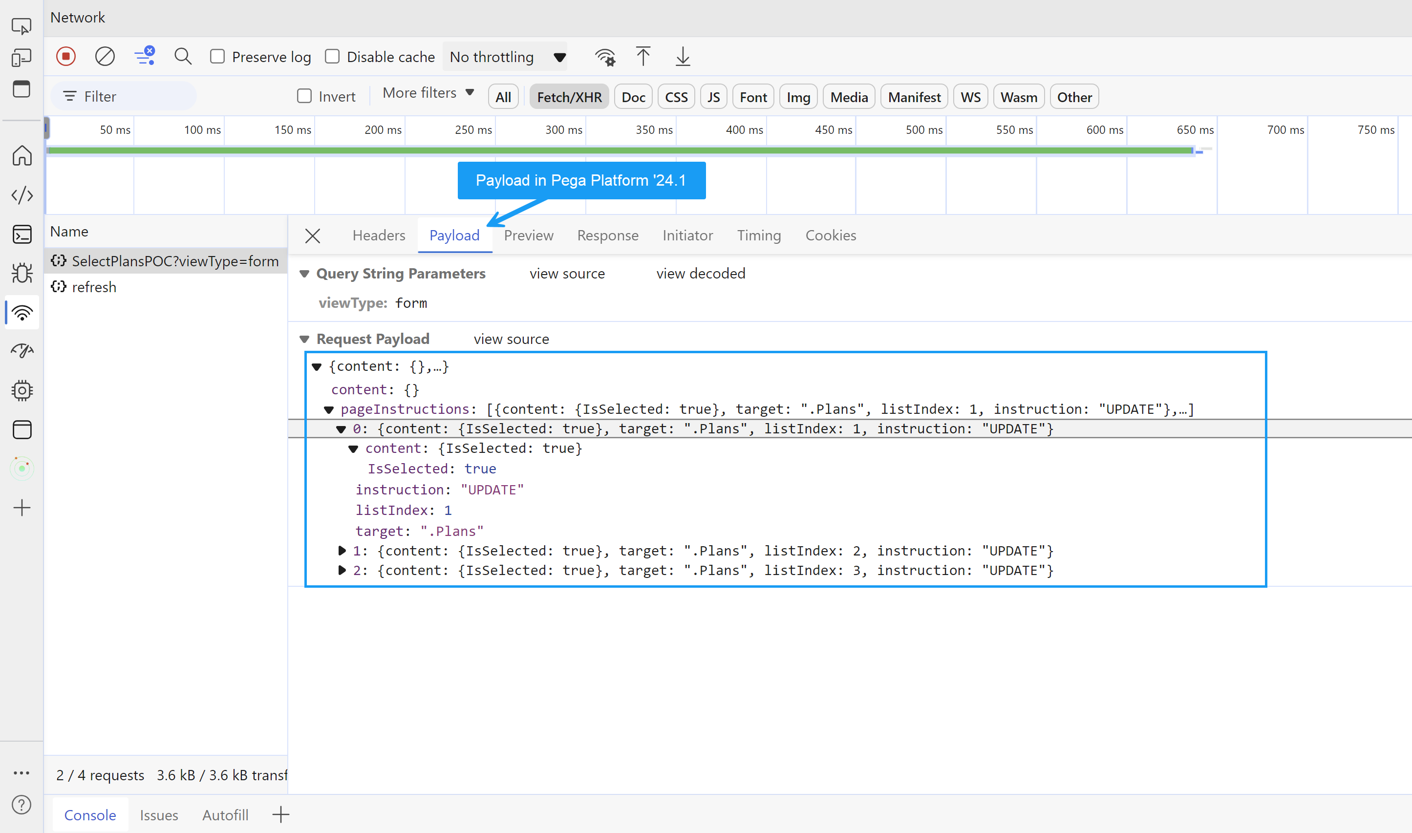
The payload gets properly carried over to the next screen: (as I mentioned this only works in Pega Platform '24.1)
I think something is wrong with the following Actions API expression: (you can see more context in my previous post where I added the full code snippet)
actionsApi?.updateFieldValue('.IsSelected', IsSelected);
Hi @RichardMarsot,
now that you mention the temp branch for 24.2, after having some trouble finding a 24.1 sandbox, I could confirm there is an issue with the PCore/PConnect APIs:

Below you can see the payload in Pega Platform '24.1:

The payload gets properly carried over to the next screen: (as I mentioned this only works in Pega Platform '24.1)

I think something is wrong with the following Actions API expression: (you can see more context in my previous post where I added the full code snippet)
actionsApi?.updateFieldValue('.IsSelected', IsSelected);
Finally, this might be more of an issue with the Dynamic Hierarchical Form component which uses a similar code, but I'm adding it here since both components are somewhat related. Hopefully that gets addressed in the temporary branch, as you mentioned.
Thanks,
-J Navas
Pegasystems Inc.
US
@josenavas A new API has been added in 24.2 that must be called if you want to page instructions to be updated - this is PCore.getContextTreeManager().addPageListNode - see https://github.com/pegasystems/constellation-ui-gallery/blob/master/src/components/Pega_Extensions_Map/index.tsx#L119-L127 - The UI Gallery has been updated to now support 24.2. Hope it helps.
-
Jose Navas
Blue Zone Consulting Partners
US
@RichardMarsot Hi Richard,
Thank you for the update, I will definitely take a look to the PCore.getContextTreeManager().addPageListNode to use the page instructions payload.
Out of curiosity, and if you take a look to my previous snippet for reference (in one of my previous replies):
const updateObjects = (index: number, IsSelected: boolean) => {
  const messageConfig = {
  meta: props,
    options: {
      context: getPConnect().getContextName(),
      pageReference: `caseInfo.content.${listProperty}[${index}]`,
      target: getPConnect().getTarget()
    }
  };
  const c11nEnv = (window as any).PCore.createPConnect(messageConfig);
  const actionsApi = c11nEnv.getPConnect().getActionsApi();
  actionsApi?.updateFieldValue('.IsSelected', IsSelected);
};
Can we control if the updated data gets added to the payload content or pageInstructions? in the POC that worked for me (see screenshot "Payload in Pega Platform '24.1") it got added to the pageInstructions by default, but I'm not sure if we can have control on that.
I will try to find time to test my modified component in 24.2 and see if the payload passed follows what I saw in 24.1 or if it's different.
Thanks,
-Jose
Pegasystems Inc.
US
@josenavas any pagelist object must be added or updated through page instructions and not through content - see https://docs.pega.com/bundle/dx-api/page/platform/dx-api/page-instructions-embedded-pages.html
-
Jose Navas
Bluerose Technologies
IN
@RichardMarsot Thanks for the component. We are giving a different Currency Code in the field UI form. But it always renders USD $ for currencies. Any thing else to be done for that?
Pegasystems Inc.
US
@Srivarshani likely the currencyCode is not passed when rendering the component - in this code- you will need to pass the currencyCode to use https://github.com/pegasystems/constellation-ui-gallery/blob/master/src/components/Pega_Extensions_CompareTableLayout/index.tsx#L75-L81
set isoCodeSelection to 'constant' and currencyISOCode to your code
-
Srivarshani Ramamurthi Jose Navas
HCA Healthcare
US
Can you please explain these
How can developers make sure their custom components keep working when Pega updates to new versions, like from 24.1 to 24.2?
What are the considerations to make if a developer want the component to handle more complicated selection tasks, like selecting items within groups or layers?
Blue Zone Consulting Partners
US
@RichardMarsotHi Richard,
Just wondering if you can create a similar discussion for the Editable Table Layout Constellation DX component. I was trying the component today, but editing does not work for me... also wondering if this component can be used to calculate other columns within the same row? like in the example, you have a column for the computer price, but can we add a quantity and total columns, the latter is calculated from the values in price and quantity.
Thanks,
-Jose N
Pegasystems Inc.
US
@josenavas best would be to create a new discussion - try first the example on 24.2 using the ComputerLand application RAP - the example is in the User Story case type in the Edit task view.
-
Jose Navas
