Discussion
Pegasystems Inc.
US
Last activity: 10 Nov 2025 11:14 EST
How to Implement a card layout with details and avoid business logic in the UI
It is very typical in a customer composite to display a list of policies associated with a customer as a card view and to provide more details when clicking on the card. This document provides best practices on how to implement such UI design and how to remove any business logic for the UI.
Here is a demo of this type of UI:
- each tile represent a data object, like a policy type
- the tile has different styles if active, as well as on hover or focus
- the title should be keyboard accessible and focusable
- on click of a card, some details about the data object is presented - the detail can depend of of the selected tile

To implement such UI, it is important to build it as reusable as possible as well as focus on performance. It is critical to avoid embedding 'business logic' into each section so that the fact that the title is selected or the detail section is not built as a single section with nested layouts and when condition.
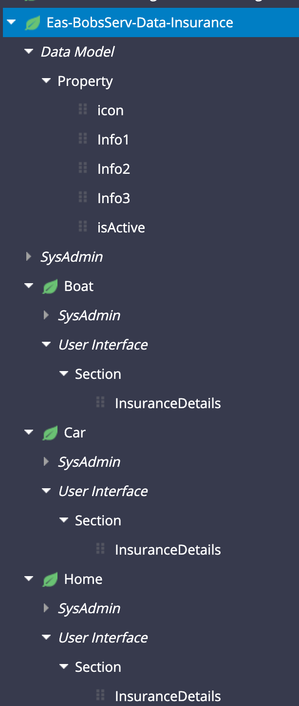
1/ Build the right data model
To avoid putting business logic, it is important to have the right data structure. For this example, we will create a data class object called Eas-BobServ-Data-Insurance and create subclass for each type of insurance. Each subclass will inherit from the insurance Data object.
This structure allows for reuse - you can set the common properties, rules in the Insurance class and keep the specialization in the child classes like the insurance details section that will allow to load a specific section for each type of insurance
2/ Loading the data
we will load the insurance data inside the pyWorkPage - for this purpose we have a Insurance page list of type Eas-BobServ-Data-Insurance. For the purpose of this demo, we will load statically the data using a DT
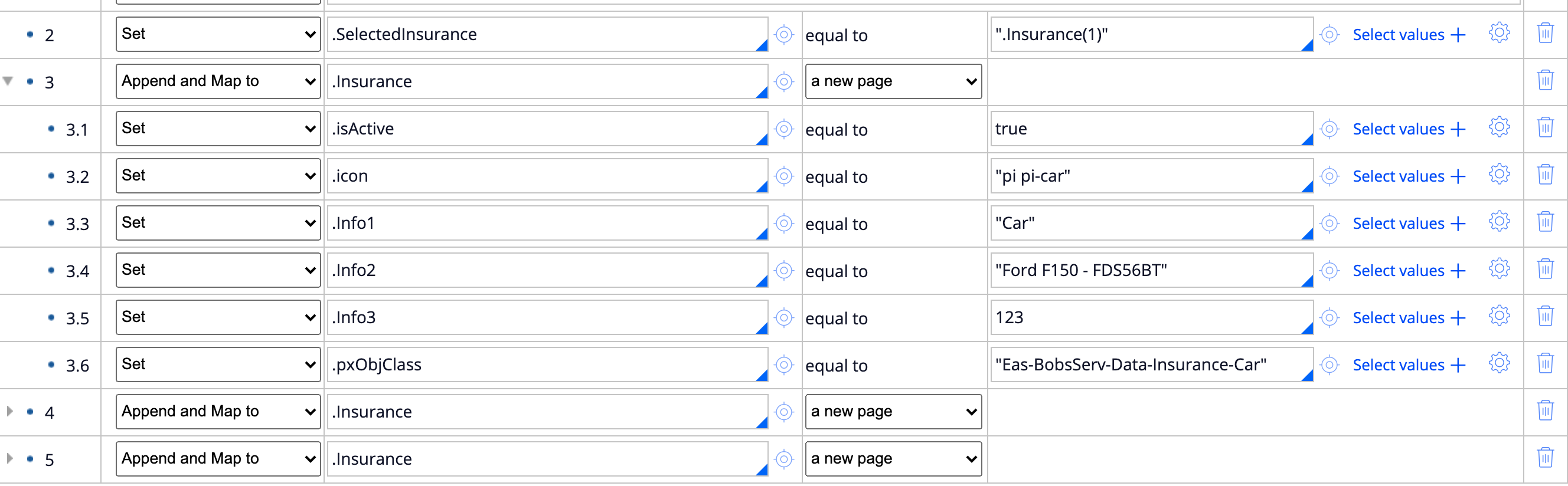
several things to note in this DT:
- a top level property called SelectedInsurance is set to '.Insurance(1)' - it will be updated to determine which title is selected. This property can be set to transient.
- the objclass for each insurance type is overriden with the subclass.
- the icon class associated with the type of insurance is stored as a property
3/ Render the UI
The main section to render the UI is composed of 2 layouts:
- one RDL set at inline that will render the pagelist .Insurance and render each tile
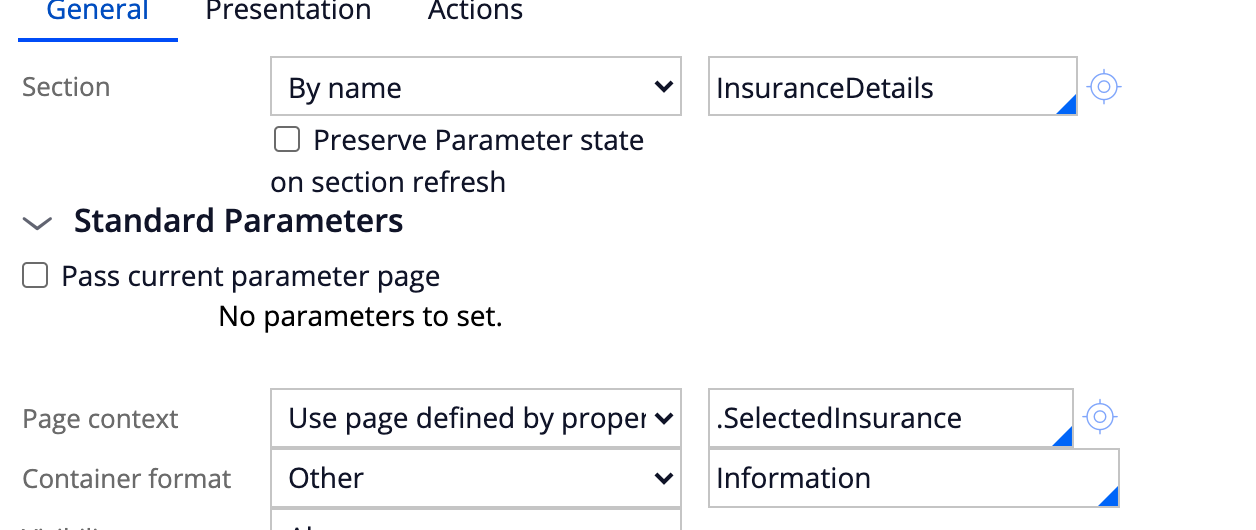
- A section include using a property ref
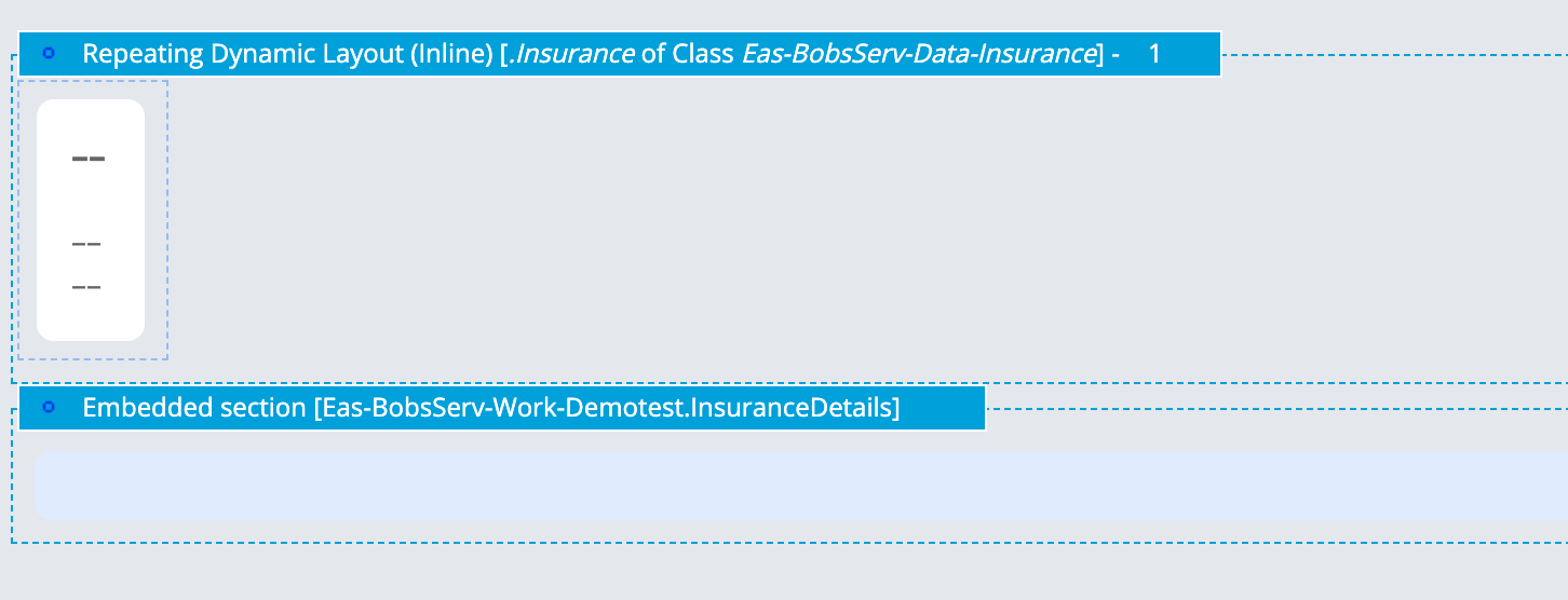
The section inside the RDL is composed of a single simple list layout
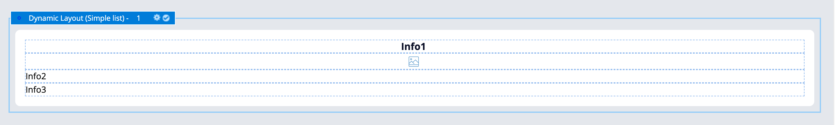
This section uses the .Icon property to render the icon class and is present in the Insurance parent class and shared by all insurance types.
Note: this section could be changed to include instead a section with a design template - the section used inside the RDL will be where the action set is defined, as such it cannot be built with a design template but it can include a section include that will be based on a design template
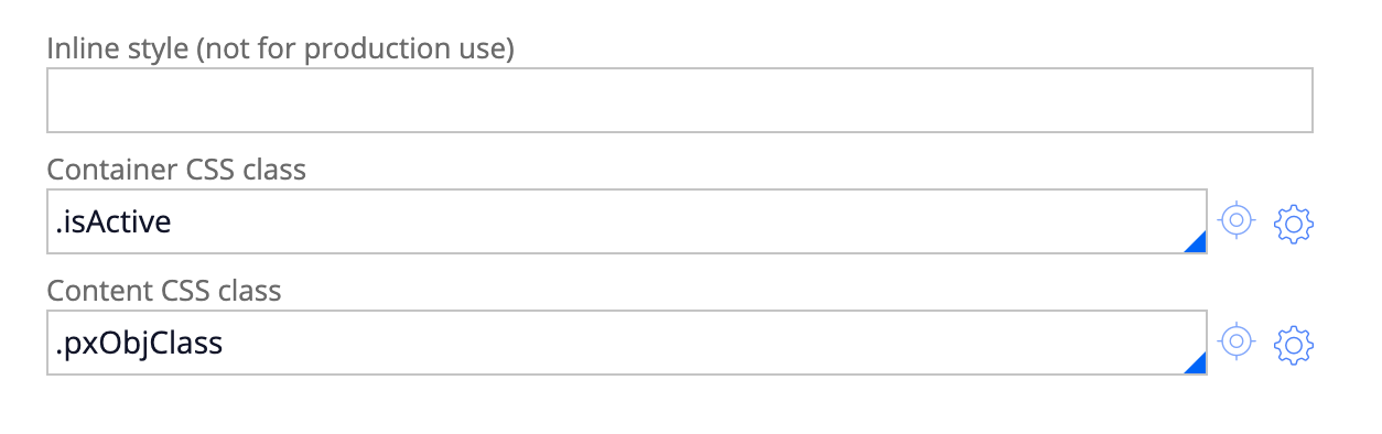
This implementation is very scalable and easy to maintain - there is no when rule to show different style if the card is active or not or depending of the insurance type. This implementation is achieve by setting 2 properties in the helper classes for the content and container - these properties are used to set the state of the card (active or not) and the type of insurance. Because we can only use one property at the time, we use a Default container for the card and use the 2 available helper classes.
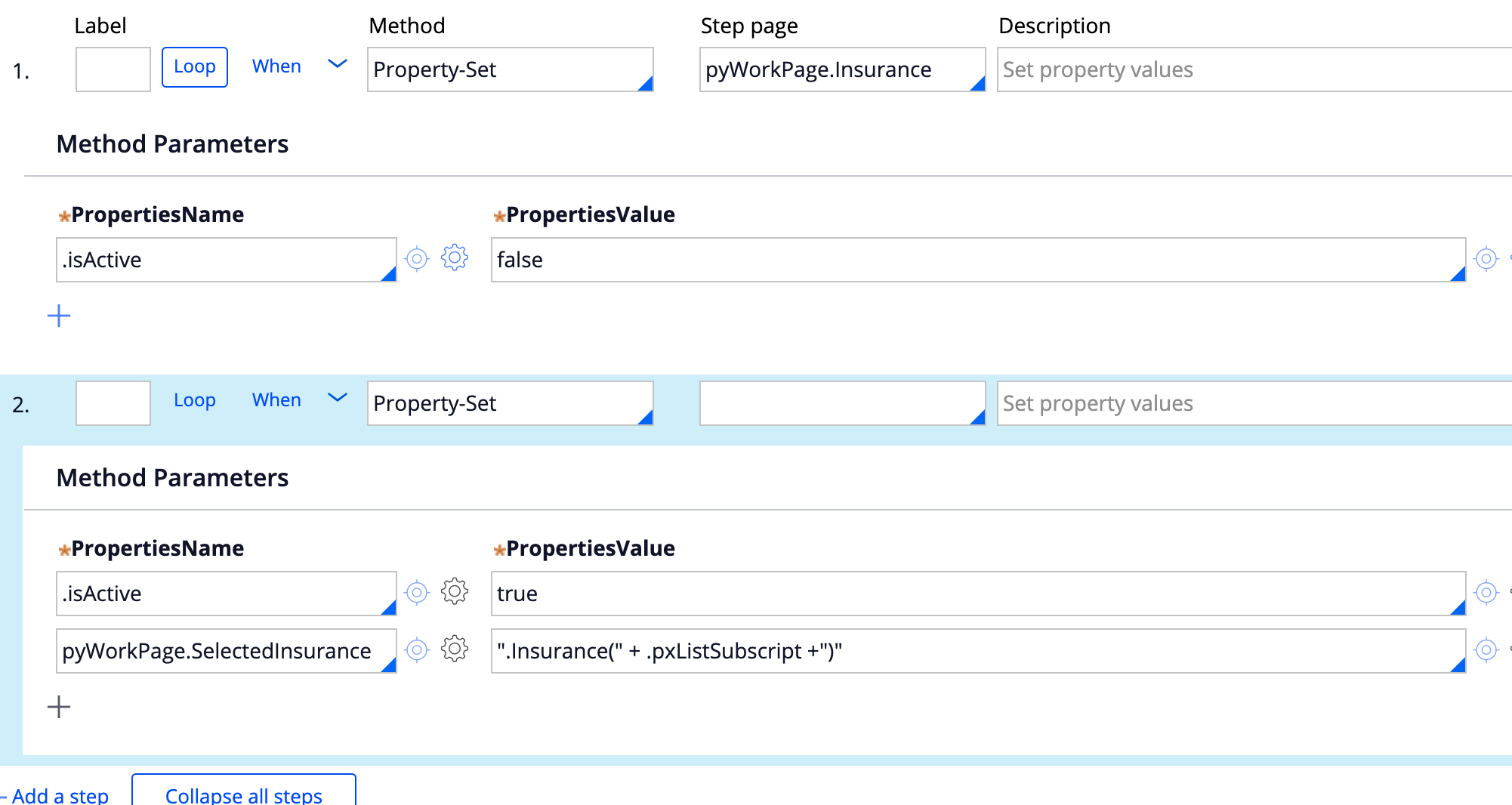
The layout is also set with the action set to show the details - this consist of an activity and a refresh other section
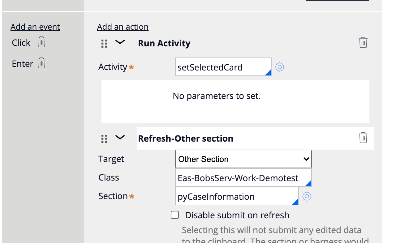
the activity just reset the value of the isActive flag for all the embedded page and then set the isActive for the selected tile. It then update the value of the SelectedInsurance property
Settings the value of this property will render the correct section during the refresh section since the detail section is using a property ref for the using page
4/ Adding the CSS
here is a snippet of the CSS needed to render the example above - it is important to use mixin variables for color so that these selected can be easily maintained and refer to design token defined in the skin ruleform.
.card-insurance .flex.content {
  border: 3px solid #333;
  border-radius:10px;
  padding: 16px;
  text-align:center;
  height:100%;
}
.card-insurance .flex.content i {
  font-size:30px;
  border-radius: 50%;
  border: 1px solid #ccc;
  line-height: 50px;
  width: 50px;
}
.card-insurance .flex.content i:before {
  vertical-align:0;
}
.card-insurance .flex.content:hover i,
.card-insurance .flex.content:active i,
.card-insurance .flex.content:focus i {
 background-color: #f3f3f3;
}
.card-insurance .has-action.true .flex.content.Eas-BobsServ-Data-Insurance-Car,
.card-insurance .flex.content.Eas-BobsServ-Data-Insurance-Car:hover,
.card-insurance .flex.content.Eas-BobsServ-Data-Insurance-Car:focus,
.card-insurance .flex.content.Eas-BobsServ-Data-Insurance-Car:active,
.card-insurance .flex.content.Eas-BobsServ-Data-Insurance-Car .heading_2,
.card-insurance .flex.content.Eas-BobsServ-Data-Insurance-Car i{
  border-color: $mx-badge_good-color;
  color: $mx-badge_good-color;
}
.card-insurance .has-action.true .flex.content.Eas-BobsServ-Data-Insurance-Home,
.card-insurance .flex.content.Eas-BobsServ-Data-Insurance-Home:hover,
.card-insurance .flex.content.Eas-BobsServ-Data-Insurance-Home:focus,
.card-insurance .flex.content.Eas-BobsServ-Data-Insurance-Home:active,
.card-insurance .flex.content.Eas-BobsServ-Data-Insurance-Home .heading_2,
.card-insurance .flex.content.Eas-BobsServ-Data-Insurance-Home i{
  border-color: $mx-badge_bad-color;
  color: $mx-badge_bad-color;
}
.card-insurance .has-action.true .flex.content.Eas-BobsServ-Data-Insurance-Boat,
.card-insurance .flex.content.Eas-BobsServ-Data-Insurance-Boat:hover,
.card-insurance .flex.content.Eas-BobsServ-Data-Insurance-Boat:focus,
.card-insurance .flex.content.Eas-BobsServ-Data-Insurance-Boat:active,
.card-insurance .flex.content.Eas-BobsServ-Data-Insurance-Boat .heading_2,
.card-insurance .flex.content.Eas-BobsServ-Data-Insurance-Boat i{
  border-color: $mx-badge_warn-color;
  color: $mx-badge_warn-color;
}
5/ Making it accessible
It is important that these titles are keyboard focusable - you can look at this article for more details
https://collaborate.pega.com/discussion/how-make-card-click-action-accessible
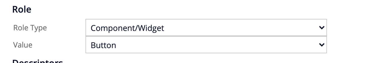
to achieve this, we will set the aria role on the layout as button, and make sure that the action is triggered on key enter and on click.
This implementation is very extensible. Adding a new policy type can be done by
- adding a subclass Eas-Bobserv-Data-Insurance-XXX
- creating the section InsuranceDetails for this insurance type
- populating the data in the pyWorkpage with the icon and other meta data
- updating the CSS to set the color to apply for this insurance type
By avoiding the use of when rules, circumstancing and unneeded layout, it reduced significantly the maintenance.
Pegasystems Inc.
US
shopping cart is a different example and showcase how you can build a cart dynamically by adding / removing items into the cart. It does not provide a detailed view when clicking on an item and does not make sure of section include using page defined by property. There is also no when rule depending of the type of item - this new sample will be added in the ui gallery in 8.6