Discussion
Pegasystems Inc.
NL
Last activity: 26 Sep 2024 4:39 EDT
Video: steps to create a Cosmos DX component
In this post I want to share my experience with creating a DX component that I could use in my Cosmos React application. While the Cosmos React architecture comes with an extensive library of out-of-the-box assets, the framework provides tools for expanding the UI by adding Cosmos DX components.
Important note
Creation of DX components is applicable for professional (front-end) developers in advanced use cases where out-of-the-box components do not meet the user's needs. To create custom components, you need knowledge in Cosmos React development and common development tools, such as NPM and Git.
Cosmos React is designed to address the vast majority of enterprise design workflow needs through out-of-the-box assets. Low-code developers, business architects, and UX designers should not create Cosmos DX components in Cosmos React. Make sure to understand the paradigm of creating the design workflow for Cosmos React before starting to think about solving requirements via the creation of new DX components.
The high-level lifecycle
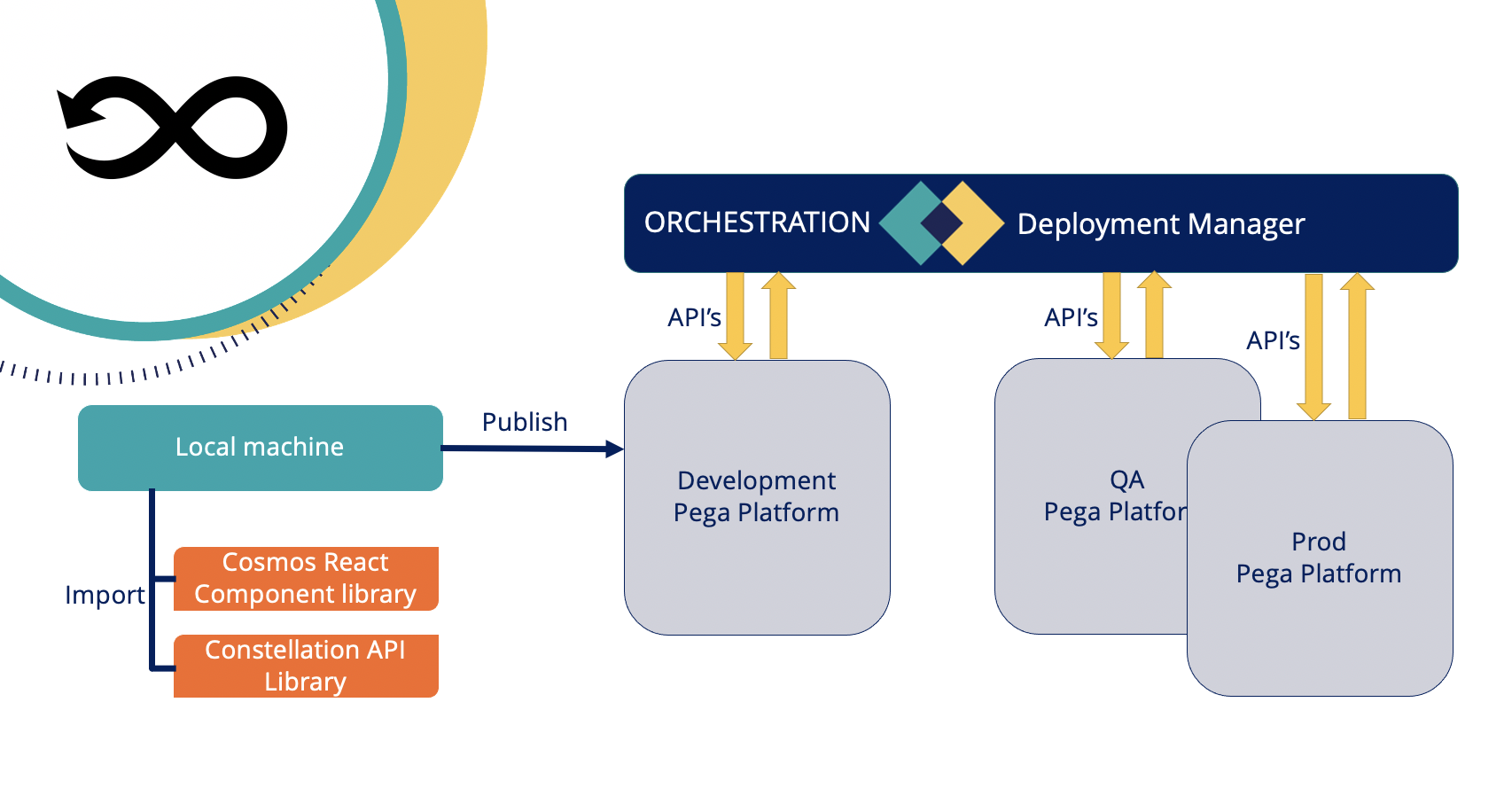
Before watching the video it might be good to see the lifecycle first of the creation of the component. See below picture.
High level you need to create the component locally on your machine. Once that is done and tested you can publish it into your Pega development environment. The DX Component gets created as a rule instance of Rule-UI-Component and needs to be published into an unlocked ruleset. Once it is in the dev environment, you can use your normal practices of deploying to other environments like to use of Deployment Manager.
The video
The video shows all steps that I had to take to create, publish and use the Cosmos DX component. Below the video is a more detailed description of these steps.
Detailed steps
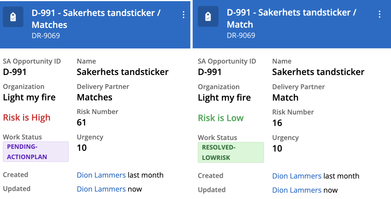
My simple use case was to have a way to change the styling of a Text field based on the value. My app is calculating risk declaratively and when the risk is high is should be marked bold and in red, when its low it should show in green.
Step 1: create a project
You need to have a local project created on your laptop. Before you can do that you have to make sure you have installed Git, NodeJS and NPM installed and that you have access to a Pega 8.7 environment where you have an application that is using Cosmos React.
Run the following command in a terminal window to get the project created.
npx @pega/custom-ui-components initThis will download the required libraries to your local machine that you need for thee creation process and it creates your folders structure. The src folder contains the components folder and there your new components will be created. There are three examples on the initial creation.
Step 2: Create the component
Now that you have the structure you can create a component. This is as easy as running the following command
npm run createIt will prompt you for some data; you can define it is only applicable for one application, multiple or any application you add it to. You also need to name in which library it should be. Make sure that you know what type (and subtype) you want to create. There are three main options:
- Widget: this can be used on a landing page or on some views in the case
- Layout: to create a custom layout for the fields and/or widgets
- Field: to create an interactive UI elements. In my example I have used Text
The command creates a folder in the components folder with the name of the organisation, library and component name. In that structure you can find the following important files:
- The
index.jsxfile contains the actual component rendering logic. - The
demo.stories.jsxfile contains the demo logic that can be viewed in the storybook. - The
config.jsonfile contains the mapping of properties for configuring the auto generated property panel. This property panel appears in AppStudio when an application is being authored to use the custom component.
I have used the following code to create my component:
import { Text } from '@pega/cosmos-react-core';
..
..
switch (value) {
    case 'High':
      return <StyledPePstlRiskTextWrapper><Text variant='h1' status={'error'}>Risk is {value}</Text></StyledPePstlRiskTextWrapper>;
      break;
    case 'Medium':
      return <StyledPePstlRiskTextWrapper><Text variant='h1' status={'warning'}>Risk is {value}</Text></StyledPePstlRiskTextWrapper>;
      break;
      case 'Low':
        return <StyledPePstlRiskTextWrapper><Text variant='h1' status={'success'}>Risk is {value}</Text></StyledPePstlRiskTextWrapper>;
      break;
      case 'Very High':
        return <StyledPePstlRiskTextWrapper><Text variant='h1' status={'error'}>Risk is {value}</Text></StyledPePstlRiskTextWrapper>;
      break;
    default:
      return <StyledPePstlRiskTextWrapper><Text>Risk is undefined</Text></StyledPePstlRiskTextWrapper>; ;
  }
}
Step 3: Test in storybook
Storybook for React is a UI development environment for your React components that is easy to use for testing your component. File demo.stories.jsx has been created for you to use in storybook. You do need to make appropriate changes to that file to assure the right data is available to test for your component. Run the following command in your terminal from within your project folder:
npm startThen storybook opens a browser window or tab and shows all the components that are part of your project. When you are done testing simply hit CTRL C to shut down storybook in the terminal window.
Step 4: Authenticate the user
Before you can publish, list or delete anything to your Pega instance, you first need to authenticate a user to access the resources in the Pega Server.
For this you need to have the clientid and secret for the DX-CustomComponent instance of an OAuth 2.0 Client Registration. If you have dont have it, you need to regenerate this and save that information (and don't forget to save the instance!). Then run the following command:
npm run authenticateYou will be prompted for the server url (https://yourdomain/prweb), the username and its password, and the clientid and the secret.
Step 5: Publish the component
Now that you are authenticated you can start publishing your component to the Pega development server. Use:
npm run publishSelect the component you want to publish, name the ruleset and the version and then the component is created and published to your development server as an instance of Rule-UI-Component. The ruleset must be unlocked and the operator that you used for the authentication must have access to that ruleset. It can be a branch ruleset.
Step 6: Use your component
This is the fun part where you actually get the use your component. In your Pega dev environment go to app studio of your Cosmos React application and depending on the type of component you created, open a landing page or a view and then you are able to select your component. If it isn't showing directly you might want to log out and open a new window.
This is my result: 
Where to find more information?
As this is early adoption work there is not yet a full documentation available on docs.pega.com but that will be available soon. The resource I have used is here: https://www.npmjs.com/package/@pega/custom-dx-components
https://design.pega.com contains a lot of information about what is currently available on the Cosmos Design system. The develop tab shows code samples of how to use the items in the library and what options are available. A very useful resource!
