Discussion
Pegasystems Inc.
US
Last activity: 14 Apr 2017 17:00 EDT
Ask the Expert - Using Skin Rules with Richard Marsot
Join Richard Marsot in this edition of Ask the Expert on Design Rule Forms!
- Follow the Product Support Community's Community Rules of Engagement
- This is not a Live Chat - Richard will reply to your questions over the course of this two-week event
- Questions should be clearly and succinctly expressed
- Questions should be of interest to many others in the audience
- Have fun!
-
Like (0)
-
Share this page Facebook Twitter LinkedIn Email Copying... Copied!
Accenture
IT
Hi,
I have got a problem with UI-Kit:07-01 (Pega 7.2.1)
It seems that the content area is not entirely filled. The same behaviour does not figure out when we use UI-Kit: 05-01
Any suggestion on how to fix? Thank you very much.
Pegasystems Inc.
US
It might because some rules in ui-kit 7 might override or masks some changes in your application (could be CSS override or section override) - The dynamic container should be present in the main area of the screen layout portal and will extend to fill the whole height. To find the root cause of the problem I would try to following steps:
1/ try with the pyCaseworker portal provided in ui-kit 7 and see if this solved your issue
2/ build a new application from scratch using the Application Wizard - you should be using the latest version of UI-KIT - create a simple case and verify that the case it using the full height
3/ check the section used in the main area of your portal - replace by the one used in pyCaseWorker.
Accenture
IT
Thank you, I will try and verify. Another one quick question: is there a way to avoid an iframe object (for pdf view) overlays modal dialogs?
Regards,
Vincenzo
Pegasystems Inc.
US
Vincenzo,
you do not have to use iframe for viewing a pdf: you can use the object/embed tag to view the document - it will require that you have the appropriate pdf viewer loaded.
For example, assuming that you have created a binary rule file called 'testpdf.pdf'
the section in your iframe could either use the following iframe tag to view the document
<iframe width='700' height='700' src="<pega:reference name='pxThread.pxReqBaseURI' mode='literal'/>/webwb/testpdf.pdf" frameborder='1'></iframe>
or you can use the object tag
<div id="pdf" class='pdfStyle' >
<object data="<pega:reference name='pxThread.pxReqBaseURI' mode='literal'/>/webwb/testpdf.pdf" type="application/pdf" width="700px" height="700px">
<embed src="<pega:reference name='pxThread.pxReqBaseURI' mode='literal'/>/webwb/testpdf.pdf">
This browser does not have a PDF viewer installed...</p>
</embed>
</object>
</div>
a similar question was raised last year - see https://collaborate.pega.com/question/custom-pdf-viewer-pega
Accenture
IT
Thank you very much, your answer has been very helpful!
Pegasystems Inc.
IN
Hi Richard,
We have dynamic layout with felxbox in the presentation mode. The dynamic layout looks good in chrome,firefox. But in IE11, the screen got expanded and causing scrollbar at the bottom. When we change the layout mode to inline mode, it is working fine in all the browser. Can you explain why it is not working in IE with flexbox? As IE 11 is popular among enterprise user, we should have this compatible, otherwise pega should not default any new dynamic layout to flexbox.
Thanks,
Saikat
Pegasystems Inc.
US
Saikat,
You are unfortunately facing a known issue with IE11 and flex layout - While flex layouts are the recommended type of layouts when building a new application, it works on all the modern browsers but has a couple of limitations in IE11.
IE11 has some issue rendering correctly flex layout when there is a <table> tag somewhere in your DOM that is parent of your flex layout. see https://github.com/philipwalton/flexbugs/issues/179.
There are 2 typical ways that you can have the 'table' tag and you can easily fix them by following the steps below:
1/ The harness container is adding a table tag
Your harness is likely using a custom header or the old default format - this configuration usually introduced a table tag at the top of your harness. A new option called 'No Markup' was added as a container format for the container. Open your harness rule, open the property panel for the container and select the 'no markup' format. This settings will get rid of any extra markup that was created by the harness

2/ The action area is adding a table tag
Saikat,
You are unfortunately facing a known issue with IE11 and flex layout - While flex layouts are the recommended type of layouts when building a new application, it works on all the modern browsers but has a couple of limitations in IE11.
IE11 has some issue rendering correctly flex layout when there is a <table> tag somewhere in your DOM that is parent of your flex layout. see https://github.com/philipwalton/flexbugs/issues/179.
There are 2 typical ways that you can have the 'table' tag and you can easily fix them by following the steps below:
1/ The harness container is adding a table tag
Your harness is likely using a custom header or the old default format - this configuration usually introduced a table tag at the top of your harness. A new option called 'No Markup' was added as a container format for the container. Open your harness rule, open the property panel for the container and select the 'no markup' format. This settings will get rid of any extra markup that was created by the harness

2/ The action area is adding a table tag
If your layout is inside the case area of a flow, it is possible that you are using an old action area - check if your perform harness is using the pyCaseActionArea and if the section includes pzActionAreaContent – The section pzActionAreaContent uses a free form layout that generates a table markup.
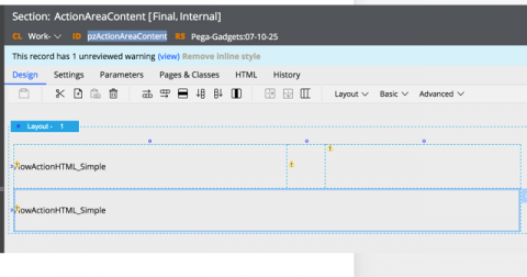
To fix the issue, override pyCaseActionArea in your application, remove the section include pzActionAreaContent and include directly the FlowAction_HTMLSimple.
If you build a new application in Pega 7.2.2 based on UI-Kit 8, the pyCaseActionArea and all the harnesses have been upgraded with these 2 changes. If you are upgrading an older application and want to take advantage of flex layouts, you need to make sure that your DOM does not have any lingering 'table' tags.
Hope it helps !
Pegasystems Inc.
IN
Thanks for the response.. Yes , we are updating our application from pega 7.1.7.
I will try out the changes and update the thread.
-Saikat
Virtusa Corp.
US
Hi Richard,
This has been awaited for long and good to see that we now have a thread running for the Skin rule too.
As I do remember, from the earlier days of Branding Wizard and how we used to leverage BrandingWorkformTemplate HTML Fragments to generate & build the Skin rules (p.s: I have been involved in the Branding Wizard & Cross Browser RTL CSS development, way back in 2008-2009 with Pega). It was always worth trying to generate the extended CSS file using the right property references (ex.: color: <pega:reference name=".pyCSSTextBoxesAndControls.pyExpanded.pyFont.pyColor" mode="literal" />;) from the Branding Wizard in the extended CSS file to ensure the branding wizard values are leveraged to build the custom CSS required to handle the requirements.
Wish we could still leverage the properties in the same way now to generate the skin and ensure it inherits the attribute values from the Skin & Mixins. Any lead on the possibility would be highly appreciated.
Have a few queries about the way the Skin Rule is evolving and the changes we can expect in days ahead
1. When do we expect the extended Flex support in the Skin Rule? I see that this was one of the expected feature as part of 7.2.2, where the Dynamic Layouts were expected to get the extended support for Flex Containers and Flex Items like flex-direction, flex-grow, flex-wrap & other relevant attributes.
2. As of now, we define the Layout type as Flexbox or Inline-Block as a part of the Dynamic Layout definition. What kind of probable impact would this have on applicaiton, once we get the Flex Enhancement in the Skin Rule and the dynamic layouts in the Skin are converted/updated to Flexbox, where as the Layouts in the Section are still marked as inline-block?
3. As we look at supporting mobility & responsive behavior using the same set of sections and skin rule, is there something that needs to be look into with caution while defining a style format apart from the responsive breakpoints to ensure the format defined and the section built is mobile/responsive compliant and works as expected.
4. How can an extended CSS be made maintenance friendly and does not end up being a maintenance nightmare as usually noticed across projects, where the custom CSS is defined as and when needed and this is a probable cause of concern during any upgrade/enhancement to the core application? For ex.: any extended CSS defined for UIKit:04-01 might not work, in the same way when I upgrade to UIKit:08-01.
Pegasystems Inc.
US
Nikhil,
The data model of the skin rule form is very similar to the earlier implementation and uses some of the same object classes like Embed-Skin-Font used in the old branding wizard but the skin rule form is now a full fledge assembled rule form and you no longer have access to the actual data model like most of the other rule forms. An HTML rule like the BrandingWorkformTemplate was difficult to maintain and was too much tightly coupled to the data model making it difficult to change and improve the model from release to release.
While you have no longer access to individual properties, we are adding the capabilities in the upcoming release to refer to mixin settings directly in your override CSS file similar to some well known pre/post CSS processors like SASS or LESS. The benefit is that you can define and manage all your colors, text settings and others using the skin rule and then retrieve the value directly in the override CSS. This feature should reduce some of the maintenance related to override CSS files.
As far as your other questions are concerned:
1/ Extending flex support to the skin rule is something that we are thinking about but is challenging to expose as a set of settings so that any developers can understand and leverage them. flex-direction is actually what is set when you switch between an inline vs inline-grid dynamic layout. flex-grow is better applied to the cell of the dynamic layout. In all recent Pega apps that I have worked on, I have taken advantage of flex using override CSS files. You can for example define this very simple helper class called 'pz-flex-grow-1' that you can set on the ReadOnly/ReadWrite style of a control to make it take all the available space
.pz-flex-grow-1 {
flex:1;
}
2/ Currently the skin generates CSS for both inline-block and flex box so that you can mix the 2 types of dynamic layouts in your application. Once most of the applications are using flex box layouts, we will certainly offer an option in the skin to only generate the CSS for flex layout - That will reduce the amount of CSS generated. Due to IE11 limitations (see above), there is still some workaround needed when upgrading all the layouts to flex.
We are also thinking about providing more tools in the skin to refactor your existing sections. The tool could allow you to rename a format for example or convert your layouts from inline-grid to flex. There is actually an activity currently available in Pega 7.2.2 that allows you to upgrade all the sections in a ruleset and version to flex automatically - the activity is called 'pzFindSections' and you can pass the activity name 'pzConvertInlineBlockToFlex' as parameter. This activity was used to upgrade all the sections in ui-kit 8 to use flex box layouts.
3/ A typical difference between a mobile and desktop app is that the font size is larger on mobile and the size of the control have an increased height. This is not something that can be configured in the skin rule form right now. The recommendation is to implement these changes using override CSS - the pyEndUSer skin in UI-Kit as a file called py-responsive-overrides that implements some of this functionality - I recommend to review this file and add an additional CSS file attached to your skin to add on to this default implementation
4/ when building a new application,I would recommended including the latest version of ui-kit in your stack and have a skin that inherits from pyEndUser. You should not override the CSS files included in pyEndUser in your own application otherwise it will make it difficult to upgrade. All the strategic applications are upgrading to the latest version of ui-kit on every release and it is usually a relatively easy process. If you already have an application running on an older version of UI-Kit, you should be able to upgrade to a more recent version of Pega 7 while keeping the same version of UI-Kit. Upgrading to a new version of ui-kit does not guarantee backward compatibility. This is why ui-kit is always incremented as a major version: we want to provide the best user experience when creating a new application with each release and as such the CSS files and design can be very different from one UI-Kit version to the other.
Virtusa Corp.
US
Thanks a lot for the detailed response Richard. Based on these inputs, I do see a few promising features coming up in the next subsequent releases of Pega.
-
Salonee Dalvi
Infosys
AU
We have a UI requirement where the header portion of the screen layout need to be of varying heights for different devices and even for multiple screens in the same device. How do we achieve this? How can we conditionally vary the header height ? As per the configuration this is fixed.
Pegasystems Inc.
US
If you want to specialize the portal to look different on a mobile device vs a tablet vs desktop, you can circumstance the portal harness. In the example below, you can render a specific portal for a mobile device. You can also use a different property based on the user agent using pxRequestor.pyUserAgent
This is a good option if the design of the portal is very different between mobile vs desktop (adaptive design). Since you can only have one type of screen layout format like header/left/main, this approach works if your screen layout type is of different type for each circumstanced harness

If you want something that is more configurable, with potentially a different height depending on the mobile device device width and length, the best approach is to include an override CSS file in your skin to handle the height changes using something like this:
/* change height of the header for iPhone 6 to 100px */
@media only screen and (max-device-width: 667px) and (-webkit-device-pixel-ratio: 2) {
If you want to specialize the portal to look different on a mobile device vs a tablet vs desktop, you can circumstance the portal harness. In the example below, you can render a specific portal for a mobile device. You can also use a different property based on the user agent using pxRequestor.pyUserAgent
This is a good option if the design of the portal is very different between mobile vs desktop (adaptive design). Since you can only have one type of screen layout format like header/left/main, this approach works if your screen layout type is of different type for each circumstanced harness

If you want something that is more configurable, with potentially a different height depending on the mobile device device width and length, the best approach is to include an override CSS file in your skin to handle the height changes using something like this:
/* change height of the header for iPhone 6 to 100px */
@media only screen and (max-device-width: 667px) and (-webkit-device-pixel-ratio: 2) {
html.iOS .screen-layout > .screen-layout-region-header {
height:100px;
}
html.iOS .screen-layout > .screen-layout-region-main-middle {
top:100px;
}
}
by default, there are top level classes in the html tag to identify a phone/tablet vs desktop and the operating system (iOS vs android)
Infosys
AU
hi Richard , Thank you for your response. We are using something very similar in our custom css but don't think this is enough . However we observe some blank spaces . I guess this is calculating height based on height configured in the skin rule. Do we need to make any additional changes here?
Pegasystems Inc.
US
I would double check using your browser developer tools if some CSS selectors are more selective (or may be used the !important keyword) and would make the media query not apply. Browsers tools can now simulate different user agents and phone device width and height and you should be able to find what is causing these blank spaces.
Accenture
SG
Hi Richard,
I'm facing One issue on UI Gllery in Pega 7.2.2. I have created a Mixin and applied to control Button. After I have created a section in @baseclass and added this button control in to the section. There after created a instance of Rule-Gallery-DemoUnit and referred the previously created section in that. After this when I open the UI Gallery and check this component the styles (given in Mixin) are not reflecting.It is just showing a normal button but the effects or styles I added are not shown.
When the same section I referred in a flow in a case the styles are getting reflected.
Could you please suggest on this why the content added to UI Gallery is not reflecting properly
Pegasystems Inc.
US
The UI Gallery is using a different skin - if you open the harness pyGalleryPage, you will see that it includes an additional CSS file called workform_pyuigalleryskin. This was done so that the look and feel of the UI Gallery is not dependent of your application skin. A lot of developers like using the UI gallery as a starting point; the best practice is to open one of the section example and copy the layout that you want to use directly into your application.
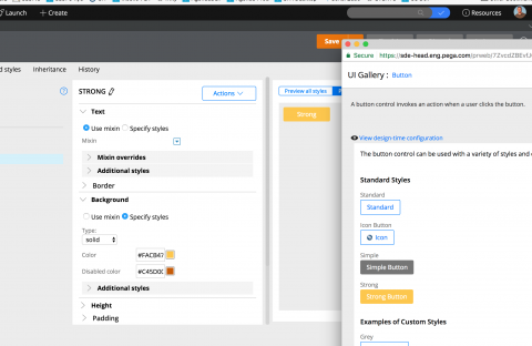
The other option is to use a feature that is not very well known: In your skin, click on the 'Actions' button and select Launch -> UI Gallery Preview. It will use your skin to preview the ui gallery. You can preview any portal or harness using your selected skin in this actions menu

In this example, I have modified the color of the strong button in pyEndUser. The UI gallery reflects the new settings.
The UI Gallery is using a different skin - if you open the harness pyGalleryPage, you will see that it includes an additional CSS file called workform_pyuigalleryskin. This was done so that the look and feel of the UI Gallery is not dependent of your application skin. A lot of developers like using the UI gallery as a starting point; the best practice is to open one of the section example and copy the layout that you want to use directly into your application.
The other option is to use a feature that is not very well known: In your skin, click on the 'Actions' button and select Launch -> UI Gallery Preview. It will use your skin to preview the ui gallery. You can preview any portal or harness using your selected skin in this actions menu

In this example, I have modified the color of the strong button in pyEndUser. The UI gallery reflects the new settings.

Don't hesitate to share your feedback on how we could improve the ui gallery and make it even more useful for all developers.
Cognizant
IN
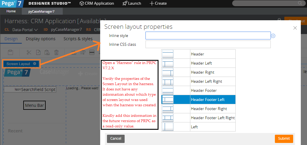
We have a component called Screen Layouts in the skin which allows us configure styles.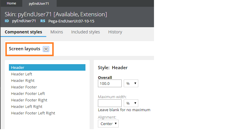
However a harness rule does not reveal enough information about what type of screen layout it has; we have to do some guess work here. Kindly verify the pic below.
Infosys
AU
Hi Richard,
We have same observation, once the screen layout is selected in the harness, we cannot see what is the format of the screen layout.
Thanks,
Binod
Pegasystems Inc.
US
Screen layouts do not support multi-formats in the skin rule form (this is different fromt he other layouts). Since there is only one format in the skin of type 'header left' for example, the preview in the section rule form of the harness should provide enough information that it has a header/left and main - Having said that we will see if we can make this more easy to see in the next releases.
Morgan Stanley
IN
Hi Richard
I have a custom format in my application specific skin, which is being used in several sections.
If i have to move from my format to a new format for some reason like the platform/ui-kit has come up with the format and we don't need our specific skin.
How do i keep track of what sections a format is using?
Is there any bulk way of updating the formats in the application?
Thank You
Pegasystems Inc.
US
Unfortunately there is no tool available right now to find all the sections that contains a component with a specific format. This is not the first time that such feature request is being asked and we will look into adding such capabilities in the upcoming releases.
In the meantime, the best strategy is to do a content search with the format name to find all the sections that are using this format.
Telstra
IN
Hi Richard,
Can you please tell how to start with for achieving UI and UX for some controls as attached image.
Attached image is for TextFields.
Thank you
Pradeep
Pegasystems Inc.
US
Pradeep,
from the screenshot, it seems that you are trying to add an underline under the input field, similar to some of the Google material design. There is a good tutorial on how to achieve similar effect (and much more) using css3 in the following document: https://scotch.io/tutorials/google-material-design-input-boxes-in-css3
Without using custom controls and staying as much as possible in the model, I would use an helper class on the input field that you want to style:
1/ add the helper class 'input-underline' in the RO/RW class of your input control
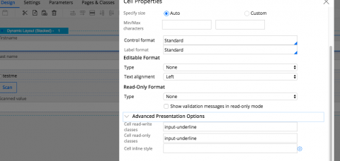
2/ add the following helper class definition in an override CSS file attached to your skin:
Pradeep,
from the screenshot, it seems that you are trying to add an underline under the input field, similar to some of the Google material design. There is a good tutorial on how to achieve similar effect (and much more) using css3 in the following document: https://scotch.io/tutorials/google-material-design-input-boxes-in-css3
Without using custom controls and staying as much as possible in the model, I would use an helper class on the input field that you want to style:
1/ add the helper class 'input-underline' in the RO/RW class of your input control

2/ add the following helper class definition in an override CSS file attached to your skin:
.input-underline > .content-inner > .field-item {
position:relative;
}
.input-underline > .content-inner > .field-item > span > input {
border:none;
}
.input-underline > .content-inner > .field-item > span:after {
content:'';
height:2px;
width:100%;
bottom:-4px;
left:0;
position:absolute;
background: #5264AE;
}
your input field will look like this

the trick is to use the span tag that wraps the input tag and position a relative element using the pseudo element :after to generate the bottom highlight
Hope it helps.
Maantic Inc
US
Hi Richard, we are working to build responsive dashboard skin. Does pega has any benchmark skin for dashboards?
Pegasystems Inc.
US
John Paul,
I am not sure what you mean by 'benchmark skin for dashboard' - can you elaborate a little bit more ? Are you referring to the ability to restyle your dashboard This document contains information about how to personalize your dashboard - see https://pdn.pega.com/quick-start-creating-dashboard-template
Thanks
Pegasystems Inc.
US
Thank you to everyone who posted questions during this session of Ask the Expert, especially to Richard Marsot, our expert on Skin Rule Forms!
This session will be archived for educational purposes. If you have a Skin Rule Form question, please click Write a Post on the right pane.
Thanks again!
