Question
PwC
US
Last activity: 26 Jan 2022 8:14 EST
Building a responsive application to 400% zoom - Pega 8.4 UI Kit
Hi All,
We are currently trying to build a responsive application that is compliant with WCAG AA standards. One of these requirements is that the application is responsive to a width of 320 pixel (400% browser zoom). One of the first issues we see is the screen layout defaults the header to 40px. is there a way to responsively change the screen layout or height of header in skin when changing screen width without building out an entire mobile app?
Additionally, we have some Dynamic Layouts (DL) that contain multiple buttons (8+). In order to make this functional at 320 width, we will be creating a new DL with a menu that contains these options that is visible based on the width of the screen. I see .pywidth is a property in pega but is it possible to reference this in an expression/when statement?
Pegasystems Inc.
US
PwC
US
Hi Rich the WCAG principle we are referring to is reflow requiring the width to be 320 px (or 400% to recreate). When opening the skin and selecting a screen layout, height is defaulted to 40.0 (no units specified) when adding rem for units, I get the error, "40 rem (40.0rem/40rem/40.0 rem) is not a valid double value."
I am assuming that the rest of components in the skin will have to be updated to rems as well.
Additionally, am I going to see a similar issue with the helper classes padding/margin since the 1x/2x refers to 7px/14px?
Best - Britt
Pegasystems Inc.
US
@BrittanyB9949some of settings in the skin are only supporting px - the ones that supports units other than px will provide a dropdown to choose the unit
You can always use CSS override to change the value of height to rem and set a root font-size in the html tag
As far as the WCAG 2.1 reflow requirement, I would recommend to simplify the header
If you are using ui-kit, the caseview page should pass the reflow test if you simplify the header and the details screen
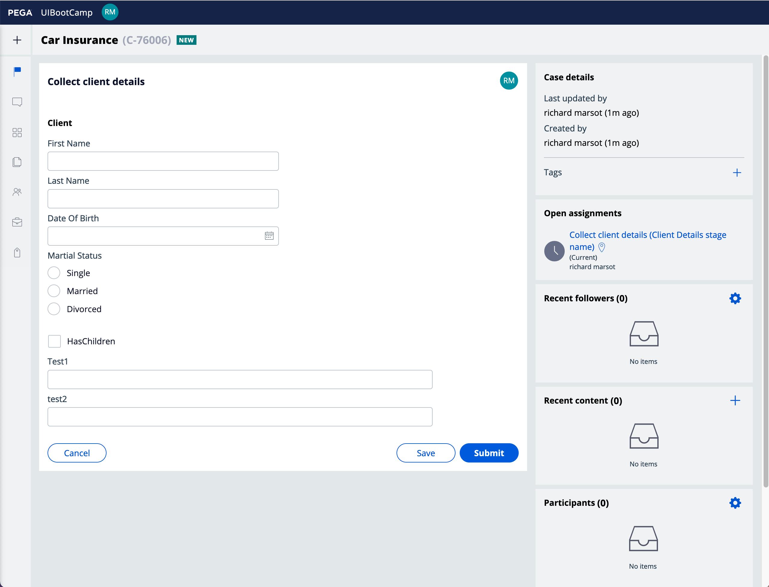
here is a case view at 1280px - 100%
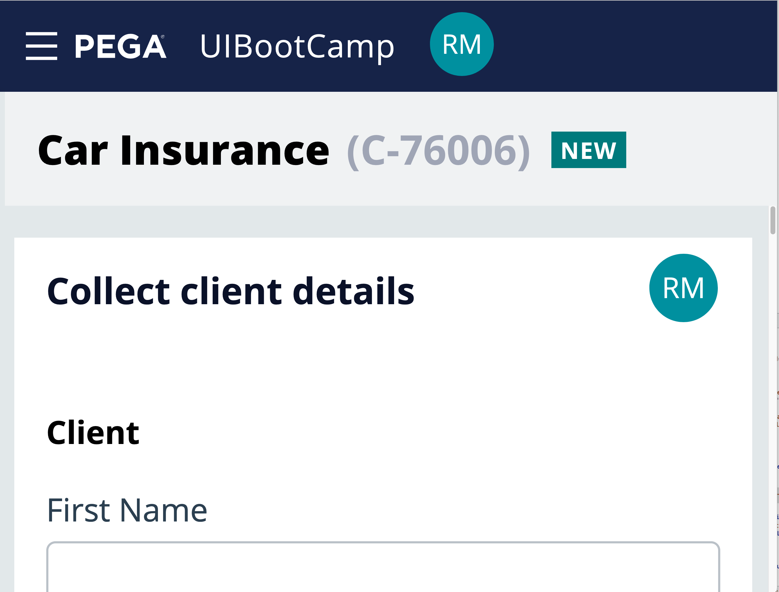
Same case at 400% zoom - there is no vertical scrolling and the hamburger icon will provide access to the navigation
PwC
US
Will override the base settings in the skin with CSS to take care of the height issue. Thanks!
However, simplifying the headers isn't an option for our product at 100% zoom. We would like to create a menu that is visible when the the user zooms in to 400% but that would require us to have 2 headers with visibility conditions dependent on the width. Is there an OOTB property that we can reference for this? I see pywidth but errors occur when its referenced.
Pegasystems Inc.
US
@BrittanyB9949 you should try using a media query based on the max-width of 320px that will hide / show the menu - the zoom is handled on the client side and you cannot use a property and a visible when rule to show / hide elements in a section.
@BrittanyB9949 to be WCAG 2.1 compliant, you only need to handle up to 200% zoom - https://www.w3.org/TR/UNDERSTANDING-WCAG20/visual-audio-contrast-scale.html
to better handle zoom, you really need to make sure that all layouts wraps and that you replace all px units by rem including the height of the header so that the height is proportional to the root font size.