Question
Capgemini
IN
Last activity: 23 Jan 2019 7:15 EST
Difference between Success Rate and Performance in Adaptive Model reports
Was trying to find the difference between the difference between Success Rate and Model Performance in the Adaptive Model reports. However, could not find any information.
Would be great if anyone can provide the description in a little detail.
Thank you!
Viswa
-
Likes (1)
Russel Kuate -
Share this page Facebook Twitter LinkedIn Email Copying... Copied!
Accepted Solution
Pegasystems Inc.
NL
Success rate is about offers/propositions. E.g. percentage of e-mails that were opened, percentage of banners that got clicked, etc. This has nothing to do with a model, it is just a plain relative count of the response to those offers/propositions.
Performance is a measure of goodness of a model. It says something about how well the model is able to figure out who is more likely to open a mail / click a banner, etc. More complicated models often have better performance, and more (and more varied) predictors also often contribute to better performing models.
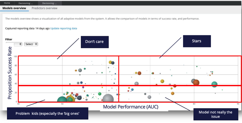
The "bubble chart" in the ADM monitoring page nicely puts these together in one plot. On the y-axis the success rate (of the propositions), on the x-axis the performance (of the models). Assuming a 1:1 relation between propositions and models, this gives immediate insight in which propositions are performing poorly and may need attention, and which models are performing well or not so well (and may need attention too, but from other people and for other reasons).
Hope this helps
Pegasystems Inc.
IN
Hi Viswa,
This article should help you understanding the difference:
Accepted Solution
Pegasystems Inc.
NL
Success rate is about offers/propositions. E.g. percentage of e-mails that were opened, percentage of banners that got clicked, etc. This has nothing to do with a model, it is just a plain relative count of the response to those offers/propositions.
Performance is a measure of goodness of a model. It says something about how well the model is able to figure out who is more likely to open a mail / click a banner, etc. More complicated models often have better performance, and more (and more varied) predictors also often contribute to better performing models.
The "bubble chart" in the ADM monitoring page nicely puts these together in one plot. On the y-axis the success rate (of the propositions), on the x-axis the performance (of the models). Assuming a 1:1 relation between propositions and models, this gives immediate insight in which propositions are performing poorly and may need attention, and which models are performing well or not so well (and may need attention too, but from other people and for other reasons).
Hope this helps
-
Pradeep Yarlagadda Krishna Chaitanya Paruchuri
Capgemini
IN
Thank you Otto! That helps clear my doubt. I think Model Performance was clearly explained in the course but since the chart showed both performance and success rate, I needed more clarification.
Pegasystems Inc.
NL
Otto's explains it well, just to elaborate on this, let me add some context on what the rationale is behind this dashboard - that we informally sometimes refer to as the starry night report.
The idea is that it let's you monitor hundreds of models or more in one go, and in context, and also is geared towards particular interventions you might want to take.
You could imagine that there are 4 quadrants in this report:
- Stars: no real action required, these decisions have a high success rate (for example if these are NBA recommendations, high accept/click rate etc) and the models also have good quality (high Area under the Curve (AUC)).
- Don't care: whilst these models are low quality, fixing that has lower priority as the propositions have a high success rate anyway.
- Bad propositions: bottom right quadrant - these propositions have low success rate, but the models are not the issue as the model quality/performance is high. So typically this is then not the data scientist problem, but a decisioning problem. For example if the propositions are offers it means that accept rates are low, even though we can well identify who is more likely to accept the offer. This might be more common than you think, and means that the proposition should be a serious candidate to be removed from the proposition set. It may also be a symptom that in the Decision Strategy the analytical targeting gets overridden to much by other factors (other weightings in the Priority calculation, hard rules) so it should be questioned whether thats done for the right reason
- Problem Kids: the name says it all, these are the real problem kids as success rate is low and model performance is low. From a data science point of view actions could be taken to see if the model performance can be improved. If the bubble is small, it means the model hasnt seen much data (outcomes) yet, so 'starting evidence' could be increased (or other weightings) to force it get's offered a but more to learn and 'prove itself'. Big bubbles are the real question marks and should be approached both from a proposition management and data science angle. From a data science point of view you could think of making additional 'candidate' predictors available to to the model.

Pegasystems Inc.
NL
-
Mary Carbonara Becky Blackwell Rosemarie Biacolo Brendan Horan Vamsi Kandivalasa
