Discussion
Pegasystems Inc.
PL
Last activity: 2 Apr 2025 5:20 EDT
Overriding components

This article is part of series of articles named Constellation Flexible UI. Please check table of contents: https://support.pega.com/discussion/constellation-flexible-ui

Please refer to github repo to consult source code of project: https://github.com/kamiljaneczek/Sweet-Life-Pega
In previous article we successfully used MashupAPI to render a Pega case. Till now case was rendered using look and feel from Material UI the default UI library for SDKs, it is time to change it. Whole purpose of this series of articles is to render Pega case according to custom design system chosen by client. In our example the design system is Delight Design System using shadcn components https://ui.shadcn.com/ styled with https://tailwindcss.com/ . To to implement it we need to abandon the believe that there is some kind magic behind mashup API. Here is how it works:
- SDKs implemented feature called Component Map, which is responsible for dynamic loading of appropriate components
- SDKs provide sample implementation of components using Material UI
- Those components will be picked up by Component Map from the node_modules package
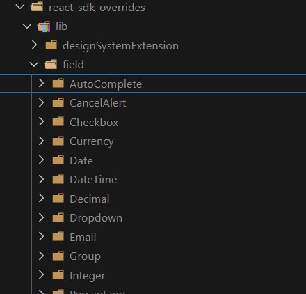
- to overwrite those components you can run
npm run overrideor
npm run overrideAll- those commands will copy components from node_modules and insert code that can be overridden to you application folder
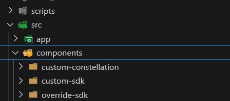
- additionally sdk-local-component-map.js file gets updated to point to overridden components residing in your codebase
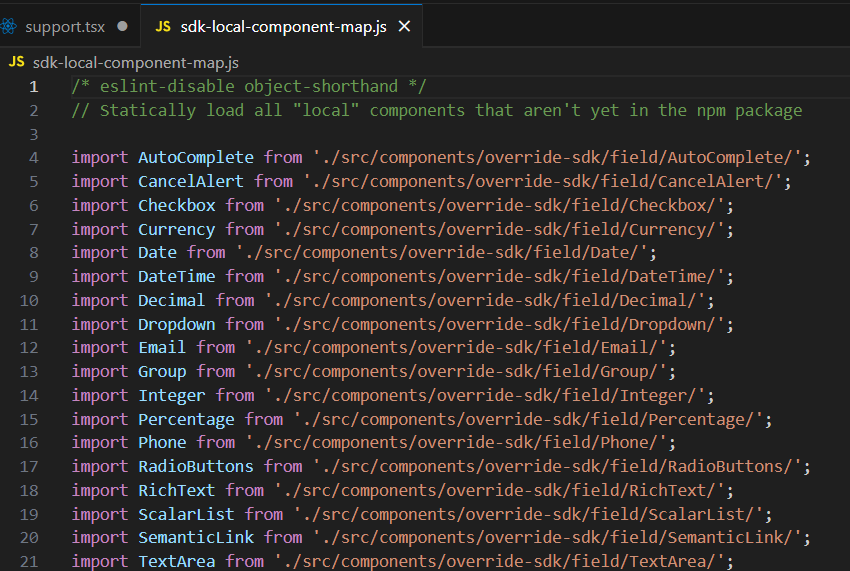
From now on you are able to override component and implement UI and UX of your choice. To start gradually migrating, component by component, SDKs implemented logging mechanism that tells you which component is being used when you interact with application. Quite handy tool to identify components that you need to work on!
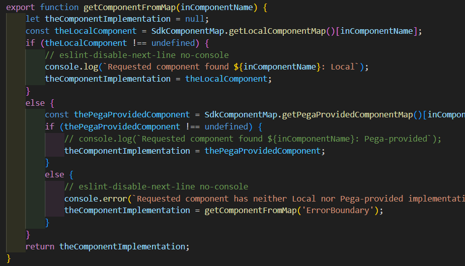
Investigate browser console to see the log
sdk_component_map.js:84 Requested component found Todo: Local
sdk_component_map.js:84 Requested component found AlertBanner: Local
sdk_component_map.js:84 Requested component found AssignmentCard: Local
sdk_component_map.js:84 Requested component found MultiStep: Local
sdk_component_map.js:84 Requested component found ActionButtons: Local
sdk_component_map.js:84 Requested component found Assignment: Local
sdk_component_map.js:84 Requested component found Todo: Local
sdk_component_map.js:84 Requested component found AlertBanner: Local
sdk_component_map.js:84 Requested component found AssignmentCard: Local
sdk_component_map.js:84 Requested component found MultiStep: Local
sdk_component_map.js:84 Requested component found AssignmentCard: Local
sdk_component_map.js:84 Requested component found ActionButtons: Local
sdk_component_map.js:84 Requested component found Assignment: Local
sdk_component_map.js:84 Requested component found Todo: Local
sdk_component_map.js:84 Requested component found AlertBanner: Local
sdk_component_map.js:84 Requested component found AssignmentCard: Local
sdk_component_map.js:84 Requested component found MultiStep: Local
sdk_component_map.js:84 Requested component found AssignmentCard: Local
The flow of work described is called component based development, and it is a majority of a developer work when working with SDKs. SDKs abstract underlaying complexity so that team of front-end developers can focus on creating and styling components.
Let's see example of overwritten component. The simplest example is to take TextInput. So let's take a look on default implementation that uses TextFIeld from Material UI.
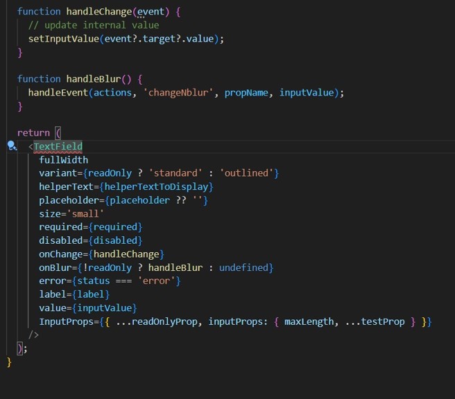
Our job here is to remove the dependency to component from Material UI and use **Input** component from shadcn: https://ui.shadcn.com/docs/components/input
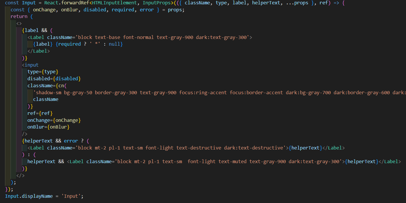
Input component from shadcn is pretty basic. It doesn't support helper text. We also need to use other component to have field label: https://ui.shadcn.com/docs/components/label. This is exactly kind of the work that needs to be performed with every component:
- analyze ootb Constellation capabilities in regards to given UI component
- consult how it was done in SDK using Material UI
- see how we you can reimplement it with help of DS and ui library that we have chosen
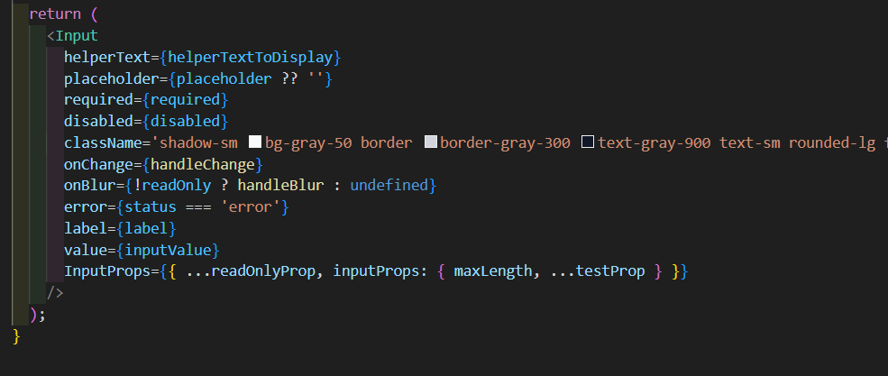
Here is how it is implemented in sample app that we build. We import Input component:

Then we pass props to it:
and here is how we override default shadcn Input component to support mentioned feature (i.e helper text)
Tip: Overriding infra components
You can override them, but if you do then there is no automatic upgrade path. You will need to manually merge in all of the changes you made in the infra components. You also have to add the component manually to the component map file. Suggestion is that you don't manually override infra components. But you can if you're prepared to take on the maintenance overhead.
Tip: Hardcoded references to components
When overwriting some component you will notice they are referencing other components. make sure you update those reference to your overridden versions

Use component map for this.

