USER INTERFACE - OOTB BANNER HELPER CLASSES IN PEGA 8.5
Feature: New banner helper classes to achieve the standard banner UI designs.
Availability: By default, we are shipping OOTB for the following applications in Pega 8.5.
- UI-Kit
- Theme - Clarity
- Theme - Cosmos
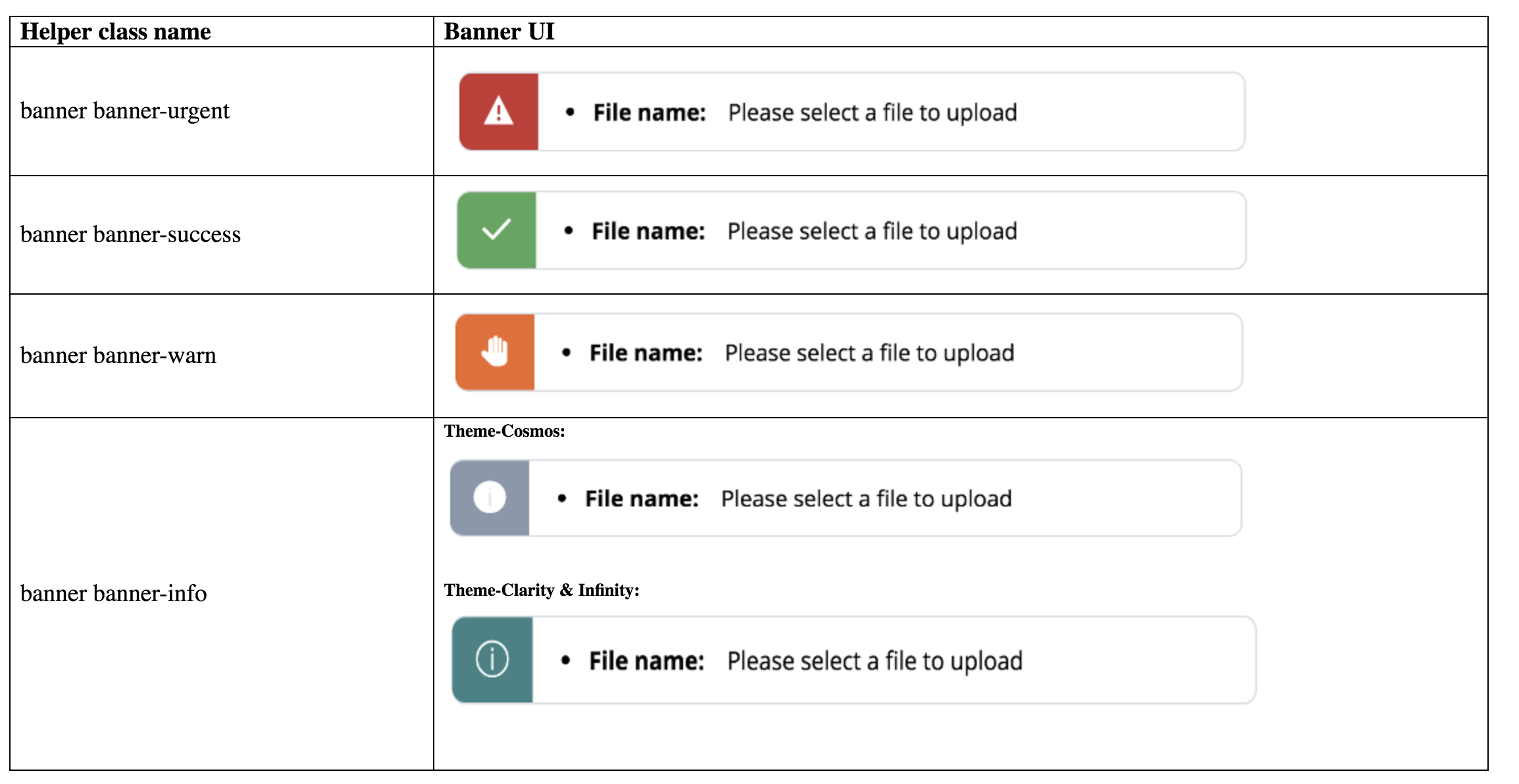
Helper Classes: When applied the following banner helper classes, respective icons, and background color are shown by default.

Usage:
Step-1: Drag and drop a Dynamic layout and apply any banner helper class from the helper class picker as per the business requirement.
[Fig 1: Empty Dynamic layout with inline layout format and default container format]

[Note: Adoption Teams can change the layout format to default if required to show the error list in stacked mode or any other format as per the business requirement following the best practices ]
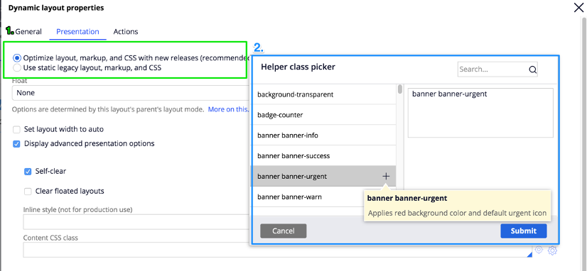
1. Go to the dynamic layout presentation tab and check the “optimize layout” checkbox.
2. Click on the “Display advanced presentation tab” checkbox and click on the gear icon in the “content CSS class” and select “banner banner-urgent” from the helper class picker.
[Fig 2: Dynamic layout presentation tab settings ]

Step-2: Drag and drop related section or any message etc.. in the Dynamic layout, we have created in the above step.
[Fig 3: Message inside the Dynamic Layout]

[Note: The message can be anything as per the business requirement]
 |
- Apply flex-align-center padding-l-1x Helper class to the message element such that it will align vertically center and spacing to left.
[Note: Helper classes applied in the above screenshot can be anything as per the UI requirement]
Click on save and run the UI.
[Fig 4: Banner component with banner banner-urgent helper class]

Congratulations: You have successfully applied the banner helper class.
Step-3[Optional] :
App teams can have a close icon and CTA as shown in the below screenshot.
This is similar to step-2, drag and drop close icon or any CTA(Button or Link) item and apply helper classes to achieve the UI.
- Close icon: This is used to dismiss the banner when the user clicks on it. Action set should be taken care of by the Adoption teams and it should be aligned to the top right corner.
- CTA (call to action): CTA can be used to trigger any action when the user clicks on it.

