Discussion
Pegasystems Inc.
US
Last activity: 20 Jan 2023 23:07 EST
How to customize the date picker overlay
When you configure a date or datetime property, the default display mode is to render the date as an input field and to display an overlay when clicking on the calendar icon to pick a different date.
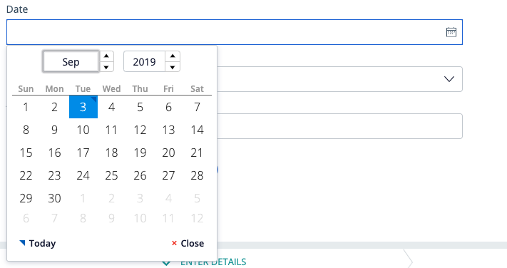
The date picker overlay that is provided out of box provides a lot of configuration options including the ability to set the range of years to display, the number of weeks in the calendar... You can also restyle the overlay with some CSS if needed.
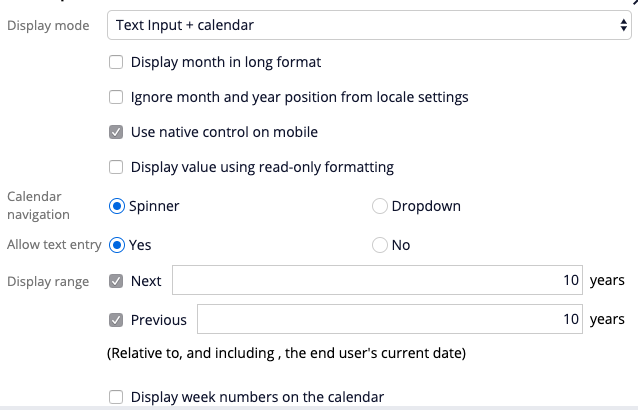
The purpose of this article is to demonstrate the different ways you can customize this overlay and provide a different picker while using the same auto-generated text input control. Overriding the default behavior of the text input for a date property is much more flexible than creating a new custom control because it will be possible to reuse existing sections and cases from other applications and will minimize the amount of customization and maintenance required.
For this customization we will look at using the native browser data picker overlay and creating a custom picker.
1/ Exposing the native browser date and time picker
Some of the modern browsers can display their own date picker if the input field is of type 'date'. By default, in the Pega platform we do not use the type 'date' for the date control because browsers like IE11 and Safari do not provide a native picker
https://developer.mozilla.org/en-US/docs/Web/HTML/Element/input/date#Browser_compatibility
To expose the browser native picker, you can follow these steps:
a/ Javascript changes
create a new JS file called data-picker.js and attach it to your portal harness. The JS file will execute a function every type a page is rendered by listening to the 'afterDCUpdate' event from the dynamic container and converting the input type from a 'text' to a 'date' type. The function will also remove the sibling element that contains the icon to avoid triggering the default overlay. This change will only be done for browser that supports native date time pickers.
/* Browser detection - only Firefox, Edge and Chrome has native date pickers */
var showNativeDatePicker = false;
var topClass = document.documentElement.classList;
if (topClass.contains("ff") || topClass.contains("edge") || topClass.contains("chrome")) {
 showNativeDatePicker = true;
}
if (showNativeDatePicker) {
   pega.ui.EventsEmitter.subscribe("AfterDCUpdate", function() {
       $("input").each(function() {
                if ($(this).attr("data-ctl") === '["DatePicker"]') {
                    $(this).attr("class", "");
                    $(this).attr("style", "");
                    $(this).attr("type", "date");
                    $(this).next().remove()
                }
       });
    }, null, null, null);
}
b/ CSS changes
create a CSS file and add it as override style into your skin with the following content:
input[type="date"] {
    background: calc(100% - 10px) 50% no-repeat url(webwb/py-calendar-icon.svg);
    background-size: 20px 17px;
    font-family: $mx-general-font-family;
    font-size: $mx-general-font-size;
    color: $mx-general-color;
    padding: 0 7px;
    min-height: 36px;
    border-radius: 4px;
    border: $mx-field-border;
}

::-webkit-inner-spin-button {
    -webkit-appearance: none;
    margin: 0;
}

::-webkit-calendar-picker-indicator {
    opacity: 0;
}
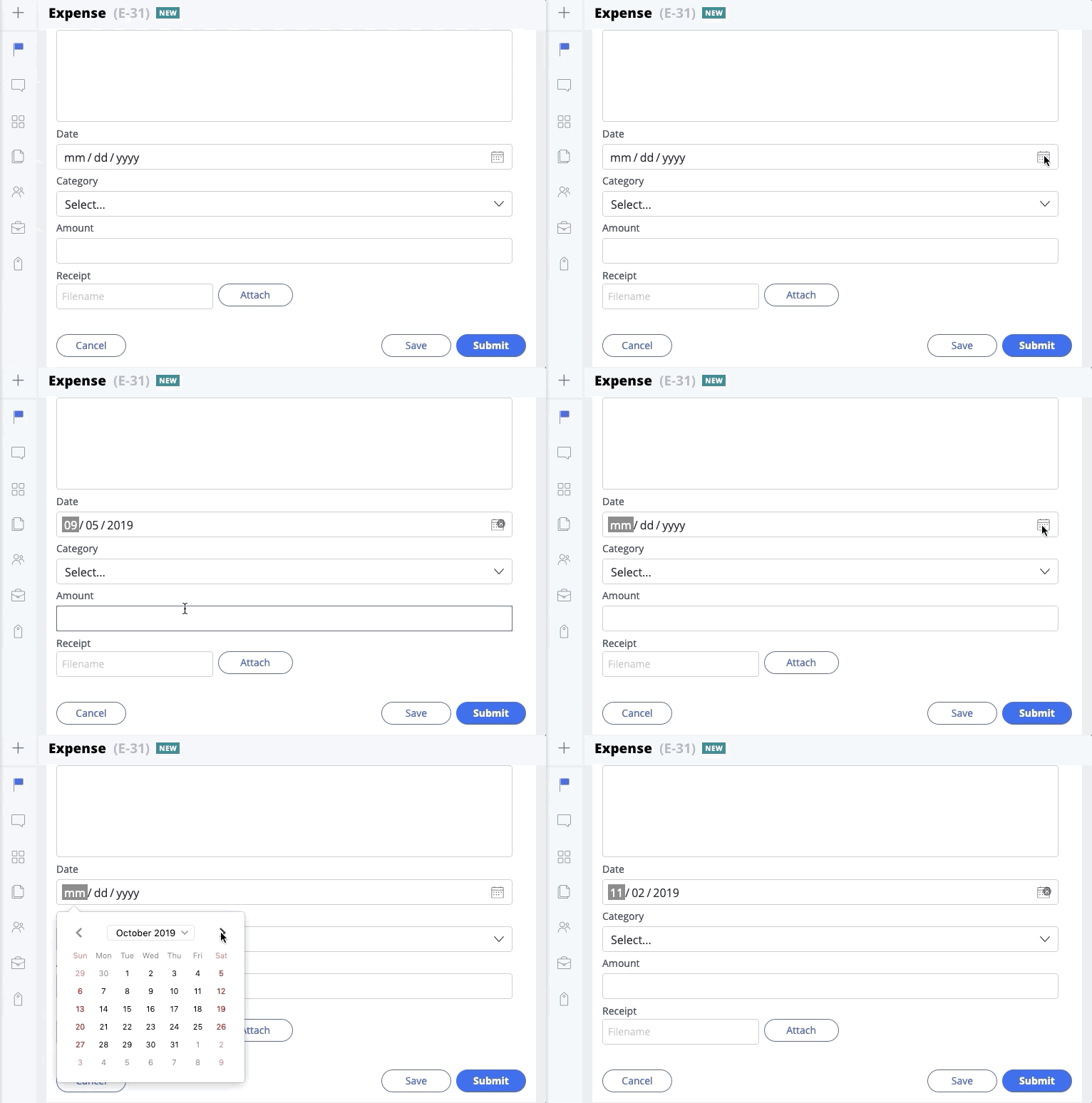
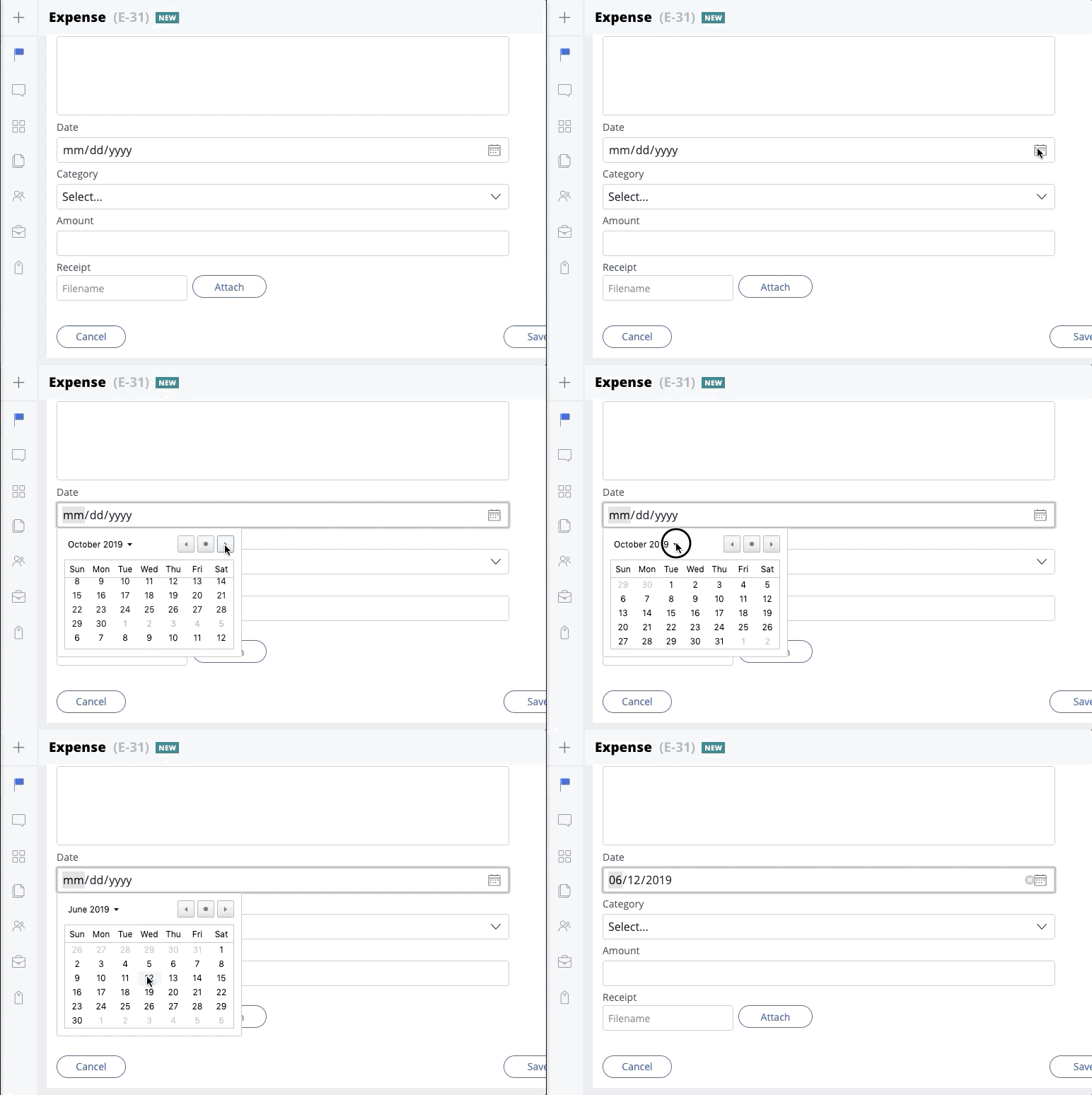
After making these changes, any date property configured to display as text+calendar will show the native date picker on the browsers that support this feature.
Here is the result on Firefox and Chrome
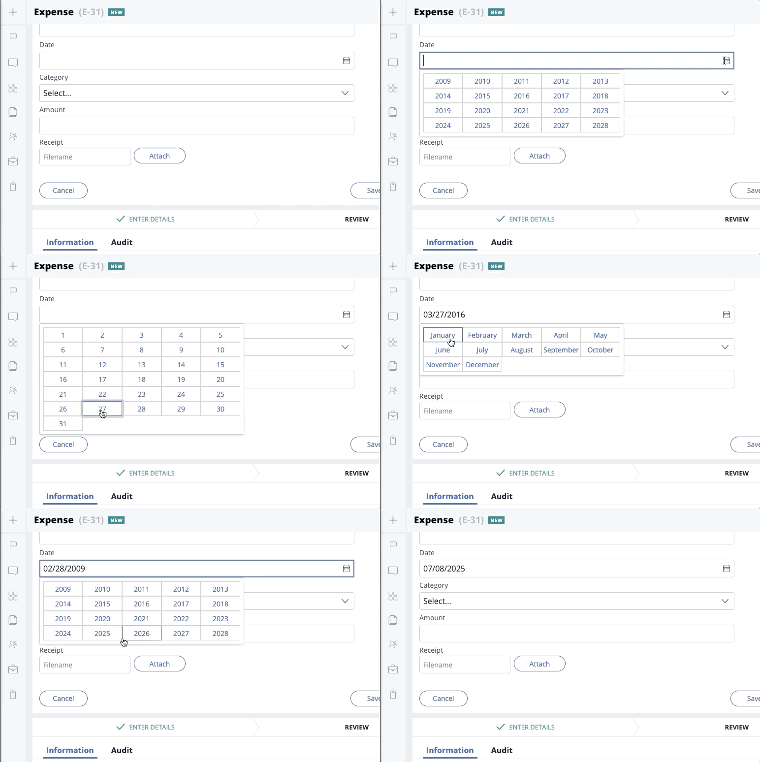
2/ Exposing the custom picker
While the browser native pickers are great, they still require some custom pickers for some of the browsers and do not offer a consistent user interface. As part of your own design system, you might have a well defined picker that you want to expose.
The moment JS library is loaded in every harness https://momentjs.com/ and can be used to handle the most complex date time functionality like determining the number of days in a given month and year.
a/ Javascript changes
Similar to the previous scenario, you can create a JS file called data-picker.js and attach it to your portal harness. The JS file will use the Pega Overlay functionality (popOver) to display an overlay on the page - this is a better approach than having to handle directly your own overlay and makes the amount of code small and easier to maintain.
/* Find all date input field and disable the click action on the sibling element (img) */
pega.ui.EventsEmitter.subscribe("AfterDCUpdate", function() {
        $("input").each(function() {
            if ($(this).attr("data-ctl") === '["DatePicker"]') {
                $(this).next().attr("data-ctl", "").attr("disabled", "true").removeAttr("tabindex").css(
                    "opacity", "1");
            }
        });
}, null, null, null);

/* On click of any input field - if this is of type DatePicker render a custom overlay */
$('body').on("click", "input", function(event) {
        if ($(this).attr("data-ctl") === '["DatePicker"]') {
            var myele = $(this);
            var _year = "";
            var _month = "";
            var container = $(this).parent()[0];
            var popOver = pega.u.d.getPopOver(container);
            var calendarDOM = document.createElement("div");
            calendarDOM.innerHTML = populateYears();
            $('body').on("click", ".datepicker", function(event) {
                if (_year === "") {
                    _year = event.target.innerHTML;
                    $("#poc0")[0].innerHTML = populateMonths();
                } else if (_month === "") {
                    _month = event.target.getAttribute("data-val");
                    $("#poc0")[0].innerHTML = populateDays(_year, _month);
                } else {
                    myele.val(_month + "/" + event.target.getAttribute("data-val") + "/" + _year);
                    _month = "";
                    _year = "";
                    popOver.close('OK');
                }
                event.preventDefault();
                return false;
            })
            popOver.open({
                content: {
                    type: 'domElement',
                    element: calendarDOM
                },
                bindings: {
                    associatedElement: container,
                },
                buttons: {
                    ok: false,
                    cancel: false
                },
                visual: {
                    displayLoader: false,
                    contentClass: 'datepicker'
                },
                position: {
                    fieldAttach: 'leftBottom',
                    popOverAttach: 'leftTop'
                }
            });
            event.preventDefault();
        }
});

/* Helper functions */
function populateYears() {
        var output = "";
        var dt = new Date();
        var currentYear = dt.getFullYear();
        for (var i = -10; i < 10; i++) {
            output += "<button>" + (currentYear + i) + "</button>";
        }
        return output;
}
function populateMonths() {
        var output = "";
        for (var i = 1; i <= 12; i++) {
            output += "<button data-val='" + (i < 10 ? "0" : "") + i + "'>" + moment(i, 'M').format('MMMM') +
                "</button>";
        }
        return output;
}
function populateDays(year, month) {
        var output = "";
        var maxdays = moment(year + month, "YYYYMM").daysInMonth();
        for (var i = 1; i <= maxdays; i++) {
            output += "<button data-val='" + (i < 10 ? "0" : "") + i + "'>" + i + "</button>";
        }
        return output;
}
b/ CSS changes
Add the following CSS selectors to style your custom data picker overlay - the datepicker class will be set on the overlay DIV and will be used to style the overlay (the class is passed as parameter to the getPopOver.open API)
/* styles fore the custom date picker control */
.datepicker #poc0 button {
    width: 80px;
    height: 30px;
    border: 1px solid #ccc;
}

.datepicker #poc0 button:hover{
  border: $mx-action_border-border;
}

.datepicker #poc0 {
    max-width: 400px;
}
Here is a demo of this custom overlay:
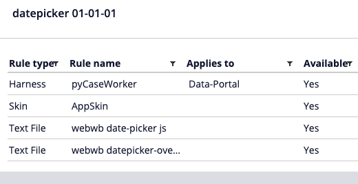
Find attached a ruleset that can be used to quickly get started - import the attached RAP and add the rule date-picker:01-01 to your application - make sure to use the latest ui-kit ruleset and pyCaseWorker portal and the AppSkin skin as your default application

@RichardMarsot hi Richard this is really brilliant and useful thread , can u also help men7nderstand if we can extend this feature to disable past dates in the calendar means onlyndates from today will be enabled in calendar for the user to select ??
Thnaks in advance
Regards
Utpalendu