Discussion
Pegasystems Inc.
IN
Last activity: 11 Feb 2021 13:08 EST
How to display the data in card layout with checkbox for multiselect and radio button for single select
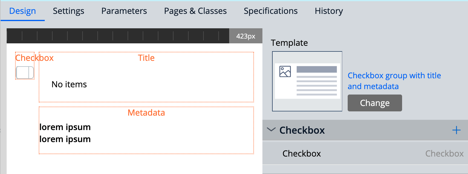
We have a design template called "Checkbox group with title and metadata" which could be used to achieve card layout with a checkbox.

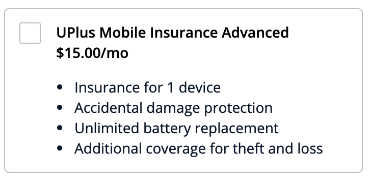
There are instances where we need to achieve UI which looks as below to show multiple cards with the option to allow the user to select multiple cards simultaneously or just one card at a time.
Multi-select using checkbox

Single select using the radio button

Above UI supporting multi-selection or single selection could be achieved by following the steps given below.
Steps to create multiple cards layout to allow multi-selection using the checkbox
- Create a section using the template “Checkbox group with title and metadata” design template and configure the view

- Create another section in the same class hierarchy
- Use the section created under steps 1 inside a "Repeating dynamic layout" as an embedded section
- Save the changes and run the application using the section created in steps 3
- Observe the card layout with the check box as desired. This is a multi-selection layout
Steps to create multiple cards layout to allow single selection using the Radio button
- Go to the section created under step 1 in the multi-select option
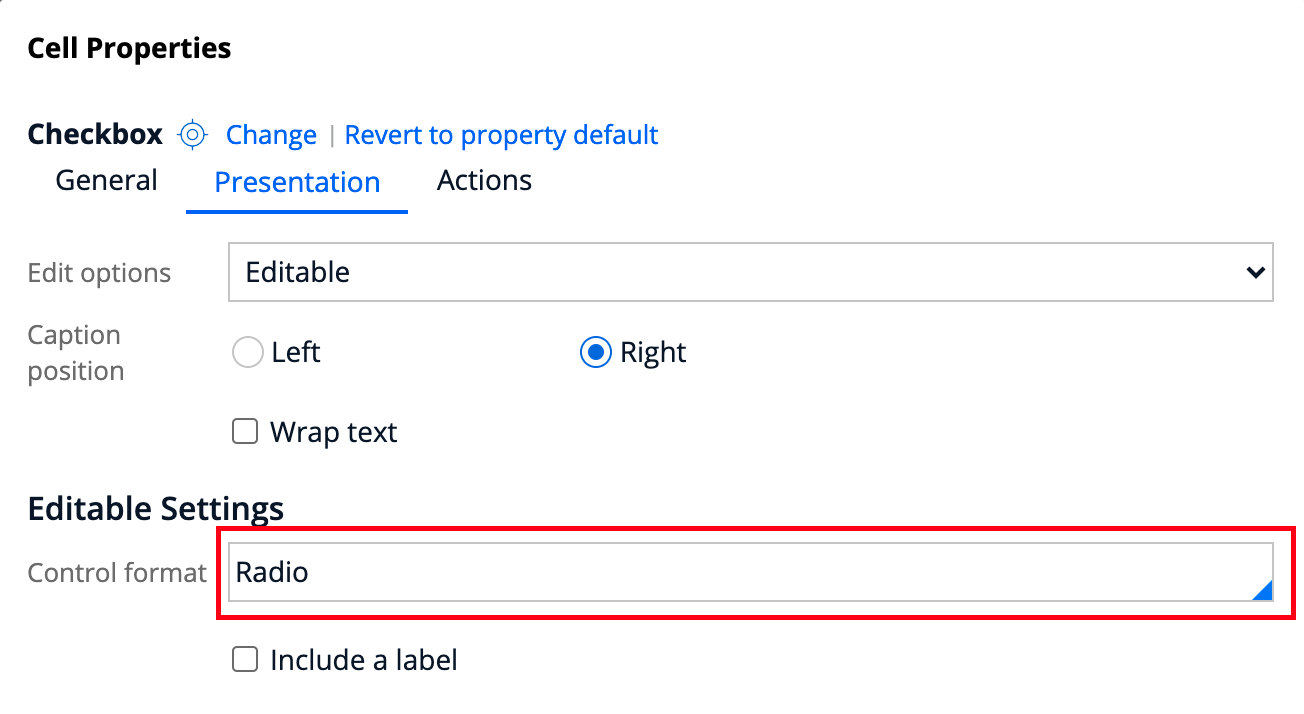
- Select the checkbox and open the property panel
- Select the "Presentation" tab under "Editable Settings" and change the "Control format" from “Standard” to “Radio”

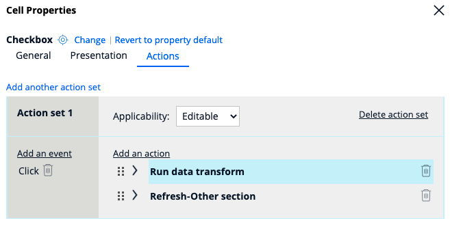
- Select the Action tab and configure the data transform on the "Click" event

- On mouse click event, enter your data transform to change the data value of the checkbox to be changed as per the selected card
- Run the application and observe only one card can be selected now.
