Discussion
Atos Information Technology GmbH
DE
Last activity: 31 Aug 2016 7:14 EDT
:focus styles & improving productivity (specially for power users)
Background Information
Some modern Browser provide an "OOTB" basic accessibility functionality to mark the focused element on a web page.

Why just getting rid of this "Blue Border" is a bad business decision
Some customers may be bothered by this style and some projects are trying to please the customer by getting rid of the focus style in the following way:
:focus { outline:none; }
The focus style is a browser feature that improves accessibility for keyboard users (accessibility is not only for users with impairments, here you can find your POWER USERS). If the users navigate the screen with the keyboard they will always be able to find where they are at each moment.
So not only is this is a bad practice for web development to be avoided (for reference please read: WebAIM: The plague of outline:0 ), but also is a bad business decision: if our power users use the keyboard and we don't facilitate their work, we are loosing time and money.
Taking into account that Pega provides services to many expert users in the back office that work keyboard navigation, it is a good example to justify the use of the :focus css styles.
If the blue color bothers the customers, we can change it at any time staying OOTB, with a couple of lines of CSS configuration following the customer's CI/UI guidelines.
Please Analyse the needs of your users, and choose one of the following approaches:
-
Change the color to a neutral color like gray or to any other color.
-
Apply a shadow.
1. Example
:focus { box-shadow: 0 0 5px rgba(81, 203, 238, 1); padding: 3px 0px 3px 3px; margin: 5px 1px 3px 0px;

2. Same example with animation (Live view: Glowing Blue Inputs):
input[type=text], textarea { -webkit-transition: all 0.30s ease-in-out; -moz-transition: all 0.30s ease-in-out; -
Apply a border or outline with a suitable style [solid, dashed, dotted, double...] (Live view: Focus) 1. Possible Styles= none | hidden | dotted | dashed | solid | double | groove | ridge | inset | outset 2. input[type=text]:focus, textarea:focus{ border= 1px solid rgba(81, 203, 238, 1); }
-
Apply a background color
Example with live code
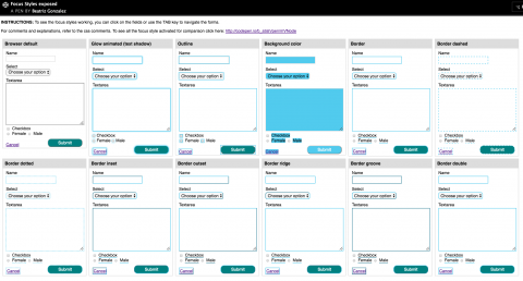
Live view: Focus Styles (http://codepen.io/b_atish/pen/dGxwRz). You can use the mouse or the TAB key to navigate the focus styles. This screenshots were made in Chrome on a Mac running OS X-Yosemite
Summary
Consider the design strategy you want to provide your users to show which element is focus when they navigate your application. Pay attention to your customer's Styleguide for Web and follow its guidelines. Consult any changes on the look and feel of your application to the proper stakeholders for approval if not available on the above mentioned styleguide.
Keep in mind that "Accessibility" is, like we have seen, not just for users with impairments or disabilities, but also affects normal and power users.
Stick to your design strategy to provide a consistent experience across your products and company, this way you will avoid confusion, lower learning curves and you will provide peace of mind to your users!
Please also take always into account the color contrast of text and background, to avoid causing issues for users with visible impairments like color blindness.
> You can use this tools to make sure your color contrast complies with the WCAG 1 & 2 Standards : http:// webaim.org/resources/contrastchecker/, Colour Contrast Check - snook.ca,
Extra Information
For further reference please check: CSS/Selectors/pseudo-classes/:focus - W3C Wiki
Pegasystems Inc.
IN
Thank you Beatriz for sharing the content on the community. It would be helpful for users who come across a simillar question.