Applies to Pega Platform versions 7.2 through 8.3.1
Recent refinements to dynamic layout and CSS
Why not remove the field-item DIV in all the cases?
Known issues with Internet Explorer 11
Flex-based dynamic layouts not supported inside freeform layouts or any other deprecated layouts
Diagnosing and debugging flex-based layouts for Internet Explorer 11
Scenario 1 Horizontal scrollbar in modal dialog
Scenario 2 Scrollbar covers entire screen
Scenario 3 Performance issue caused by flex-resize function
Scenario 4 Screen layout has grid overflow creating a scrollbar
What is Flexbox?
Pega introduced Flexbox-based layouts for dynamic layouts in Pega Platform version 7.2.1. The Flexbox-based layout module makes it easier to design flexible responsive layout structures in your Pega application. Used in combination with other layout options, the Flexbox-based layout has some limitations that you should consider, especially for UI display in Internet Explorer 11. If your application uses older or deprecated layouts, not dynamic layouts, you cannot take advantage of the Flexbox-based layout module.
This article describes basic Flexbox capabilities and identifies the limitations and the possible solutions for addressing them. Of note are the suggested approaches to troubleshooting and debugging flexbox layouts when Internet Explorer 11 is the target browser. Throughout this article, the Flexbox-based layout module and its capabilities are referred to generically as flex-based layout.
For more about Flexbox, see 15 Awesome Flexbox CSS Frameworks.
Recent refinements to dynamic layout and CSS
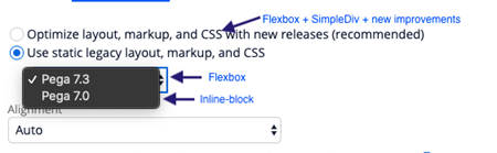
Design time setting
The following image shows the new design time setting for flex-based layouts.
Layout settings
You can specify Item Alignment and Vertical Alignment of a flex-based layout.
Item Alignment
For both the inline and inline-grid alignments, specify the following setting:
flex-flow: row wrap
The only difference between inline and inline-grid alignment is the content item width that is being set. For an inline-grid, the content-item width is calculated using the CSS calc() property, which is applied to the various content-items using the nth-child selector.
Vertical Alignment
Based on the flex direction of the content item DIV, vertical alignment is achieved by specifying one of the following settings:
- justify-content : [flex-start, center, flex-end] [when, flex-direction==column]
- align-items: [flex-start ,center ,flex-end ] [when, flex-direction==row]
However, Pega does not expose these flex configurations at design time. You can write a custom CSS to support these settings.
The best practice is to use skin-based formats rather than a custom CSS, unless you have a requirement to create complex flex-based layouts.
Label settings
You can specify Label Position and Label Width of a flex-based layout.
Label Position
Based on the label position the flex direction of the content-item, DIV is evaluated as follows:
- When the label position is top, specify the following setting:
flex-direction : column - When the label position is left, specify the following setting:
flex-direction : row
Label Width
When the label position is configured as left, an option to specify the label width is provided. This label width is set as flex-basis:
flex:0 1 label-width
The shrink factor is set to 1 to support cases where the available container space is less than the label width specified. This emulates the behavior of inline-block layouts.
Item spacing
Existing dynamic layouts (that is, inline-blocks) are treated as follows:
- For inline format, the item spacing values are treated as margin.
- For inline-grid format, the top and bottom values are treated as margin, and left and right values are treated as padding.
For new dynamic layouts (that is, flex-based layouts), item-spacing values are treated as margin for both inline and inline-grid format.
Float alignment
The Float property has no effect on a Flex-based element. Therefore, to achieve the same behavior as float-aligned elements, you can use the option of alignment in the Presentation tab of dynamic layouts.
There are two choices for aligning a flex-based element:
- auto
Auto, the default option, aligns an item to the left. - align-end
Align-end, used in combination with Set layout width as auto, aligns the item to the right.
To achieve align-end, specify the setting margin-left : auto.
The align-end option is available for dynamic layouts whose parents are of type flex. For non-flex layouts, the float option is available.
Example: To align the items as shown in the image below, follow these steps using two dynamic layouts:
- On Dynamic Layout 1, specify an alignment option of auto and Set layout width as auto.
- On Dynamic Layout 2, specify an alignment option of align-end and Set layout width as auto.
Why not remove the field-item DIV in all the cases?
The markup for dynamic layout using the label+field combination is shown below:
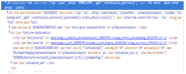
Initial plans to eliminate the field-item DIV posed some challenges in a few use cases.
For example, the Autocomplete control with the combination of [input+span] does not come enclosed inside a span or DIV element as other UI controls do, such as date-time. This makes the label, input, and span three different flex items inside the container. When the label position is changed, the flex-direction changes apply to all flex-items.
Additionally, the need to accommodate non-auto generated cases would cause similar issues. Therefore, the decision was made to retain the field-item DIV.
Currently, the field-item DIV is removed only when the Reserve space for label field is not selected. A class flex-row is generated to override the flex-direction to the row in these cases.
Known issues with Internet Explorer 11
Internet Explorer 11 has known defects related to flex-based layouts. Pega has corrected all reported defects for the Edge browser, but not for Internet Explorer 11. See Pega Platform Client Operating System and Browser Support, Browser Support, Important Browser Notes, Note 1.
Prior to Pega Platform version 7.2.1, nested layouts had a large number of nested DIVs, some of which were added to support older versions of Internet Explorer and to support vertical alignment. With the new CSS flex displays, vertical alignment is very easy and can be done without the need for extra markup.
Starting with Pega Platform version 7.2.1, a number of enhancements are offered to remove the need for unnecessary DIVs and to use display flex CSS for dynamic layouts.
Flex-based dynamic layouts not supported inside freeform layouts or any other deprecated layouts
If you start to mix and match flex and inline-block layout in a work object, do not use the old pzActionAreaContent in your application because this rule is a final rule and cannot be overridden in a section.
Instead, use the strategy similar to the one used in the UI-Kit: Override Work-.pyCaseActionArea and point to a new section in your application that does not contain the table layout (freeform layouts). This is a better alternative to pointing to pzActionAreaContent.
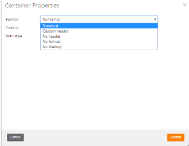
An issue occurs when the flex-based layout is nested inside a table. That is, the Pega harness container generates markup tag <table>. Starting with Pega Platform version 7.2.1, the No Markup option is provided on the container format to prevent the generation of the markup tag <table>.
Other changes include the following improvements:
- In pzbase-div-layouts, wrapper DIVs are added to support flex within a grid layout for display with Internet Explorer 11: flex-grid-table-wrapper and flex-grid-tablecell-wrapper
.ie11 table.ie-table-fix{
table-layout:fixed;
}
div.flex-grid-table-wrapper{
display:table;
table-layout:fixed;
width:100%;
}
div.flex-grid-tablecell-wrapper{
display:table-cell;
}
- Starting with Pega Platform version 8.2, in pzbase-div-layouts and the pzbase-browser.css file, the display type of flex-grid-table-wrapper and flex-grid-tablecell-wrapper was changed to block to correct the pagination issue inside the modal wrapper. This ensures that widths are correctly calculated for pagination.
.ie #modalWrapper div[node_name="pyGridPaginator"]>.layout>.layout-body>.flex-grid-table-wrapper{
display:block !important;;
width:auto !important;
}
.ie #modalWrapper div[node_name="pyGridPaginator"]>.layout>.layout-body>.flex-grid-tablecell-wrapper{
display:block !important;
}
Diagnosing and debugging flex-based layouts for Internet Explorer 11
The following problem scenarios and solutions pertain to flex-based layouts display with Internet Explorer 11. The problem scenarios do not occur with Chrome or Firefox.
Prerequisite
Determine whether the flex-based layout is applied to a screen or part of a screen in your Pega application.
In the DOM, search for the flex class. See the flex container, the parent element where you have set display:flex. Within the flex container, see the child elements.
Scenario 1 Horizontal scrollbar in modal dialog
Explanation
The modal dialog contains a freeform layout that generates the <table> tag in the markup, causing an issue with flex-based layout.
Solution
Update the modal dialog template to use new dynamic layout instead of the old freeform layout.
Scenario 2 Scrollbar covers entire screen
Explanation
Tables in the markup cause an issue with flex-based layout.
Solution 1 Find and remove the <table> markup tag in application harnesses
- Update the container format of the harness to No Markup to ensure that the top-level table is not generated.
- Check and repeat this step for all harnesses in the application.
- Check for pzActionAreaContent and update its freeform layout to the new dynamic layout that supports flex layout.
- Convert the container to the inner work area screen layout so that the table from the container is not generated.
- Check for any other harness that contains the <table> markup tag.
Solution 2 Revert to inline-block layout (stop using flex)
Update the layout formats in your applications to use the Pega 7 legacy layout options, in effect generating inline-block layout instead of flex.
Start from the innermost DIV /Layout and proceed to the ancestors(root).
You do not need to clear the option Set layout width to auto? Keep this check box selected. This option has no effect elsewhere in your application, unless you have layouts that apply flex attributes. The objective is to find the <table> markup tag that is wrapping a flex layout.
Solution 3 Stop the table layout algorithm
Set a fixed table layout algorithm by using table-layout:fixed in the table markup.
Scenario 3 Performance issue caused by flex-resize function
Explanation
The flex-resize function gets called on resize and causes reflow of the harness. Harness reflow causes performance issues.
Solution
Set pega.u.d.DISABLE_FLEX_RESIZE to true. This setting disables the resize function.
Alternative Solution
Try this shortcut solution to quickly verify if the issue is a flex issue. (This approach does not work if the layout needs reflow to render.)
To determine whether display:flex is causing the issue in Internet Explorer 11, in the frame where you need to remove flex-based styling, run the following command:
run : $('.flex').removeClass('flex')
Scenario 4 Screen layout has grid overflow creating a scrollbar
With Internet Explorer 11 version 11.2068.14393.0 and Chrome, users report that the grid layout is overflowing and creating a scrollbar. After a system upgrade from Pega Platform version 7.2.1 to Pega Platform version 7.3.1, all layouts are updated by default to Optimized mode. This causes layouts to load very widely when the grid layout is enabled with Optimized mode.
Solution
To correct the width miscalculation for Flex-based layouts displayed in Internet Explorer 11 and Chrome, add the following Flex-based style for the Inline grid format used in the user configuration:
.ie11 .flex.content-inline_grid_double > .flex.content-item {
flex-basis:50%;
}