Closed
Responsive Breakpoint
Can you please explain why the answer is
Show More
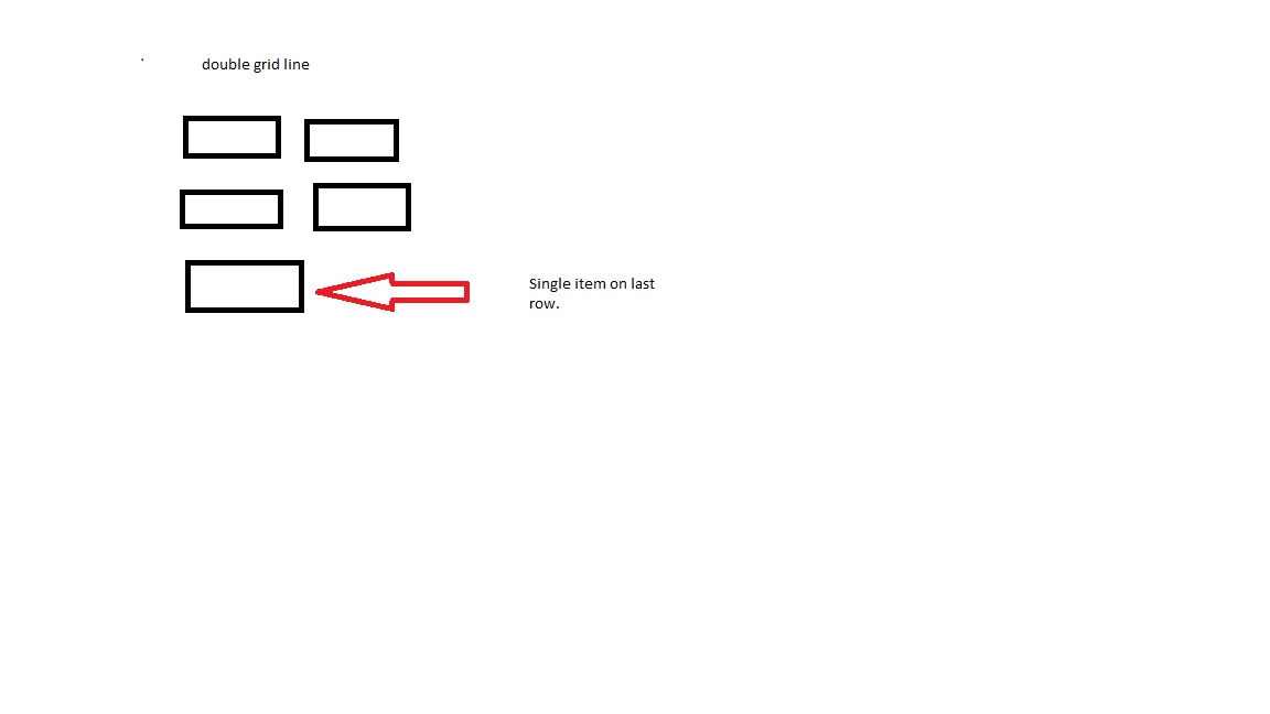
Can you please explain why the answer is Two since it is in Inline grid triple format?
As I understand it should be inline double format because of the breakpoints at 768 pixels.
Question 2
-
A dynamic layout uses an Inline format to organize UI elements on the screen. The Inline format is configured with two responsive breakpoints: the first one is to change to an Inline grid triple format at 1024 pixels, and the second one is to change to an Inline grid double format at 768 pixels. The UI elements are arranged into various numbers of rows depending on the screen size and number of elements on the screen. When the screen size is at 800 pixels and there are five elements on the screen, how many elements should be in the last row?
Five since it is in Inline format.
Undetermined — it depends on the sizes of the elements.
One since it is in Inline grid double format.
Two since it is in Inline grid triple format.
Show Less

