Form validation ensures that users enter correct information into data entry fields. This can include the data itself, lack thereof, or formatted a certain way. When any validation constraints are not met, error messages should be provided to help users easily identify and resolve issues within the form.
Constellation forms use both client-side and server-side validation to ensure accurate data entry according to authoring intentions.
Client-side validation
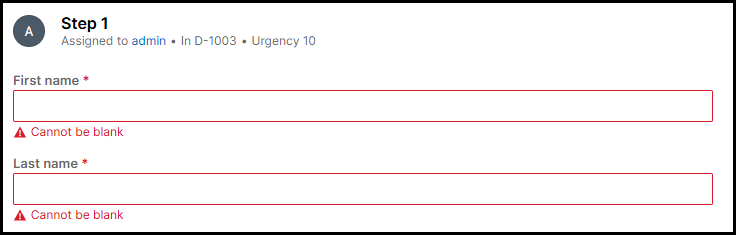
Client-side validation offers real-time feedback as users interact with and navigate through the form. For example, if a required field is left empty, an inline error message appears directly below the field indicating that it cannot be blank. This messaging is consistent across all required fields.
Server-side validation
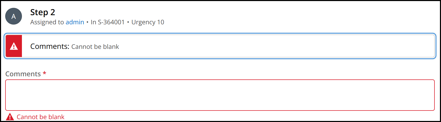
Server-side validation occurs when the user Submits the form. Should validation identify any fields that contain an error, a banner appears at the top of the form. This error banner begins with a heading level 2 stating "Error" followed by the total number of errors in the form. Listed below are all fields that have some form of validation error, including both the field name and what the error is. Additionally, the form fields themselves will also provide an inline error message.
When collapsed, the banner only displays the number of errors in the form. When expanded, the details of each field and its corresponding error are then displayed.
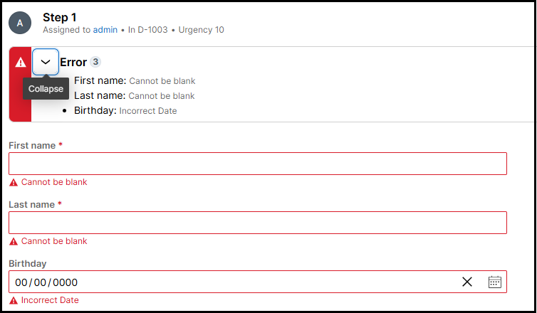
When the banner appears, focus is brought to the banner to allow keyboard and screen reader users an efficient starting point to review the identified errors and how to remediate them. This approach allows users flexibility in how they resolve errors. They may choose to correct all issues at once or address them one at a time, submitting the form repeatedly until all errors are resolved.
When there is only one field with error in the form upon validation, keyboard focus will still be set on the banner. Screen reader users will hear the same "Error" heading announcement followed by the total number of errors (1 in this case).
While the heading in this scenario is not visible on the UI, this design provides screen reader users with a consistent experience of the recognizing the section of content containing form errors being preceded by a heading.
Issues listed in the error banner currently do not provide direct linking functionality to send focus to the specific form field with an error. While this implementation is not required for WCAG compliance, it is considered a best practice and we are investigating the feasibility of enhancing this behavior in the future.