Discussion
Pegasystems Inc.
PL
Last activity: 22 Aug 2024 2:46 EDT
Installing tech stack of choice

This article is part of series of articles named Constellation Flexible UI. Please check table of contents: https://support.pega.com/discussion/constellation-flexible-ui

Finally we are fully prepared to start implementing alternate design system and connect it with SDKs. In one of previous articles we reviewed Delight Design System so we know what we need to implement. Now the question is how we will achieve it. We need to choose tech stack that will help us with this task.
In an enterprise setup, freedom might be restricted to tooling and technologies already adopted be enterprise. For the need of our sample application we can freely choose tech stack.
Two choices needed to be made in regards to styling are:
- tooling for styling we use
- what component library we use
As for tooling/styling library we can stay with default one for SDKs which is Styled Components (https://styled-components.com/) or chose from many more choices:
- css-in-js - https://cssinjs.org/
- Sass/SCSS - https://sass-lang.com/
- Tailwind CSS - https://tailwindcss.com/
I will go with last option, TailwindCSS, which is my favorite and default for my many projects. Tailwind CSS is a utility-first CSS framework that allows developers to rapidly build custom user interfaces by composing pre-defined utility classes directly in their HTML markup.
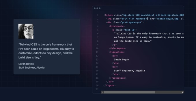
Instead of providing pre-built components like buttons or cards, Tailwind offers low-level utility classes that can be composed to style individual elements. For example, bg-blue-500 textwhite p-4 rounded would create a blue button with white text, padding, and rounded corners.
Tailwind makes it easy to create responsive designs by allowing you to prefix utility classes with responsive breakpoint prefixes like md: , lg: , etc. This applies the styles at specific screen sizes Just-in-Time Mode: Tailwind 3.0 introduced Just-in-Time (JIT) mode, which scans your HTML files and generates only the required CSS, resulting in smaller bundle sizes and faster build times compared to the previous full utility generation approach.
Tailwind can be extensively customized through a configuration file, allowing you to define your own color palettes, typography scales, breakpoints, and more. Tailwind CSS is designed to be a highly customizable, low-level CSS framework that prioritizes rapid UI development and optimized performance by generating only the styles you actually use in your project.
While it looks like madness it is super handy to define your css only by classes. Give it a try! But of course we show here just sample so you can choose different option that make sense for your project. Take a look at this article: https://dev.to/nickgabe/hate-on-tailwind-i-have-seenthat-before-549i
To install Tailwinds follow installation steps described here: https://tailwindcss.com/docs/installation/using-postcss
After installing Tailwind make sure it works properly. Add couple of classes and see if they are picked up in runtime.
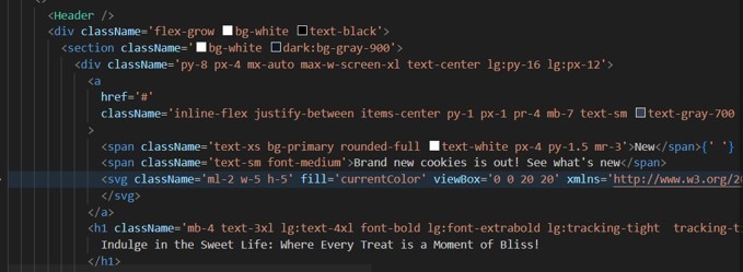
Note: You need to have this command running in background to compile your styles:
npx tailwindcss -i ./src/common.css -o ./assets/css/common.css --watch
Second choice to be made is the component library. Typically set of UI components has already its sample implementation according to Design System done. In our case we do have styling ruled defined in DS but with implementation we start from scratch.
But as we don't want to implement each component from bare ground we use some already existing and well tested components. As we chosen Tailwind we will make sure that our library is also using Tailwind. One of more popular libraries that use Tailwind is Shadcn:https://ui.shadcn.com/
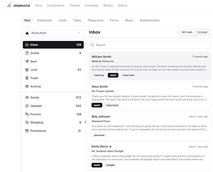
shadcn/ui is an open-source library of beautifully designed, accessible, and customizable UI components that developers can directly copy and paste into their applications.
Key Features of shadcn/ui:
- Reusable Components: shadcn/ui provides a collection of pre-built UI components like buttons, forms, modals, alerts, and more, which can be easily integrated into web applications.
- Accessible by Default: All components in shadcn/ui are built with accessibility in mind, adhering to best practices and guidelines for creating inclusive user experiences.
- Highly Customizable: Developers have full control over styling and implementation, allowing them to tailor the components to their specific design requirements and branding.
- Framework Agnostic: While shadcn/ui is primarily built with React in mind, the components can be used with various front-end frameworks and libraries, such as Next.js, Gatsby, Astro, Remix, and more.
- Open Source: shadcn/ui is an open-source project licensed under the MIT license, encouraging community contributions and fostering a collaborative ecosystem. shadcn/ui aims to streamline the process of building modern web applications by providing a robust set of reusable, accessible, and customizable UI components that can be seamlessly integrated into projects across different frameworks and libraries.
Follow installation steps listed here: https://ui.shadcn.com/docs/installation/manual
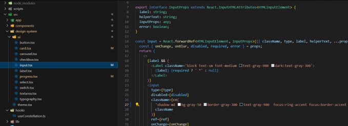
After installing shadcn, try importing sample component. Make sure you put your components inside design-system folder. Great thing about shadcn is that it is fact NOT a component library. It's a collection of re-usable components that you can copy and paste into your apps. It allows us to easily modify style of each component, what we will use in next chapters.
Selection of shadcn is arbitrary and depends on preferences, we could use some other library. Here coupe of examples of libraries that goes well with Tailwindcss:
