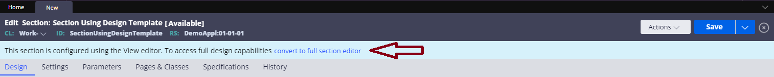
Live Design Preview for Section editing in Dev Studio
The following describes how to use the Live Design Preview feature in Dev Studio, unless otherwise noted the following feature is available for users on version 7.4 + and screenshots displayed were taken from version 8.1. The preview is available for Sections which use Design Templates and brings some elements of runtime editing into Dev Studio to give the user a better sense for how their Sections will appear at runtime and provide a consistent developer experience between App Studio and Dev Studio.
How to create a Section using a Design Template
Mark the "Create Section using a Design Template" checkbox as true when creating a new Section in Dev Studio.
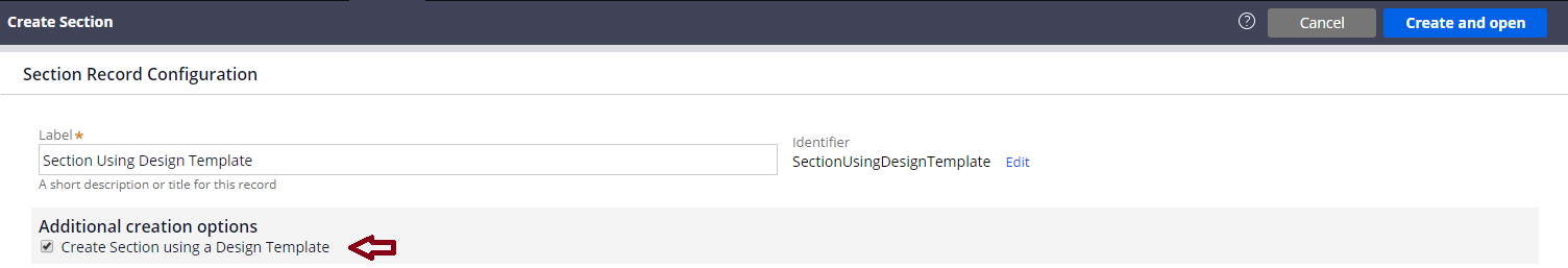
Note: You can still convert back to a non-templated Section at any time within your Section's rule form, however this cannot be undone once saved.
How to edit a Field
The following edit actions will disclose the full Dev Studio Property Panel for the current Field being edited:
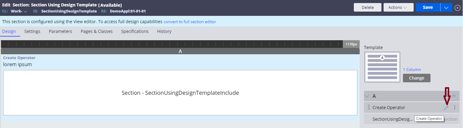
- From the Layout Editor hovering over the Field you would like to edit will display an edit pencil which can be selected.
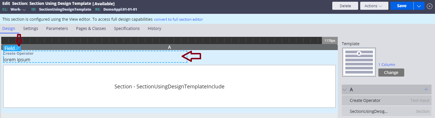
- Within the preview area hovering over the Field you would like to edit will display a blue highlight with an info bar and edit pencil:
- Edit pencil within the field's info bar can be selected.
- Within the blue highlight area of the currently hovered Field can be selected.
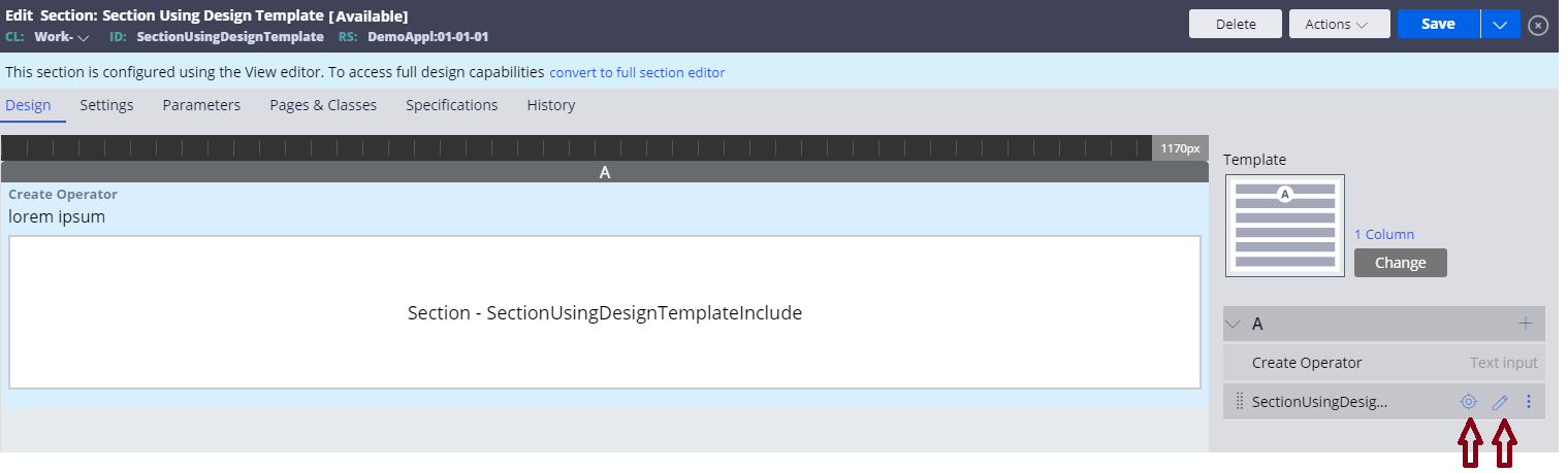
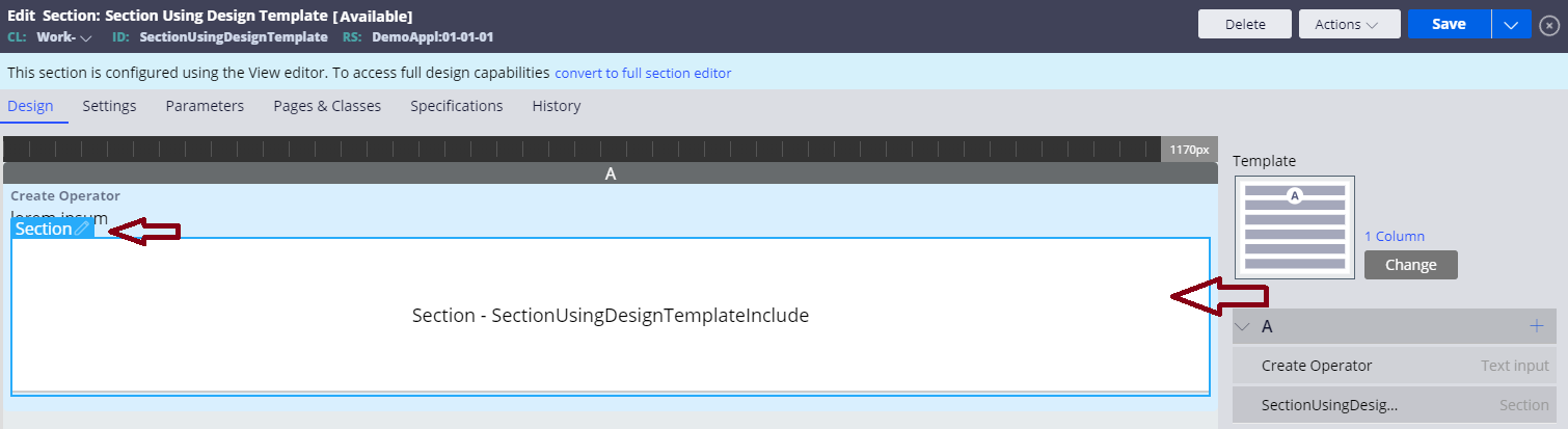
How to edit a Section include
The following edit actions will disclose the full Dev Studio Section include Property Panel for the current Section being edited:
- From the Layout Editor hovering over the Section include you would like to edit will display an edit pencil which can be selected.
- Within the preview area hovering over the Section include you would like to edit will display a blue highlight with an info bar and edit pencil:
- Edit pencil within the section's info bar can be selected.
The following edit actions will open the Section include that was selected in a new tab in your Dev Studio portal:
- From the Layout Editor hovering over the Section include you would like to edit will display a target which can be selected.
- Within the preview area hovering over the Section include you would like to edit will display a blue highlight with an info bar and edit pencil:
- Within the blue highlight area of the currently hovered section include can be selected.
Note: Section includes display with a generic placeholder Section within the preview area using the name of the Section include as a placeholder label.
Additional editing available
Within the Layout Editor:
- Drag / drop of Fields and Section includes anywhere within the Layout Editor's Regions.
- Change of template currently being used by the Section via the 'Change' button.
- Add of additional controls and Section includes. Note that there are a few controls missing if you are on version 7.4, but they were added to the menu in 8.1. Additionally, the "Embedded Section" option can be found in the "Advanced" tab of the add controls menu launched from the "+" on each of the Region headers.
- Select on template name will open the Design Template Section that your Section is using in another Dev Studio tab (Introduced in 8.1).
- Titles, Layout Group formats, and helper classes can be overridden for Regions via the edit pencil on each of the Region headers.
Within the preview area:
- Drag /drop of Fields and section includes anywhere within the preview area.
- Preview area can be resized to test the responsive behavior defined in the current skin. By holding the mouse down on the far-right side of the preview/to the left of the Layout Editor and dragging horizontally. As the preview area is resized the width that the preview is currently displaying as will be adjusted in pixels and displayed in the preview ruler on the top of the preview area.
- Preview area runs within its own thread and displays using your current Application's skin. Changes to the skin will reflect as such within the preview area for each of your Sections using Design Templates.
Placeholders for advanced/custom controls
Out of the box advanced controls which are not configured will display with a default preview image placeholder that is defined in a Data Transform. These placeholders can be overridden, and custom controls you have can have placeholders defined in the Data Transform "pyLiveDesignCustomControl". An example of setting a placeholder is as follows:
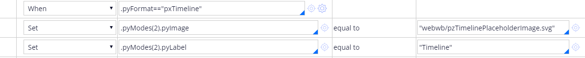
Note: Keep in mind the properties you need to set for your custom control may be different depending on how you have configured it.
Additional notes on the preview
- Changes made are reflected live within the preview area as they are made, however unlike App Studio runtime editing these changes will not be saved until the rule form save button is selected.
- Within the preview area itself all actions on Fields and Section includes are disabled.
- Any data for Fields is translated to be "lorem ipsum" where appropriate.
- Any when conditions specified for Fields and Section includes are not honored so they will all display just as they would in a non-templatized Section in Dev Studio.
Note: What can be displayed within the Live Design Preview is limited to what is available at design time. Additionally, to use the Live Design Preview at least one of the following needs to be true:
- The current Application being used has at least one unlocked ruleset.
- The current Operator being used has checkout enabled.