Discussion
Pegasystems Inc.
US
Last activity: 29 Dec 2020 1:41 EST
How to build a 2 columns with resizable widths
This document provides some details on how to implement a 2-column layout with resizable width. This is in response to this question https://collaborate.pega.com/question/section-template-supporting-2-columns-resizable-widths . The use case is that you have a set of fields and you would like to resize the width for each column.
To use this example, you can download and import the RAP file attached to this discussion post. The RAP contains a ruleset called Template2ResizeCol:01-01 with the following 4 rules

The code has been implemented and tested on 8.5 but should work with any Pega Infinity platform version. It relies only on Jquery for the draggable implementation - see https://jqueryui.com/draggable/
To achieve this implementation, we are going to create a new design template that will automatically add the slider between the 2 layouts and support the resize. We are using the same region names than the 2 column layout to make it easier to switch to this new template

This design template has an embedded custom HTML section that will contain the logic needed to render the resizable handle and the initialize the javascript implementation.
There are multiple ways to implement such functionality. the most typical is to set an inline px width when dragging the resize hanlde for each region. The downside of this approach is that the width will not work when resizing the browser window and as such requires to add a resize handler to update the inline width.
A better approach is to make region B flex-grow 1, so that it takes the available space and set a % width on region A as inline style when dragging the resize handle. This approach provides the most lightweight and efficient implementation and does not require an resize handler.
To identify the layout, a new helper class called two-col-resize is added to the parent layout - A little bit of CSS is added in the HTML non section to correctly render the layout once the resize handler is added to the DOM
.flex.content.two-col-resize {
    flex-wrap: nowrap;
  }
  .flex.content.two-col-resize > .flex.content-item.item-1{
    width: calc(50% - 12px);
    min-width:200px;
  }
  .flex.content.two-col-resize > .flex.content-item.item-2{
    width: auto;
    flex-grow:1;
    min-width:200px;
  }
  .two-col-resize > .resize-handle {
    background-image: url('webwb/screenlayout_collapse.png');
    background-repeat: no-repeat;
    background-position: center center;
    background-color: #CCC;
    width: 8px;
    cursor: ew-resize;
    position: static!important;
  }
a min-width of 200px is set for each region to avoid draggable handle to be too much on the right or on the left. The layout is also no longer wrapping and will no longer be responsive. The drag handle is similar to the screen layout resize handle.
The Javascript code will leverage the draggable functionality of JQuery - to avoid initializing the component multiple time, a check is first made to determine if the drag handle is already present or not. If not, it is added to the DOM and the jquery api is initialized.
Here is a snippet of the JS code:
function initTwoColDraggable(elem) {
    $(elem).each(function() {
      if($(this).children(".resize-handle").length > 0) return;
      var that = $(this);
      var origpos;
      var maxoffset;
      that.children(".item-1").after("<div class='resize-handle'></div>");
      that.children(".resize-handle").draggable({
        axis: 'x',
        start: function(ev, ui) {
          maxoffset = that.outerWidth();
          origpos = maxoffset / 2;
        },
        drag: function(ev, ui) {
            var leftpos = ui.position.left;
            if(leftpos < 200) leftpos = 200;
            if(leftpos + 200 > maxoffset) leftpos = maxoffset;
            var diff1 = parseInt(leftpos - origpos) - 32;
            ui.helper.prev().css("width", "calc(50% " + (diff1 >= 0 ? "+ " : "- ") + Math.abs(diff1) + "px)");

        }
      });
    })
}
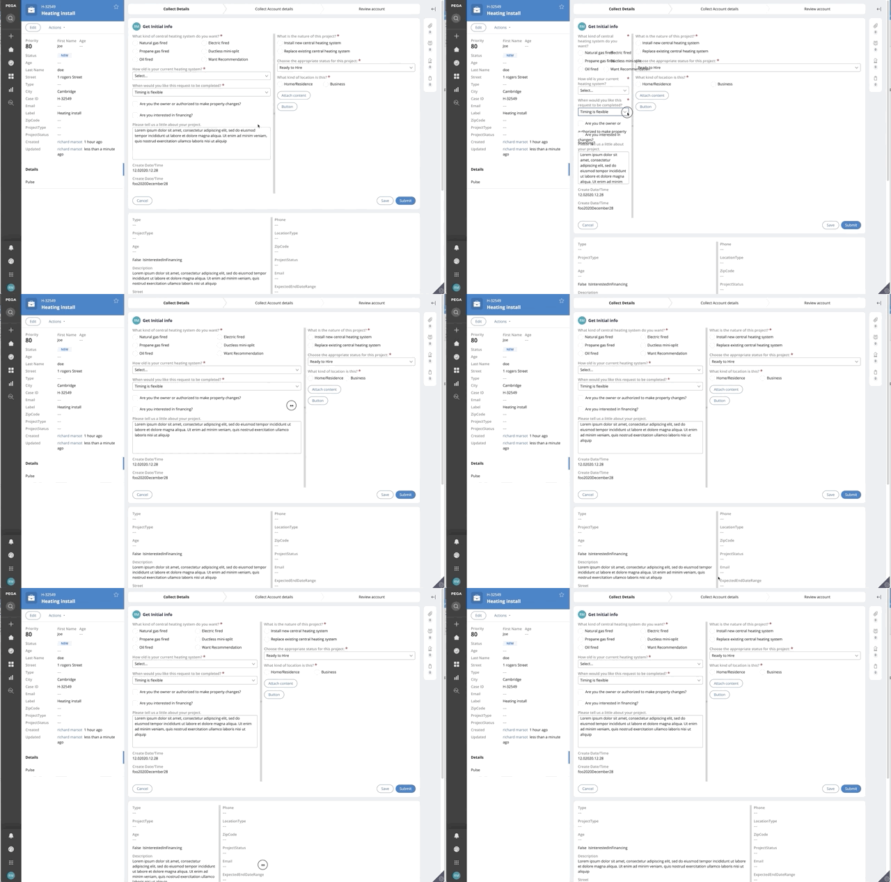
Here is a demo of the functionality. The new design is used in an assignment as well as in the case details.

