Discussion
Pegasystems Inc.
IN
Last activity: 31 May 2023 7:20 EDT
Everything about web fonts
What are webfonts:
Typeface:
A typeface refers to the set of typographical symbols and characters: letters, numbers, and any characters that let us put words on our website. It is the design of the alphabet, basically the shape of the letters that make up that style. When we refer to Helvetica, we are referring to a typeface.
 Font:
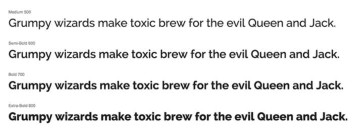
A font is defined as the complete character set within the typeface, often referring to a particular size and style. Helvetica Bold 10 point is a way to reference a font. Fonts are specific to the files that contain all the characters and glyphs within the typeface. Web fonts are a CSS feature that allows you to specify font files to be downloaded along with your website as it is accessed via server and these are loaded into the browser where it can be viewed how the designer intended.
Are any fonts available by default on OS?
- Computers come with standard fonts locally installed—called “safe web fonts” or “system fonts”. Few safe web fonts are Arial, Times New Roman, Helvetica, Courier New, and Garamond.
- When a website or application is called up on that device using one of those system fonts, that computer recognizes it and renders it.
- But when a designer creates a design with lesser known font and if that font isn’t installed on a computer, then it won’t display thus losing consistency.
Why to use webfonts: There are more things for web designers to consider when creating a website or mobile app’s design, such as:
- Consistency: People view designs on different devices, screens, and browsers, so there’s a need to ensure sites and apps look the same across the board.
- Performance: File sizes of web page designs can slow the load time of a page, which can in turn lead to higher bounce rates. If elements of a design are loaded as individual image files instead of as text, that can also increase a site’s payload
- Resolution: Some designs and fonts don’t scale or respond well to the different screen sizes and pinch-and-zoom functionality of modern mobile browsing.
- Availability: If a designer is using a font other than a basic, web-safe font, chances are it isn’t installed on every computer out there. This means a design might have to default to a different, available font, and look different than you intended it to.
- Search engine rank: Some designers convert type into an image to ensure it displays the way they want, which can affect SEO. If more aspects of your site’s design are loaded as images/logos, they’re less readable to search engines than text, which can affect rank.
Hence, to address all these problems, web fonts were developed, allowing designers to use custom fonts that aren’t available on computers which ensures their design remains consistent no matter who’s viewing it, or where.
How do fonts work:
- Fonts can be hosted locally, or on a third-party server, or accessed through a provider like Google Fonts or Typekit.
- By declaring the @font-face rule in our stylesheet, we can specify the name of the typeface, the location, and the font weight.
- Below example shows how we add Open Sans Regular. You will see the source is a fonts folder that is included in the website project.
 This declaration above adds the font so it can be used.
 - This can be used in the below way. Font-family is specified as Open Sans Regular, along with Arial, sans-serif. This means if Open Sans Regular isn’t available, then it falls back to Arial and others based on the availability.

Font formats and browsers they support:
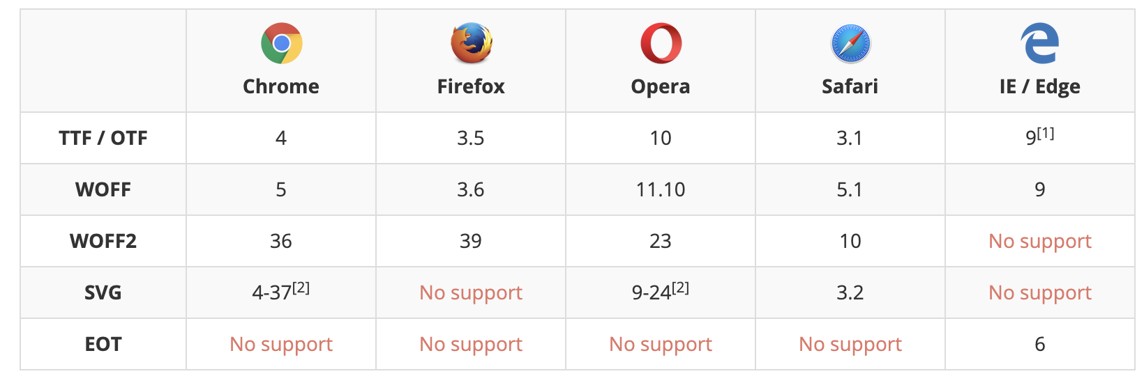
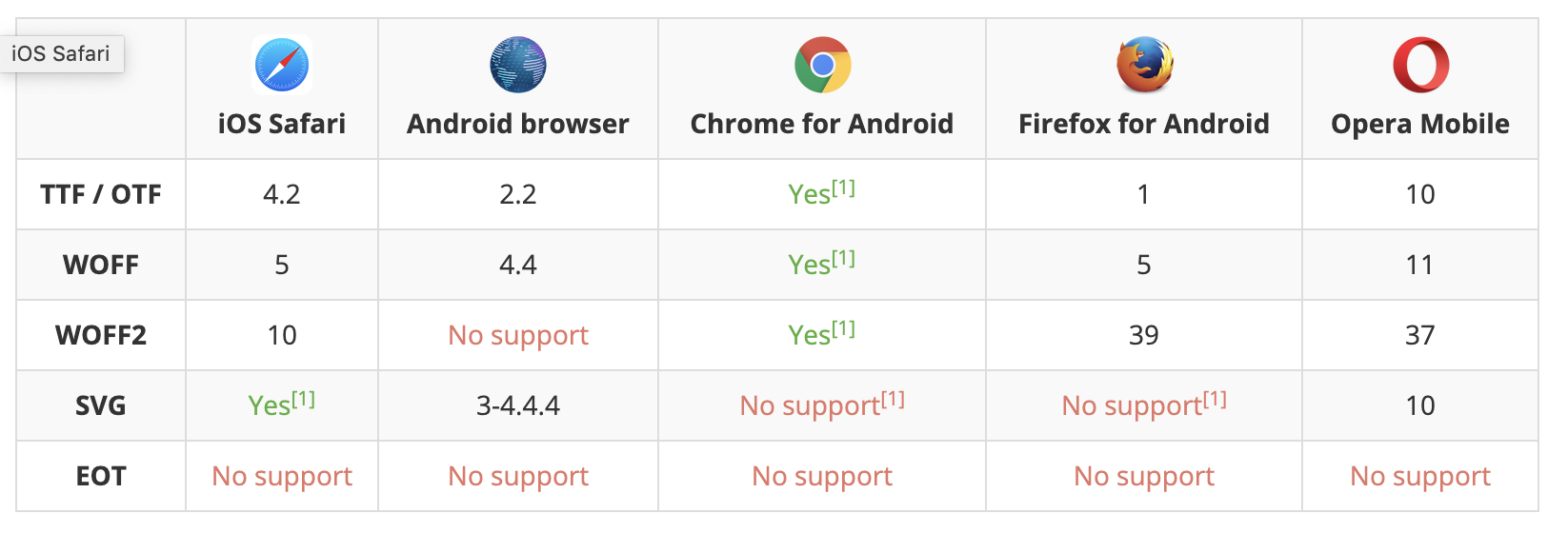
Not all browsers supports all font formats. So, designers need to make sure to provide everything that other browsers need.
- Postscripts: => Created by Adobe. They have two different parts, one that contains information for printing, and the other that's used to display the font on the screen. => They're not cross-compatible. => Since the creating of OpenType fonts, the use of PostScript fonts has dwindled significantly.
- TrueType (TTF): => Developed by Apple and was eventually licensed to Microsoft. => They only require one file, but a separate file needs to be added for each instance of the font. Which means you'll need a different file for normal, italic, bold, bold italic, etc.
- OpenType (OTF): => Newer font type build on the TrueType format that supports more advance typesetting features like smallcaps, ligatures, and alternatives inside the font instead of separately. => It was intened it replace TrueType fonts. => They're compatible cross-platform.
- Embedded OpenType fonts (EOT): => They are a compact form of OpenType fonts designed by Microsoft for use as embedded fonts on web pages. => It is an attempt to address the copyright shortcomings of TTF and OTF when publishing on the web. => Uses encryption. => Only supported by IE.
- SVG fonts: => Allow SVG to be used as glyphs when displaying text. => The SVG 1.1 specification define a font module that allows the creation of fonts within an SVG document. => You can also apply CSS to SVG documents, and the @font-face rule can be applied to text in SVG documents. => The greatest drawback to SVG fonts is the lack of font-hinting. Font hinting is extra information embedded to render small font sizes with quality and legibility. => Also svg's are not great for body text. => However, if you are targeting iPhone and iPad users, SVG fonts are your only choice. This is the only file format allowed by version 4.1 and below of Safari for iOS.
- Web Open Font Format (WOFF): => It is essentially OpenType or TrueType with compression and additional metadata. => Metadata allows for the inclusion of license data within the font file to address copyright issues. => The goal is to support font distribution from a server to a client over a network with bandwidth constraints. => This is WWWC recommendation and is clearly the future of formats.
- WOFF 2.0: => This is the next generation of WOFF. => The WOFF2 format offers a 30% average compression gain over the original WOFF. => Because it still just a recommended upgrade, it does not have the wide support of WOFF.
Here’s a list of browsers and what font file types they support:
Desktop browsers
 Mobile browsers
How does browser downloads font?
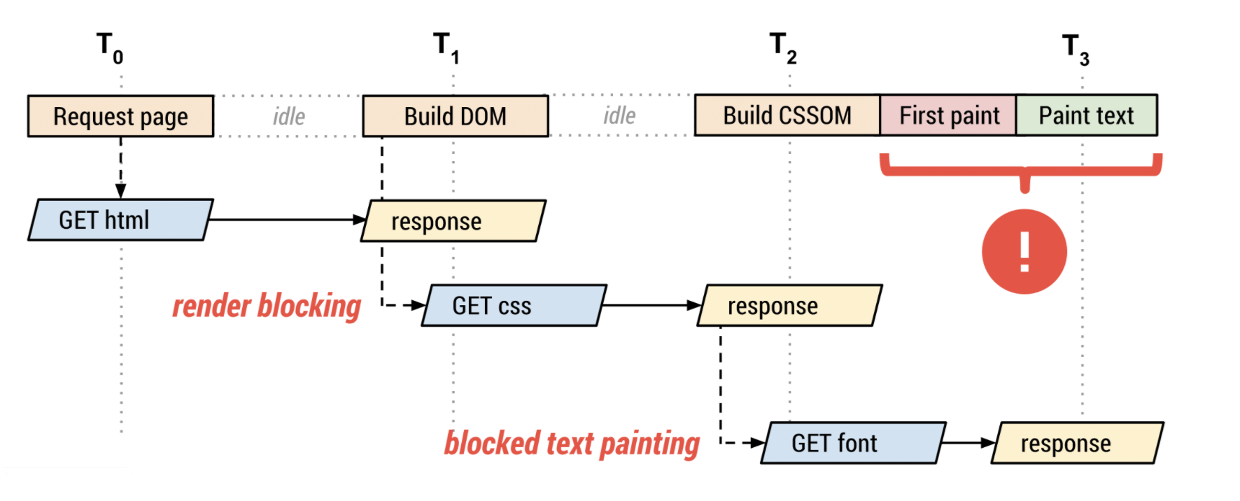
- The browser requests the HTML document.
- The browser begins parsing the HTML response and constructing the DOM.
- The browser discovers CSS, JS, and other resources and dispatches requests.
- The browser constructs the CSSOM after all of the CSS content is received and combines it with the DOM tree to construct the render tree. -> Font requests are dispatched after the render tree indicates which font variants are needed to render the specified text on the page.
- The browser performs layout and paints content to the screen. -> If the font is not yet available, the browser may not render any text pixels. -> After the font is available, the browser paints the text pixels.
How are font formats selected:
Each @font-face declaration provides the name of the font family, which acts as a logical group of multiple declarations, font properties such as style, weight, and stretch, and the src descriptor , which specifies a prioritized list of locations for the font resource.
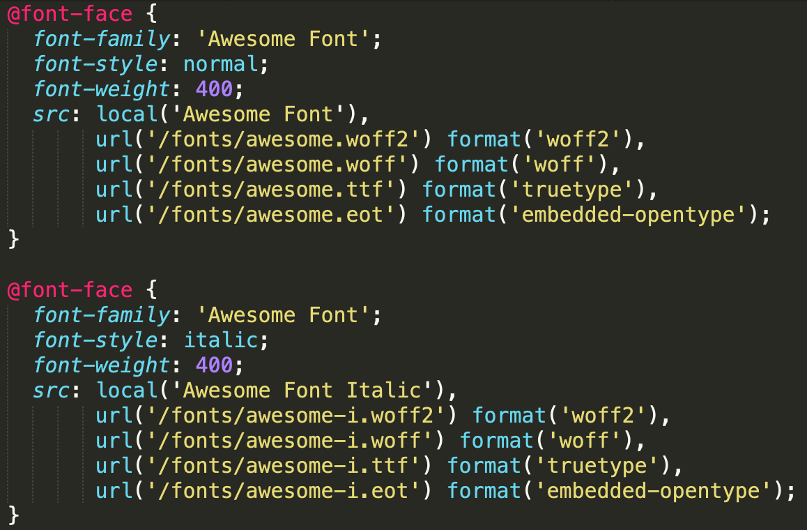 In the above example, Awesome Font family is defined with 2 styles (normal and italic), each of which points to a different set of font resources. Each src descriptor contains a prioritized, comma-separated list of resource variants.
- The local() directive allows you to reference, load, and use locally installed fonts. It is always recommended to start with local() entry "just in case".
- The url() directive allows you to load external fonts, and are allowed to contain an optional format() hint indicating the format of the font referenced by the provided URL.
- The browser performs page layout and determines which font variants are required to render the specified text on the page.
- For each required font, the browser checks if the font is available locally.
- If the font is not available locally, the browser iterates over external definitions:
- If a format hint is present, the browser checks if it supports the hint before initiating the download. If the browser doesn't support the hint, the browser advances to the next one.
- If no format hint is present, the browser downloads the resource.
What happens when a weight is specified for which no face exists?
A face with a nearby weight is used. In general, bold weights map to faces with heavier weights and light weights map to faces with lighter weights. Similarly for italic variants, the browser substitues the closest match. If no match is found, then the browser synthesizes its own font variant.Things to Consider When Using Web Fonts:
1. Indicate a fallback web safe font in your CSS:
In case a browser doesn’t support your chosen font or the font provider’s server is down, including a web safe font in your CSS font stack will ensure your text always appears. The dreaded flash of invisible text (FOIT) can last anywhere from 3 to 30 seconds, depending on the browser, which means your site may display no text at all until the browser calls in a default font.
2. Not all browsers support all web fonts: You may opt for a WOFF or WOFF2 font because a majority of browsers support them, but to prevent anyone from seeing nothing at all, add in a web safe font as well.
3. Pay attention to rendering speeds:
Using multiple web fonts may require more HTTP requests to the server where that web font resides, and you want as few HTTP requests as possible to keep your site from running slowly. File size can also affect load times, so it’s important to only use the options listed above that you really need (whether it’s italic but not bold, etc.).
4. Know that third-party font hosting sites can always go down:
When their servers go down, your font isn’t available—and that text won’t appear unless you have a web safe font as a backup.
5. Double-check your CSS to make sure it’s correctly pathing to the font:
If you’ve downloaded or purchased a font, ensure your CSS is pointing to the correct location of that font, whether it’s to a folder on your own server or through a line of JavaScript code provided by a third-party font host.
When to use web fonts and when not to:
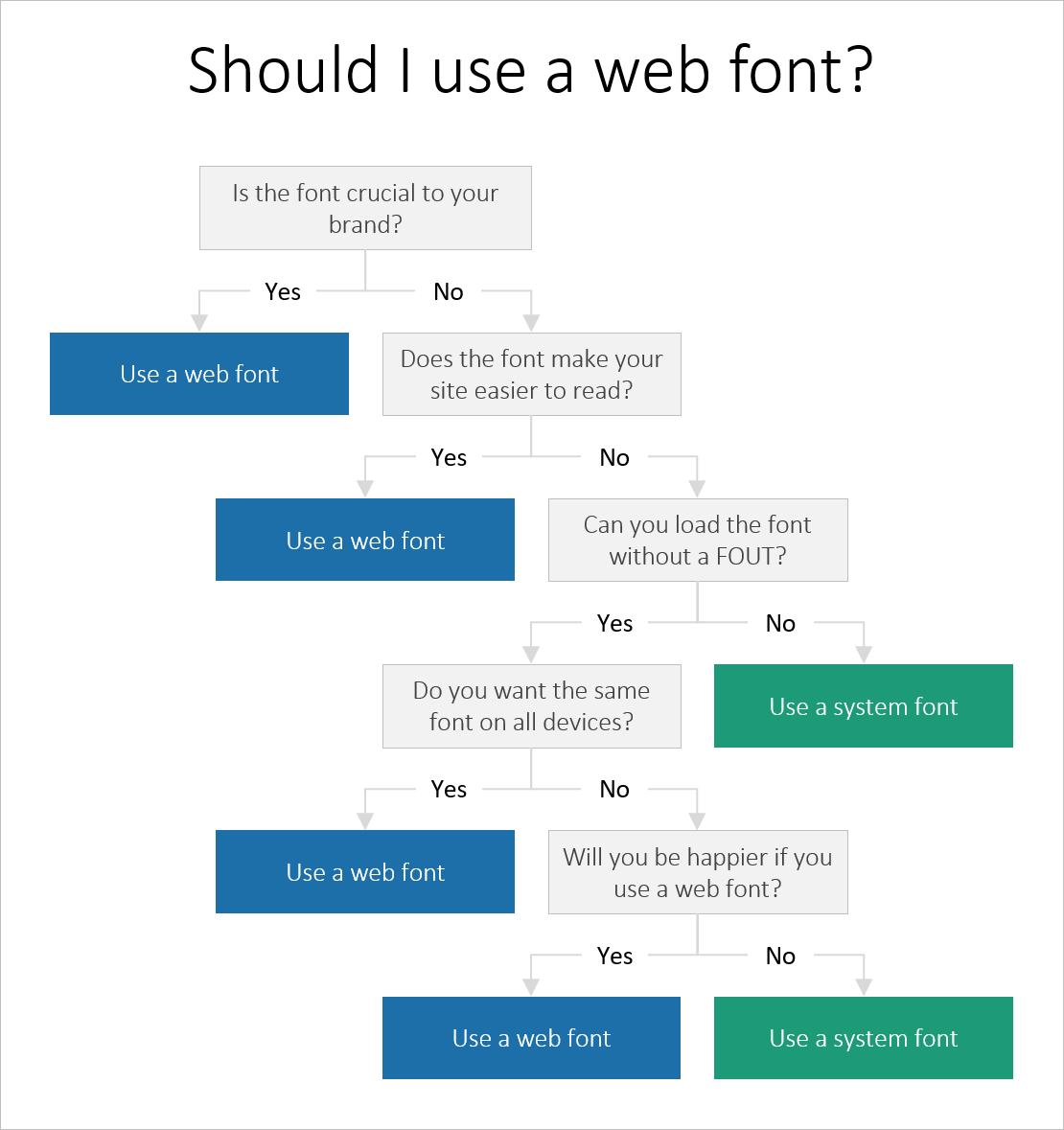
Flash Of Unstyled Text (FOUT):
When using a custom font via @font-face, browsers used to display a fallback font in the font stack until the custom one loaded. Techniques that can be used to minimize or even eliminate it:
- First, limit your pages to only one or two external fonts.
- Minimize the size of your included font file. This starts with choosing fonts with smaller payloads when possible. Not all font packages are equal — when it comes to the web, stick to fonts in the kilobyte range rather than some of the bigger, multi-megabyte files out there. If your server supports it, be sure to serve your font files using gzip compression. If you’re using WOFF-formatted fonts, you can skip this step, because WOFF already includes compression.
- Include your link tag(s) to stylesheets within the <head> of your web page documents.
- Font resources are typically static and don't see frequent updates. Hence, it is appropriate for most uses to serve font resources with cache-first strategy. It won’t help for the initial page load, but subsequent loads will happen faster. LocalStorage or IndexedDB are not recommended to store fonts. The browsers HTTP cache provides best and robust mechanism to deliver font resources to browser.
- Another possibility is to hide the entire page until the font file loads. This is one the solutions TypeKit has started to use, adding a new class to the page body tag when the font files have been loaded. Just hide the body tag, then set the loaded class to “visible,” and you’ll avoid the FOUT. This method avoids the FOUT by holding up the entire page, which may not be the best solution.
- The final — and perhaps most useful — solution to FOUT is to simply learn to live with it. Browsers load fonts in roughly the same way they load images. Slow internet connections have always meant progressive page loads, with elements staggering in as the browser draws the page.
Flash Of Invisible Text (FIOT):
When the browser sees that a custom font is applied to a text, it waits till the font is downloaded. Until that time text will be invisible. Once the download is complete, the custom font is immediately applied. This is known as the flash of invisible text.
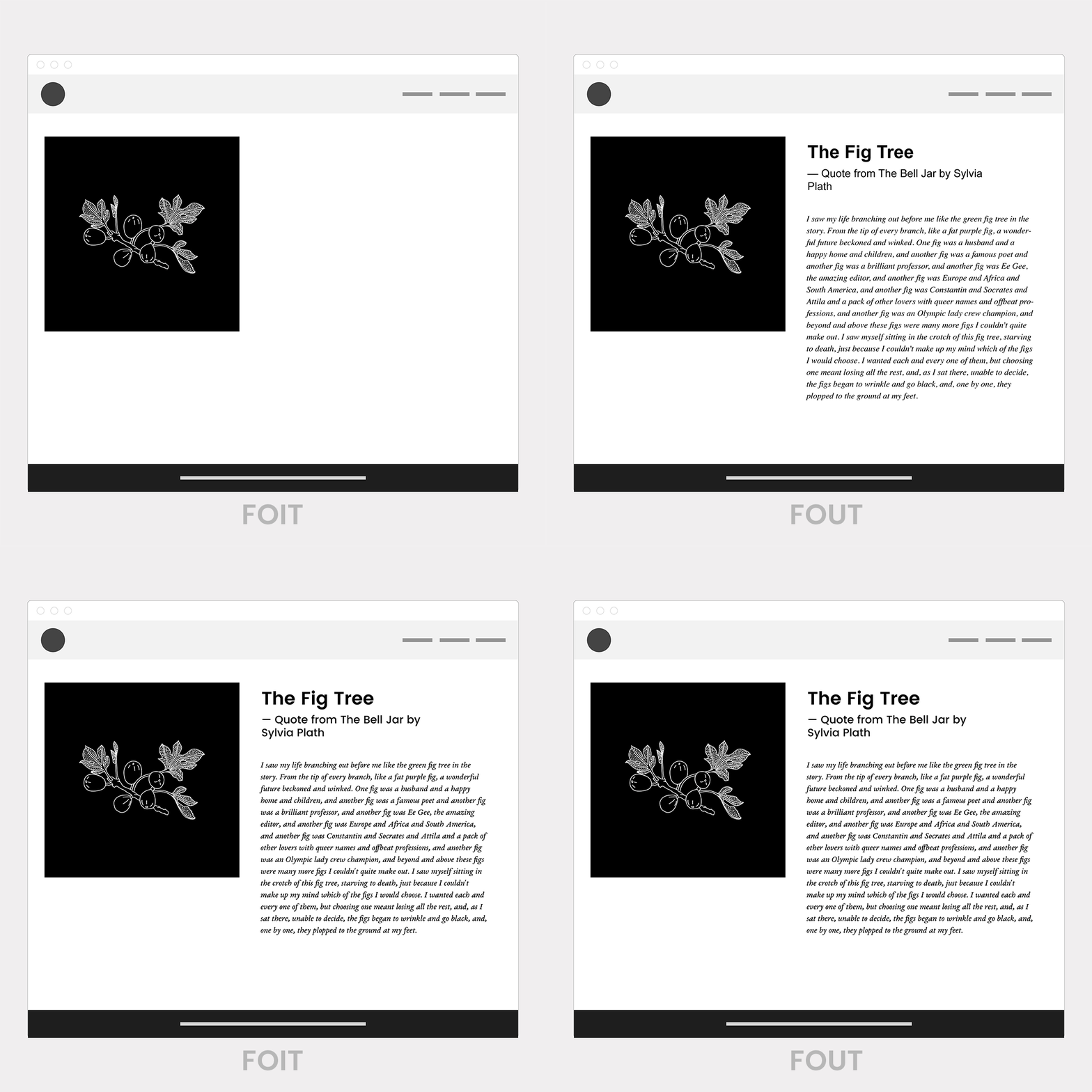
Few ways of avoiding this are:
Option#1 : Use font-display
font-display is an API for specifying font display strategy. swap tells the browser that text using this font should be displayed immediately using a system font. Once the custom font is ready, the system font is swapped out. If browser does not support font-display, it continues to follow it’s default behaviour.
 font-display currently supports the following range of values: auto | block | swap | fallback | optional
-
auto: uses whatever font display strategy the user-agent uses.
-
block: gives the font face a short block period (3s is recommended in most cases) and an infinite swap period. The browser draws "invisible" text at first if the font is not loaded, but swaps the font face in as soon as it loads
-
swap: gives the font face a zero second block period and an infinite swap period. This means the browser draws text immediately with a fallback if the font face isn’t loaded, but swaps the font face in as soon as it loads.
-
fallback: gives the font face an extremely small block period (100ms or less is recommended in most cases) and a short swap period (three seconds is recommended in most cases). In other words, the font face is rendered with a fallback at first if it’s not loaded, but the font is swapped as soon as it loads. Best for things like body text where you’d like the user to start reading as soon as possible and don’t want to disturb their experience by shifting text around as a new font loads in.
-
optional: gives the font face an extremely small block period (100ms or less is recommended in most cases) and a zero second swap period. Similar to fallback, this is a good choice for when the downloading font is more of a "nice to have" but not critical to the experience. This value leaves it up to the browser to decide whether to initiate the font download, which it may choose not to do or it may do it as a low priority depending on what it thinks would be best for the user. Beneficial when user is on weak connection.
font-loading behaviors for common browsers:
|
Browser |
Default behavior if font is not ready… |
|
Edge |
Uses a system font until a font is ready. Swaps out font |
|
Chrome |
Will hide text for up to 3 seconds. If text is still not ready, uses a system font until font is ready. Swaps out font. |
|
Firefox |
Will hide text for up to 3 seconds. If text is still not ready, uses a system font until font is ready. Swaps out font. |
|
Safari |
Hides text until font is ready |
Wait to use custom fonts until they are loaded
Option #2: Wait to load custom fonts until loaded. This can be implemented with below 3 steps.
- Don't use a custom font on initial page load. This ensures that the browser displays text immediately using a system font.
- Detect when your custom font is loaded. This can be accomplished with a couple lines of JavaScript code, thanks to the FontFaceObserver library.
- Update page styling to use the custom font.
Option #3: Preload webfont resources.
- If a page need a specific Webfont hosted at a URL you know in advance, that can be download using new web platform feature <link rel="preload">
- This serves as a "hint" to the browser that a given resource is going to be needed soon, but it doesn't tell the browser how to use it. You need to use preload in conjunction with an appropriate CSS @font-face definition in order to instruct the browser what do to with a given Webfont URL.
For more details on FOIT and FOUT, check this pega community article. Optimization Checklist:
- Audit and monitor your font use: don't use too many fonts on a page with too many variants
- Subset your font resources
- Deliver optimized font formats to each broswer
- Give precendence local() in your src list
- Customize font loading and rendering using <link rel="preload">, font-display or the FontLoading api
- Specify revalidation and optimal caching policies
- Lighthouse is an auditing tool built by the Chrome DevTools team.
- It can help automate the process of making sure that you're following web font optimization best practices.
- Give Lighthouse what URL to audit, and then it runs a bunch of tests on the page, and gives you a report of what the page is doing well, and how it can improve.
Font services where we can download fonts:
- Cloud Typography
- Typekit
- Fontdeck
- Webtype
- Fontspring
- Typotheque
- WebINK
- Fonts.com
- Google Fonts
- FontSquirrel
Resources:
- https://getflywheel.com/layout/everything-you-need-to-know-about-web-fonts/
- https://www.upwork.com/hiring/design/what-are-web-fonts-and-why-are-they-important/
- https://medium.com/hackernoon/web-fonts-when-you-need-them-when-you-dont-a3b4b39fe0ae
- https://www.wired.com/2010/05/dealing-with-the-dreaded-flash-of-unstyled-text/
- https://www.malthemilthers.com/font-loading-strategy-acceptable-flash-of-invisible-text/
- https://web.dev/avoid-invisible-text/
- https://creativemarket.com/blog/the-missing-guide-to-font-formats
- https://web.dev/fast/
For installing custom web fonts in pega platform, please refer to link.
