Discussion
Pegasystems Inc.
US
Last activity: 28 Sep 2020 8:03 EDT
Customizing the Welcome widget in a Cosmos application
By default, a Cosmos application includes a Home page. Unlike a traditional Pega dashboard that is customizable by an end user, the Home page is intended to be a curated experience where application designers can specify what all users first see upon logging in.
The default Home page includes a welcome widget, and, because it is based on an underlying design template, developers can easily modify its contents -- the title, text content, and action buttons -- using only App Studio.
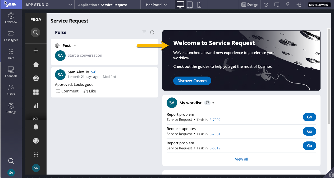
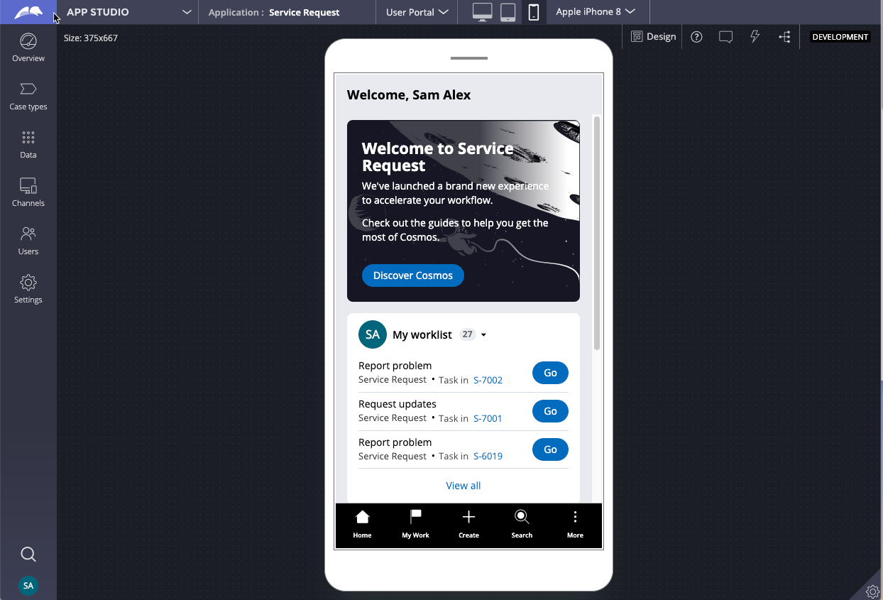
The welcome widget is also responsive, rendering appropriately from small screen sizes to large monitors.
This article demonstrates how you can using mostly App Studio to modify the contents of the Welcome widget, including changing the title and text, the action buttons, and the background image. But first, let's examine whether or not you should reuse this widget or develop your own.
Should you re-use this widget?
The default welcome widget is based on an underlying design template, and the styling for this template is defined by CSS that is shipped in Cosmos CSS files. The CSS specifies a dark background and white text. If you intend to use other background colors with other text colors, or if you desire a completely different layout, we recommend not re-using the welcome widget and instead building your own welcome widget from scratch.
If you stick with this color combination and layout, then the rest of this article will show you how to use App Studio to modify its contents. Before describing how to modify the contents, let's examine the Welcome widget's underlying template.
The welcome widget template
The welcome widget contains two regions. The "Welcome text" widget is a stacked layout; any control you drop into this region, such as Text controls, are stacked vertically.
The "Action area" region is an inline layout intended for buttons or links or menus. (Remember, as a best practice, use buttons to launch actions on the current page. Use a Link when navigating to another page). Buttons and links in this region render horizontally.
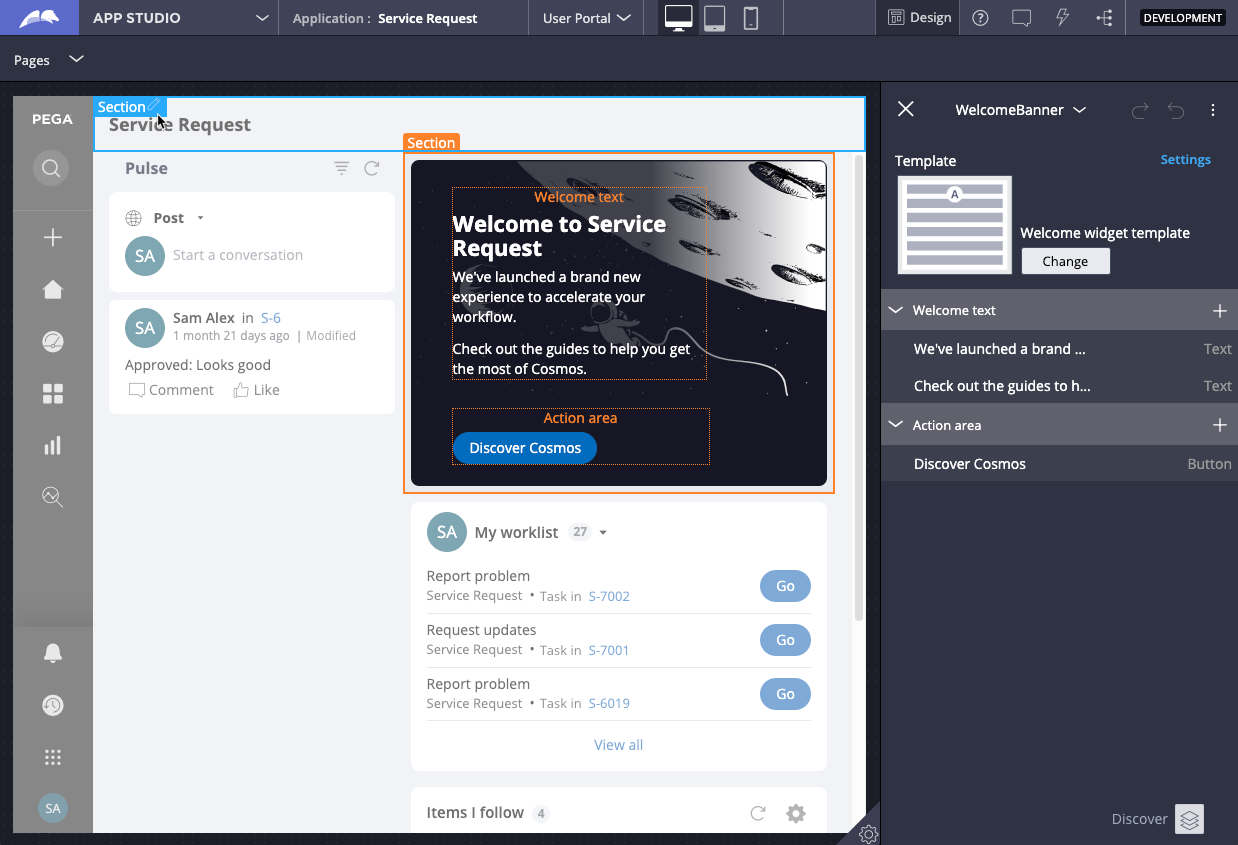
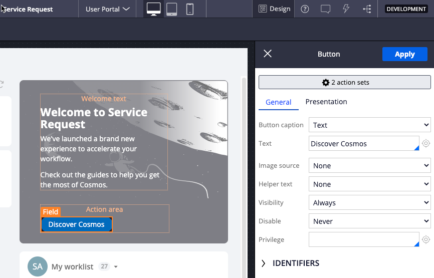
To begin customizing the contents of the welcome widget, log in to App Studio and toggle on the design mode. Hover over the welcome widget and click the pencil in the border of the widget.
Customizing text contents
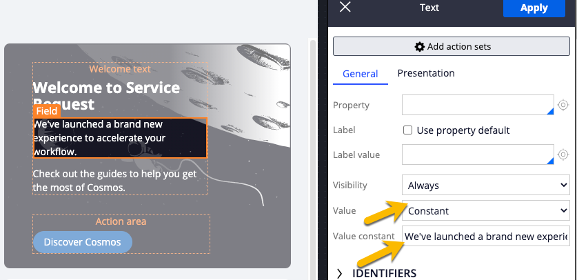
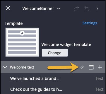
To modify the text contents, modify the existing Text controls in the "Welcome text" region by hovering over the Text control and clicking the pencil icon to reveal the Text control property panel.
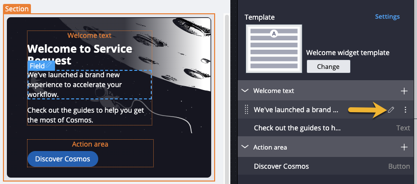
Update the "Value constant" to the text of your choice. Alternatively, update the "Value" field to a Field Value, and use a Field Value rule as the source of your text.
Customizing the welcome widget title
By default, the welcome widget renders the string "Welcome to" concatenates the value of Application.pyLabel, which stores the name of your application.
To modify it, hover over the "Welcome text" region and click the pencil icon.
This reveals the underlying region's property panel. Change the Title input to another Field value in your app. Do not change the other settings in the property panel.
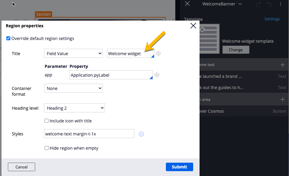
The nice thing about this approach is that it produces accessible markup as well as a proper HTML heading that is already styled for Cosmos.
Customizing the action area buttons
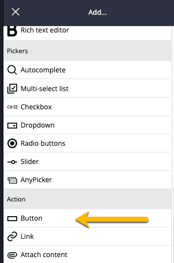
If desired, add your own buttons or links to the "Action area" region by clicking the + button in the "Action area" region and selecting Button or Link.
Once the button or link is added to the region, hover over the button control in the region and click the pencil icon to modify the button properties (button text, button skin format, button action set) as you normally would.
Remember that button should be used to launch an action, such as a modal, but remain on the current page. Link controls should be used to navigate to another page entirely.
You can also remove all buttons from this region if desired.
Modifying the background image
By default, the welcome widget background image is white line art of an astronaut on a space walk and moon rendered over a black background. The underlying design template's CSS will position it in the top right corner of the widget.
To change it:
- switch over to Dev Studio.
- Open WelcomeWidgetBackground.svg Binary file rule
- Override this rule by doing a Save As into your application's ruleset
- Finally, upload a new svg. For best results, upload a new svg that has a black background and also has similar dimensions to the default one, currently 913 x 232.