Discussion
Pegasystems Inc.
IN
Last activity: 8 Oct 2020 6:18 EDT
Creating status badges
Pega design system defines status badges as below:
Status badges and their color help users quickly find a case or object’s health. Color alone must not convey meaning according to international accessibility guidelines. The label in the badge itself must also clearly identify the status.
We often come across many use cases of status badges, but how we configure them in our application? Is there any OOTB control for this? Are there any helper classes? We are going to see the same in our current post.
To clear the air, there is no dedicated control as such for showing the status badge but this can be easily achieved with the help of:
- Formatted text (OOTB control)
- Badge text
- badge-bg-* helper classes
Step 1:
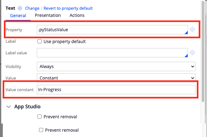
Drop in the Formatted text (you can see it as just Text in property panel) in the section. You can configure either through a property or just as constant as shown below:

Step 2:
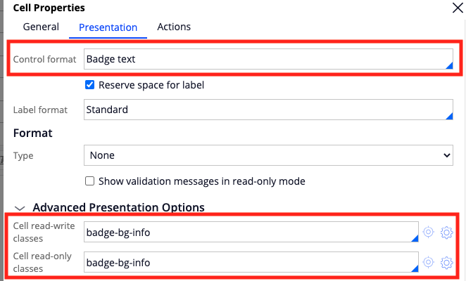
Now choose "Badge text" fromat in control format
Step 3:
Choose the relevant helper class like badge-bg-info or badge-bg-wait etc ( Can we know how many of such helper classes are there OOTB? Sure will touch upon them little later)

That is it! You should be able to see the status badge in your application. But what are the different OOTB helper classes available for status badges?
| Badge helper class | Color |
|---|---|
| badge-bg-info | #179595 |
| badge-bg-wait | #6839A8 |
| badge-bg-old | #585B73 |
| badge-bg-warn | #FD6000 |
| badge-bg-good | #20AA50 |
| badge-bg-bad | #D91C29 |
| bg-badge-offline | #A6020D |
Applying these helper classes in,
UI-Kit:

Theme-cosmos:

Hope this article helps. Happy coding!
