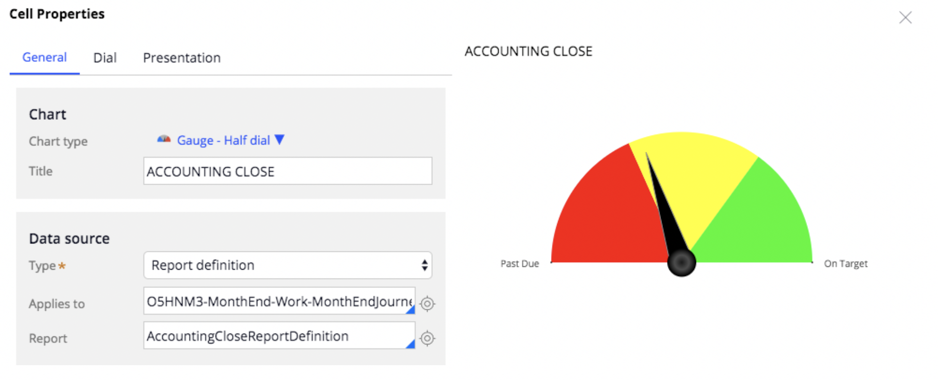
Creating a Dynamic Gauge Chart for Pega Application
By: Nia Christian
Date: 12/3/18
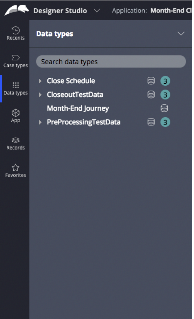
- Click Data Types from the side navigation bar
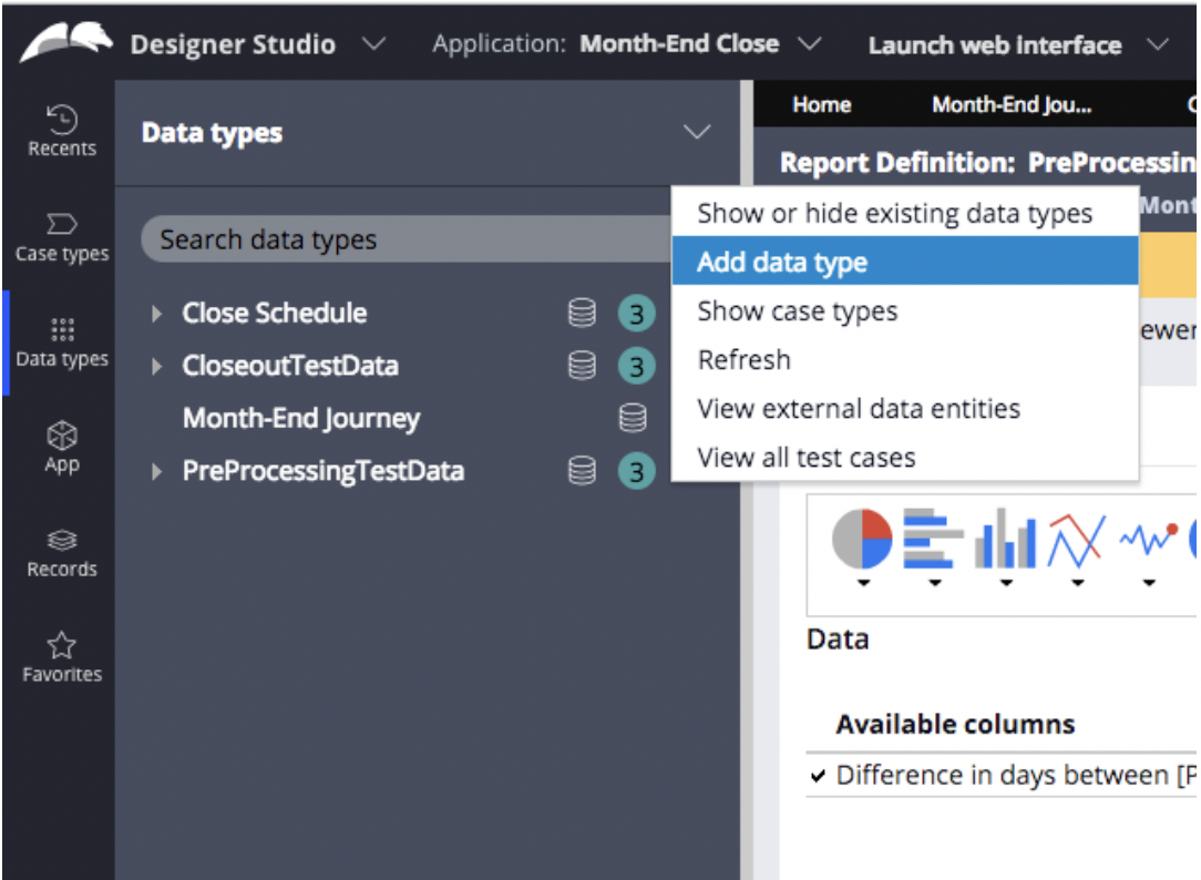
2. Click the dropdown arrow next to the Data Types label and select -> Add data type
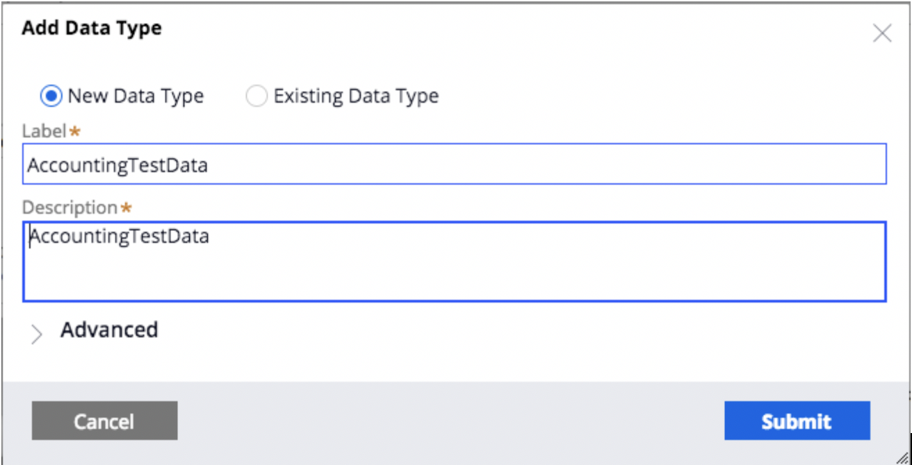
3. Add a name and description for your new Data Type and click Submit
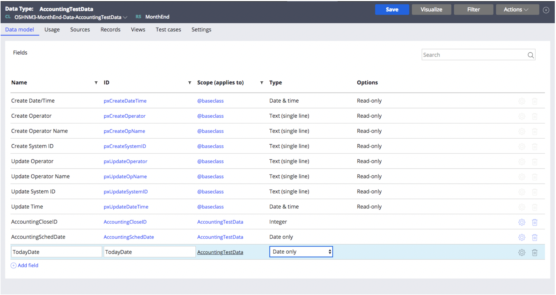
4. Add as many fields that you would like to use in your configured calculations for your chart. For example, I would like to determine the color location of the gauge chart based on a date, so I need at least one date field. *Be sure to add an ID field of type Integer
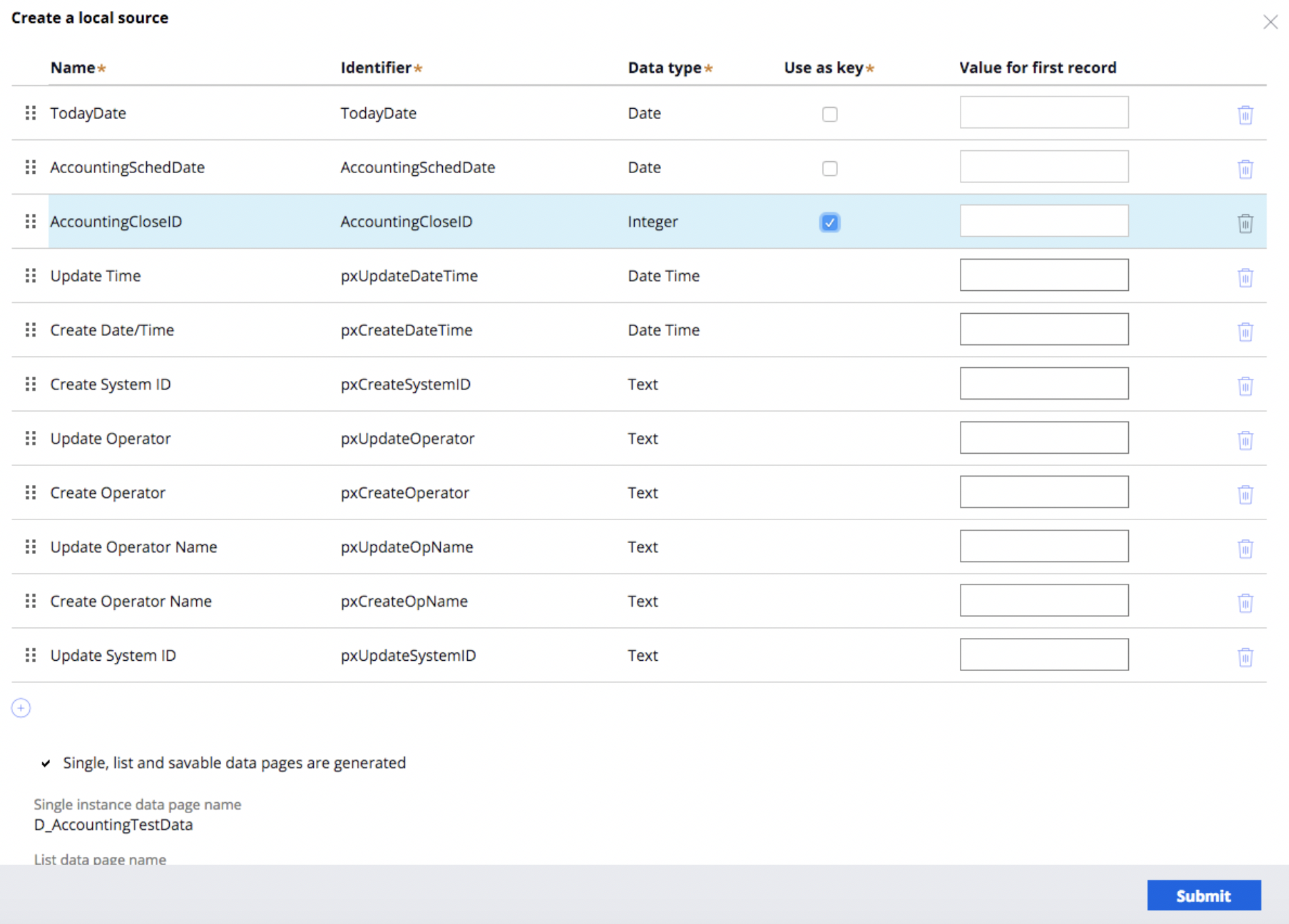
 5. Click the Sources tab, and click Create a local source

6. Select the ID field that you created to “Use as key” and submit and close

7. Click on the records tab to add sample data that your chart will use
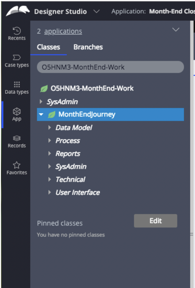
8. Next in the app explorer tab, click App -> and Select your application
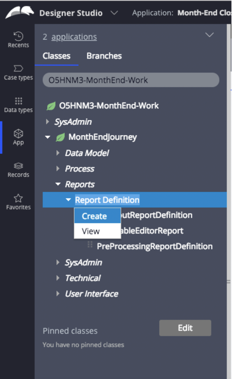
9. Click the Reports dropdown -> Report Definition -> Right click Create
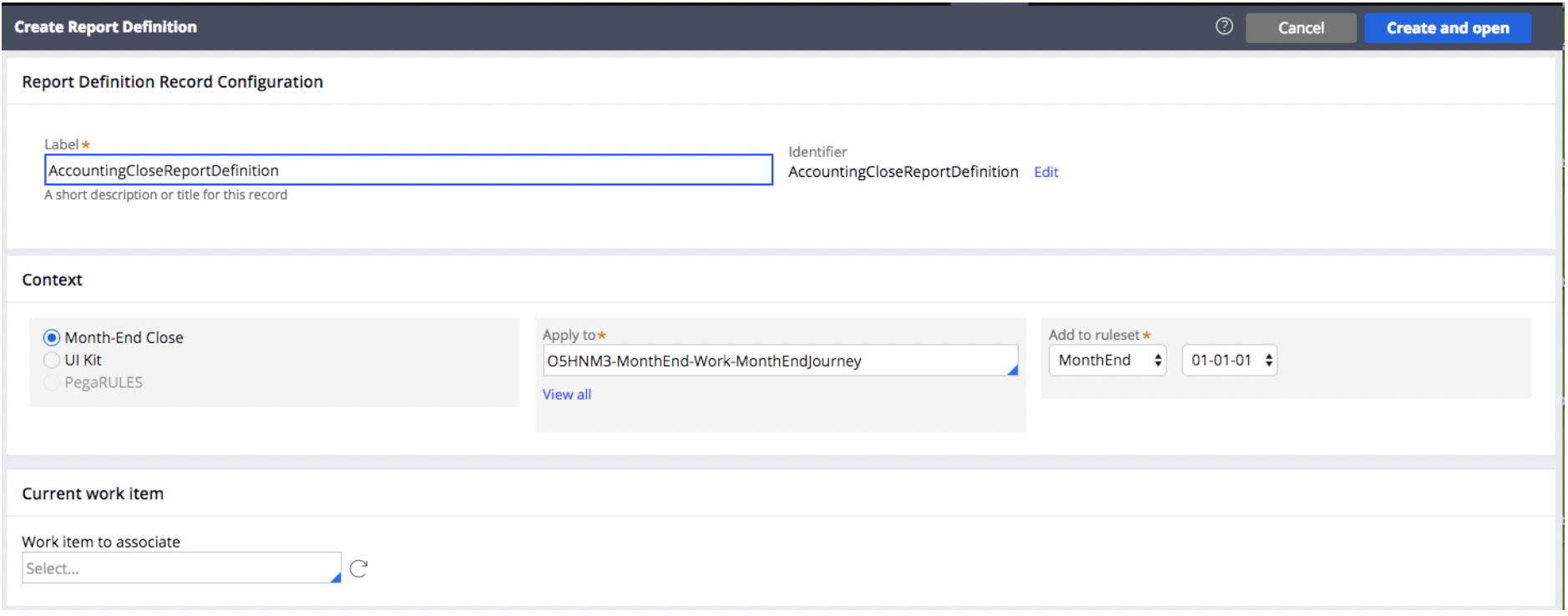
10. Name your new report definition and create and open
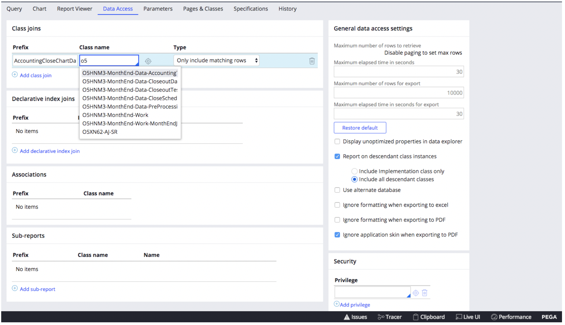
 11. Select the “Data Access” class and click “Add class join” Enter a prefix, and select the name of the Data Type that you created as the Class Name.
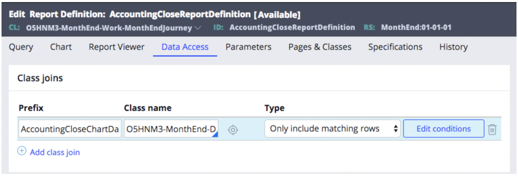
 12. Click Edit Conditions
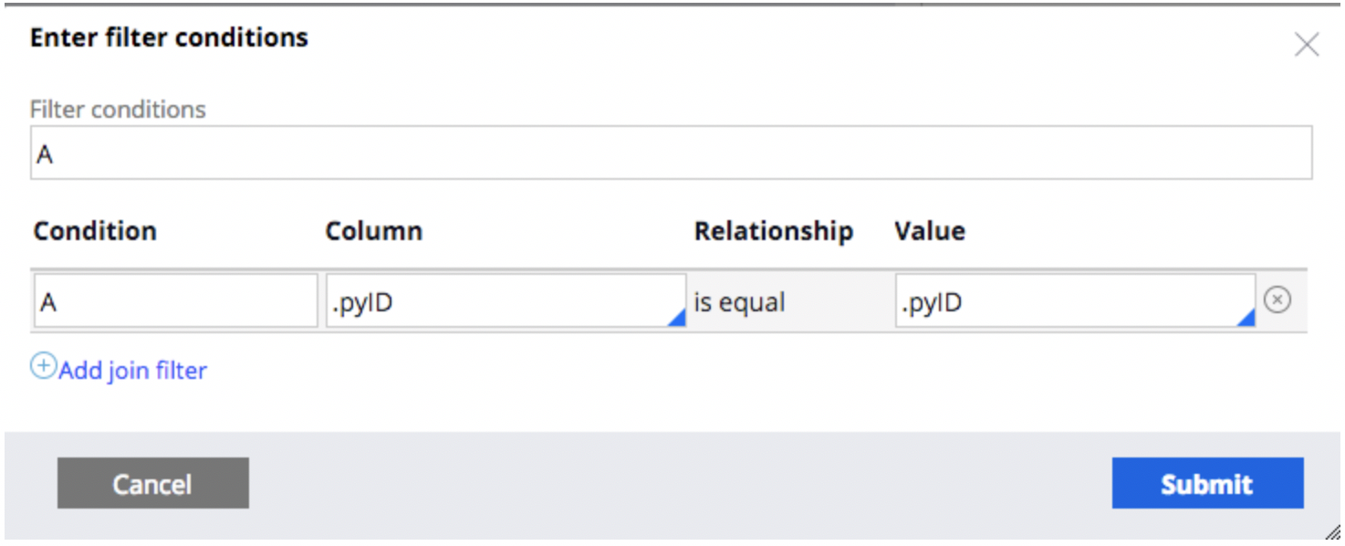
 13. Set your conditions to .pyID Column with the value .pyID and Submit
 14. On the query page select a Column source value that you would like to use to generate your dynamic data for your chart. PageName*(Based on your prefix name on the Data Access tab).yourProperty
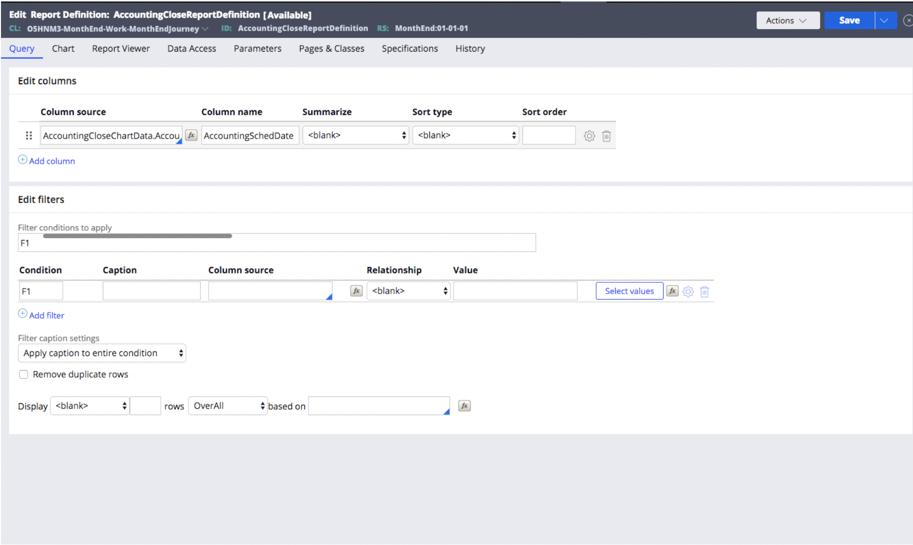
15. If you would like to include a function to be performed on your selected column source, click the fx button between the Column Source and Column Name

16. Select a function and if necessary add your specific parameters. Once your parameters are specified, click submit
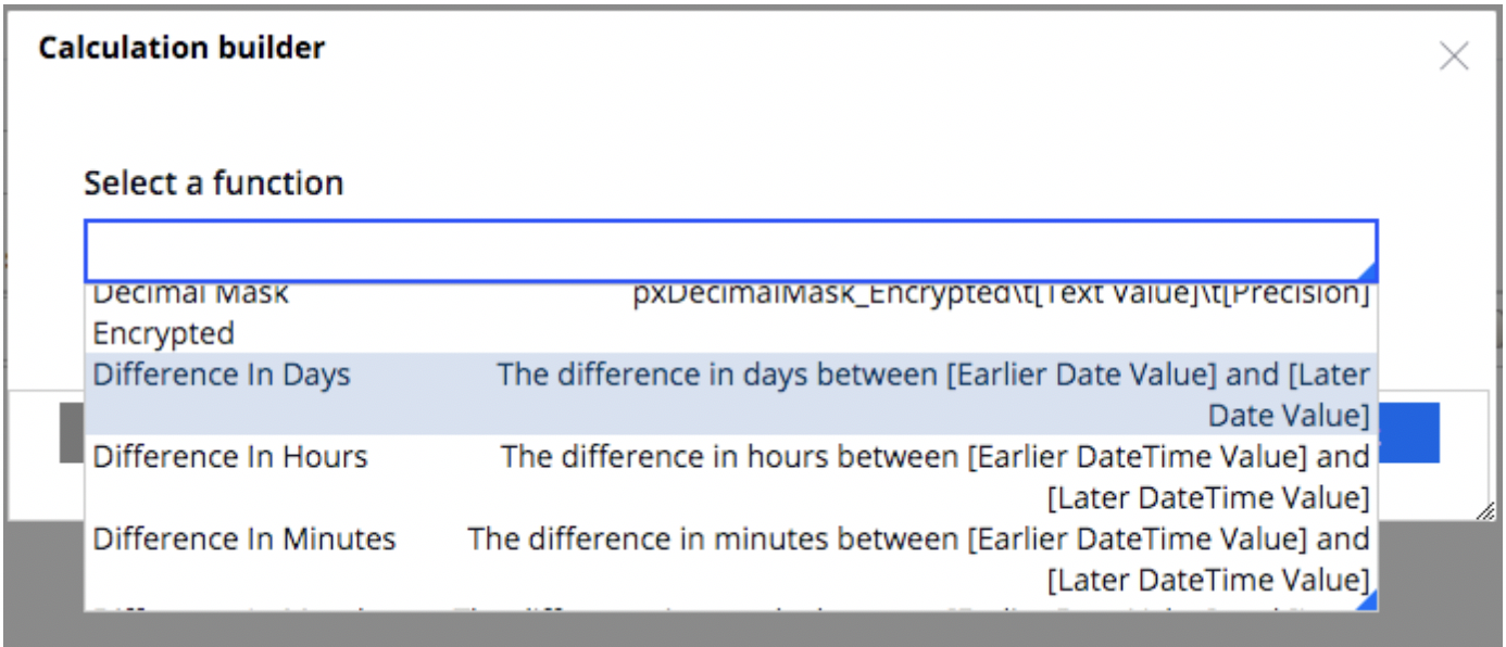
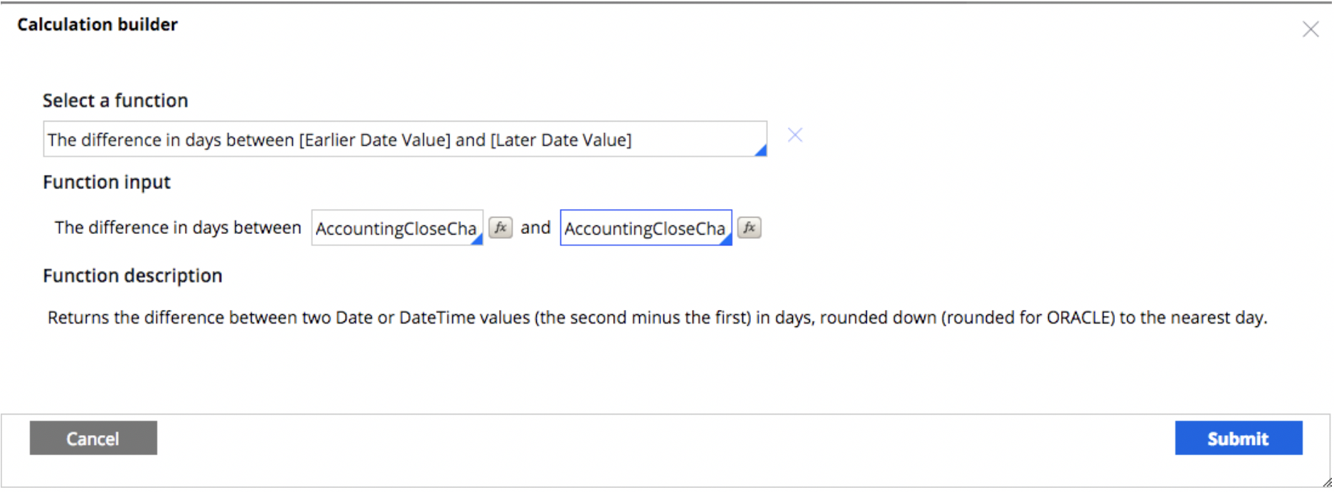 17. Be sure to select values for the Summarize and Sort Type values
 18. Click on the Chart tab and click Include Chart
 19. Select your specified chart from the All Chart Typed link
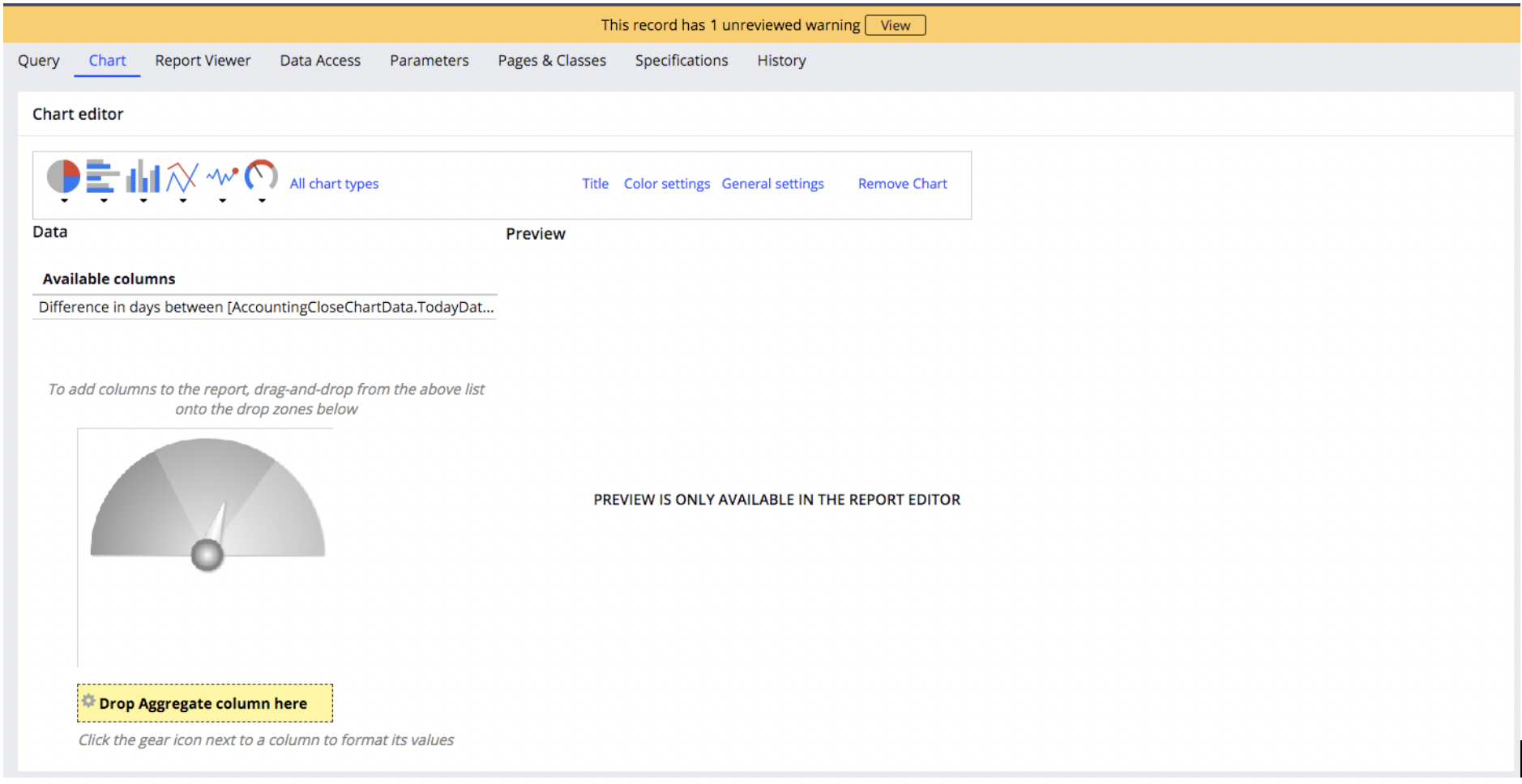
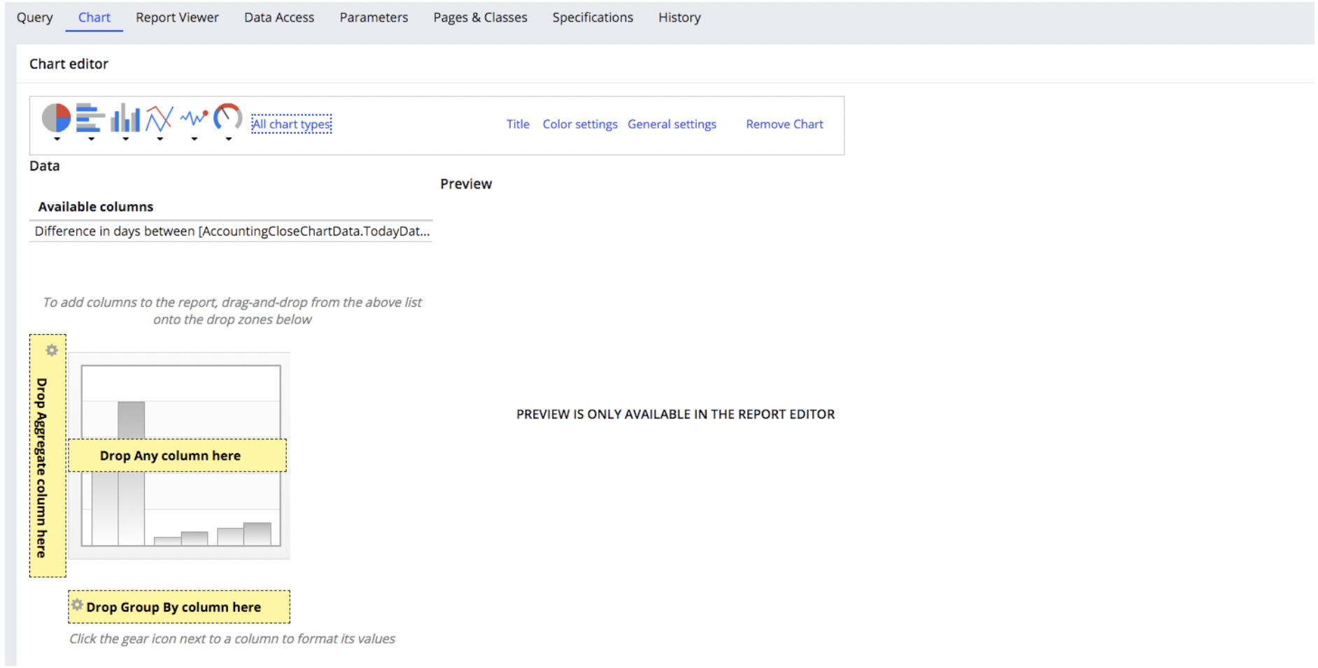 20. Once you have selected your chart, be sure to drag your available column onto the aggregate column listed in the chart area. This will ensure that your data is displayed based on your query
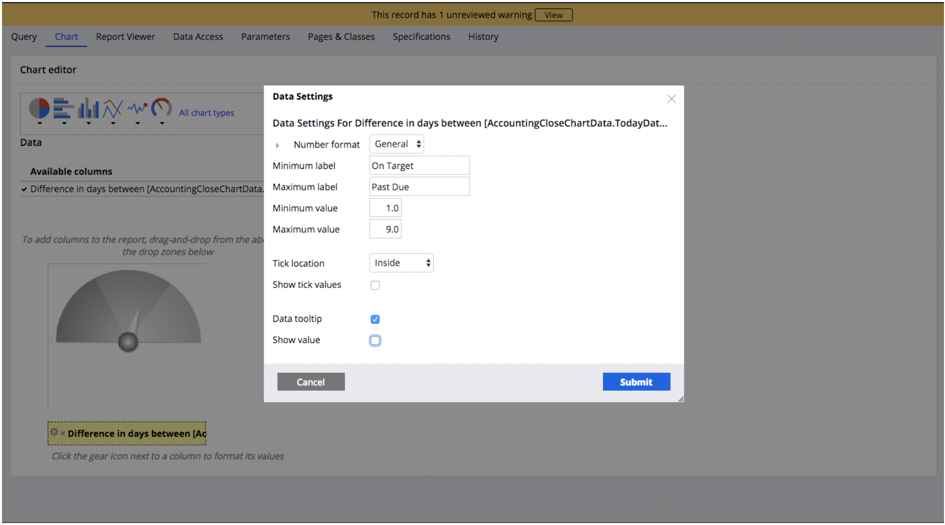
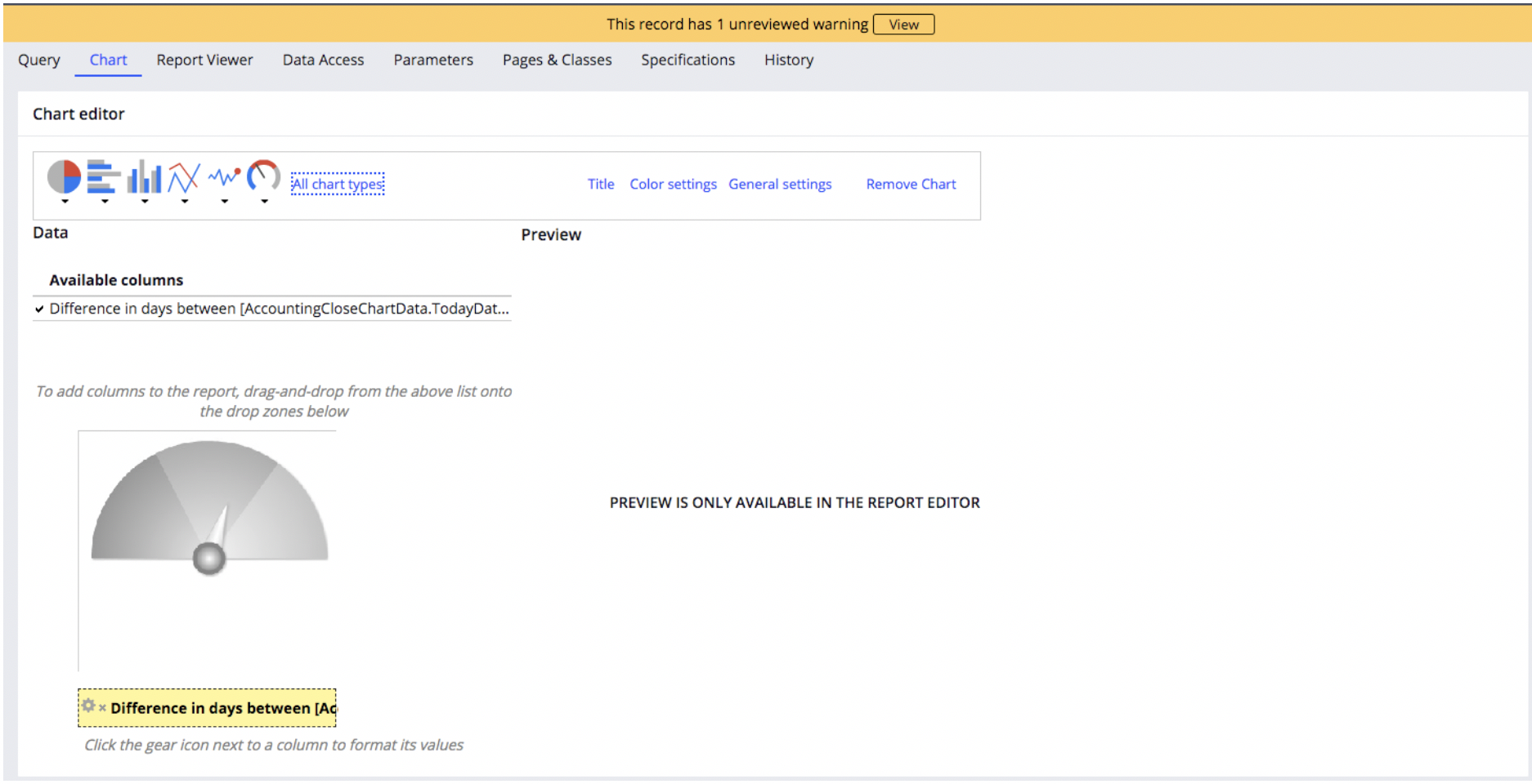 21. Configure the chart settings, by selecting the gear next to your specified column and Submit
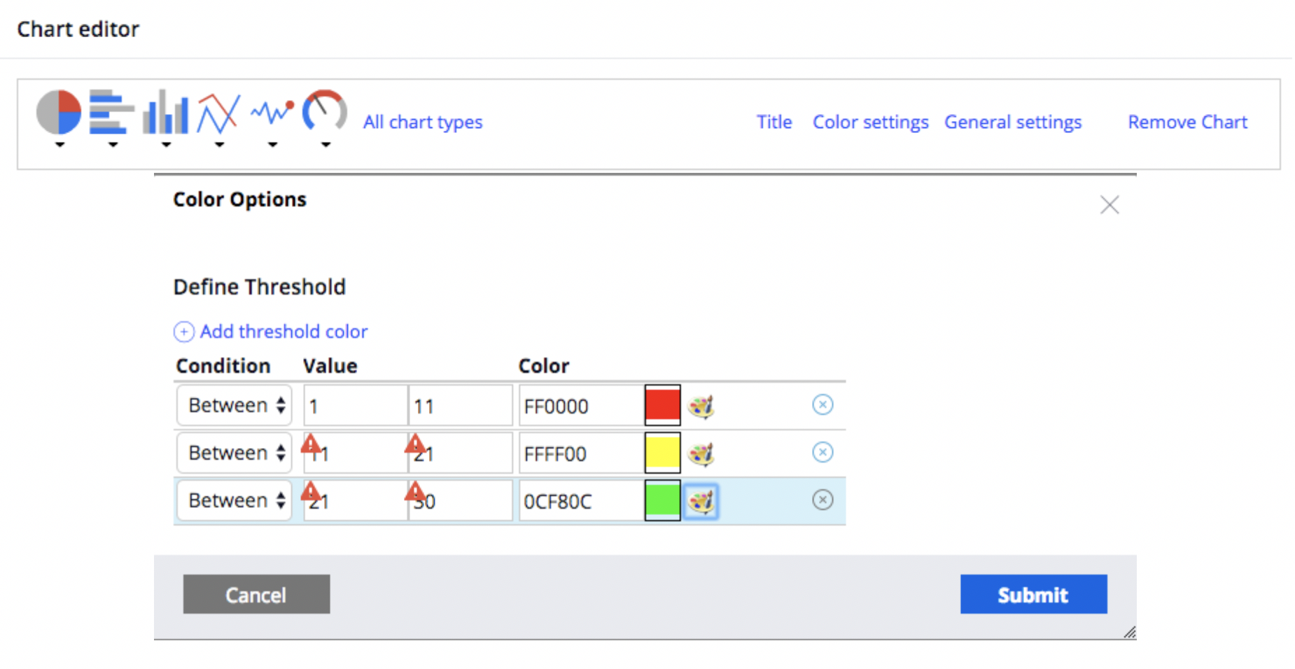
 22. Next configure the color thresholds etc under the Color settings.
 23. Save your work. Create a section within your application and add a chart to that section
 24. Open the settings of your chart. Select the Type as “Report Definition”, select “Applies to” as the class that your Report Definition was created under. Select the “Report” as the Report Definition name that you created.
