Badge Icons with status
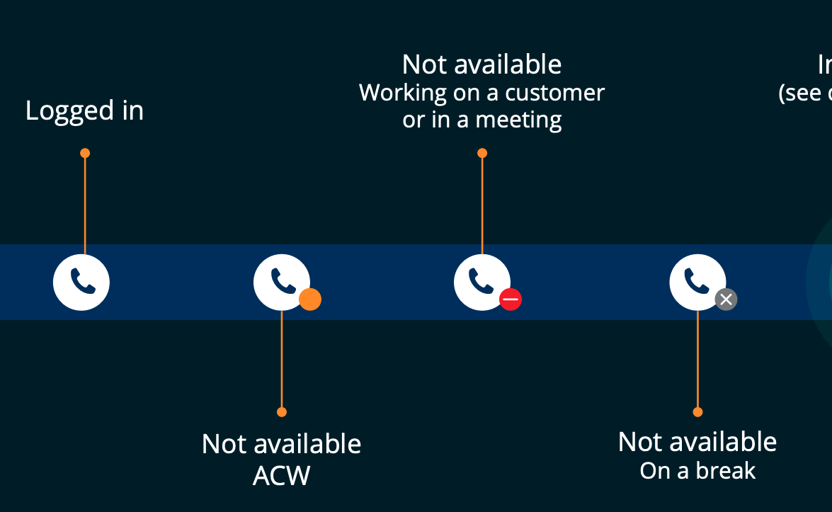
While icons does convey things very easily to the user, it will be great if we can do below things to convey more in depth status to the user
- Club 2 icons in to one. I.e. Primary and Secondary
- Apply a background color to Primary and Secondary
Let’s say we need to let the user know that there is a call in progress and its currently kept on hold. If we convey the same using a text it will not be a great user experience and will occupy more real estate on the screen.
Instead if we can show that in a single icon as below that can save us lot of real estate on the screen and also does give the user a great and appealing user experience.

Let’s go ahead and learn how to build such icon (Let’s say to denote Chat on Hold) in Pega using CSS
We need to add 3 blocks of CSS Code to a CSS rule to design the icon as above
- Base CSS
- Primary Icon (Chat icon) CSS
- Secondary Icon (Pause icon) CSS
Include below Base css in a CSS rule and attach it to the skin
.app-icon-status {
   font-size: 19px;
   line-height: 30px;
   width: 30px;
   display: block;
   text-align: center;
   border-radius: 50%;
   margin: 5px;
   height: 30px;
}.app-icon-status:before {
   vertical-align: inherit;
   font-size: inherit;
}.ie .app-icon-status:before {
   line-height: inherit;
}.app-icon-status-large {
   font-size: 25px;
   line-height: 50px;
   width: 50px;
   display: block;
   text-align: center;
   border-radius: 50%;
   margin: 5px;
   height: 50px;
   padding-top: 0;
}.app-icon-status-large:before {
   font-size: 25px;
   line-height: 50px;
   vertical-align: 0;
}.app-icon-status:focus {
  outline: none;
}.app-icon-status:hover {
  opacity: 0.5;
}.app-icon-substatus:after {
  font-size: 8px;
  height: 12px;
  line-height: 10px;
  width: 12px;
  display: block;
  text-align: center;
  border-radius: 50%;
  margin: 14px;
  position: absolute;
  left: 8px;
  font-style: normal;
}.app-icon-substatus-bottom-right:after {
  bottom: -3px;
  top: auto;
}.app-icon-substatus-top-left:after {
  left: -8px;
}.app-icon-substatus-bottom-left:after {
  left: -8px;
  bottom: -3px;
  top: auto;
}.app-icon-status.app-icon-substatus {
  position: relative;
}
Include below Primary icon CSS block to design the icon with blue background and white icon
.app-icon-status.app-icon-status-active {
  border: 1px solid #097FFF;
  background: #097FFF;
  color: #FFF;
}
Include below Secondary icon CSS block to design the sub icon with red color background and white icon
.app-icon-substatus-danger:after {
  border: 1px solid #A6020D;
  background: #A6020D;
  color: #FFF;
}
Great… We now have all the assets ready to design the “On Chat Hold” Icon. Let’s go ahead and integrate the above in a section
Drag and drop a Image control into your section
Modify the Icon source as “Icon class”
Apply below CSS class string
pi pi-chat app-icon-status app-icon-status-active pih-badge-icon-pause app-icon-substatus-danger
Configuration looks like below

Done, go ahead and here is the preview.

Well.. Still confused what does that big css class string does and what is the job of each class inside that. Here is the anatomy

OTB from pega we have below sub icons whose css class names starts with pih-badge-icon-*
pih-badge-icon-warn
pih-badge-icon-wait
pih-badge-icon-call
pih-badge-icon-eye
pih-badge-icon-mic
pih-badge-icon-mic-off
pih-badge-icon-lock
pih-badge-icon-unlock
pih-badge-icon-users
pih-badge-icon-check
Here is the preview of each badge icon
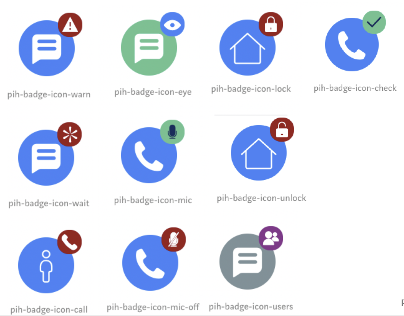
You can find the latest set of sub icons from py-icons.css Rule
Also you can fill below template and append it to CSS rule to create your own status for Primary and Secondary icons.
/**** Primary Icon Status ********/.app-icon-status.app-icon-status-[Primary Icon Status name] {
  border: 1px solid #[Circle Border color];
  background: #[Circle Background color];
  color: #[Icon color];
}/**** Secondary Icon Status *********/.app-icon-substatus-[Secondary Icon Status name] {
  border: 1px solid #[Circle Border color];
  background: #[Circle Background color];
  color: #[Icon color];
}
While the Sub icon by default is rendered on top right corner, you can control the position by adding below extra css class name
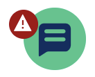
app-icon-substatus-top-left
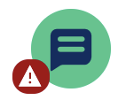
app-icon-substatus-bottom-left
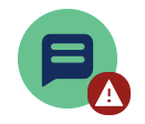
app-icon-substatus-bottom-right
***Edited by Moderator: Pallavi to change category from General to Product***
